DataSelf Analytics, Acumatica Summit 2020 Preview Webinar
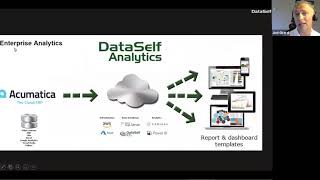
Johnny Girardi, founder and CEO of DataSelf, previews the Acumatica Summit 2020 and walks through DataSelf Analytics' integration with Acumatica. The platform uses natural language processing to build dashboards and handle reporting without requiring extensive training.
Chapters
Good morning everyone. Thanks for joining us. My name is Johnny Girardi, I'm Data Sales founder and CEO and today we'll talk about Acumatica Summit 2020. Get a little preview of our presence over there. If you haven't been to Ecumatica Summit and you're going this time, you're going to love it. I've been in ERP conferences for about 20 years and Acumatica Summit is at the top of the most exciting one. So you'll have fun, you'll learn a lot. It's an event that has a few thousand people, so it's still possible for you to get to know anyone that you want. When conferences get really big, like usually beyond 10,000 people is harder to get to meet some key people. So if it's new to Acumatica Summit and you want to meet with people, really connect, it's a great opportunity, it's fun and you learn a lot. The first thing I want to talk about is a little bit about reporting and BI opportunities at Acumatica Summit. The main BI players and vendors will be present at Qemedica Summit. I want to highlight two of them. One is of course Dataself and the other one is Velexo. Velexo is Excel reporting kind of solution. I'm highlighting these two vendors because Dataself and Velaxo are used internally by Acumatica, the company Acumatica. So if you look what Acumatic is using internally out of their own Acumatica system, they quad use Velaxo for Excel reporting and Data Cell for dashboarding and data warehousing. So certified products, highly well endorsed. I highly recommend you to check both companies if you're looking for better reporting. We're going to have a session on Monday, 3:30. It's called Lightning Fast Key Performance Indicators for Acumatica. So it's going to have a little bit more than what we're going to be covering here today. So if you want to have other people to learn about it as well, if you want to see it again, stop by our session next day on Tuesday morning. Reporting and data dashboarding for the modern business is a session by Gabriel, which is the CEO of Alexa, also talking about reporting dashboarding out of Ecumatica. There's also a session if you're a reseller. This is mostly for resellers. I encourage you to go for the best practice for co selling with ISVs. I'm going to be part of the panel about to have the session, going to be talking about how ISVs together with Acumatica we enhance customer experience out of the whole Acumatica ecosystem. So maybe take a screenshot of this page if you want to get some suggestions of the Ecumatica Summit. A few clients using Data Self some success stories. The first one technical contracting. They came from another ERP system and one of the main goals when they moved to Acumatica was the ability to analyze their project history from the old system, the legacy system and Acumatica together in a single place. And Data Self is the tool they're using to see their whole project history, sales history, financial history. Like they never change from the old legacy to Acumatica. So very good success story. If you want to learn more you can stop by our booth at Summit2Learn Home Enhancement it's a distribution company and Carl Owens owns is the director of sales and he said that you know with Acumatica the management of their sales looking at what's growing or what's declining, what the opportunities are becomes so much easier than before when it was a very manual process excel based and people would take a while to see perspectives from their sales operations. The last client but not the least again Acumatica, the company using Dataself internally and Nigel, the CFO coo. They use Dataself extensively for analyze sales trends. Acumatica is a company highly focused on customer satisfaction and Data Self is helping them become even better at delivering in that value. Having said that, big benefits of Data Self probably the most important one is providing decision makers with easy access to their key performance indicators inside of Acumatica or outside of Acumatica as well. So let me just mute the other person here on my team. So the idea is decision makers can easily find the reports and dashboards using Acumatica as a portal. Maybe some of them don't have access to Acumatica. No problem, we can be outside, but it becomes easy with Data Self. Very intuitive. We have a lot of reports and dashboards available on day one. So as soon as we deploy your decision makers will have valuable insights into critical trends. It's very easy to customize. It is actually the easiest to customize reporting platform in the market and I'm going to tell you why is the easiest in the next slide and also show a little bit as I go through the product demo today. The technology uses the latest and greatest in analytics. It incorporates natural language, artificial intelligence and machine learning. So there's all of these things behind the scenes doing the magic of Data Self analytics. And the good news is the Deployment of data box is primarily a 15 minute procedure, all web based. You deploy it and off you go to start getting data, better data out of your acumatica. From an architecture standpoint in this what we're calling advanced analytics which is the old data self light, if you have heard about that before. But primarily we put we pull data from acumatica into our cloud system that is powered by technology developed for Fortune 2000 companies. We also add our own secret sauce, you know, data warehousing in Tableau what I'm going to be showing today. And tableau is considered the gold standard for ease of use in user empowerment. And that's an endorsement by Gartner. So that's why I'm saying is the easiest to use technology for reporting because it's very intuitive. Gartner has been giving Tableau this kind of seal for about six years in a row. At the end of the day decision makers get easy access to their reports. They can be using desktop computers, web browsers, mobile devices. This advanced analytics which is very affordable only pulls data from acumatica1tenant. If you have more data sources, if you have multi tenant then we have what is called enterprise analytics which is a platform that leverages the full data warehouse framework that we can bring any data Source Together, Payroll, Salesforce.com, google Analytics, Excel sheets, point of sales, whatever you have in your system. With enterprise analytics we can bring all of them together while the advanced analytics is primarily only acumatica. Having said that, let's jump into the product presentation. So before I switch to the browser, when I mention about being highly customizable and easy to use, I'm going to show, I'm going to start showing the pieces of the solution that are the most empowering. And when we talk about empowering, there's two group of people. There are the decision makers, business users that quite often are super busy and might not have time to learn complex reporting tools. So they need something that they can actually run with it without going through hours of training and learning complicated things. So that's one kind of user. The other kind of user are the more we call data geeks people whose life is to do data analysis, to build reports and dashboards, to work with data problems. The data scientists per se. And for both of these group of people we have what's the best out there in technology. You know some people tell the best technology of the planet is what data self uses anyhow great technology to empower each group of people to be more independent. This demo, this webinar is going to be focusing on users, business users. It's not focusing on the more technical side of it. I'm going to show a little bit, but not too much. So let me show the first perspective of how this technology empowers those users who don't have time to learn complex technology. So now I'm switching to Acumatica. So I'm inside of my Acumatica sandbox and this is called natural language. Natural language is if you know English, guess what, you are ready to build your custom reports. Yes, if you know English, you are ready. There's no extra training, of course. You need to get to know the tool and how to poke around and how to get it right. But it's natural language. Let me show some examples. Right now I'm connected to the sales natural language of data self inside of Acumatica. You don't even need to know data self. It's just part of the Acumatica framework. But suppose I'm VP of sales and I see sales by salesperson. What I do is I type sales by salesperson. And yes, I mistyped by just to show that even though I mistyped it, the tool kind of tried to figure out what I meant by those words. And tell me, do you want to see the sum of salesperson? Sum of sales by salesperson? I'm going to confirm. Just confirm. Just click on it and right there the tool will come up with the salespeople bars for sales. And that's it. It's that easy. If you type the question, the computer might understand and give you the right answer. Like in this case. Now realize can be more complicated. Right. Sometimes people don't know how to ask the right question. In this example, it was a simple question and when they look at the numbers like account, home account, $36 million. That's kind of doesn't make sense. And then I realized, well, I just wanted to see the sales in 2019 because right now it's looking at the whole company history. Ah, right. Okay, so let's put in 2019. The tool tries to interpret what you're asking and will give you options of what you're trying to say. You want to filter by something. In this case, invoice date should be in 2019. Okay, so I click on it. Now the tool recalculate my query and shows that my home account was $80 million last year. Now we're talking. But again, natural language. Let's go further. What if I want to break it down by month? What you do is by month, the tool again tries to interpret gives me option. In this case, there's only one option is by invoice, date, month. You choose it and then it will change the format to something that is more meaningful for what the tool thinks you want to see. So in this case, for the year 2019, by month, sales by salesperson. And I can change, you know, maybe I want to see on a bar chart instead. And right there it shows on a bar chart instead by salesperson. By month, the sales. But again, business people will need no learning because they know English. I mean, if you know English. Of course, right now it's only available in English. So if you know English, you can do it. Let me show some other examples. Oh, by the way, once you build this dashboard or this kind of query, if you want to save it, you simply click save and you save it. It's that easy to get some answers to many business questions. Let me show some example a little bit more elaborate. I want to see top 10 customers by sales. I just type it in and actually let's put in April 2019. So a fairly complex question and the computer actually figured out I want to see the top 10 customers by sum of sales with the invoice date in April 2019. That's exactly what I want to see. I just confirm and that's the answer. It's really amazing. It's really empowering getting decision makers to find their answers. A final example, in my natural language, I want to see sales by state. So now I'm talking about geography analysis. Right there you see some of sales by state. Yep, I confirm. And guess what, you guess it right. You see a map and now showing darker colors for more sales, lighter colors for less sales. And again, you can keep on going. I want to see by year. I'm going to show sometimes that when things don't go the way that people want because again, natural language is a fairly new technology, is a few years old and it's not perfect by far. It's not perfect, but boy, it can give you a lot of answers. I'm showing an example now. I'm going to choose by year. When I choose by year, what it does is something that I might not understand. What happened to my map? Right. If you really close look closely, what it did is it put two years for every state, it shows a curve and then you can scroll down. But right now this is not very informative. I still want my map back, please. Well, we can go here and choose map and then you're going to get your map back. In this case, it's going to show nicely to map side by side both years again, the color schema and see how you're growing from one year to another on a geography standpoint. And just a final example, going to put in April. So I want to see this analysis. What happened in April in 2018 and 2019, you know, did I grow, did it change from one year to another, specifically in April. So right now it's only looking in April. I see that we start to do some business in some states. This Alabama, it becomes darker. You know, last year $62,000 in sales, this year $306,000 in sales. Very cool. But again, natural language, super empowering. Getting decision makers to finance their questions anytime, anywhere by just using plain English. Very empowering. Now with natural language query you can do these simpler queries. Maybe you're going to say this is not simple, this is complex. Without data self. Yes, true. In data self it becomes simple. And by the way, some people, they don't like to see charts or they have a hard time understanding charts. Can you see numbers? Absolutely. You come here and say I want to see a text table instead. So the tool will take whatever it found as an answer and give the information in a tabular format. So those people who are more numbers driven, not chart driven, they also get information, you know, in a tablet format. Now again, natural language is great, is super promising as it evolves, but still you cannot do everything when it comes to reports and dashboards. What I'm going to show you now is the next polar data cell that comes out of the box ready to show a lot of key performance indicators on day one. So now out of this natural language, and by the way, let me just get more real estate because now we're going to go into the dashboard capabilities so we have a little bit more real estate. I'm going to click the 360 Review tab in the Data Self dashboard. This dashboard is an example of an out of the box dashboard designed for C level people, CEOs, CFOs, COOs, people that want to see information across the whole business. This is part of the advanced analytics package, you know, the one that only pulls data from Acumatica. If we were to look at the 360 degree view dashboard from the enterprise analytics package, then we can pull data from other data sources from payroll. If you're using an external payroll system from Google Analytics, from social media, from Excel, Sheet, whatever it is, the enterprise can bring all of those pieces together. But the Concept is the same as a C level person. I want to see my data across different data silos. In this example I'm looking at cash flow projection. I'm looking aging information, open sales orders and sales in a single dashboard. Now in acumatica you can also see things like that. You know you can take ecumatica built in dashboards and build something like this. But in ecumatica the built in dashboards which are really nice the way that they laid out, but if you try to interact with them, you usually go. When you click something you go into the GI and now you see all the underlying data. But you can't filter across the different sections. You cannot drill across, make a lot of changes. It's usually one directional, you can drill down into the GIS and there you go. With data self you can do a lot besides drilling into the details. Let's show some examples. So in this dashboard here, the middle section is for open sales orders. And I see that today I have about $470,000 worth of open sales orders to be shipped. There's also some that are pretty late and some that are not as late. I'm going to click on this orders to be shipped today. And what happens is this whole section in the middle now only shows me the customers in the products that I'm supposed to ship today. And I want to see more details about them. Let's say this top two customers, I want to see what's going on with them across different areas of my business. I'm going to come over here and select only these two customers. What happens is now the whole dashboard changes to only show me sales for these two customers in the prior period. So right now, you know, last period I shipped about $400,000 and today I'm almost doubling my sales from last period to this period for this customer. So great news. Now when I look at aging, you know, this teal color is on time, in orange and brown colors are late invoices. I can tell that this customer which has a big order has a lot of late invoices. Oh, that could be a problem that could hold the shipment. As a decision maker, I may want to be proactive to be sure this invoice is being paid or call the customer to see if there's anything holding the payment so we don't delay the shipment. And here again, if I click on this customer, it will change the dashboard again to only reflect the open sales orders for this customer, what I sold to this customer last period and how they affect my cash Flow projection, so highly interactive. Again, in Acumatica you cannot do this filter around. When you click on something, you go to the GIs, you cannot see how it affects the outside of your business. So this is a major advantage for decision makers to see interaction among their different data sets before they drill into the details. Let me show one more example. Cash flow projection. For many businesses, you know, it's something important to keep close track of cash flow projection. In here, what I have is bars up mean inbound money, bars down is outbound money. And this line means it's the aggregation of the cash flow. And this is the line of credit and this is today. And I can tell that on the 19th of October, in my simple database, my cash flow projection is going to go negative and that's going to be a problem, right? Going to go over my line of credit and if I were the CFO and yesterday I had no cash flow issues and today I see this problem, I want to know what the heck is going on. So I'm going to click on this chart right now and when I click, the tool will automatically shift into a zoom of the casual projection. I was in the 360 view perspective. Now I'm into a tab dedicated to do casual projection. So I can see more information visually as well as all the details. And right here I can see again on the 19th, a big outline of payment. And I still don't know what's going on. So I'm going to click this bar. When I click this bar, the tool will filter my details to show me everything that's happened that particular day. And in this example, which is actually, I'm just telling the story of one of our clients, they have a similar situation. A vendor sent an invoice to be paid and the AP person just entered the system to be paid. However, that invoice was not actually delivered yet, therefore was not due yet. And this should be not affecting my cash flow projection. So when the CFO saw that this vendor that had $1 million worth of, you know, invoices was already exceeding as a payment, saying, no, no, this is not correct. I'm going to go over here and I'm going to do a what if scenario in my cash flow analysis, I want to say exclude this vendor out of my cash flow projection and let's see what happens. And when you exclude it, what I just did, it removes all the bills from that vendor and now my cash flow again is back to where it was supposed to be. So I'm just giving an example that using the data cell functionality, business users will be able to do this kind of what if scenario slicing and dicing. See details, drill down to the details. Like all of these underscore parameters. You know organization, these would be vendors or customers in document numbers if they are underscored. Means that if you click on it and you are in a production system when you click this would open the Acumatica document number, whatever the number is, if it is an AP or it is ar when you click you go straight into Acumatica and show that particular document. If you click on the organization here, what's going to happen is open the customer or the vendor profile in Acumatica. So tightly integrated dashboard framework inside of Acumatica and even if you're outside of Acumatica and you click on those things and if you have credentials to Acumatica it will launch Acumatica and open that particular document that just clicked on. So far what I'm showing you is part of the out of the box packages. So you don't have to build this from scratch. It's actually available on day one. Let me show one more example. Many organizations are sales driven and they want to have analysis around their revenues, their sales, you know, by customer, by product, by salesperson, by project, by GL account, things of that nature. And this is how interactive these dashboards can be. This is an example of an out of the box report. It shows year over year sales. So right Now I'm looking 2019 data through period 10. So I'm comparing 2018 versus 2019 through 10 periods. I can see the totals, I can see the variances, I can see this by period and in my sample database. I mean October 8th is the current day in my sample database. What if I want to compare through the period nine? Because it's not fair to compare period ten a few days versus a full month. I simply come over here, I remove whatever I want, press apply and now make a comparison through the end of September. If I have calendar periods. And now I can see I'm growing 90% versus last year I can see sales by salesperson this year, last year I can see by location, bigger bubbles, bigger sales. And if it's black, it's growing since last period, if it's red is declining, I can see information by customer, by product. And what if I want to see how I'm doing only on the first half of the year, so I just unselect only select the first six months, press apply. So this would be a half year comparison. Last year versus this year. And typically when people are analyzing these kind of things, people want to see top performers, biggest last year, biggest this year, in a certain quarter, in a certain month, is it growing or declining? And it's very easy if you want to see the top last year to date. I just sort this by this column. See, this is top custom by sales last year and how they're doing this year and how it's changing. Maybe I want to see who's growing the most. I just sort by the variance. So these are the customers growing the most since last year for the first six months. Maybe I want to see who's declining. I click again to sort in the descending order and there it is. Two customers are responsible for a major decline in sales. What's going on? I can select these two customers and the whole dashboard will change to show everything about these customers in this perspective. You know, the totals, the sales curves, who's selling to them, geography, you know, the ship to where customer address, what products and maybe know what products are driving the decline. I can come to the product section and sort descending to show the top products that are driving the major decline. And actually these three products are driving the most sales decline for these two customers. This again is highly interactive. If you are a salesperson, a VP of sales, it takes little time for you to learn how to interact with these dashboards with little training. This can be done in mobile devices. It can be done inside of Acumatica. If a business person comes to this dashboard and realize, hey, I want to receive this dashboard in my email every morning, every, every, every Sunday, every first of the month, whatever the time period is, you as the administrator or the person themselves can just come and say, hey, I want to subscribe to this report. I click subscription. I tell who's going to receive it. I'm going to say, Peter is going to receive. Let me try. There we go. Let's put Zach, let's put. Who else? Let's put that. Only one. I'm going to put myself. I can say only email this view or email me the whole workbook with all the tabs and then you click subscribe and that's it. Whatever. The schedule right now would be daily, six in the morning or only on Mondays or only monthly. You just pick the schedule and then let's say monthly, the first day of the month at 6am and once you click subscribe, myself and Zach would be automatically receiving. You don't have to tell anyone, you don't have to refresh. You don't have to for wait to remember to email you. It will be completely automatic in your inbox as scheduled. And you the user can do it or you, the admin person can schedule for all the users so they don't have to worry when to get, they'll just get into their inbox. Some users, they love to export to Excel. You know, they get these reports on Dashboard, they want to get into Excel to do something else or they want to export to PDF or they want to email to someone else. So I can come over here, let's say I want to see this customer information in Excel. I just click inside of this section or this widget I go to download and then I can download the image, I can load the data, the cross tab and the PDF. Let me export the crosstab. The crosstab is primarily taking that particular widget in putting it inside of an Excel file as numbers, not as a sheet. So right here I have my customers and I have the sales last year in this year. Super easy to get this built in reports and dashboards and get to into Excel. Or maybe I want to get this whole dashboard into PDF, you know, download PDF, create PDF, Download. And now this becomes a PDF that you can email to people or you can do, you know, print it out, whatever you want to do. So super easy to get it out of the framework. Now let me show the AR aging reporting dashboard that is also built out of the box. For many businesses, aging, er, aging is not a big deal, but many is a little hard to manage. Outliers, who's late, which account manager holding those accounts, who the customers are. So this is a way to see the total aging, aging by bucket, by where the money is supposed to come from by due date. And today is this line here. So the green, the teal colors are on time and the other colors are, you know, late aging by salesperson, by document, by customer, all the details. And let's say hey, I want to focus on only what's late. I can easily just select what's late buckets and right there the whole dash will focus only on what's late Money, what's the money, where it's coming from by due date, salesperson, whatnot. And if I choose, let's say hey, what's going on with these top three customers by late amounts I just select them and again the whole dashboard changes to only reflect what I selected. Highly interactive, really designed for business people who have little time to learn complex reporting tools, inspire them to be more self sufficient to make more informed decisions and These more people will shine, they will grow, they will sell more, your company will be more successful, they'll give them more bonus, they'll give you more promotions. Give them what they need to do better their jobs and everybody wins. That's what Data Self is all about. Empowering smart people with better decision making. Now how a report like this would look on a mobile device. Business people are usually on the go. So let me switch now outside of Acumatica. Now I'm showing the same dashboard using a regular web browser. So as I mentioned, you don't need to be inside of Akumatica. No you don't. You can be outside. Maybe some of your members, some of your users should not be Acumatica users at all. No problem. Maybe they're the board members, maybe they are outside salespeople that don't have access to Akumatica. No problem. You can roll out functionality for them as well. They will see things in the same way using web browsers in how these reports and dashboards look. On a cell phone for instance, I have this device layout functionality in the browser. When I click it shows me that dashboard, how it has been organized or how the layout has been done from a mobile device like a cell phone in all the widgets are seen vertically. So kind of, you know, still pretty easy to find in the same interaction. If you click on things right here in your mobile device, you're going to slice and dice dashboard the way that you want. Everything that I'm showing today is designed for users who don't need a lot of training like natural language, you maybe need zero training per se. So it's not for the more data geeks that can learn how to change and how to modify. So today I'm not going to show that part of the process. When it comes to changing reports and dashboards behind the scenes, there are training we offer and resellers offer as well. A lot of the changes don't take a lot of hours to learn and if you want to become a BI expert, you know it can become a full time job. But a lot of the changes, a lot of the customizations can be done with little training. So I highly encourage for you to investigate our options as a way to enhance your report and dashboards from Acumatica. Let me show on our website some materials that you can also find in case you want to go back and learn about Dataself. So I'm going to dataself.com if you click Acumatica you go to our Acumatica page. This link provides some additional content about Acumatica Summit and all the things we're doing around aqumatica Summit so I encourage you to visit the page. This button here goes to the Data Self Analytics Lite which we are rebranding to Advanced analytics. So I encourage to click over there to also see some additional content description, pricing and whatnot. You can also deploy Data Self Analytics Advanced analytics by clicking this button. You will need your reseller to be part of the process. So as you go through the deployment questionnaire you'll have to tell who your reseller is will get them on board in the process and Primarily in a 50 minute process someone can fill out this form and usually in a few hours. By tomorrow Data Self and Advanced analytics will be live showing your data. All right, having said that, I'm going to jump Back to the PowerPoint. I hope you have found the presentation very inspiring and informative. At Summit we're going to have some news new releases what we call the Business Essential templates. We're going to be focus reorganizing them to be around a P A R E ngl. So it's AP Aging AR Aging Cash Flow Projection, AR Sales Analysis NGL Transaction Analysis. So that's going to be the new Business Essentials package that we believe every company should have. If you have a par ngl you probably need the Business Essentials to get much better reporting out of it. We're going to be also releasing the distribution templates that will build on top of the Business Essentials, adding inventory analysis, purchase order analysis and sales order analysis. So if you're distribute distribution company these additional templates should be of value to you and also construction which initially is going to be adding project accounting like combining proof form invoices with your aging showing your projects, you know the budget amounts, the actual amounts, revised budget whatnot. So construction that will focus on those different perspectives. So to learn more, you know go to Summit and ask us more details and we'll give you what the details are for those templates. Pricing so Data Self Analytics Advanced analytics which is the old data cell flight starts at 299 per month and that is for the small edition larger editions the price goes up. So if you have the X or the E or P is even more but this gives an idea of the starting point the starting price provides again AR sales GL Tran, AR. Nap Aging cash flow projection and 10 users we are in a we are changing our pricing model so we no longer charge individual name user license like we used to we're getting out of that business model. So right now when you get Data Cell flight, you get 10 users for free. And as a promotion, if you order Data Self during Summit, we're going to give you a total of 20 users for free. So we're doubling the number of users if you order during Summit. Also contact us if you have more than 20 users. If you have 50 users or 100 users, we have user packages of course above 20. So contact us to learn more details about that. That's it. That's my presentation. I'm going to open for questions and answers and right now there's a little summary of I just covered to ask questions you can use the Zoom Chatting panel or the Q and A panel. So I'm going to switch my screen to look at questions. And I have questions here. All right, so the first question is from Sherry. Can Data Self connect live to an on premises point of sale system? Sherry, thanks for your question. Can Data Self connect live to an on premises point of sale system? So first of all the answer is yes overall. But we have to see in detail what you're trying to do and why you're trying to do. Many people when they ask for live connection to their source system, they might not understand the implications of doing or using a solution as powerful as Data Self to connect a live system. And I'm saying that because once you give your decision makers access to something like Data Self, you might have many of them clicking the refresh button all the time, very frequently and you don't want to hit reporting in your live system all the time because you might slow it down, especially point of sale system. So yes, we can do it. Should we do it? Sherry, we'll have a one on one conversation later to discuss what your thoughts are. Again, this is enterprise technology. If it's possible with technology, most likely our technology can do because we use real enterprise technology done for 2000. But we will ask the right questions to see if that's what you want most of the time. What we do instead is we do either multiple refreshes throughout the day, every, I don't know, every hour, every half an hour, every 15 minutes. And we do small pools so we don't pull, we don't slow down your source system and the data is not necessarily live but might be as fresh as of people need it. And again if it needs to be live we can do it. But we always question why you want to do it. So Sherry, we'll take this question offline to discuss more in Detail and see if it makes sense to you. More questions. There's another question here from Margaret. How much training is involved in learning Data Self? Margaret, thanks for your question. Training depends. Like I mentioned, to learn natural language you don't need training, you just need a little tour. And using English you can ask questions and find answers. And at the same time natural language as I mentioned is not perfect and it will not answer all questions. It will answer a subset of the questions. So typically people, some people will have to learn also other pieces of the tool on how to do it. We have many users that have zero training and they become self sufficient. There's a lot of online documentation for self taught people. However, we have all other users that became wizards in Data Self and they have invested a lot of time to training. Overall, when we sell Data self we usually budget. We are the reseller budgets time enough to get you covered with the basics. What usually 80% of the customers need to get completely in a much better and more empowering reporting framework. So we usually budget, you know, enough hours to get you to that level. But again some users, they need little or no training. Some users might spend a lot more time depending on how complex your bi needs are. Maybe you want to integrate a lot of different data sources. Again salesforce.com, macumatica, maybe you have other ERP system that you bring all the data together to consolidation. You might have multi currency. You know, it can be very complex and require a lot of time. But most people require usually hours of training to become self sufficient. I want to ask him one more question and then we'll, we'll wrap it. Let's see here. Okay, question from Carl. What's the difference between Light and Enterprise? And Carla Gas, you've been hearing from us for a while. Light we're now calling Advanced analytics. And Enterprise we're calling Enterprise Analytics. So let me go back to my slide where I talk about those two and tell the difference. So this is the Advanced analytics or formerly Light and this is the Enterprise. And the only change between the two is that I put an additional other data sources right here. In a nutshell, advanced analytics takes advantage of a transparent, transparent data warehouse. What is a transparent data warehouse? It's something you don't have to worry about but is doing a magic behind the scenes. Is it stretching your data efficiently? You're not going to see Acumatica slowing down. By the way, with Data Self. Typically if you're having performance issues in Acumatica for whatever the reason is, I'm Sorry. If you're having performance issues because of reporting, maybe you're running gis, maybe you're running dashboards in acumatica and acumatica slows down. If you're having those issues, data self will likely remove 100% of the problem. Acumatica will no longer have any issues, will run fast and data cell reports run always in seconds because of the data warehouse. So advanced analytics or light uses a transparent data warehouse that makes extraction simple, that aggregates data. When it runs, reports run super, super fast. But you can only pull data from one Archmetica instance and that's it. And nobody touches the data warehouse. It's just GI's flow through the transparent data warehouse and connect to tableau. So people use tableau and GIS in the middle. The transparent data warehouse makes the magic. If you have more sophisticated needs. If you need to do massage, data massage in the data warehouse. If you need to do multi company, many akumatica databases, maybe you want to integrate several different ERP system, you want to bring salesforce, then you need to have the data warehouse unlocked, no longer transparent but completely fully functional, full fledged data warehouse in the cloud. And that's the enterprise. Same benefits as the prior one, but now you can do multi company, you can do multi currency integration, new data sources, more data massage, much more power to your needs. So that's pretty much the difference between the two. Transparent data warehouse, you don't touch it versus an unlocked data warehouse to do whatever it takes to get the job done. Folks, I have budget 45 minutes so I'm getting out of my time here. I'm going to go back to the PowerPoint to wrap it up. Where's my PowerPoint? Oh, I just have to click here. Go to the next slide. We're going to have a booth as I mentioned over there. We're going to have sessions. We're going to having three or four of my team over there. We should have Zach Taylor and potentially Clark as well. I highly encourage to stop by, talk with us, ask questions. If you want to schedule any meetings, one on one meetings, absolutely. Contact us. We will be happy to sit down with you to discuss your needs to see how DSL can be more valuable to you. And we look forward to seeing you in Vegas. By the way, this session is being recorded and we're going to make available to you. So if you want to share with other people, feel free. Thank you for joining and hopefully see you in Vegas. Thank you all.










