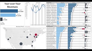
DataSelf Analytics lets you ask plain-English questions about your data and get instant charts and tables. The demo shows a year-over-year dashboard, a high-risk accounts tracker for invoices 30+ days overdue, and one-click Excel exports.
Chapters
Thanks for joining the Data self analytics demo script. When you land on the demo page, you're going to see many buttons that can go to different dashboards. We recommend following the demo script because it's proven to be effective. The first thing to show is the natural language query functionality. Just click that button in here. You just can follow the script on the right. That is very impressive. Natural language query is like using Google or Bing to search the. You know the Internet but you're searching for your data and you get reports as the output. So I'm going to go through this quick exercise. I'm going to see sales by salesperson in 2020. As you write the query, natural language understands or try to understand what you wrote and make a syntax at the top. You just press enter and we'll render the magic right there from scratch. A new chart showing sales by salesperson in a chart format in 2020. To break down by month by month just press it. You see is building the query here. Press enter and again the magic. It will convert the report showing sales broken down by month in 2020 by salesperson. Hey, I want to see this as a grid like in Excel or any other chop chart format. You come here and you pick in this case text table. There it is. Beautiful and easy. Next I want to clear and query something else. I want to see my top 10 items by sales in Q1 2020 and press enter and the magic happens. In this case the top 10 are in blue. The other items are in gray. Last example, sales by state by year as a map. And as you guess you'll get a beautiful chart showing maps and the sales change over the years by ship to state natural language query, very powerful and is available in data self. The next is going to the year over year dashboard. I'm going to click the home button and click the year over year variances. Or you can go straight through the tab. I'm going to click the year over year tab. You go to the same location. This dashboard is the most popular dashboard in our client base. It allows people to quickly, easily analyze and do ad hoc analysis. Looking at sales last year and this year, year to date, only a few periods and see the variances very quickly. Right now I'm looking in 2020 and I'm going to choose the first nine months of 2020. Just picking whatever you want here. Click apply. So this is a yearly comparison for the first nine months of the year. Then you see the total this year in dark blue. Total last year, year to date, you know in light Blue and the variances. And I see by period, by ship to by customer sort of descending last year sales this year and the variance from last year same information by item. Now look my my second top customer by sales last year has a big decline this year. What's happening? Why is that? I can select this customer, just clicking on it and the whole dashboard changes to only show data for that particular customer. Total strength analysis shipped to in product sales last year, this year. Now which products are driving the decline. I can quickly put the mouse over the headers and on the right I have the sort icon. I click once, it sorts descending, I click again, it sorts ascending. And in this case I'm going to drag the mouse and select these three bars. Just drag and select. And once you do this again the whole dashboard changes to only show these three item sales from this customer. The dashboard has changed and now here I also have show details. And when they click on it it will bring at the bottom the transaction details for those three items in those two years. Very easy to get the detail and if you wanted to export to Excel would be a click away. The last part of the demo script go back to home and click the high risk download Debt customers, also a powerful and important KPI. The way we calculate out of the box the high risk debt customers is by looking at customers with large AR debt that are 30 or more days late in this metric of course can be easily customizable, customized. But that's how we define out of the box. And here in this dashboard you can see the totals of your opener by aging bucket. How much is the total being in aging for the high risk clients and who the high risk clients are, the totals and how they break down using the colors and then the normal customers. And on the right you have all the details having the high risk customers segmented. And again, this is all customizable, easily interactive. You can use the filters on the right to, you know, change the view. You can click on a data point. In this case I only want to see high risk customers. So right now I only have the high risk customers. Maybe only want to see the normal ones. There it is, only the normal ones. Or maybe I only want to focus my analysis in a certain bucket. I encourage you to go back to the home button and explore. There are a lot of important KPIs available out of the box. They'll be available pretty much once the deployment is completed for a new client. And deployment is very, very quick. I hope you found this informative. Thanks for watching.