DataSelf Analytics for Sage 100 MAS 90 MAS 200
Recorded DataSelf Analytics webinar (Nov 6, 2014) where Johnny Girardi (founder & CEO) demonstrates DataSelf Analytics for Sage 100 (MAS 90/200). He demos building detailed tabular reports and interactive dashboards via drag-and-drop (sales by customer, invoice, product; relative-date filters; multi-company splits; CRM meetings overlay; geographic bubble maps). Emphases: user-centric self-service BI, >5,000 out-of-the-box reports/dashboards/KPIs, Tableau + Microsoft BI integration, ~14 years of Sage 100 BI experience, support for Sage 100 versions down to 3.6, and entry-level subscription pricing described as "in the thousands of dollars."
Chapters
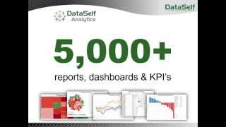
Self Service bi What is Self Service bi? Well, self service BI is when users can take care of their own reporting needs anytime, anywhere without calling for an expert. Typically in this market, sage 100 products, when a user needs a new report or a modified report, typically they have to call an expert and wait until the expert has time to take care of their needs. So that's not self service. That means it's an expert centric solution. Our solution is user centric users with little training, they'll be able to build reports, slice and dice reports, take care of their own needs without calling for someone else. And that's pretty much drives liberation liberation for everyone. With data self analytics, business users will be able to use their desktop, web and mobile devices and anytime, anywhere they'll be able to find information that they will need to answer their questions. They won't need to call an expert, they won't need to call it or the accounting department to to address those questions. So they become liberated. On the other hand, people who usually are building reports today, let's say it, or accounting, they'll be liberated to do other things because now end users can take care of their own reporting needs by themselves. So everyone is liberated. And that's what we're going to be talking about here today is Self Service BI using dataself Analytics. My name is Johnny Girardi. I'm the founder and CEO of Data Self. So let's jump right into the product to take a look at how easy to use the solution is. I'm going to start showing the product showing a sales example, how to build a report or a few reports using sales information because it's usually easy for anyone to relate to. This solution is actually designed and is mapped already to the most modules from Sage 100. We have sales, sales order, purchasing, payables, receivables, inventory, GL. So there's a lot of modules already mapped. But my presentation is going to focus on sales order kind of information, sales information, customer product and so forth. Here on the left I have what we call the dimensions from a sales standpoint. So I have customer products, invoice and so forth. And I have the measure that I can look at my sales such as sales amount, gross profit, quantity shift and so forth. I'm going to build two types of reports here in this presentation. One is going to be like a detailed level report showing detailed information and the second is a dashboard for kind of management standpoint. So I'm going to show both a more tabular approach like most people are used to and also more a dashboard approach and both are very easy to use. So let's start with the first one. I want to build a report showing detailed information about my sales in last quarter. So let me just start dragging and drop information to show the mechanics. I'm going to take my sales drag to my report here. This is my total sales in the whole history. I'm going to break down by date. So right now in my sample database I have three years worth of data and I see sales by year now and I can expand by year going to the quarter level and expand the quarter goes to the month level and I can expand, go down to the day level and so forth. Pretty straightforward. Now in my example I just want to focus on data for 1/4, let's say last quarter, which is my last quarter in my sample database. When I drag my date to my filters and when I do that I can choose what kind of filter I want to filter my information by. One of the most popular is called the relative date. I'm going to choose that one. Relative date gives me this very user friendly wizard that I can choose kind of period, level, year, quarter month, weeks. I'm going to choose quarters in this case and I can choose this quarter, previous quarter, last three quarters, next quarters and so forth. Pretty straightforward. I'm going to select the previous quarter, which is the last one in my sample database and I click. Ok, so now there I have my total sales in the last quarter. Let me just put the dates in my columns instead. Okay, now I want to break this report and see sales by customer, by invoice number, invoice date and a few more details. Well, everything here is easy and kind of, you know, drag and drop. So if I want to see customer information, I go to the customer list. Here I find the customer name, I drag, let's say to my rows. So there it is by all my customers. I have the total sales in the third quarter, 2014. Well, what if I want to see the invoice number, each invoice number that I sold to each customer? Well, I go to my invoice details, I get the invoice number and I drag to my report. So there it is by customer, I see the invoice number and the total. If I want to see more details, I just keep on adding more fields to this report. So let's say if I'm going to see invoice date, I drag the date to my report. So there it is. Maybe I want to put some product information. Everything is drag and drop. Like item brand. Item brand would be like a custom field in my database. I'm using the find field that is already mapped in this solution. It doesn't matter where it comes from. I just drag and drop. Right there I have item brand. Maybe I want to put, you know, product information. You name it, you just pick and choose any field from your sales related fields. They're all listed here and just drag and drop the report and you get the data. Maybe we should also put, you know, quantity shipped. Let's drag quantity shipped to the report. Let's put the measures below my date. There it is. I have in the last quarter quantity shipped, sales amount for all my customers, all detailed information. So this is just an example of building a detailed level report. It's pretty straightforward. You just need to drag and drop. You do not need to be an expert to do this. With a few hours of training and poking around, any person who wants to learn will be able to do things like this. Now the next report that I want to show is a more management level kind of report. It's a kind of a dashboard. In this next dashboard I want to show three pieces of information. One is I want to see sales in number of meetings together by month. I want to break down that information by company. You know my sample database has a multi company framework and then I want to put that information. I also want to put the information on a map showing sales by state and how big my deals are by state. So I'm going to build a new dashboard and I'm going to create a new sheet here. And I want to see sales. So I'm going to put sales in my report. This is going to be a chart approach. So I see total sales. I'm going to break down by month. So I'm going to put my months in my columns. So there it is. By month you see sales growing. Now I have a multi company. I want to split the sales by company. So dragging company to my color. And now for every company I have a different line that shows sales by month. Now in my sample database I have sales information coming from my Sage 100 as well as CRM. Information coming from CRM system can be Sage, CRM, Sales Logic and so forth. So in this case I want to add number of meetings which comes from the CRM. And I put here. So this is the sales amount and this is the number of meetings from CRM. And so I don't get confused, I'm going to make the number of meetings as bars. So bars are number of Meetings, sales are lines. Okay, that's a good piece of information for my management dashboard. Next I want to put in a map and I can use any kind of geography component like no bill to information, ship to information. In this case, I'm taking the customer address, I'm taking the state. I'm going to choose the deal size and I'm going to choose the sales amount. So I'm going to put these three pieces of information in a map. I'm going to choose the mapping capabilities here and right there I start seeing a map where bigger bubbles are bigger sales and the slice of each bubble relates to how large the deals are, the accumulation of sales for each one of those kind of deals. And then I want to put the same information on a tabular format. Let's put this showing only numbers and I only want to show sales by state. Okay, so I just built those three pieces of information and I want to combine all of them into a single dashboard. So I want to put my state here, sales by state. I want to put at the bottom, let's say the sales by month. And then on the right here, the sheet showing sales by state. So it took me about a couple of minutes to build from scratch a fairly sophisticated dashboard. And as you can tell, everything is drag and drop. It's really focused on users. This is kind of a self service technology that allows business people anytime, anywhere using desktop application like this one, the web interface or mobile devices to be able to self service their own reporting needs. Very easy and very straightforward. Let me talk a little bit more about the concepts behind this. So as I mentioned, this is a user centric approach and I have here a picture of my mom and my dad. A few months ago I was in Brazil. By the way, I'm from Brazil. I went to Brazil for her 80th birthday. And my mom, she never used a computer in her life before. She would call my siblings to ask help to connect with me, let's say through Skype, to talk through a computer. But she would never be able to do it. Computer is too complicated, it needs like an expert. Well, last year I gave her an iPad which is a user centric computer. And since she got the iPad now mom calls me directly by herself. Skype. She doesn't need any help at all. She does it all by herself. And she's even using Facebook. Why? Well, because an iPad is a user centric computer. What we do here, this technology is a user centric reporting technology. It's a technology designed for business people. They will be able to take care of their own reporting needs without calling for experts. On average, more than 70% of the reporting needs of the average user, they will be able to take care of those needs by themselves. So it's very liberating, it's very empowering. The other main concept is we've been doing this technology Enterprise Level BI for Sage 100 for about 14 years. And over the years we have built a very comprehensive out of the box solution that has more than 5,000 reports, dashboards and KPIs as a plug and play. And as I mentioned, we cover Most modules from Sage 100 like financials, payables, receivables, inventory, purchasing, sales, sales order and so forth. Very comprehensive. Now I was showing you the desktop client, but many users will be consuming the reports using the web interface. So this is like the web portal that most people would be accessing information from. When they log into this portal, they only see their own reports. So let's say if I'm the CEO, when I log in, they would only show the CEO reports and dashboards. If I'm from sales, I would see the sales team dashboards. Let's say if I go to one of these dashboards here, let me open one of them. We're going to open the top customer by sales dashboard. It's a sales dashboard. When I open this dashboard, the tool can be configured in a way that it will only give my own information. So if I'm the rep for California, these would be the top customers by sales this year to date in California. The rep in Florida opens the same dashboards and sees top customers in Florida, while the big boss opens the same dashboard and sees the top customers across all territories. So same dashboard provide information from different people based on their user credentials. Now out of the box, as I mentioned, we have lots of different reports and KPIs. This is one example of top performers we have here. The customers. Every customer has a bar. Bigger bar, bigger sales. The color of the bar is represented by this color. So from not very profitable, always very profitable. And we also have the black dots on this scale here telling profitability. So this report here, once I understand how it works, it will be very easy next time to see what's important. So if in my business keeping profitability above a certain limit, I could easily tell that some of my top customers are very unprofitable or low profitability and I may need to work on them to improve profitability anyway. Using this kind of graphical representations will make it easier for decision makers to have insights out of the data so they can more quickly act on information instead of digging through information. Another kind of important reporting we also do is looking at the tip of the growth curve of your major key performance indicators. This is an example. This report is showing the top customers by sales growth since last year to date as well as the top decline since last year to date. Typically, top growth are being taken care of. Salespeople are working closely with them. Maybe not so critical for my analysis, but the clients declining the most. Maybe there is something wrong and maybe I can fix it if I act in a timing session. So looking at the top sales decline can help you focus on clients who are not very happy. Maybe they're moving away and you can reverse the trend if you act in a timely fashion. So looking at the top growth and decline from different key metrics can help you focus in your many initiatives and reverse trends that can be damaging your business. Another kind of interesting analysis here is commissions. If you have a fairly sophisticated commissions schedule, this one shows a very simple framework I have for my current month, which is September here. Days of the month. As I move through the days of the month, my sales are accumulating using this line and my target is right here. So hopefully by the end of the month I'll be crossing my sales target. And these bars are the commissions that I'm accumulating throughout the month. Now, if I'm the salesperson, I'll probably like to receive this report refreshed every, let's say Friday night so I can see how much money I'm accumulating. And if I'm going to be spending some extra money over the weekend, I wanted to know that. So I can come here and click this subscribe button and I can tell that I want to receive this report refreshed every Friday evening in my email so I don't have to come here to look at this information on the portal. I just received an email that has this information and I subscribe and that's it. So it's very easy to subscribe to reports and receive them in my inbox. Let me show one more piece of information here that is also kind of interesting. We also have what is called exception reporting, which sometimes can also be very critical. Exception reporting shows you transactions that are no longer happening. And sometimes this can be very critical. In this example, on the sales side, it's showing customers who were buying before, but they are no longer buying. And this dashboard shows four different time buckets. You know, people who are buying the last 60 days but not in the last 30 days. Or people who are buying the last six months, but not in the last two months, or maybe in the last three years, but not in the last year, or maybe in the last five years, but not in the last two years. Anyway, looking at customers or transactions that are no longer happening can be critical. And this technology provides many ways that you can build easily these reports and keep track of your major key performance indicators. So that's pretty much what I want to cover today on the product. How do we accomplish all of this ease of use? Well, this is a very quick explanation. Gartner is one of the most reputable companies doing technology assessment in the Fortune 2000 world. In the last assessment on the BI and analytics, which was done in February 2014, they came to the conclusion that Tableau is the leader when it comes to ease of use and dashboarding in the Fortune 2000 world. And Microsoft is the leader in BI infrastructure also on the Fortune 2000. Well, what about them? What about Data Self? Well, Data Self analytics actually is Tableau Microsoft bi. We add our own technology that eliminates programming from these two enterprise level BI solutions and we have added more than 5,000 reports, dashboards and APIs for Sage 100. So what you get from Data Self analytics is enterprise level technology that is easy to use, fast deploy, affordable and is the best of the brief technology in the Fortune 2000 world. So it's user centric, fast deploy, you get expertise from us and the cost to deploy this is really a fraction that if you try to build it by yourself. So now we're going to open for a Q and A. If you have questions, you can use the GoToWebinar panel, you can write questions and send it to me. And I'll be addressing the next couple of minutes, so let's see if we have questions. So we have a question here from Peter. What Sage 100 versions are supported? Peter, thanks for your question. Let me show you here. If you go to our website, which is dataself.com and you go to analytics by Product and choose Sage 100, Then here you're going to find information about our solution for Sage 100, including the supported versions we support, all the way down to 3.6, all the way to the latest Sage 100 version. We also have here further information such as the software architecture, ROI brochure and this is a link that shows simple KPIs and reports. So if you want to see what's included in the out of the box, you can use that link. Peter, thanks for the question. The question here from Michael what is the cost to implement for about four seats? There's also another question from Jeff which is about the same, talking about pricing. Thanks for your questions. One of the good news about pricing is we are releasing a new pricing schema in the next few days that's going to be make the solution more affordable for most companies, especially the entry level solution right now because we're changing the price schema. I cannot disclose here yet. However, overall you can buy the solution or you can subscribe on a yearly basis and the entry level cost if you go with the subscription approach is in the thousands of dollars. So I will be contacting each one of you later, probably in the next couple of days, a few days with the new pricing we can talk about it, learn more about your needs and see if there's a good fit. So I'll be getting back to you very shortly about that. Thank you. Well, we're running out of time so let me wrap up here. If you have any questions, if you want to learn more about the solution, discuss your needs pricing, you can contact me directly. You have my cell phone here, my email as well as my Twitter account. I really appreciate your time and interest here today and I look forward to talking with you again. Thank you and have a happy Thursday.










