DataSelf Analytics for Sage 500 ERP MAS 500
Johnny Girardi, founder of DataSelf, walks through DataSelf Analytics for Sage 500 ERP. The tool lets non-IT users build reports and dashboards with drag-and-drop, includes about 5,000 pre-built reports and KPIs, and works on desktop, web, and mobile. He covers pricing options and which Sage 500 versions it supports.
Questions this video answers
November 20, 2014.
Johnny Girardi, founder and CEO of Data Self.
More than 5,000 reports, dashboards and KPIs.
"Entry level cost if you buy right now is five grand."
"If you subscribe it's like 25 or $2,600 per year. ... And that's for three years, three users."
Chapters
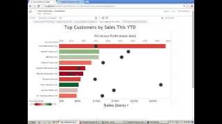
So Self Service BI for Sage 500. What is Self Service BI? Self Service BI is when users can take care of their own reporting needs anytime, anywhere without calling for an expert. And that's not what typically happens in the Sage 500 market. Typically the business person, the person who knows the problems, you know, the opportunity of the business, when they need a new report or a modified report, they have to call someone else and wait. And sometimes they are in a meeting, they are in negotiation and they just cannot afford to wait. So if they cannot make changes to the reports or build new ones on the fly anytime, anywhere, if they cannot do that because they need to be expert, they're not going to be making the most informed decisions and that will not drive most likely the best decisions. So Self Service BI is enabling people, business users, people who know the business that are not it, to take care of their own reporting needs without calling experts. Doesn't matter where they are, they can use a desktop, web and mobile device. That's about Self Service bi and Self Service BI drives liberation, liberation for everyone. Now the decision maker can make decisions by themselves, anytime, anywhere. They don't need to call someone else. While typically accounting and IT are the departments responsible for report creation, now these folks will also be liberated to do more important things that they are more experts at. So everyone is liberated. The company gets into more an efficient reporting platform. And that's what we're going to be talking about here today is Self Service BI for Sage 500 using data self analytics, which is our product. My name is Johnny Girardi, I'm the founder and CEO of Data Self. So let's jump right into the product and I'm going to start all over again. So our product covers pretty much all modules from Sage 500. You know, we have connectors for sales, sales order, purchasing, payables, receivables, inventory, financial information. However, for the sake of the example, I'm going to be focusing on sales analysis just because it's easy for everyone to understand sales concepts. So here I'm going to show two main features of this product. First I'm going to show the self service side of it from a building and modifying things from scratch. I'm going to build a report from scratch using a tabular approach. And then I'm going to show a more trend kind of analysis for management kind of analysis. And then later I'm going to show the out of the box solution for Sage 500 which comes with a ton of reports and how typically report viewers will consume that information. So I'm going to show all of these things. So let's start building, first of all, a tabular report. Let's say I want to see sales. I'm going to drag sales to my report. So that's my total sales in the company history. I want to break down by year. So I'm just dragging my dates to my rows. And now I have in my sample database three years. And that's the sales. I can drill down from year to the quarter level, I can drill down to the month level, I can drill down to the day level. And if I was also capturing hour, minutes and seconds, I could also drill down to that level of detail just by clicking as I showed here in my example, I want to focus on a quarter kind of analysis. And typically when you are building reports or modify reports, you want to see filters. You know, you want to slice your data in a different way. So let me show how I can put a filter here to show only last quarter. I'm dragging date to my filter shelves. And here I have several ways I can filter my dates by. And I'm going to choose the relative date because it's usually the most popular. When people are filtering by dates, it's typically against today's date, like this year, this quarter, last period, last year to date is always comparing to today's date. So this wizard has different buckets, days, weeks, months, quarters. Let's say I'm going to choose quarter. For this example, I can choose this quarter or last quarter, which my sample database is the last one that I have data for. So I'm going to choose that filter. So this report will always show my last quarter, regardless what today date is. Now let me put these dates in my columns instead. And then now I want to break down sales by something else, by product, by customer, salespeople, territory, you name it. So pretty much it's drag and drop. Let's say if I want to see customer, I come to the customer list. I pick customer, I drag to my rows. So there it is, sales by customer in the third quarter. Maybe I want to add invoice number to my report. So I go to my invoice details, I find the invoice number and I drag to my report. So there it is by customer, by invoice number. Maybe I want to see the invoice date. Same thing, drag and drop date after my invoice number. Or maybe before. Just drag and drop, whatever you want. So now the date is before in this customer, the same date he bought a few different invoices very straightforward, maybe something else product. You just drag and drop whatever you want. You just have to find the parameter drag and drop rearrange. Maybe I'm looking at sales, I want to put something else like quantity shipped, put quantity shipped in my report, drag things around to change the formatting. So my quantity shipped, invoice, sales amount. And that's takes little training to gu that an average user, a business person, the company owner, if they're willing to learn how to do this, it doesn't take much time for them to learn to look at this reporting list and drag and drop and apply filters and build charts. Very straightforward. It's really self service user centric technology. Now let me build some chart kind of reports. So let me get some sales here. I want to break down by month. So for every month I have my sales throughout history I have a multi company, my sage 500. So let me break down by company putting my colors. So for every company now I have a line and I see how sales is going throughout the months. In this example we have merged the Sage 500 sales along with the CRM information coming from SalesLogix, Sage, CRM and so forth. And now it's all combined. As a business person I don't care, I just need to drag and drop. So I take my number of meetings from the CRM, drag my report. So this is sales, this is the number of meetings and I want to make the number of meetings as bars. So number of meetings or bars, sales or lines, very easy to tell them apart. Next I want to see information on a map. You know it could be bill to ship to. So I select let's say state. I want to see by deal size my sales and I'm going to put everything on a map and then I want to make the bubbles bigger. So bigger bubbles, bigger sales and they're sliced by the deal size. And now I want to take all of these reports, these three reports I built and put on a dashboard so I can share with people on their mobile devices for instance. So I'm going to put my map here. I want to put my other report at the bottom and maybe the other report right on the right. So everything is drag and drop. As you can tell I don't need to be an expert to do these things. We have videos on our website that can teach people how to do this. We have training, it's very intuitive. It's really self service bi. And how do we do it? Well let me talk about some concepts here. This is really a user Centric technology self service bi and I have here the picture of my mom and my dad. I'm originally from Brazil. So a few months ago I went to Brazil for my mom's 80th birthday. And interesting story is in the past my mom, she never used a computer because it was too complicated. When she wanted to Skype with me, she would have to wait for a sibling to connect her through Skype with me. Computer was too much for her. Then last year I gave her an iPad. And what is an iPad? It's a user centric computer. So now my mom can check the weather, she can check the news, she can Skype with me by herself. She even has Facebook because she's now using a user centric computer. That's what we do. On the reporting side, it's a user centric reporting technology. A technology that has been designed for the business people that they can do things by themselves without calling for an expert. Not only that, not only is user centric, but we have built more than 5,000 reports, dashboards and KPIs for Sage 500. So it's very comprehensive. When people log to it, they'll see plenty of information. So let me show how that works. Let me show some of those out of the box reports. What I showed before is what we call the power user functionality. Power users can build reports, license reports, change reports extensively on the fly using desktop, web and mobile devices. The other users are what we call the viewers. They're less sophisticated users. They just want to receive reports ready by someone else and they just want to change some filters and that's it. So let me show that when these users log to the web portal using web or mobile devices, they get their own dashboards. So if I'm the CEO, I only see my CEO dashboards. If I'm the finance, only the finance dashboards. If I'm a salesperson, only the salesperson dashboards. Now here we have a lot of reports and dashboards out of the box. Let me show just a couple of them. So let me show a sales dashboard. And when I open a sales dashboard, I can have security to control what information I can see. So this dashboard is the same for all salespeople. But because I'm the account manager for California, I can only see California top accounts. The account manager for Florida is only the Florida accounts. If I'm the big boss, I see the top customers across all territories. So same dashboard for all people, but each one will get their own information. The dashboard that we have out of the box and Reports they're also very informative. They try to give to the point quite this example, I have my customers here and each customer has a bar. Bigger bar bigger sales in the color of the bar is represented by gross profit and these black dots are also gross profit on this axis. Once I learn that if increasing profitability is a major goal in my company, I can easily see which of these customers top customers are not so profitable and they now have to act on them. So very easy to have those insights. We also have out of the box lots of reports showing top growth and decline of your major metrics. And things that are growing the most and decline the most are usually very important. This is a very good example. This is showing my top customer by sales change since last year to date. So these customers are growing the most and this is the sales change since last year to date. And this is the top sales decline since last year to date. Maybe some of these decline customers are not so happy and if you don't fix the problem in a timely manner, they may be gone for good. So looking at the top growth and decline of your sales, maybe inventory things and expenses is critical and out of the box. We have lots of those reports. Other type of reports are usually pretty important. Are also what we call exception reporting. Exception reporting is looking at trends that are no longer happening. Let me give an example here on the sales side as well. So example of exception reporting on a sales side, customers were buying the past, but they're no longer buying. So this is showing four different time buckets. Buying the last 60 days, but not in the last 30 or the last half a year, but not in the last two months. Bought in the last three years, not in the last year. Bought in the last six years, five years, but not in the last two years. I mean the point is looking at things that are no longer happening. Maybe on an inventory, if you have inventory, what items have not moved in the last couple of months, let's say. So exception reporting is critical for that. And let's say if I'm a user and I would like to receive this dashboard on my inbox on a regular basis so I don't have to log into my portal, I just receive it. I can come and click on any of these dashboards and subscribe. And when you subscribe you can tell how often you want to receive. In this example I have a few options like every Friday evening. So every Friday evening I want to receive this report. Maybe it's a commission report or whatever it is. So I don't need to open this I just receive in my inbox. So that's about Self Service bi, the way that you want to access information. It's yours and you just pick and choose and go with it. Let me go back here to the PowerPoint and tell you how we deliver this user centric Self service BI solution. So this is an analysis from Gartner. Gartner is one of the most reputable companies doing technology assessment in the Fortune 2000 world. In every February they release an assessment of what's the best in the Fortune 2000 for BI and analytics. So this is the latest making long story short, Tableau is currently considered the leader in self service BI ease of use analytics for Fortune 2000 companies and Microsoft is considered the leader in BI infrastructure. What about them? What about Data Self? Well, Data Self analytics is actually a bundle of Tableau which is the leader in self, service, bi, Microsoft, bi. In the BI infrastructure we add our own technology that eliminates programming from this platform here and then we have added more than 5,000 reports, dashboards and KPIs out of the box. So what you get from us is nothing but the best of the BRI technology from Fortune 2000 companies for Sage 500 clients. It's fast to deploy, typically in hours or days you get this outstanding technology. We have been working with enterprise level technology, enterprise level BI and analytics for over 14 years. So we know enterprise level analytics, we know sage 500 products in and out and we know how to connect them together. And finally, it's going to cost you little money to get this outstanding technology. Our latest pricing actually is really affordable. It's completely based on users. Less users, less money. More users, more money. And that's it. So that was my presentation. I'm sorry that I got it started a little on a mute basis. If you have questions, Please use the GoToWebinar panel to write the questions. And I'm going to be addressing questions now. So let's see if we have questions here. Yes, so we have questions from Carl. Carl is asking what versions of Sage 500 we support. Carl, good question. So if you go actually to our website, dataself.com and then you go to the analytics by product and you choose your product, in this case sage 500. Here you'll find a lot of information, including a recorded webinar, what versions of Sage 500 we support and as well as, you know, ROI brochures, sample reporting KPIs. So feel free to come to this website here to get information about versions and what else we have. Carl, thanks for your question. Let's see more questions. So another question here is from Mary, is what is the price of this solution? Mary, thanks for your question. So price wise, we just released a new pricing model which is really exciting. Pretty much the only factor influencing cost is users, nothing else. It doesn't matter if you have Sage 500 and let's say Sage CRM and SalesLogix, other data sources, it doesn't matter. You get all the templates, all the functionality, and the more users, the more you pay. But typically people start with only a few users. And if you go with only a few users we have, you can buy or you can subscribe. And the entry level cost if you buy right now is five grand. And if you subscribe it's like 25 or $2,600 per year. So very affordable. And that's for three years, three users. The more users, the more inexpensive it gets. So very inexpensive to get started and also very inexpensive even if you grow to a lot of users, which is pretty common. Well, we have to wrap up the presentation. We're almost reaching the 10 o' clock here. I really would like to thank you for participating here today. You have my contact information here, my cell phone, my email, my Twitter account. If you want to learn more about self service, bi about our technology and how we compare with others as well, please contact me. I hope you have enjoyed the session. I hope you have learned something. I hope you have a great Thursday. Happy Thursday and look forward to talking with you again. Thank you.










