DataSelf Analytics for Sage CRM Webinar
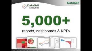
Johnny Girardi, founder of DataSelf, demonstrates analytics software that connects to Sage CRM with over 5,000 pre-built reports and dashboards. Build custom reports with drag-and-drop, add map visualizations, schedule delivery, and access everything on mobile. Costs hundreds of dollars per user monthly.
Questions this video answers
Johnny Girardi, founder and CEO of Data Self.
>5,000 total; about ~1,000 for CRM.
Support for Sage CRM going back to version 5 (as stated by presenter).
About 14 years (as stated by presenter).
"Hundreds of dollars per user" per month (presenter phrasing).
Chapters
HCRM what is Self Service bi? Well, it's when users can take care of their own reporting needs anytime, anywhere. They can be in a meeting, they can be in a coffee shop, they need a report, they need a dashboard. They can just get it and if they need to change it, maybe they need to build a new one. They can do it without calling for an expert. That is Self Service BI is giving a tool that is really user centric, really easy to use, that business people will be able to fulfill most of the reporting needs by themselves. And that means liberation, liberation for everyone. Now business people can make more informed decisions anytime, anywhere. While people who usually spend hours and hours supporting those decision makers with reports, typically people from it, from accounting or even external consultants, now they are free to do other things besides reporting so they can do more things that their experts are. So everyone is liberated, everyone is happier and the company becomes more efficient. That's what we're going to be talking here about today. It's about how Data Self analytics for Sage CRM delivers Self Service BI. My name is Johnny Girardi. I'm the founder and CEO of Data Self in the thanks for joining us. So let's jump right into the product. I want to show three main things in this presentation. First, I want to show how easy is for a power user to build a detailed level report from scratch anytime, anywhere. Then I'm going to show how to build from scratch a more management style kind of dashboard, you know, showing charts and things like that. Third, I'm going to show how people usually consume information using web and mobile devices. So we're going to talk about those three things and I'm also going to be showing some other concepts as we walk through this process. So first of all, let's build a detail level kind of report. And this tool right now is connected to my Sage CRM opportunities. So I have a bunch of node dimensions that show account, account manager, opportunity, information, product and so forth. At the bottom I have measures I want to keep track of. So let me start here from scratch. So suppose I want to see my actual sales. So I'm going to be dragging my actual sales to my report and I want to break it down by the the actual close date. So I'm going to take the actual close date and drag and drop into my report very easily, very intuitively my sample database. I have those three years. Now if I want to break down by year by quarter. So I just expand to the quarter level. I want to expand to the month level. I want to Expand to the day level. So just kind of drag and drop and expand. You can see more detail level information. We're looking at calendar periods. This could be fiscal periods, could be on a weekly basis, you name it. Let me just shrink to only to the year level and put in my columns instead. Okay, so now I have information for all those years. What if I want to break down this information? Actual sales by account manager. Well I go here, I found account manager and I just drag it to my grocery instance. So there it is by account manager I have actual sales by year. Maybe I want to break down by account manager by account name. Well find the account name which will be the company name and drag to my report, let's say right after account manager. And now I have by account manager by account name sales in those three years and everything is drag and drop. You know, if you want to add more information, maybe you want to see the opportunity type. So let me take opportunity type and actually put after my account manager between account manager and account name. So now I have buy opportunity type buy account manager, buy opportunity type buy account name and you keep on going. Maybe I want to see product and warehouse. You name it, you just drag and drop and you get information. So now I also have product. Maybe I want to filter this information in a different slice of it. Let me take the actual date here and add it. And then when I add a date to my filter shelf I have this wizard which sometimes is really easy but really informative. You can choose different time buckets, but let's say you want to use the relative date which means time buckets comparing to today's date. You can use days, weeks, months, quarters, years and and let's say if we choose year. So this could be this year, whatever the year is, previous years or the last few years, the next few years, year to date, you just pick and choose. You click ok. Now you filter the report to only show this year's worth of data or maybe this quarter and as you move to next quarter it will keep going that way so you don't have to be changing the time periods every time that you run the report. So very, very easy. So building reports, detail level reports is just like that. You drag and drop, you find the fields here, you find the measures, you apply filters and you get what you want. You do not need to be an expert to do this. We have several of our clients, users, salespeople, sales managers, the company owner, the CEO, the CFO that they learned how to build reports like this just by watching a Demo like this, no need to call an expert, they just do it. It's really incredible. So this is a detailed level kind of report showing how it works. Now I want to build from scratch a more management type of dashboard that has charts and bars and things like that. And for this example I actually going to use a more generic sales connector that in this case is combining sales to information that comes from the CRM system along with the ERP system together. Behind the scenes there is some data massaging, but at the end of the day, as a business person, I don't care. I want to see sales information. I want to see the sales amount, the number of meetings, who's buying, where I'm shipping to, you name it, that's what matters for the business people. And that's my example. Right now I'm going to build a dashboard that shows three main pieces of information. Sales by month, number of meetings by month from the CRM, you know, the contact part of CRM. And then I want to see sales by geography on a map. Let's do it, let's do it. So I want to see sales, I'm going to drag sales to my report. So total sales, I want to break it down by month. So I'm dragging my months to my columns. So right there by month I see sales and it's growing over the years, which is good. Now in my sample database I have a multi company framework. My business has several different companies and I consolidate all of them into my data software, analytics. And I want to see that broke down by company. So I'm going to bring the company into my color button. And now I'm breaking down sales by individual company. These are not my customers, these are my own companies. Now I also want to see number of meetings by month. Well, number of meetings is just another entry in this list. It comes from Sage CRM. It is combined with the ERP information. It doesn't matter, it's just related. So as a business person I just have to drag number of meetings to my report. So now I have sales, actual sales and number of meetings from the contact side of CRM. Well, so don't get confused. With this report I'm going to make the number of meetings as bars. So meetings are bars, sales are curves and that's easier for me to read that information when they open this dashboard later on. All right, this is a good dashboard. Now let's make one showing sales by geography and how big the sales were. So geography could be customer address, bill to address, ship to you name It I'm going to choose the customer address, I'm going to choose how big the deals were and sales amount. I want to put all of this information on a map so the tool figures out how do you want to see that and gives it a shot. In this case I have bigger bubbles for bigger sales which is good by state and then the bubbles are sliced by how large the deal was. So very formative. I get the map. Finally I want to put all this information together in a format that people can open on an iPad so that when they're in the field meeting with my customers they can actually, let's say see that information and everything is drag and drop. Everything goes towards being self service. I just built from scratch a dashboard that is fairly sophisticated, very informative to my example and and it took me a couple of minutes and as you can tell I do not need to be an expert. I do not spend hours and hours and days being trained. As I mentioned, many people learn how to do this with little training and even using the online videos and people just take ownership of the reporting needs. So that's how easy it is to build and to modify reports from scratch. Let me talk about some concepts of how we do this. So let me go back to PowerPoint. Really in order to do something as easy as this, the solution must be what is called user centric. Most or pretty much all other BI solutions in the Sage CRM market are what we call expert centric. Someone will have to spend a ton of hours and days to learn how to do things. And pretty much everyone else, you know the business users, the people who know the business opportunities and problems that want this license data, they'll have to call the expert when they want something different that is available. So it's not efficient. Sometimes they just cannot wait. They have to make a decision. They don't have the report, they just have to use their gut feeling which sometimes is okay. But if you have more information, usually you can make better decisions. So being really user centric is critical. Now why do I have the picture of my mom and my dad here? Well, I'm originally from Brazil and a few months ago I went to my mom's 80th birthday and interesting story. In the past when my mom was trying to call me, let's say Skype me, she could not use a computer you it was too complicated for her. She never used a computer in her life so she would have to call one of my siblings so they could connect through Skype. Well, last year I gave my mom an iPad. An iPad is a user centric computer designed for anyone to use. What happens since then? Well, my mom now checks the weather by herself, checks the news and she skypes with me and my siblings and other friends all by herself. IPad is a user centric computer. She can do it. Anyone can do it. We are like the iPad of reporting and dashboards. We give people users a tool that they can take ownership and they can do most of their own data analysis without calling for experts. So that's really user centric. Not only that, not only it's super easy to build and modify reports, but we have more than 5,000 reports, dashboards and KPIs available out of the box for Sage, CRM and ERP systems. So it's very likely that many or most of your questions that you have today unanswered will be covered by the out of the box solution or there'll be a great starting point to answer variations. So so easy to create new ones and very comprehensive solution out of the box. So let's take the look at how people usually consume information out of data self analytics. So typically they will be using web browsers in let's say PCs, Macs, mobile devices, or also using mobile apps for Android and iOS. When they log to this portal which can be on premises or in the cloud, they'll be accessing their own dashboards and reports. So let's say if I'm the VP of sales I would have the VP of sales reports and dashboards. If I'm an account manager I will see the sales team dashboards. Now when I open one of these dashboards and here we have just a sample out of all the reports and dashboards we have, the dashboards can be specific for your own account. So let's say if I open the top customers by sales this year to date report, which is the same report for all account managers. But if I'm the account manager for California, this would only show the top customers in California, while the account manager in Florida opens the same dashboard and views top customers in Florida and the big boss opens the same dashboard and views top customers across all territories. So the tool by using user credentials will know which dashboards and reports you can access and what information can be rendered to you individually. It's very important, very critical. Now when we build the out of the box reports and dashboards, we make them informative and insightful. Like this example here. We have the top customers on this list here and they have bars, bigger bars or bigger sales and the color of the bars are represented by this color schema. So from not so profitable to very profitable. Profitability is also shown on this axis using these black dots. Once you learn this, next time will be very fast for you to look at this dashboard and learn something important. So let's say if in your business, increasing profitability is a high is a very important goal. Next time that you open this dashboard, you can clearly tell which of your top customers you have to work more closely to improve the profitability. So very insightful. And we have many of these dashboards that have information laid out in a way that will make insightful for whatever that you're looking for. Other kind of techniques that we use that are very important for decision makers is looking at the tip of the growth curve of your key performance indicators. Whatever is growing too much or declining too much is usually important. In this example is a way looking from actual sales growth on a year to date basis. If you have recurring customers and the ones who are growing the most are very likely happy customers, maybe you don't need to worry because people are really paying attention to them. But what about the customers who are declining the most in sales in a given period? Is there something wrong? Can you fix it? Well, first you have to know who they are. So reports showing the top growth and decline is usually critical. And we have many of these reports showing out of the box as charts as well as grid approaches. And by the way, let's say that you'd like to receive this kind of dashboard in your inbox every week or at the end of the month, whatever the time period is. You can come here and click the subscribe button. You tell how often you want to receive this dashboard. And these are just a sample of schedule options. We can have many more, but you choose, you subscribe and then let's say every Friday evening you receive in your inbox an email showing your commissions, whatever it is, with all the refresh information. If you want to see let's say the dashboard and slice and dice it, you can click on that link in your email. It jumps right into the web. And if you have the capabilities, you'll be able to slice and dice it and make more informed decisions. It's really impressive. I'm going to show two more examples on the web that are usually important. One is what we call exceptional reporting. Exceptional reporting is typically also very important for keeping track of some of your major key performance indicators. And exceptional reporting looks at things that are no longer happening. And this is a very typical example for salespeople which customers are no longer buying from you. This dashboard has four different buckets. You know, customers who are buying the last 60 days but not in the last 30 days. Customers who bought in the last half a year but not in the last two months, bought in the last three years, not in the last year or. Or buying the last five years, not in the last two years. Easy to change the buckets, but the idea is for you to focus on customers who are no longer buying and see if you can reverse the trend. And this can be done for anything. Maybe you're looking regions, maybe you're looking at products that are no longer selling. You name it. The point is doing exceptional reporting and being able to pinpoint situations that can be critical. I'm going to show also a dashboard that is typically highly customizable for CRM. That gives you a snapshot of everything that you have this month. This we have pipeline actual sales in top deals this month we have several quadrants on this dashboard that shows you what is top open, what is top loss, what is actual sales, how do you compare month over month with any time in the past. Different kind of ways of looking at information. And this is highly customizable. You can come here and tweak it completely to fit your own specific reporting needs. My last example is just to show that when you're looking at these dashboards on the web which you could be using again your mobile devices, they are highly interactive and I'm going to show this dashboard as a way to show the interaction. Suppose you take this dashboard and you need to completely slice and dice it. If you're a power user, you click the edit button here and then when you click the edit button, let's say on your tablet you go to this user interface that has all the things that I was showing you at the beginning of the demo. Let's say I want to see this demo, this vision, this view showing numbers and I want to start to slice and dice it. Let's say I want to bring product line, you just drag and drop. You could use your finger. If you're using a tablet, there is a product line I want to add customer. You just drag and drop, you apply filters. It's really user centric. It's really self service BI for Sage CRM. So how do we deliver such a user centric technology? Well, Gartner is one of the most reputable companies doing technology assessment in the Fortune 2000 world. In every February they release an assessment of they call the Magic quadrant for BI analytics for the Prior year. These two vendors, Tableau and Microsoft, they're currently the leaders in the Fortune 2000 world. Tableau is the leader when it comes to self service, BI user centric dashboards and analytics, while Microsoft is the leader when it comes to BI infrastructure. How to get data together that can be supported by tools like Tableau. What about them? What about us? Well, data self analytics is actually Tableau, which is Tableau and Microsoft which are the leaders in the Fortune 2000 world. We add our own tool that eliminates programming from these other folks so it's easier to deploy, easier to maintain. And then we add more than 5000 reports Dashboard KPIs to make the solution not only super easy to use and fast, but with a very comprehensive starting point that should be answered a lot of your questions. So at the end of the day we're delivering nothing but the best out of the upper market for Sage CRM. This technology is fast to deploy, usually takes hours or days to deploy. With all of this out of the box reporting KPIs, we've been working with Sage CRM and other mid market ERP package for about 14 years. So we know those products, we know how enterprise level analytics works and we know how to put them together for midsummer companies. Finally the cost is low, literally you can buy or you can subscribe and if you go, let's say to the monthly approach, this would literally cost you hundreds of dollars per user to get started. So it's really affordable from a license standpoint. Already we're shooting to have this webinar closed in about 25 minutes total. So if you have questions Please use the GoToWebinar question box. Send me the questions and I'll be answering right now. So let's see if we already have questions here. So one question is from Chuck. Can you remove the cents from the reports? Chuck, thanks for your question. Absolutely. You can completely format the number, you can remove the cents, you can only have one digit or you can say show me the numbers in thousands, millions, in billions, whatever. It is very straightforward, very simple to do other questions here. Yes, we have more questions. Question from Carl. So the question from Carl is what Sage CRM version is supported? Carl, thanks for your question. Let's let me go to our website dataself.com and if you come to analytics by product and you select Sage CRM or any other product, if you're interested, you're going to find here. A bunch of information about Sage CRM. We actually support Sage CRM going back to version I think it's five in all to the latest. This page here has a lot of information descriptions. The links on the right gives you software architecture, ROI analysis brochure, a two minute demo which is really impressive for people who have very little time to see how the solution works. This link here goes to a page that shows the reporting KPIs. So for CRM we have here the list which has about almost a thousand only for CRM. And if you click the download full list you'll get the detailed information about all of those reports. So I recommend you Carl to take a look at that. Well, we're running out of time today we have more questions but we will be answering them on a one on one basis. This webinar is being recorded and will be send you links to that recording. If you want to contact me to discuss, learn more about our solution, see how we compare with other vendors, you can find here my cell phone, my email and my Twitter account. I hope you have found this session informative. I wish you have a happy Thursday and we'll be in touch shortly. Thank you.










