DataSelf Analytics for Sage ERP Webinar
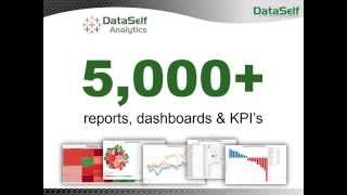
Johnny Girardi shows how DataSelf Analytics lets Sage ERP users build reports and dashboards without coding, using drag-and-drop on any device. The platform includes 5,000+ ready-made reports and KPIs, combines ERP and CRM data, and deploys on-premises or in the cloud.
Questions this video answers
Johnny Girardi (founder & CEO of DataSelf)
December 4, 2014
More than 5,000
Approximately 1 million sales-detail records
Third quarter, 2014
Chapters
Self Service bi. What is self service bi? Well, it's when users can take care of their own reporting needs anytime, anywhere. They do not have to call an expert. They can be using a mobile device, a tablet, in a meeting in a coffee shop and get access to the information even is licensed. That means giving users a self service bi and that means it brings liberation, liberation for everyone. Now business people can make decisions, more informed decisions anytime, anywhere. While people that usually support decision makers such as accounting and it, they don't need to be writing reports all the time for decision makers. So everyone is liberated, everyone can make their jobs more efficiently. And that's what we're going to be talking about here today. That's Data Self analytics for Sage erps. My name is Johnny Girardi, I'm Data Self founder and CEO. So let's jump right into the product to show self Service bi and I'm going to show pretty much three main features of the product. One is how easy it is to build new reports from scratch and I'm going to build a very detail oriented kind of report. Second, I'm going to build a kind of dashboard like report for more management style. And then I'm going to show how users typically consume information using web and mobile devices. So let's take a look at the first part where I'm going to be building a report, a detailed report from scratch. So suppose I'm a power user and I want to build something completely from scratch. Suppose I'm going to be showing sales information because most people can easily relate to. But the mechanics of this works for all you know, if you're doing sales, financial analysis, purchasing, inventory receivables, payables and so forth. We have connectors for pretty much all Sage ERP products and they all work in a similar manner. So suppose I want to see sales amount. I'm going to drag sales to my report. So this is the total sales in the whole company history. But let me break down by date. Typically you know, invoice date. I want to see how the sales are going over the years. And in my simple database I have three years. I can very easily, very easily drill down from year to quarter to expand to the month. I can expand to the day level. Just point and click and you expand into more detail level. This could be fiscal periods, whatever the fiscal period is, you know, months or shipping, months or weeks, you name it. So let me go back to the quarter level and my sample database finishes in the third quarter, 2014. So let me just focus on that Quarter I'm going to filter the information to a particular time period and when I'm filtering by dates I have different options. How I can filter by dates. Relative date is the most popular because it's usually a period comparing to today's date. So you can choose year level, quarter level, month, week, days and this tells you I'm going to take only this year, previous year, the last few years or next few years and so forth. In my example I want to choose the prior quarter which is the last in my sample database. So I click OK, now we only have the last quarter in 2014. Let me move things around here a little bit for this query. So I'm going to put my time in my columns. Well what if I want to break down this report by customer by invoice number, invoice date and product and you name it? Well everything is kind of drag and drop. If I want to see customer, I find the customer in this list. I drag to my rows and now I have sales by customer in the third quarter. Well I want to see invoice number. Well you just have to find in this list invoice number, drag to report and there it is by customer, invoice number, sales in the third quarter. Where I want to put the invoice date is all drag and drop. So now I have date as well. I want to see product, just find the product. So very intuitive. People with little training, sometimes no training, they just see a demo like this and they can start building a report like this very quickly, very easily. This sample database has 1 million records on the sales details. And as I'm building the reports, things takes literally seconds to run and you just drag and drop. Let's say I want to put warehouse ID after my customer or before or anywhere. You just drag where you want and the information will be posted right there. So very easy. That's kind of self service. Not everyone will know how to do this, but people who want to learn, they don't need to spend hours and hours to learn. Sometimes a 5, 10 minute intro will let people just start building reports that today would require an expert to do. So it's very user centric. This is the first part of the demo. Now I want to build a more management style kind of report. A dashboard showing charts and maps and things like that. Again the idea is to show self service and ease of use. In this dashboard I want to build two different views. One showing sales, another one showing number of meetings from my CRM by the way in this example I have a Sales connector. But in data self analytics we have combined information from the ERP with the CRM system together. It doesn't matter where the information comes from, it's just part of my sales information. So I'm going to show combination of that information together. And finally I want to see sales on a map showing by state how big they are. And we're going to do this right now. So first of all I want to see sales. So I'm going to drag sales to my report total sales. I want to break it down by month. So I'm going to bring months to my columns. So right now by month I see how sales are growing over the months in my sample database. I also have a multi company several ERP databases together. So let me break down the sales by company putting as colors. So now for every company I have a different color and I can see sales by individual companies. I also have as I mentioned, number of meetings that come from my CRM system. You know, Sage, CRM, SalesLogix, you name it. I want to drag the number of meetings to my report. So now I have sales on the top and number of meetings at the bottom. Well, so I don't get confused. I want to make number of meetings as bars and sales as lines. So it's very easy tell which one is what. Okay, this is part of my dashboard, the next segment of my dashboard. I want to see sales by geography. I could choose, ship to customer billing address, you name it, I'm going to choose the state. I want to see how big the deals are and I want to see on a sales standpoint and everything I want to put on a map perspective. There you go. Let me make this a little bigger. So bigger bubbles, bigger sales. Now the slice of the bubbles relate to how large the deals were. Large meetings and small deals or invoices. Okay, beautiful. So I just built those two different queries and now I want to put them on a dashboard so people using, let's say iPads could easily access and make better decisions. So I'm going to add the chart at the top. At the bottom I want to put my, you know, sales by month and I also want to see the detailed information at the bottom. You know, if you want to see the warehouse ID and everything else, I mean literally it takes me minutes and I do not need to be a expert to build things like this. The idea again is to empower decision makers with a tool that they can take ownership and they can do their own analysis anytime, anywhere. Using desktop, web and mobile devices that's truly self service bi. Well, let me talk a little bit about the framework that we use. So when I mentioned about user centric, most other BI solutions in the sage market, they are what we call expert centric. You know, when someone needs something different, they need to slice and dice reports out of the basics, they have to call an expert. You know, sometimes someone in the organization, sometimes an external consultant and you know it's going to take time, sometimes hours, sometimes days, even weeks to get the report ready. That's an expert centric solution. Ours is pretty much the only user centric. Why I have my mom and my dad here in this picture. Well, I'm originally from Brazil and a few months ago I went to Brazil for my mom's 80th birthday. Now interesting enough, my mom, when she was trying to contact me, she was using Skype. But she would have to call one of my siblings to help her because she never used a computer by herself. Computers were too complicated. There are expert computers, the tools. So she could not do it by herself. Well, last year I gave her an iPad. An iPad is a user centric computer. And what happened since then? Well, now my mom checks the weather, checks the news and Skypes me directly by herself. She no longer needs someone else to help her. You know, an iPad is a user centric solution and that's what we do. We're like the iPad for reporting and data analysis is the user centric that enables people to be able to do things by themselves. Not only that, not only is really user centric, but we have more than 5,000 reports, dashboards and KPIs available out of the box. So you get a very self service BI solution with a ton of reports and KPIs ready to go. So let me show you the next part of the demo now which is how people usually access the information, how they can consume information and how easy it is to change that. So most people will be consuming information using a web portal. They can use a web browser using let's say a Mac, a PC or a mobile device. And there are also mobile device apps for iOS and Android. So when people log to this portal they will have their own dashboards and reports. Let's say if I'm the CEO, I have the CEO reports and dashboards. If I'm a salesperson, I will see the salespeople dashboards. Now when I navigate in my dashboards and here we have just a sample out of the 5,000 and I pick a dashboard, let's say I want to see this Dashboard here, top customer by sales. Well, the tool can be designed that when I open this dashboard, it will only show me my own information. The same dashboard for all salespeople. But let's say if I'm the California rep, these would be my top customers. In California, the rep in Florida opens the same dashboard and views top customers. In Florida, the big boss opens the same dashboard and views top customers across all territories. So very easy to publish a single report to serve different people because security will take care of what each person can access. Now in the out of the box reports, we try to make them very insightful. Like this example here. Here I have my top customers with bars. Bigger bars shows bigger sales. Now the color of the bars are represented by gross profit. From not so profitable to very profitable. The profitability is also showing these black dots on this axis. Once I know this will be very easy next time to read what's important. You know, if in my business profitability is critical and I need to get more profitability out of my top customers, I can easily tell which clients here are not so profitable and I have to work more closely with those accounts. So very insightful, easy to read that kind of information. Other type of reporting that is usually very important. This one shows the tip of the growth curve of your key performance indicators. In this example I'm looking at top sales change on a year to date basis. So the tip of the growth curve, these are the top customers by sales growth since last year to date. And this is how much sales has increased since last year. Most likely these customers are happy, salespeople are working with them. But how about the customers who are declining the most in sales since last year to date? Is there something wrong? Can you fix it? Well, by knowing who they are is the first step towards fixing some problems, if there are any. So when you look at the top growth and decline by sales expenses, quantity on hand, cost on hand, things like that can usually give you insights into important trends in your business. And we have many reports out of the box showing that kind of a trend. Another kind of trend that is usually important and we have a lot out of the box is what is called exception reporting. Let me show an example of exception reporting that is very insightful from a sales standpoint. This one here. So exceptional reporting shows transactions that are no longer happening. In this example we have customers who are buying from us but are no longer buying. Why can you do something about it? Well, this dashboard shows customers that were buying the last 60 days but not in the last 30 days. Or in the last half a year, but not in the last two months or in the last three years, but not in the last year and so forth. So different buckets, just to give an idea, but again, easy to change two different buckets. And in the name of self Service bi, if you want to receive any of these dashboards on a regular basis in your email inbox, so you don't have to go to your dashboard, you can click this subscribe button and you can tell how frequently you want to receive an email with this dashboard. So you guys can change. These are some sample options, but you can have bunch of options here. And once you do that next time you're going to receive it in your inbox. You can just see the information. And if you want to go right into the dashboard to slice and dice it, you can click on the link on an email, it goes to the dashboard on the web and then you can click and start slicing and dicing it. Let me show an example of that very quickly. How you slice and dice a dashboard using the web. So let me take another dashboard here, this one here. So I open this dashboard on my web or mobile device and if I'm a power user I can click the edit button and when I click the edit button I have a similar user interface that I showed you before. So I can take any of these dashboards here. I can let's say make just a grid approach. And now I want to break down by product line, just drag and drop. So using my fingers on my iPad, let's say I could just drag it. Then I'm starting to change my report very easily, very intuitively. So that's Self Service bi. How do we accomplish such an easy to use technology for Sage ERP products? Well, let me talk about that. So this is Gartner Magic Quadrant. Gartner is one of the most reputable companies doing technology assessment in the Fortune 2000 world. In every February they release who's doing the best in that market. You know the upper market for BI and analytics platforms. Well, right here I have highlighted Tableau. Microsoft Tableau, currently in the Fortune 2000 world, is the leader in dashboarding and self service BI while Microsoft is the leader when it comes to BI infrastructure. How to pull the data together. Well, what about these vendors? What about Data Self? Well, what you get with Data Self is a package that includes Tableau and Microsoft, which right now are the leaders in the upper market. We add our own technology that eliminates programming from these other two technologies so it's easier to Deploy easier to maintain. And we add our more than 5,000 reports, dashboards and KPIs. So you have a solid start point. It's not only easy, but it has probably most of your questions already answered. So what we do is we provide the best of the breed user centric technology available for Fortune 2000. We bring to Sage ERP. So it's really the most user centric technology out there. It's really fast to deploy, usually takes only hours, maybe a few days to deploy. The solution for you, it can be on premises or in the cloud. We have been developing enterprise level analytics for Sage products for over 14 years now. So we know sage RP, we know enterprise level BI and we know how to deliver that kind of solution for mid sized companies. Finally, it's low cost, literally you can buy or you can subscribe. And if you subscribe, let's say using the monthly approach, you, you can literally pay hundreds of dollars per month to get started. So it's really affordable. So that's what we do. Right now I'm going to open the Q and A. If you have questions, Please use the GoToWebinar panel. Press the send button. Oops, I'm sorry. And I'll get the questions and I'll be addressing them. So let's see if we have questions. Yes, the first question here is from Peter. Peter, thank you. So what ERP products do we support? So Peter, good question. Actually let me go to our website to help you answer this question on an ongoing basis. So if you go to dataself.com and you go to the analytics by product, you can see what products we support. And if you choose one of them, let me choose here, let's say sage 300, then you have a lot more information about it. You have what versions are supported. And we usually support versions as old as from the year 2000. So we support many, many versions back. You have recorded webinars for that specific product. You have a description of the solution and you have also links that can be very helpful such as architecture, the kind of roi. From our solution brochure demo of the product. We have like a two minute demo that is really informative and quick and this link here shows you all the reports and dashboards that are available out of the box. So we have here a breakdown by module how many reports and KPIs is included and you can also download the full list that will give you a detailed view into more than 5,000 of these reports and dashboards. Peter, thank you for your question. Let's see other questions here. So question from, let's see here from Ashley I think yeah, Ashley, where do you pull the data from? Ashley, thanks for the question. To answer this question, let me go to our website and look at the software architecture to explain how the data flows through our system. So this architecture, how the data flows, the data would come from your ERP package, your CRM and any other data source you may have. It flows through a SQL Server data warehouse that installed on premises and then this data is manipulated to make it easier and faster for users to consume it. Then this data is pushed to this web server that can be on premises or in the cloud. And then finally people using different devices that can pull information from Typically this data flows through on a batch basis, but we can also pull data in real time if needed. So we serve both batch based for large amount of data as well as real time data as needed. Well folks, we're running out of time. We're going to be wrapping this presentation in about a minute and we have more questions but we will be addressing them on a one on one basis and be contacting you after this webinar. This webinar is being recorded and we're going to make the recording available and we're going to be sending the link. I really appreciate your time joining us today. If you have more questions, you're going to discuss how we compare with the other BI solutions. You have my cell phone information, my email address as well as my Twitter account. I hope you have found this webinar informative. I hope you have a great Thursday and we'll be in touch in a few days. Thank you very much.










