DataSelf Analytics for Visual Produce - Silver Creek User Group
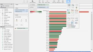
Johnny Girardi demos DataSelf Analytics, a drag-and-drop reporting tool built on Tableau that lets non-IT users build dashboards without coding. The platform includes 5,000+ pre-built reports, connects to sales and inventory data, and can combine sources like Google Analytics with ERP data for trend analysis and exception alerts.
Questions this video answers
April 14, 2015.
Johnny Girardi — founder and CEO of DataSelf.
More than 5,000.
About 15 years.
Tableau (front-end/web server rendering/analytics engine).
Chapters
All right, appreciate it.
So we're going to get started with our next presentation. We've got Joni Girardi on the line from Data Cell. Data Cellie. Go ahead and explain that. But this is a third party, third party couple that we've integrated. As John mentioned before, we've gotten this deployed in Valdor and a few other clients as well. So, Jeremy, I'll go ahead and give you the port. If you guys have questions, I'm just gonna sit up here to kind of repeat those questions to him to make sure that he can hear.
All right, thank you very much. Good morning. Can you hear me well? Yes. Awesome. It's a pleasure to be here for the whole Silver Creek team. I really appreciate the honor. So, as she said, my name is Johnny Girardi. I'm the founder and CEO of Dataself. And let me jump right into what we're going to be talking here about. In a nutshell is who need business intelligence or reporting. This is one of the funny things. When I founded the company back 10 years ago, the vision of this business, quite simple. People who need reports are usually running the business or running people. They're managers, the decision makers. Quite often these people, they're not necessarily IT experts. They're actually building, selling, produce, or whatever they are, and they use the computer as an a tool. And when they need some new information, they're having a meeting, they have some discussions, and they need to make some informed decisions. Quite often there are no report ready for that particular perspective, so they need to call someone else, an IT expert that will build a report on the fly to answer the question. And as you know, that quite often doesn't happen. It usually takes hours, sometimes days or weeks to get a new report available. So it's not productive. People who need reports are usually not IT experts, and quite often they're the ones asking new questions and they have to wait for someone else to answer the question. So this, the main challenge is giving business people, people who are making decisions on an hourly basis, a tool that will allow them to find their reports or build new ones from scratch, anytime, anywhere. And that's what we're going to be talking about here today. Data self analytics is a must have if your company or if your decision makers fall into that category. They need more information, and today they just can't get it because it's too hard, too complicated, too time consuming. So how do we do it? How can we make reporting data analysis something very easy that any person could do it? Well, let me show this little chart here, Gartner is one of the most reputable companies doing technology assessment for Fortune 2000 companies. And every year they assess in the Fortune 2000 world which companies are doing the best in different areas. This chart here shows the business intelligence and analytics platforms. It was just released a couple of months ago and these two vendors highlighted are actually right now the leaders. When it comes to ease of use dashboarding, reporting for Fortune 2000 companies, they're executing the best make it easy, making it affordable. But typically if you try to get that technology and build it from scratch, usually it's going to cost you an ARM and a lag. So what do we do is actually right now we're taking the top leaders in the Fortune 2000 world for BI analytics, which is Tableau and Microsoft, we put in a box, we add our own secret sauce that makes easier and faster to deploy those solutions. And we have been doing this for over 15 years using products like what super quick supports. And we have more than 5,000 reports, dashboards and KPIs available out of the box. So what you get from data self analytics is nothing but the best available for Fortune 2000 companies. But it's simpler, it's easier and it comes with a very comprehensive out of the box solution. So fast deploy. We have been doing this for 15 years. So we know Sage Pro, we know Sage 300 and other ERP packages, we know how to put them together. And overall this is going to cost you little money comparing to the benefits that you get out of it. In a nutshell, it goes back to the initial vision of the company is to give business people the ability to do reporting by themselves. And we call this technology user centric instead of the expert centric, most likely the reporting tools you have today, only one person in the organization knows how to use them, how to build new things from scratch. So you need an expert. With ours, it's the user that is empowered. And I'd like to make a comparison of an iPad. Just make a little story here. My mom, she turned 80 last year and she never used a computer in her life. A computer was too complicated for her. If she tried to do Skype with me, she would have to call a sibling, one of my siblings, to do Skype with me. Well, I gave her an iPad a couple of years ago and now she does Skype by herself. She checks the weather, the news, she even has a Facebook account. And why? Because an iPad is a user centric computer. Anyone can do it. And that's what we do. For reporting data, self analytics is like an iPad for reporting. Anyone that wants to do the job, they can do it by themselves. So it's user centric. The other main benefit is, as I'll show later, there's a ton of reports, dashboards and key performance indicators available right off the box. I'm going to show some of them as we go through the presentation. So are you ready to see something fun now? So let's go out of this talk part. What I'm going to do next is do a little bit of a case scenario. Typically when people are trying to analyze their data, they want to do different things. Let's say I want to see detail invoice by customer or by anything. So I want to show how I can do that from scratch. And then typically you want to compare sales versus quantity shipped or profitability. Maybe website visitors put these things on a chart so you can see how they relate to each other. In my example, I'm going to show how my sales and my website visitors are related to each other and see if there's a trend so I can make decisions. On top of that then typically you may be shipping your products to different customers in different regions. It could be only in your county or in your state, in the whole country, internationally, I want to show a little bit of that. And then finally I want to show some of the most popular reports and dashboards that come available out of the box. Let's look at it. All right, so let me show first how to build some reports from scratch and show how easy it is and how intuitive it is. So in this case I'm looking at the authoring tool and I'm looking at the sales connector. We have sales connector, we have purchasing connector that analyzes sales information, purchase information, inventory information. You can look at the financial information. There are different connectors to different parts of your business. In this data here that I'm looking at, which is the sales, it will be having your sales information, your customers, your products, your salespeople ship to different metrics. Whatever is sales related could be part of the sales connector. And in my example I could have here, let's say CRM information, I could see website information, whatever sales related could be as part of this connector. So, so in my first scenario I want to build a little report showing sales by customer in a certain quarter. And I want to see detailed information like invoice number, product and see sales amount and quantity shipped, let's say. So as I'll show here, everything is drag and drop. So if I want to see sales, I can drag my sales into my report. So this is only my sales total sales company wide. I want to break down by customer. So go to my customer list and I bring customer information and I just drag and drop into my report. So right now I see by customer total sales in the whole company history. All right, well, I want to break down usually things by time, buckets by year, by quarter, by week, fiscal period, whatever you want. So let me drag my date or invoice date into my columns here in my sample database I have only three years, but it could go as back as your data would go in your actual ERP package. So I have sales by year and if I expand a year now I see sales by quarter. If I expand a quarter, I would see sales by month. I can go down to the day level or can go to the week level, fiscal period, whatever you want. Now in my sample database, my last fiscal quarter is quarter three, 2014. Let's assume that in my analysis, I would like to see sales by customer, detailed sales by customer in that particular quarter. So when I slice my data, only a specific quarter, how can I slice the report by that specific quarter? There are many ways. The most popular is just drag whatever you want into the filter shelf and then you can have here a filter wizard. For dates, you can choose years, quarter, months, or you can use relative date. It's quite popular. So let me choose relative date. Relative date is because typically when you're analyzing your reports, you're looking at dates compared to today's date. Let's say I want to see this month, this quarter, this year to date, last quarter or the same quarter. Last year is usually something comparing to today's date. And this relative date option is popular because you can choose. If you choose years, you can choose this year, previous years, last three years, whatever it is, you just pick and choose maybe quarters. In this case, I want to pick the third quarter last year. So I'm going to choose quarter and I think I'm going to choose the last four quarters because I want to include that quarter. Let me press apply. There you go. So I just got my last four quarters, which in my human database only has third quarter, 2014. But anyway, as I move forward, this report will always show me now the last four quarters. So always be less four quarters. And I could easily come here and change to maybe five quarters or whatever you want to change. It's very easy to change as a filter here. Okay, so I got a slice of the data. Now what if I want to see now more detailed information. Let's say invoice number, invoice, date, product, you name it. It's all drag and drop. So if I come to the invoice details and I choose invoice number, I drag and drop to my report. And now I have by customer, by invoice number, sales in that quarter. Maybe I want to see the actual invoice date. Well, let's take the date and drag to the report. Just drag and drop. And now I have the invoice date. Maybe let's put the invoice date before the invoice number. There you go. Now I have the date here. Invoice number. As you can tell, you do not need to be an expert to do these things. Most business people with little training sometimes only watching a presentation like this, they will be able to build their own reports anytime, anywhere using web and mobile devices. Maybe let's add here some product information. Go to the product list. If I were using let's say an iPad, a tablet, I could use my fingers to do the same thing. So if I want to add let's say product to my report, I just add product there. You get by customer, by date, invoice number, product and sales amount. Very easy, very intuitive. It's like an iPad. If you want to do it, you can. So maybe I want to see also pound shipped. Well, you just drag and drop pound shipped to your measures and put your measures right below everything else that I have. You know, pound shipped and sales amount. So this is something again that the business person with little training would be able to do anytime, anywhere using desktop, web and mobile devices. Alrighty, now that I built this first detailed oriented report, I want to see some trend analysis comparing my sales versus my website visitors over time and see how they're relating to each other. And then we're going to show some bars, some charts. So let's do that. So I want to start with sales. This is my total sales in the whole company. I want to break down by month and see how is it growing over the months. So right now I have all the months in my company history here how my sales is growing. Now I have in the sales connector information consolidated with my Google Analytics and I have website visitors. I'm going to drag my website visitors, my report. So this is website visitors and this is sales. Let me see. Website visitors, a bar. So bars are website visitors in sales or it's a line. Now is this relating to each other somehow? Well, right now I can kind of see in A way. But let me just put everything together on a single dual access approach and look how much nicer this is. So now website visitors are in orange bars and my sales is a blue line in. And then looking at my data I could see that there is some relationship between the two. If you go down the website, these will have less sales and goes up, I go up in sales. So this could be an indication that I should do more campaigns, hopefully around my website, more social media, hopefully, and that may drive more sales. I mean this would be just an idea of how you can easily see trends like this between two measures, how they relate to each other and how that can help you make more informed decisions about where you should focus your energy and your business to drive them more quickly. Okay, so that seems like a good chart analysis. And again, as you can tell, you don't need to be an expert to do these things very quickly. Drag and drop, point and click. You can change and build the reports. The last report I want to see is, well, I'm shipping my products nationally and when I see my sales by state and also how large the deals are for each state. So I can use ship to information, bill to information, whatever. There's an address in my database I can put on a map. In my example, I'm going to use the bill to, I'm going to choose state. I also have deal size which breaks my invoices by small, medium, large invoices. And I want to see sales. So I just chose those three parameters and then I'm going to go to my show me and choose mapping. Show this information on my map and see what we have. Look at that. Let me make the bubbles a little bigger. So what I have here is for every state that I ship to, I have a bubble, bigger bubble, bigger sales. Then the bubbles are sliced by these colors which represent how much sales were, you know, large invoices, medium or small invoices in different colors. And that can be also very informative for my decision making. Now what if I want to take all of these three queries that I just created and put on a dashboard for my VP of sales, let's say that is meeting with my west coast team using his tablet and he's on the west coast. Well, let me put all of these reports in a single dashboard. So now I'm going to build a dashboard and because I know my VP has an iPad, I'm going to choose iPad format and then I just drag and drop my queries into my dashboard. So first I'm Showing the map. Then I want to put in my, you know, maybe the bottom part, that train analysis that I just did. Then I want to put the detailed information on this quadrant here. And that's it. I just built from scratch in a few minutes this dashboard that shows, you know, mapping capabilities, trend analysis, detailed information. And again, you do not need to be an expert. The reality is many of our users, you know, we have, I'm sorry, CEOs, VP of Sales, salespeople, CFOs, controllers, purchasing people, they are doing this by themselves again using their desktop. They can be using a web interface, let's say with their notebook on a coffee shop, or meeting the client, or even using mobile devices such as tablets and smartphones. Other of our clients, some of these people, they are too busy even to learn this. Can they do it? Yes, they can, but they have more important things to do. But the good news is that usually these people, they have someone closer to them, someone that knows more the business problems, business opportunities. Not necessarily an IT person, maybe an assistant or maybe just a co worker that knows how to do this stuff. And then they will be helping the decision makers make decisions anytime, anywhere. Maybe they're in board meetings, maybe in front of the client, they can just take these reports, slice and dice and make more informed decisions. Now let me show also a little bit of the out of the box reports. As I mentioned, we have more than 5,000 available. And typically when people are going to consume the reports and dashboards, they're going to be using a web portal, using a web browser or mobile devices. When they log to this portal, the information is highly secured. It can be behind your firewall or it can be on the Internet or Internet. Those are just technical details. The point is it's highly secured and there are several layers of security. Let's say only people that know the address and have the right credentials, they can log to the portal. That's the first layer of security. The second layer of security is let's say if I'm a salesperson and I log in, let's say I can only access sales dashboards, while the accounting team, let's say, would only access the finance dashboards and reports. While let's say the big boss would only access the CEO level dashboard. So your user credentials will tell the system what reports and dashboard they have access to. Finally, let's say if I'm a salesperson and I'm the responsible for California, let's say I open a particular report, sales report, I would only view, let's Say California information, while the rep from Florida opens the same report and only views Florida information, while the VP of Sales opens the same report and views sales across all territories. So information security can be that granular controls who can access the portal, what dashboards are available for every person or every group of people, and then what specific information can be delivered to every specific person or group of people. So the security framework is really impressive. Now this is an example of a web portal where I have several different examples of dashboards covering different areas. Let me show here initially some financial kind of reporting and dashboards. So when it comes to financials, most companies already have their balance sheet and profit and losses taken care of. So we can also do that. And if your company is spending too much time building your financials, maybe you'll be spending hours or days crunching the data. Talk with us, because typically we can automate 100% of the manual intensive process. We cannot automate people's intelligence. But if it's a mechanical process that you're copying and pasting into Excel and manipulating that part, we can automate. So we can help you with the regular financials as well. Now what most companies come to us is when they want to have dashboards for financial analysis like this one, where you see revenues projection by any kind of categorization that you may have. In this example, we're looking at quarter revenues by different cost center and more detailed information on this particular quarter revenues. Gross profit, gross profit percentage. This quadrant here shows data that has been combined from different systems. We have bookings, which is kind of actual sales, open sales orders that come from the open sales order module, as well as expected new revenues which may come from CRM. And then combining this information we can come up with what is the current monthly projection at the end of this month. Anyway, this is just an example. Every business is different. But the point is having financials on dashboards for management, showing charts of things that matter is usually critical. And our technology can make this easy, affordable and really empower the decision makers to find this information and change it anytime, anywhere. Some other examples of financial information that also sometimes is good for companies like produce companies. I'm sorry, you may be looking at your metrics on a weekly basis. And here we have actually a multi company framework. Several companies, let's say if you own several companies, you want to see how the sales is working across the different companies. And there are several metrics here. Revenues this year, last year change since last year. Number of customers last year, this year is growing or Declining and on a weekly basis in the same metrics by individual company. So just a way of also showing detailed information about your financials. Some people are very driven by charts. So again, this tool has many ways, as I showed before, to build trend analysis just by drag and drop. Also, let me show some sales dashboards. So let me show some popular sales dashboards here. So when I'm analyzing sales, some of the popular dashboards is what we call top performers. Looking the top performers, top customers, top products, top sales people, top territories, by whatever, by sales, quantity shipped, pound shipped, gross profit, whatever is important for you in the way we show top performers or any kind of report is usually visual. Again, some people love charts, some people love numbers by the penny. We have both approaches. Some approach I'm going to show here is showing the chart approach. This example here is a report showing top customers by sales this year to date. And we have bars by customer. So bigger bars means bigger sales. And the color of each bar also has this color schema that represents profitability. So not so profitable, very profitable. And profitability is also shown by these black dots using this scale. Once you learn how to read this dashboard and let's say that in your business, profitability is something important to keep track of and to maximize next time that each let's say salesperson would open this report and as I mentioned before, let's say if I'm the California rep and I open this dashboard, it would only show California customers. When I look at this dashboard for my customers, I could tell that a few of my top customers are not so profitable and maybe I have to do something else to try to bring profitability up. So very insightful. Once you learn how to read this kind of dashboard, you'll know what to do. You spend less time analyzing and more time doing what you're supposed to do, which is calling people and trying to see where you can change maybe the portfolio of products to increase profitability. So that's one way of looking at these reports among top performers. We also like to look at the tip of the growth curve of your main metrics. You know, things that are growing the most or declining the most often are important. And sometimes you're not aware of some of those things and you may be missing some opportunities or even losing some opportunities. An example is what I'm showing right now. This report shows my top customers by sales change since last year to date. And this axis shows how much they have grew, grown or declined since last year. Typically, these customers who are growing the most since Last year are no problem. You know, most likely salespeople working closely with them, they're probably happy. Maybe this is like, you know, this dashboard for this purpose maybe is not so critical. But how about these customers who are declining the most since last year? Is there something wrong with some of them? If there is, you better work before it's too late. So keeping track of things who are changing the most, growing or declining, you can look at from a sales perspective, quantity on hand, cost on hand, expenses over time, whatever it is, looking what is growing or decline the most is usually important. And we have several reports showing those trends that can make you focus your business on what what matters the most. Also, we can help with a sales commission. If you have elaborate sales commission structures, typically we can automate the process. We can also help people keep track of your sales and commissions on an ongoing basis. Like this report here shows the sales target for the month. I'm looking at September information, how the sale is growing throughout the month or accumulating throughout the month, and how much commissions I'm accumulating throughout the month. And all of this is what we call. Self service PI. I could tell this dashboard to be emailed to me automatically every Friday night and would take me a few clicks. I would do that. And then every Friday night I would receive in my inbox an email showing my dashboard just like it is right now. And let's say if I want to further analyze it, I could click on my email and then it would jump right into my actual dashboard here. And then I could start doing ad hoc analysis if I want to. Let me show one more example on the sales here. That is also usually very critical is what we call exception reporting. Exceptional reporting is showing you transactions that are no longer happening. This is an example here. I have customers who were buying from my company before, but are no longer buying in different time buckets. In these quadrants I have customers who are buying the last 60 days, but not in the last 30 days. This showing buying the last half a year but not in the last two months. This one by in the last three years but not in the last year. And this buy in the last five years but not in the last two years. I mean this is just example of how we can slice the data. The point is looking at things that are no longer happening, maybe what products are no longer selling or maybe they're no longer selling the last 15 days or last 40 days or whatever it is. So exceptional reporting is also critical and we have lots of reports out of the Box. All right, let's see. The last thing I want to show you here is. Let me see where I saved that report. The last thing I want to show is a little bit of the ad hoc analysis that you can also have on these dashboards. So assume that I would be the VP of sales, and I'm meeting with my west coast team, and I have this dashboard on my iPad. So when I open this dashboard, because I'm the VP of sales, I have access to everything, but I only see my information for the west coast states. So on my iPad, I could use my fingers and I would select only the west coast states. And right there, what happens is now my dashboard was filtered to show salespeople selling to those three states and what brands of product has been shipped to those three states. And, you know, bigger bubbles, bigger sales, and also sliced by the size of the deal. Okay, what about, what is this salesperson selling? I click on it, and right now the dashboard changes again. And now I only see what this salesperson is selling for those three states and what products are being shipped. So these dashboards are very interactive. And using my fingers, I could change it. And if I'm a power user that I know how to slice and dice dashboards, I would have this edit button on my tablet. I will click on it. And now I could completely change the dashboard. I would completely be able to build new ones from scratch, just like I did before at the beginning of this presentation. For instance, right here, I have the different quadrants of my dashboard that I was just showing. Now, what if I want to go to my salesperson dashboard and I want to see numbers by the penny? So I click numbers here. Now, by salesperson, I see gross profit and sales amount. And maybe now I want to see sales by item brand. I just come here and I choose item brand, and I drag and drop. I could be using my fingers, just drag and drop. And there it is. Buy, salesperson, buy item, brand. They see gross profit, sales amount. And, you know, if you want to add customer, just add customer. You drag and drop and you get the result again, very easy, very intuitive, and very fast. Doesn't matter how big your data is, your reports will run in seconds. It's really a high performance platform. All right, that was what I want to show. I hope you have enjoyed the presentation, and I'm open for questions and answers now.
Asking if you could do the.
Same thing with purchases and buyers. Yes, absolutely. As I mentioned before, what I came here to show today, it has the sales connector, which has sales Information, but we have purchasing connector, we have receivables, connector payables. And then you would come here and you see the list of, let's say purchasing connector, vendors, products, purchase order information, things of that nature, warehouse.
Inventory to them.
Yep, absolutely. Can you pick different items from different connectors and put them in a wonder report dashboard? Yep, absolutely. You can have here several connectors you know you can have together. Let's say sales, purchasing and inventory connectors together. And let's say all of them they have in common product. Right. So you could have, let's say quantity on hand. That comes from your inventory module. You can see inbound products coming from your purchasing order module, and you can see outbound products coming from your sales order module and see everything on a chart like, say, for forecasting purposes. So do you have to create a combined connector or you can just use individual connectors and create a report out of it? Pretty smart question. So both approaches are available. You can have the three connectors, just you add the connectors like drag and drop here, and then you just build your query. Sometimes, depending how large your database is, sometimes it's better to make a single connector that combines the three together behind the scenes and that will make it easier and faster. So the answer is yes, you can. The more detailed answer is, depending on your specific needs, how big your database is, how often you're going to be doing this. We can help you do this at the user interface level, like here, you just add the connectors and slice and drag and drop. Or if you have more sophisticated needs, a more IT person would have to that combination on the back end of the system. At the end of the day, once this is done and you come to here, you'd have a single connector that would combine purchasing on hand and sales orders all together in a single connect and then you drag and drop. Maybe I'm giving too much information to sophisticated information, but the point is, yes, it can be done. The matter is how sophisticated your needs are. Can we then with three different connectors or a single connector, that would be a question to be answered depending on your specific needs. Does it make sense? Yes.
All right, can you, like you showed us how you can do a quarter or a week. Or can you add like, let's say I want to do a report that's got two quarters and two weeks and I want that all in one column. Can you add up some of these and put them in one column?
Let's say you want to have in a single report information that shows, let's say two weeks and two quarters, Is that right?
Correct. Or any odd amount of continuous date time. And just have it in one column.
Let's say you have like four columns. In your example would be two columns for two weeks and two columns for two quarters. Right.
And then I'd sum them. But can I have it all on one column?
Yes, yes. Would be. Let me just show an example. If I can do this right now. So let me put here salespeople. Then I want to see sales and then I want to see date. Let me just see dates for. I'm going to do it quickly so I get to what I think you're telling me. So this report here is showing me two quarters. Just hold with me while I'm building the idea that you're telling me. And then I'm going to see sales. I want to do now by week. So I want to see by week, but I want to see numbers and I only want to see actually for the same time period. I don't want to do this. Relative dates, month, the last 10 months maybe or nine months. Okay, let me do this. And then now what I want to see is I'm going to put them all together. So what I'm building here now is with a little bit of juggling around. Let me just hide this information here. Now I have the salespeople aligned to each other here and I have information using the quarter level and at the week level. I think I can hide my salesperson here and you can have in a single report different levels of information showed. Because you're combining two different reports in a single one. Does it make sense?
Yeah, the thing is I would probably be looking at like an item sales report which some weeks that item might not be sold and other weeks it would. But what I'm looking for is like a seven week summarized one column report.
Okay, well, I'm just a salesperson. You're asking a fairly sophisticated maybe question. If you want, probably we could go on an offline and I get one of my consultants that are better at me than this overall. This tool here is not a magic wand. Not all wishes will come true. But if it can be done, this tool excels at it and typically it can be done by. You don't need to be an expert. You can just drag and drop something like I did here and come up with a report. One of the report that I showed during the presentation here, let me go back, maybe have some of the answers that you are saying.
Can you sum across some multiple date measures?
Sure. Like here, if I want to put sum totals, I can have totals by rows. So right now I'm summing the rows. Then I can also sum the columns. Now at the bottom I have also a total. So I'm summing, you know, this way and this way. Does it make sense?
Yeah, no, that's fine.
And let me see something here. And as you change, note that that summary came to the report and now I have my totals here and my grand totals at the bottom.
He could achieve it then if you just do it by product. Because he's got it by salesperson.
Yeah, I mean if you want to change the salesperson by product, I just can. Product and I replace instead of salesperson, Id put product, just drag and drop on top and then put product here too. Now it's a product report, not a salesperson report. My dashboard. Now I change, I have product, quarter sales and weekly sales.
Then you'll see some weeks it's not purchased. Is the product priced by number of users? Number of super.
What do you call them? Power users.
Power users do you get? Is it priced by power users and how many viewers or how do you price the product?
Yep, exactly. So there are primarily three types of users. The power user, which is someone that can have all can do whatever they want, and you still ask. There's an admin user who gives control to each user or each group of user what they can do. And the administrator user is also a power user. So a power user can have full rights to everything, or you can even limit them to whatever you want. That's the power user. The viewer user is a user that can only consume reports because by power users, they can change filters, they can drill down, they can download information, but they cannot build or modify reports. Those are the viewer users. The third type of users is we call distribution module users. These users, there's actually no license for them. You just buy a module called distribution module. And then what the distribution module does is you can tell which reports and dashboards will be refreshed on a schedule basis. Let's say every day, every week, every month, whatever it is. And then who's going to receive these dashboards automatically. And then this tool will run these schedules, you know, can be several schedules, daily, weekly, monthly. And it will be emailing reports, email in PDF format automatically. So the users can be unlimited, you can send to all your customers, for instance. There's no extra fee. But the reports are PDF. They are not dynamic like the ones you can slice and dice. It's just a PDF Report showing the latest information. So power user, viewer, User and report distribution are the three type of users.
And the report distribution user. You can only see PDFs. You couldn't put it in a value only Excel sheet.
Yes, we can do actually PDF and Excel as well both. If you go Excel, the actual Excel report must be built using Excel and not this particular tool. But yes, we have several clients that use a combination of both. The PDF come out of this tool because it's so easy to build new reports, but clients that need Excel information instead, they build the reports in Excel connected to this tool in Excel and then they use the distribution module to gather reports in an Excel format to other users.
Are you pulling data directly out of the SQL tables or are you using.
Yeah. So let me show this answer using on our website dataself.com if I go to analytics by product and then I choose architecture, let me show how the product works behind the scenes. It's a very high level description here. So this is the architecture of the technology. This would be your databases, Your Sage Pro, Sage 300 or whatever database you may have. Then our system has a separate SQL Server database where we pull data from your ERP and other systems into it. And in this database we optimize information for reporting purposes. We make it faster, we make it more user friendlier, and. And then we have this web server which can be again deployed on premises or in the cloud. It's a web server that will format the information in a nice way and then render information using desktop, web and mobile devices. So making your question a long story short, we pull data from your databases into a separate SQL Server database and then from there we push to the clients. This data pool can be done usually on a scheduled basis, usually overnight, but it can also be run throughout the day in batches or even running live. If your source database is also SQL Server, does it make sense? Yes. So there is no analysis services. Good question. Yeah. So the web server that we're using here is powered by Tableau, which I talked about before. Tableau is this kind of high end analytics platform. And Tableau has an engine called it's in memory analytics engine that is easier faster than analysis services cubes. So let's put it this way. If we go back four years ago, we were using cubes from Analysis services heavily. We had more than 15 cubes available out of the box for different accounting packages. Since we adopted Tableau, we have pretty much decommissioned most of the cubes. We still have them. But Tableau does such a Much better job than cubes to. Right now we only have 2, 3 cubes available for certain specific needs because all the other cubes became outdated. Because Tableau is easier, better and faster than cubes. So we still work with cubes if required. Even though overall Tableau does a better job than analysis services. Does it make sense? So Tableau runs on top of a SQL Server database? Yes. If you've got some legacy data cubes, you can use Tableau to access those. And by the way, Tableau also pulled data from cubes. So if you have cubes available and you want to keep them because it's working, Tableau also read from cubes, read from cubes, read from the SQL Server database. So you don't need to dump those things. More questions?
All right, I think we're good.
One thing I want to mention before I let you go here is that when we do and user groups like we're part of this today, if you decide to move forward and acquire data self in the next 30 days, we give you 5% off licenses. So if you found that this is something that may work for your company, I highly recommend you to talk to other people. Whoever you have to talk. Let's do more one on one meetings. We can show you to your team, specifically what we have. And if we manage to get the whole decision in less than 30 days and the decision is moved forward, you're going to get some good discounts. So just to let you know, thank you people. I hope you have enjoyed the session and learned something. My name is here with my contact information. Feel free to contact me or use John's people as a resource and I hope to hear from some of you soon.
Thank you, Johnny.
Thank you. Thank you. Have a good day.
All right, that will conclude our morning session. We're going to have lunch.










