DataSelf Analytics NFR - Build New Dashboard v502
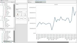
A tutorial video (DataSelf AI) demonstrating how to build reports and dashboards using the DSA Demo Sales sample file. Covers connecting to sales data, creating a detailed tabular report, applying relative date filters, building trend charts (including dual-axis comparison with website visitors), mapping sales by geography, assembling sheets into a dashboard, and saving the result.
Chapters
This video will show how to build new reports using data self analytics sample files. After you watch this video, I highly recommend you go to our website dataself.com go to learning and choose training videos. In here you'll find more videos on how to get more familiar with the navigation techniques of data self analytics. Now let's practice and learn how to show it to prospects. Most of our prospects come to us looking for better sales analysis. That's the most popular demand for data self analytics. So this video will focus on DSA demo sales file even though the overall techniques I'm going to be using work also for all the other DSA demo files available in the NF4 sample files. So let me double click the DSA demo sales. And typically when I open it up the first thing is I like this feed width to be regular or normal. That's the best way to visualize things. So if it's not, just click to normal here and you should come back always as normal. Once you set that up. Now here what we have on the left we have the sales connector. The sales connector would be connected to the client's sales information which can be coming from the ERP system or maybe from the CRM or maybe from a combination of different sales data sources. Regardless, once it's set up, once it's been deployed, business people would come here and they would see dimensions which are entities that people want to analyze their information by and then they see measures which are the numbers they are want to keep track of. Now I'm going to be building a few different things here. I'm going to create first a detailed oriented report showing very granular information. Then I'm going to show some charts to show trend analysis that for some people is very valuable. And then at the end I'll put everything together in a dashboard. So let's do it. So first of all let me see sales. I want to see sales by the penny. So I'm going to drag and drop sales to my area here in the middle. And this would be the total sales for all history of this company. Now let me break down sales by customer. So I come to the left, the sales connector. I find the customer list and I'm going to use the customer or any of the subcomponents. This case I'm going to take customer and drag to my rows area and right there I see total sales by customer in the whole company history. Well, typically when you're looking at reports you want to narrow down by specific periods. Let me show some variations of how you can narrow by the period. First let's drag date to my columns area and automatically the tool will break down whatever you have here by year. So right now I see customer sales by year in my sample database has only three years worth of data and I can easily drill down. If I click the plus signal here I expand to the quarter level. So now I see in 2012 quarter, 1, 2, 3, 4 and so forth. For the other years if I click on quarter I go to the next level, which is I now I'm the month level. So I have the year, the quarter and the month. And I could go down to the day level and our level if I have in my sample database. But I don't in my sample database. So let me go back to the quarter level. In my last quarter is the quarter three in 2014. Well, let's assume that I want to see invoice information for the quarter three in 2014. I want to take a slice of this report only for that quarter. So one way to do that is I can take my date and drag into my filters shelf and then I can select different ways to filter this information by years, quarters, months, dates and so forth. The most popular approach is the relative date approach. I'm going to click next and show what that means. First of all, the relative date is very, very easy to use. When you come to this page you can see different kind of buckets that you can work with. You want to work with quarter buckets. So I click there and then you have this very helpful options. You know this quarter, previous quarter, next quarter, last, you know, three, four quarters, next quarters and all of this is related to today's date. So if I choose here the last three quarters which based on my current quarter that will set to the last quarter in 2014. So this report will be always showing my last three quarters worth of data. So if I had data through today, I would have three quarters showing here. I only have my last quarter of my simple database showing. In this case I click ok. So okay, right now I narrowed down my customers showing sales in the third quarter of 2014. What if I want to see invoice details, invoice number, invoice date, you name it. Well, I find the invoice detail information here and I just drag and drop whatever I want is this invoice number. I drag invoice number and put after customer. I want to see all invoices. So there it is. I have my invoice numbers. Maybe I want to put the invoice Date so I can take date and drag it, let's say after my invoice number. And there it is. Maybe I want to put my date before so, so I drag and drop between the two. So now I have date and invoice number, maybe product information, just drag and drop. Let's put item ID for instance, put after invoice number. So there it is, very easy. Have customer have date, invoice number, item ID and sales amount. Maybe I also want to put quantity shipped since I'm looking at products so I find quantity shipped. I drag to my data area, drag and drop over there. And then in this case I want to put my measures at the bottom of this list of parameters so I see the date, the quarter and the measures right there. Very easy, very intuitive, very quick. I built a very detailed render report. This sample database has about 1 million records. Still it runs very quickly. Now let me simplify this dashboard a little bit. This report a little bit. I'm going to remove the item id, I'm going to remove the quantity just to make it a little simpler because eventually it's going to make into a more elaborate dashboard. Now let me create a new sheet. I'm going to click this button. There are two buttons. This is a new dashboard, this is a new sheet. I'm going to click the new sheet right now and create a trend analysis. Let's see. I want to see sales. So I drag sales now to my rows and now I see a bar with total sales in my old company history. Well, I want to break down these sales by month. So I have this date, month, year here and I'm going to drag to my columns and right there I see by month I see my sales growing. Well in my sample database I have sales coming from the ERP system and website visitors coming from Google Analytics. Let's say we can bring data from any data source and combine if there's a way to combine the data. So let me drag website visitors to my report. I'm going to drag right here my columns and I have sales and website visitors. So right now I clicked on this website visitors label and I go to this automatic and I choose bars. So they're very easy to tell. Bars are website visitors and sales is aligned. Finally I want to combine these two, you know, trend analysis in a single chart so I can see if there's any relationship between sales and website visitors. So I'm going to take here this drop down list and choose dual access. And maybe I should put my sales on the right so it comes forward and there it is. Very informative. I have website visitors here, let me make this a little more to the light views, better use the space. And on the right I have sales. Okay, very informative. I can see a trend between, let's say, my sales and my website visitors. Now I want to create a new sheet again and I'm going to click this button for a new sheet. And in this case I want to see sales by geography. So I could be looking at ship to information, bill to information, you name it. In this case, I'm going to be choosing under customer address. I'm going to be choosing state. I also want to break down my sales by the deal size, which is part of my invoice details information. And using my control button, I'm pressing my control button and selecting sales amount. So I selected state, you know, billing state, deal size and sales amount using the pressing, holding the control button. Now I go to this show me button. I click on it, which is toggles between opening, closing this little panel and I'm going to choose the mapping capabilities. So I click the mappings and I close the show me button and I start to see something interesting. But I want to see bigger bubbles because they're too small. Right now I click the size button and let's put this a little bit to the right and that looks much better. So here we have bigger bubbles, bigger sales, and each bubble is sliced by the aggregation of sales based on the size of the invoices. Very informative. All right, now I want to put all these three queries into a single dashboard. So now I click the second button here, the second tab that will give me a dashboard area and I can select what the size of the dashboard will be. It could be for an iPad. Since I'm using a small screen resolution here, I'm going to say automatic, so it will automatically fit to my screen size. And then I just need to drag and drop, drag my sheet three which has the map. It will plot it right there. Then I'm going to put the sheet two and I can just drag and drop into quadrants left, right, bottom, just drag and drop right there. I see the new piece of information. And finally, my first sheet, I want to put, let's say, right besides my little chart over there. And I'm going to just resize things to the left, let's say. And there it is. I just built from scratch a fairly sophisticated dashboard. And as you can tell, I do not need to be an expert. Users with little training will be able to do things like this just being business users using mobile devices, web interfaces, anytime, anywhere. If you build a different dashboard like this one and you want to save it for later, I recommend not clicking the save button because that will change your original blank sheet. I recommend you to click File Save as and say whatever the name is My first dashboard and save it and there it is. Next time you want to open the same dashboard, you just click my first dashboard and you pop right back where you were. There it is. So I hope you have found this informative again. I recommend you to watch the other videos explaining other techniques of data self analytics if you have more questions. If you need support, please email us@salessdataself.com thanks for watching.










