DataSelf Analytics NFR - Sample Dashboards v502
A walkthrough of sample Tableau dashboards in DataSelf Analytics NFR files, showing financial dashboards with revenue and expense tracking, manufacturing quality dashboards with defect maps, and sales dashboards with performance rankings and commission analysis. The dashboards pull from ERP, CRM, and Excel data and support email subscriptions.
Questions this video answers
February 19, 2015.
us@salessataself.com.
Chapters
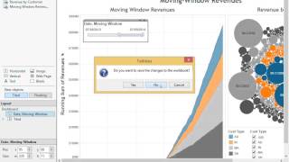
This video covers data self analytics sample files part 2 assuming that you already have installed the NFR and the NFR sample files. So we're going to be looking at the sample dashboards. So you go to Documents, my documents, my my Tableau repository workbooks and here you find three different DSA sample dashboards. We're going to open each one of them and give you a quick overview of what they're showing and how you can go about talking about them to your prospects. So I'm going to open the first one just by double clicking it. Depending on your screen resolution, things can look a little cramped like this. Typically most people will use a bigger resolution that I'm using right now. But even if you're using this small, you can click this button here which is the presentation mode and then the dashboard will fit nicely on your screen. And this first dashboard shows revenues and projection. You're looking at your financial information and then we have a segment showing revenues by quarter here by different type of revenues you have in your business, in this business, the totals and the grand totals. Then you have the revenues this quarter, you know, revenues, gross profit and the percentage gross profit. On this section you have revenues this month again by the same categorization of revenues. You see the current month bookings, open sales orders that have not yet been invoiced, your expectation of new revenues and the current month projection. Based on all this information and on the right you have more details about the projection per se. These would be the remaining deals in your pipeline, how much you're expecting to close out of those deals in the pipeline, in the expecting closing rate. And then at the bottom you have by segment of your revenues, how much money, how much revenue you're having by different quarters and seeing things over time. Now where will all of this information come from in a actual deployment? Well, this is an example of a client that have information coming from financials as well as CRM information or Excel files that are giving expected revenues and pipeline information. It doesn't matter where it comes from. If you have this information somewhere, data self analytics can consolidate. And then dashboards like this can be built where we see financial information combined with other pieces of information in a single dashboard in a very visual and intuitive way. The next dashboard here I'm going to click on the second tab, which is the weekly metrics. This dashboard is a more tabular kind of approach, just showing numbers or major key performance indicators on a weekly basis so week three through week ten and it tells what the week's periods are and then we have a bunch of different KPIs, revenue this year, revenue last year, revenue change since last year, margin percentage this year, customer counts last year, this year and so forth. A bunch of different KPIs that are critical for this particular business that I'm showing information for. And this dashboard was designed for a company that has several different companies together. It was a multi company framework. So here we have the same metrics now broken down by individual company. So this is a dashboard that is also pretty detail oriented with a lot of metrics and very informative. The next dashboard is the same dashboard related to the weekly metrics, but now showing information on using charts. The top one is just revenue by week. So simply the revenue by week we have last year in blue and this year in red. The bottom is accumulated revenue. So as the week, you know, move forward, we accumulate the sales and see how they're going. And in this case we see that this year's revenue is bigger than last year, which is always a good thing. Next dashboard is an example showing total expenses by quarter and by month. So we're just taking all expenses from financials and showing for different years by quarter and by month. And then we can see here by quarter, and then we see the different colors or different columns showing if the revenues, if the expenses are growing. And you can easily change this date. Let's say in this case my sample database only has three years. If I only see 2013 and 2014, I'm going to go down to three years. I mean 2015 is not here. It would show 2015 if I had in my SAP database. But then I can make comparisons and see how my expenses are last year versus this year. Let's say the final dashboard for financials is a little bit more kind of fancier dashboard. It's showing moving window revenues. So I have here the whole company history. And this is a one year moving window. And I have sales, you know, running sum of revenues growing throughout one year period. And the colors are broken down by in this case, customer type. And if I move this moving window to the left or to the right, what happens is I see how my revenues were growing from the beginning one year forward, and then how the distribution of revenue by customer was. And then if I put my mouse on a specific customer, gives me the customer id, the type of customer and the sales amount in that particular one year period. And then if I move this all the way to the far right, then I see what happened with my sales in the last moving window of one year. So this is my financial dashboard. I'm going to click Escape to get out of the presentation mode. I'm going to close this particular sample and I'm going to click no for now. I don't want to change the original ones. I'm going to show the manufacturing quality dashboard. This dashboard is an example of quality assurance for manufacturing companies. It's fairly self explanatory. You have here different, different manufacturing facilities in different states. And then you know, right now we have selected Pennsylvania. Then it's showing that for Pennsylvania, you know, for the assembly revision it shows the defect type and how many we had in here. Production and defect for defects for the PA facility. So this dashboard is fairly specialized for manufacturers that are looking at looking at production and defects using maps and different kind of charts. I click Escape to get out of the presentation mode. I'm going to click this dashboard and open the next one which is a very popular dashboard for our prospects. Many of our prospects come to data self analytics because they want to improve their sales operations. So let me maximize this one and go to the far right of my dashboard. So I'm going to click here to go all the way to the left. Click here instead. All right, so I went to the far left. I have several dashboards on this particular file. The first one is a very simple one is showing what we call top performers in this example, top customers by sales. This year to date we have the customers here. For every customer we have a bar which relates to this axis showing sales. And then the bars have colors that are related to the gross profit of each of these customers. We also have gross profit as these black dots using this scale. If for this business profitability is something important to keep track of. This dashboard is really insightful because a rep would look at their own top customers and see which ones are not so profitable. You know, the red ones are the ones with the black dots on the far left. And work more closely to see if they could increase profitability for those top customers. This is an example of out of the box top performer reports. Another example of top performer reports is looking at the tip of the growth curves of your major key performance indicators. You know, looking at what things are growing the most or declining the most in a given period. This example focus on top customers by sales change since last year to date. In other words, which customers have been growing the most or declined the most in sales since last year to date. This axis shows sales change since last year, biggest growth and biggest decline. These customers are growing a lot. Most Likely happy customers, salespeople are working closely with them. Maybe not a big deal for this particular perspective, but how about the top customers by sales decline? If you have recurring customers, you want to be sure that if something is wrong with these customers, they are being taken care of before it's too late. So this is an example of report showing the tip of the growth curve of your major KPIs. You could be looking at products, you could be looking at expenses, cost on hand, you name it. Looking at the top growth end of the client is usually critical and, and we have lots of reports looking at such perspective. The next dashboard is just a way to look at commissions, which sometimes it's a very important topic for many organizations. This particular dashboard is looking at the particular sales in September in my sample database, which is the current month. And as the days progress I see the sales, my sales that I'm an account manager growing throughout the month. So I'm almost reaching my sales target and I'm the 24th, so it looks like I'm going to make it. So sales is in this gray line. While the sales commission that I'm accumulating throughout the month is showing as these bars here. So very kind of informative dashboard. In the actual data self production environment, people can click on any of these dashboards and subscribe to them to receive them automatically by email. So if I want to receive my sales commission report, like this one every Friday night in my inbox because I want to see if I can make, you know, spend some more money over the weekend, I can do that. Just subscribe to this email and select the frequency. I want to receive dashboards in my inbox so I don't have to go to the dashboard framework. The next two dashboards, they talk about what we call exception reporting, which is showing transactions that are no longer happening. And these two dashboards show customers, you know, regular customers were buying before, but no longer buying. This particular dashboard shows customers that were buying the last 90 days but not in the last 30 days and showing all of them distributed, you know, by region in the US and showing the account managers by the color of the slices. This is interactive. If I come and I select a particular state like here, the dashboard will change to show just the customers in that particular territory that were buying the last 90 days, but not in the last 30 days. The next dashboard here actually gives me a, a few different options. You know, some businesses don't care for clients who are buying the last 60 days because their recurring business is pretty much every half A year, or every year, or every three years, whatever the time may be. And this is just a way to show that we can have dashboard showing no sales or no transactions for whatever it is in different time buckets. This example, I have sales in the last 60 days, not in the last 30. This one, sales in the last half a year, but not in the last two months. This case, sales in the last three years, but not in the last year. In this one, sales the last five years, but not in the last two years. Anyway, it's just a way to show that we can show any kind of time buckets and showing things are no longer happening. This dashboard for companies who sell products with recurring customers is usually fairly popular. It shows among the top products, the products that you're selling the most, where you're having the biggest sales declines. And that may be a red flag or maybe you're not doing a good job or something and you can act on to try to reverse the decline. Sales. This bar here you define, you know, how big the sales decline is since last year to date. In this example, I want to see only among my top products, the ones who are declining by more than $100,000 since last year to date. The left of this dashboard shows me by top product, which customers have been declining a lot. You know, sales decline, sales change since last year to date. So by product I see customer who are declining on this right side. Actually I have just on a descending order by customer and by top product. So which ones are declining the most? Customer and product combination. So again, if you are selling products, you want to be sure that your top products don't have a lot of large declines. And if you do have one, maybe you can fix it. Two, maybe it's time to change the portfolio because the top products are going down. So this is a very insightful way of looking at those trends. This dashboard is more like, you know, showing different ways of looking at sales trends. Here we have what is called a tree map. And in the size of each box here we have the customer name at the top of the top left of the box. And then the size of the box relates to the sales size. So bigger boxes means bigger sales. While the color of the box is represented by profitability using this schema here. So the idea is you want to be sure that the bigger boxes have in kind of decent profitability. And I'm going to click Escape to get out of the presentation mode and click close. And that was a quick overview of the sample dashboards. Watch the other videos to learn more about the other parts of the NFR sample files. If you have questions or comments, you can actually email us@salessataself.com thanks for watching.










