DataSelf Analytics Product Demo - Self service BI
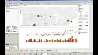
John E. Girardi demonstrates DataSelf Analytics, a self-service BI tool that lets business users build reports with drag-and-drop. The platform claims to cut reporting labor by over 80% and comes with more than 5,000 prebuilt reports, handling roughly 70% of typical custom reporting needs without IT involvement.
Questions this video answers
John E. Girardi, DataSelf founder and CEO
October 23, 2014
Over 80% reduction in labor with reporting tasks
Sample database goes through August 2014
More than 5,000 reports, dashboards and KPIs
Chapters
Joining our session, my name is John E. Girardi, I'm Data Sales founder and CEO and today we're going to spend about an hour showing a product presentation in more detail about Data Self analytics, which is a self service BI solution. We have a pretty big agenda. We're going to cover a lot of different things. Want to be sure that you walk out of this session viewing several ways of building reports and dashboards and consuming that information. So we're going to be building and changing a lot of the things as we go through this presentation. One of the main messages that I want you to get out of this is that with Data Self analytics, overall there is an over 80% reduction in labor with reporting tasks. So it's much easier and faster to build and modify reports on the fly. And most of the time users, business people who know the problems, who know the business opportunities, they'll be able to do those things by themselves. So that's the idea, is to show how easy the solution is. So I'm going to jump right into the product presentation and we're going to have a questions and answers at the end of the session. However, if you want to pop some questions throughout the presentation, I'll see if I can keep on looking at the GoToWebinar panel to see questions and address them on the fly. So first of all, let's start explaining the product in the main pieces in how things work. So what I'm showing right now is Data Self Analytics Desktop, which is the main tool for publishing reports and is very powerful when it comes to slicing and dicing information. Here on the left side we have a connector, meaning this tool right now is connected to the sales information of my organization. And sales information in this example can be anything that is related to sales in this example. And I'm going to do some exercises here. This sales information is coming from the ERP system as well as the CRM information combined. This is like some kind of customized connector where I can see sales and CRM information in a single connector. I'm not going to be showing how that's done behind the scenes. It's not a concept. The idea is to show how users, which can be business users or report authors, can take this kind of tool and just build a lot of things easily and quickly. So here in the sales connector we have dimensions and measures. Dimensions are the information that typically I want to see my reports, let's say they are grouping things such as customer products, salespeople ship to warehouse, you name it, and if you expand Any of these dimensions, you have the subcomponents of that dimension. And this list that I'm showing here is a demo list. So it's a summarized list of reporting components. If you actually get data self analytics for your organization, all of these lists would be much more comprehensive, typically a couple of dozens, maybe more reporting parameters for each of these dimensions. Now on the bottom we have the measures which are typically the numbers that you want to aggregate. Your sales, your quantity shipped, your returns, your expenses, your purchasing amount, payroll information or kind of number of hours, you name it. So the numbers that you want to aggregate things by also. Again, this tool has been designed for business people, people who are not necessarily experts with computer technology. So this tool is designed to be easy and intuitive and try to be informative on the fly. Let me show an example. If I look at the sales connector and I see salesperson here. So what is salesperson information? Well, if I put the mouse over here, it tells me that is the wrap recorded on the invoice header. So if I look at sales, let's say two years ago, it would look at the salesperson analysis based on the sales reps of two years ago. Even if they're no longer here, they change the territories. While if I go to the customer list and I look at the account manager which is also a rep, it shows that the rep currently assigned to each customer. So if I look at sales two years ago by customer would be looking at by the reps assigned today. So if I'm the rep today, I want to see how my customers are doing over years. Even if I change territories, I would use account manager here. Now if I want to see sales from other accounts that I'm allowed to, I could use the salesperson. So anyway, this is a little explanation of the sales connector. And as we'll see later, we have connectors for sales, for financials, for purchasing, inventory and so forth. But let me show how easy and how it works to build a report from scratch. Pretty much everything is drag and drop. So let's build one example from scratch. Let's see, by the way, in my sample example here, this is a multi company framework. I have several ERP systems that I have consolidated into data self analytics. And now I can see sales across all organizations on a consolidated view as well as I can say sales by individual company or by group of them. So let me see sales by company. My example I'm going to take company, I'm going to drag into my report. So these are the four companies I have in My sample database. And I want to see sales for each one of them. So right there, very simple. This is total sales by company, drag and drop. Pretty straightforward. Now this is total sales throughout the whole history. Typically I want to narrow down to a specific time frame. Let's say I want to see by year. I'm going to drag and drop my date into my columns. And there you go, I have sales by year, by company, drag and drop. Very easy. Now as I go through this presentation, I'm going to show some tabular reports like this, but I'm also going to show more managerial trending with charts and graphs. I'm going to show a little bit of everything. So for those in the audience that are more numbers driven, I'm going to show many of these reports. Those were more chart driven. I'll show that as well. Okay, so this was pretty simple, pretty straightforward. Now what if I want to break down these sales by something else? By company, by, I don't know, product description or product line description. Well, I just go back to my list of reporting components and they just drag and drop. The next parameter, let's say product line. So there you go, by company by product line. Sales for those three years, just drag and drop. Maybe on a breakdown by something else customer. Well, everything is the same mechanic. I can choose customer drag, let's say after my report. And there you go, by company by product line, by customer, sales in those three months. Or maybe you want to reverse the order of things. I'm going to put product line after my customer drag and drop. And there you go, by company by customer, by product line. All that I'm doing right now using this desktop client tool can also be done using web and mobile devices. So you do not need to be on a computer to do these things. You can also do on web and mobile devices, as I'll show later. Now this is very simple, very straightforward. Typically also people like to filter information to just see some slices of the data. Maybe for just one period or maybe for just, I don't know, a salesperson, a territory, you name it. Filtered information is usually critical in reports. And this tool also does a great job. Let's say, for instance, I want to filter by date. I'm going to drag my date to my filter shelf. Just drag and drop date filters. We have different ways to do it. So we can do relative date, which means dates comparing to today's date, like this year, last quarter, two quarters ago, and so forth. Or you can simply select different kind of time buckets, years, quarters, Month, days, fiscal periods, you name it. Relative date is one of the most popular options. So let's choose relative date because people are always looking at reports in this month, this quarter, this year versus last year, things of that nature. So when I go to the next slide here, next step, what I have is this very intuitive wizard that tells me I can choose years, quarters, months, weeks, days by default. Let's say if I choose year showing this year, I can choose prior year, next year, year to date, or maybe a few different periods. In this case I'm going to choose this year, I'm going to apply. When I click apply, I'm going to see that all years except this year is going to be present in my report. There it is. So right now I see just 2014. And by the way, typically it's very helpful to show the quick filter, meaning the filter becomes on the right side. So now I can very easily come here, just click on this and maybe I want to see previous year instead. So there we go. Now it's showing the information for 2013. Or maybe I want to see the last three years. Very easy, very intuitive. You don't need to be a rocket science to do this kind of thing. The idea is business people with little training, they will be able to build a report filter without calling for experts. Okay, pretty cool. Now let me go for the this year information. Now what if I want to drill down? There are so many ways that you can drill down into information. You can pretty much go in any direction. Let me show some examples. I want to see sales, let's say on a quarterly basis. Well, I can expand from year and now I go to the quarter level. So I have year in by quarter. Maybe I want to drill down to the month and to the day and you just keep on drilling down and you go from year, quarter, month and all the way to the day level, even to the hour level if you want to keep track of that kind of information. So very easy to drill down and everything here is kind of drag and drop, easy, intuitive. Let's say I don't want to see quarters, I can just remove the quarter pill out of this column and then now I have year and month. Maybe I want to, let's say just see two months, the same month in two different years. So let's say I can take the date, I'm going to add again to my filter and I want to say I want to add months. And let's say I want to use all first of all, and I want to make a Quick filter. So I have all my months on the right side. Now what if I want to compare two months, let's say April for the last two years. So there you go. I have for 20, 13 and 14, those two months and I see how I'm doing. Maybe you want to put another month. Just point and click and you see how things are going. This could be quarter, this could be month, it could be week, anything. The point is it's easy, it's intuitive, and it doesn't take much time for a user, any user, to learn how to do these things. Therefore, let's say business people who know the problems and the opportunities, they will be able to take a report or create a new one from scratch as they need, anytime, anywhere. All right, so this was just like an example showing a little bit of everything. Let me show another report that is even more detail oriented that sometimes people want to see at the very detail level. So let's say I'm going to start analyzing invoices. You know, suppose I want to see invoices for the past couple of months or so. First of all, let me filter my report to show information just by the last quarter, which by the way, in my sample database is the last date that I have. My sample database goes through August 2014. So if I look at this quarter's I would have nothing because my sample database doesn't go that far. Then I want to see sales. So this is the sales total sales in my previous quarter. Now I want to see detail level information, my invoice information. Well, I can go to the invoice details. Let's say I want to see invoice number. I'm going to drag to my rows. So right there I have all invoices and then sales by invoice. But then I want to actually build a report showing customer information, dates and product and everything else related. Well, many ways I can assemble this report. One is if I keep on clicking and expanding these bills. What I'm doing is actually I started with this invoice number and every time that I expand, I go to the next level in this list. So from invoice number I went to date payment terms. Now if I click again, I go to the line type. If I click again I go to the deal size and so forth. Just do it. Or maybe you don't want to do that. Maybe when you're doing this kind of analysis. Let me remove things here. Actually, when I do a drill down, I actually want to have the deal size right after the date. I Can change this order here and now when I drill from date, it goes to the deal size instead. The point is everything is drag and drop. Everything is intuitive. The point is to help decision makers, business people to find information anytime, anywhere. So it must be intuitive. So I'm kind of building this report showing detailed information and I want to bring other information. Maybe something that is not in my invoice details list here. Let's say I want to see the customer information. Well, I come to the customer and I can drag customer information. So there it is, invoice, date, deal size, customer. Maybe I want to put product information, just add product id, let's say. And you keep on adding these things and then the report keeps on getting bigger. So again, very intuitive, very straightforward. You can build detailed level reports anytime, anywhere. Now, what about something with charts? So what I'm going to do now is actually a similar example that we have been doing on prior webinars, but just to show how easy it is to build dashboards on the fly and using flashy charting. So let's say I want to see my sales. So I'm going to put my sales in my rows now. And right now I have a big chart showing my total sales throughout history. I want to break down the sales by month. So I already have this date, year, month, year format. I'm going to drag into my columns. And right there I have by month, I have my sales growing over the years. Very easy, very straightforward. Well, what if I want to break down by something else? In my case, I'm going to do by company. So I'm going to drag my company to my color shelf. And when I do that, for each one of my companies that I'm consolidating, I see their own line showing their own sales. Pretty easy, pretty intuitive. Now this is sales amount as I mentioned. I also have CRM information which is here is showing us number of meetings, which may be very important for my business metrics. So I'm adding number of meetings and then I have here sales and number of meetings side by side. Now so I don't get confused, I'm going to make number of meetings as bars. So sales as lines. Bars or number of meetings. Okay, pretty easy, pretty intuitive. This could be very insightful. Maybe you want to build another dashboard that uses charts and this example can be even more informative in a way. Let me build a dashboard that looks at geography information such as state. I want to also break down by deal size, which is the size of my invoices, small, medium, big, Ones and I want to see sales amount. Now when I choose my report variables and I go to the show me button. The show me button is a very smart functionality. Actually, the engine behind this tool was designed by Stanford University professors who studied how business people have insights out of data. And it's a journey, it's a process. You know, when they ask for a report, they don't know exactly the final report because usually when they see something, they decide to spin it, to change it, to summarize it differently, to filter differently. It's a journey, it's a process. So this tool helps these non IT experts to walk through this journey with little or no assistance from it. And this show me button as an example, because I chose a geography component, it allows me to map information as well as put the information in some other formats. As you can tell, some of the charting capabilities are disabled because I cannot plot that kind of information using the parameters that I chose. So the tool kind of walks me through what options are available and I just have to point and click. So if I want to see on a map, which I want to see, in this case, I want to click the map capabilities. So right there I'm seeing, let's say, bubbles. Let me make these bubbles bigger. So bigger bubbles, bigger sales in the tool kind of, you know, look at the reporting parameters that I chose and already organize them in a way that may be meaningful for what I'm looking for. So it smartly puts sales as the bubble size, which makes sense. And then it took each bubble and created slices for it based on the deal size. Very smart. I mean, just did it because it expected that if I'm a business person looking at this kind of information, they may be very useful. So right there I see this report, which can be very informative. Now, once I build this, one of my next questions is, what about this over the years, Is it growing or is it declining? Are the slices getting bigger or smaller? Which slices are getting bigger or smaller? Well, if I want to slice by time, I can say put my date, let's say my columns would be one option. So right there, what I have is every year I have a different segment and I see how things are growing. So this could be very informative. Now, typically we are finding that many business users are going mobile and they want to be able to see information using tablets or smartphones. With that in mind, I don't think this particular view would be very helpful because this view on a small screen would be too cluttered. So maybe we need to Spin in a different way. Well, let's try to put the year in my rows instead. Drag and drop. Now I have the same information using rows. Kind of cool, but I think for my mobile driven users still we don't have a winner. Well, we can also do things on page and with page, what we have is we can have a single piece of information. And here we're going to put the page name, make it a little bigger. So what I have here is every year it's a page. So this page is showing for 2012 and here I can come and change to the other periods and the pages change. So I can see things growing over the years. Maybe on a mobile device this can be really informative. And here I can even put on a loop playback. So I see as the year changes I can see what's happening with my sales, with my slices. Now that is really cool. Okay, well this could be very informative. Let's keep on moving forward and build a different report here. And I want to build a dashboard at the end of the day putting a bunch of information together. Well, my last piece of information may be what I want to see is my top product sold in current year. So what I want to see is products. So I'm going to bring my products to the report. I want to see my sales and then I want to see this year information. So I'm going to put in my filters and I want to choose relative date. I want to choose years this year. So right there I have this year information. Let me show the quick filter. So I just built a product sales this year information, but I want to see my top products. How can I do it? Well, first I could for instance just sort in a descending order. So these are my top products in a descending order. But I have all products, I don't want all of them. I only want to see my top, I don't know, 15, 20. Well, if I want to filter by product, I can take the products and drop into my filter shelf and then here I can select, I could choose a few items, I want to use all of them. If I'm building a filter, I can use, let's say wild cards. Show me items that have in the code something divi or whatever. If customers that have in the name Walmart, you name it, you can build conditions, you know, show me products where sales are over something or profitability is below something or you name it. Or we have the pretty straightforward top, bottom kind of reports. So when I see my top, let's say 20 based on sales amount and I click OK, so there it is. Here we have our top 20 products by sales. So now I want to take all this information, combine it in a dashboard for iPads, let's say, and publish to a server. How can I do that? Well, first let's build a dashboard, putting pieces together. So I click this button which creates a new dashboard. And then because my users are iPad users, I can use the iPad landscape or I can put any kind of automatic, any kind of size that I want or even make it automatic to the screen size. I'm going to put the iPad so I'm going to be optimizing for those users. So this is the iPad screen. Now I can just drag and drop my reports, my sheets into my report and I drag and drop things, the reports start taking place. Very intuitive, very easy to use. So there it is. It took me a few minutes to build from scratch, a few queries, putting a fairly comprehensive dashboard that has the filters, the color schemas, the dates that I can change, the bubble size and everything else. Very cool. Now when you're working with dashboards, you may want to have interaction among them. So if you change something, if you click on something, one of the dashboards, maybe you want to have that information also filtering the rest of your dashboard. So I'm going to tell that each one of these quadrants are filtered for my dashboard. So I just come and I select use as filter and I'm going to show what does that mean? And I'm going to only for these two. So what it means is now this dashboard has interrelation among the different components. So let's say if I choose these three states and I could be doing this with my fingers in a mobile device when I choose them, what happens is the dashboard changes to reflect what the other reporting components are related to. Okay, so it was very intuitive, it was very quick, very easy as a business user to build this from scratch. Now I'm the desktop user, I'm kind of a publisher user. What if I want to give this dashboard to other people? Well, before I do that, let me show you how. Typically most users will be consuming reports out of data self analytics. Most of them would be consuming information through a web portal and you can use pretty much any web browser to access those reports or mobile devices. We also have apps for iOS and Android. So this portal can be in your intranet, behind your firewall, or it can be on the open Internet or even using our cloud based services. It's your choice on premises or in the cloud. Now, when you log to this portal, the first thing is it's highly secured. You have to know the URL and you have to have the right credentials. So when you log in, you'll be able to see your own reports and dashboards. So let's say if I'm a salesperson, I would see the sales team reports. If I'm from finance, I would see the finance team reports and dashboards. If I'm the CEO, maybe I have my own reports and dashboards. So it's unique for you as an individual and as a team. And also when you open one of these dashboards, it can be unique to your own individual credentials. So let's say if I'm a salesperson and I open a sales team report showing sales by customer, if I'm the rep for California, it would only show California sales while the rep for Florida opens the same report or dashboard and only views Florida sales while the big boss opens the same report and views sales across all territories. So a single reporter dashboard can serve different needs depending on user credentials. So just to show an example here of an out of the box report of these kind of ideas that I just covered, like this one, this is one of the out of the box reports. I'll show more about this later. So I open here the top customer by sales this year to date report. It shows me my customers here. Each one has a bar, bigger bar, bigger sales. Using this axis here, the color of the bars are represented by gross profit, red to green. So I can tell that these two customers are top customers. But very unprofitable and maybe I need to do something about it. Profitability is also being shown using this black dot. So very intuitive, very informative. I open this dashboard, I have an insight. If I'm the rep in California, these would be only California customers. If I'm from Florida, it would be only Florida customers. If I'm the big boss, I see top customers across all territories. Now that's how most people would consume the reports using web and mobile devices. And later I'm going to show how easy also is to change those reports using the mobile devices. But back to my example where I was I just built this dashboard from scratch and I'm going to call this dashboard. I'm going to put number one to go to the top of the list and I'm going to call DataSTARP Analytics Demo 1. So I just built this dashboard and I want to publish to the web server. So go to the server. I click publish workbook and Then I only want to publish my final dashboard. I don't want to show the other piece of the information. And I click publish. And when I'm doing this, I can actually select which users will be able to access this dashboard. Let's say only salespeople, maybe only the cfo, the CEO, you name it. This is a little preview. Okay, it was published. Very straightforward. Now, if this dashboard was requested by my VP of sales, which is in a meeting, I just call the VP of sales and tell, hey, refresh your dashboard on your tablet. The person would refresh the dashboards and right there I would get number one DSA demo. And the person clicks on it. And right there on the web browser, and maybe on my iPad or even on my iPhone, let's say on a smartphone, I will get that report. It was very easy and quick for me to build it. Much easier to give it to other people. And now as the report consumer, I opened this like, wow, that was pretty informative. I'm meeting with my east coast team list, let's say, and on my iPad, using my fingers, I could come here and just select those four states. And when I do that, the report changes automatically. And if I come here and I also change this, I can see how things are changing over years. Very easy, very intuitive. Now, as a user of this tool or as there are many ways that I can access these reports and dashboards. For instance, what I'm looking right now is what we call a viewer user license. So as a viewer user, I can access these dynamic reports, I can refresh them, I can interact with them, I can apply filters, I can change things, the things that I did in my prior example. I can come here and say I want to see for my previous year. And this would be the information on the bottom here. I can change the quarter to months to years. I can do any kind of interaction that is available on the dashboard per se. So viewer users, they can only consume information that was published by power users. And when I was using this tool here, that's a power user functionality. A power user can change dramatically, can build new thing from scratch using any kind of user interface. Now, if I'm a power user and I'm on the road, I'm using, let's say, a tablet. How can I change the dashboard? I'm meeting with my team and I see this dashboard, which is very informative, but perhaps I went to slice and dice it. I want to break it down by different things. Well, if I'm a power user, I have the edit button on my browser and mobile devices. If I click on the edit button now on my browser and mobile device I have a user interface that is very similar to the desktop client. And here I can start changing things. So for instance, let me see, I want to go to this particular dashboard here. Let's say I want to see this in a different way. Let's see, I want to change this. I don't want to see by month, I'm going to bring month back. I want to put actually date here. I want to see by year and I want to drill down by quarter level. So there you go. So by year I see by quarter and suppose that's what I want to see this information. No problem. Or maybe you want to build a new sheet and I want to build something from scratch. I actually want to see buys salesperson. You know, everything is drag and drop just like I was doing before. You start building and you start getting the results and you can be using this, using your iPad and just, you know, build from scratch the queries and see information. So power user, anytime, anywhere, they can just start building reports and slicing dicing reports. And the idea is they become self sufficient. That's why we call self service bi. Self service. BI means any person, especially the people who need information, they should be able to take care of their own reporting needs by themselves. In our experience, more than 70% of the custom reporting needs of the average user, business user, they can do it by themselves. They do not need to call an expert to tackle. So it's pretty intuitive, pretty straightforward. So that's how even using the web and mobile device I can take reports and dashboards and extensively change them, slice and dice them in the gouas. Okay, now some other ways to distribute information. So what I did, I built a dashboard using the desktop client, I published the server and now user would be able to access it. Well, let me show something else here that's pretty cool as well. Let me go back to one of these queries, Let me go to this query and go to this month sales commission query. So this query is like, you know, if I'm a salesperson and I want to see how my commissions are going throughout the month. So this would be a report that probably I'll be keeping track of every day. It shows here my sales accumulating throughout the days of the month. So right now I'm in September, throughout the days I'm 22nd September, I'm accumulating a total of $413,000 in sales this month. My total commission so far is about $41,000. Now, as a salesperson, I actually want to know every Friday evening how much commission I have accumulated in the month. So I can see if over the weekend I can spend some more money or not. I want to see that information every Friday and I don't want to need to go here and check it. I want to receive my email. So anywhere I can open my mobile device and check it. Well, I can just as a user I can click the subscribe icon and I can tell that I want to receive this report with this title and I want to receive on a schedule, let's say every Friday evening. So I choose every Friday evening I subscribe and off I go. Now, every Friday evening I'll get an email showing the latest. This report will be refreshed automatically. It emailed to everyone who subscribed to this particular dashboard. The same kind of functionality can be designed and can be done. Let's say if I'm the IT person and I'm scheduling for a bunch of people, I can also do that. And off you go. You know, you tell all my salespeople we receive this dashboard refreshed every Friday evening and the IT schedule in a one time procedure and every salesperson will receive it. Or maybe you want to send to your own clients, your own customers. Suppose you have thousands of customers and at the end of every month you want to automatically send them a report showing the outstanding open invoices. Well, the technology also provides for that. And the reports can be shared as, as PDF reports, as PNG reports, or they can also have links that if you click the email and if you are an authorized user, when you do that, it jumps right back into this interface using whatever tool that you have, let's say a tablet, smartphone or a desktop. And when you click and you jump right here, you can come here and then you can start interacting with the dashboard on the fly. If you choose another month right there, you choose and you see what happened last month. So last month you actually were above target. So you did great. You got a lot of commission, you're a happy camper. Okay, so I already showed a bunch of things here. What about if you want to actually get this information into Excel or how does data self analytics integrate with Excel? Well, let me show a couple of examples here. Let me first go to one of these dashboards here. I'm going to get this one here. So suppose you look in one of your dashboards and again, you can use any of the user interfaces and let's say I would like to actually see the details behind the specific bar or a specific number. Like in this case, I want to see all the details behind this yogurt quantity shipped. So I put my mouse over and I choose View Data. When I click View Data, what's happening is I have access to the underlying data behind all of that number. So these are all the transactions added that particular number. And actually I want to see everything. I want to see the invoice number, the invoice date, you name it. And finally, I can dump this information into, let's say a CSV file and jump into Excel. So one way is to just export the raw data into Excel. Just take a couple of clicks and you get right there. You can also export just the actual report per se. So if you not only export this, you can also do the complete data. Now, with Excel, we also have other ways of integration. Let's say this is an example of balance sheet in profit and loss of a report. You go to Excel, you can see a balance sheet and then you can interact with it. You can drill down to the most detailed level. You can See P&LS. So the integration with Excel is also very powerful, even though we like to show more the other tool because it's usually way easier to use than Excel. Let me show you also one more example here of how you can do analysis over time that is more elaborate. Let's say I want to see here salespeople, put salespeople. I want to see sales and I want to see sales by year. Okay, now instead of looking at sales by year, maybe I want to see a different variation of my sales. Let's say we have this called quick table calculations and we can see differences, running totals, percentages, you name it. So let me narrow down this a little bit more to show how cool this can get. Let's put years and. Okay, And I want to have also months. I get all of them. And I want to make this a quick calculation here. I only want to see 2000 the last two years. And let's say only for two months. Let me drill down here very quickly. Okay, so right now suppose I'm going to make a comparison year over year, those kind of calculations comparing March and May of two years. So just build the foundation of this report. And I'm looking right now as the total sales for every month. Well, if I come over here and I go to the quick table calculation and I say I want to see running total. Now actually what I'm seeing is and Let me actually choose January and February instead. I'm going to show what that means. So let me add sales amount back to my report and put everything on the top. So what I have here, and let me just reverse the order here. So what I have in the first column I have sales. The second is running total, which would be like no year to date. So in January, sales and running total are the same. Now in February, the running total is adding this plus this equals this and the same thing for 2014. So very easy to do year to date running total additions. Maybe I want to convert my sales amount into a different calculation. Let's say, let's see here, year over year growth. How about that? So now let me put back my sales to my report. So what I'm doing is, let me go back to my 2014. What I show here is it shows my sales in January 2014, February 14, how much the sales grew since the same period last year and how much my accumulated sales are over the years. So doing calculations like that year to date calculation, growth versus prior period versus prior year percentiles is very straightforward. And finally, what I also want to show is in our solution. Let me go here. If you buy our solution, there are more than 5,000 reports, dashboards and KPIs as a starting point. So even though building new ones from scratch is really easy and because of the ease of use, we're going to be reducing your labor associated with reporting by more than 80%. So ease of use equates this reduction. But maybe out of these 5,000 reports and dashboards, a lot of your reporting needs already covered, which usually happens a lot. A lot of our clients, when they get the out of the box, they realize that they already have a lot of reports that they even never even thought about. So let me show some of the things about the out of the box reports. First of all, I was showing you sales and I'm just going to show here we have sales connectors, I mean sales order connector, we have inventory related connectors, we have financial connectors, CRM, purchasing payables, you name it. So there's a lot of different connectors that you start building reports from scratch. It's very straightforward. Also when you go to the portal, typically what happens is if I'm the administrator, I have access to everything. Now if I'm not an administrator, typically what I have is I would have access to a different, or maybe to a set of these different projects. So if I'm, you know, a CRM opportunity person, I would have only access to those dashboards. If I'm a financials person, I go only to that project and so forth. So there are many ways people can access information based on their user credentials. And when they log to their portal, they go right into their favorite page, which can be a dashboard right there or the list of available reports in dashboards. And then you just have to browse through them, click the ones that you want and go for it. Now, the out of the box reports we have, they provide a lot of different insights into important KPIs. For instance, we have what is called exception reporting. Exception reporting shows things that are no longer happening. It can be anything, it can be expenses, it can be sales. And this is a very easy example from a sales standpoint. This dashboard shows customers who are no longer buying in different time buckets. They were buying the last 60 days, but not in the last 30. These were buying the last six months, but not in the last two months. These were buying the last three years, not in the last year. And these were buying the last five years, but not in the last two years. So the idea is an exception reporting looking at transactions that are no longer happening. Maybe you want to see what items have not been moving in the last 60 days. You need to get them out of the stock and just blow them out of sales. So exception reporting is pretty critical and out of the box. We have lots of reports like that. Also out of the box we have other kind of KPIs which are usually critical, such as top bottom performer. Top, bottom performer means you know, when you're analyzing the tip of the growth curve of a major key performance indicator, maybe expenses, you want to see what's growing the most or decline the most. Maybe inventory on hand. This example I'm showing sales top growth and decline. So this is sales change since last year. To date, these are the top customers growing by sales and these are the top ones declining by sales. Looking at the tip of the growth curve of your major KPIs is usually critical and out of the box. We have lots of those reports. Well, folks, I covered a lot here today. I hope you found informative. Now I'm going to open for questions. If you have any question, you can go to the GoToWebinar panel and write your question. And we're going to be addressing them right now. Let's see if we have questions. Let me open my panel here. Where it is. Okay. Question here from Peter. What is the pricing of the solution? Peter, thanks for the question. So pricing of the solution. There's like a server side component and then pretty much price per user. You can purchase the software or you can subscribe to it on a yearly basis. For instance, from a user standpoint, there are three type of user licenses. There is the power user which is the more expensive license. There is the viewer user which is less expensive. And there is the we call the distribution module which allows you to email or create an unlimited number of reports to an unlimited number of people for a flat fee. So those are the three kind of users. If you go from using a subscription approach, literally the investment data itself will be the equivalent of hundreds of dollars per month on a yearly basis. So the solution can be fairly inexpensive. If you want to learn pricing for your specific needs, give us a call, shoot me an email. I'll be glad to talk about your needs and make an assessment of how much this be would the cost. But overall it's not very costly. Another question here from Mark is how do you make links to your existing data? Can you link the Excel sheet? And what happens if that Excel sheet is now moved to a new location on the network? Mark, thanks for your question. So linking the data, I mean if you are a report publisher that have been using, let's say Crystal or Excel or, I don't know, reporting services, linking data is a job for IT people. But the kind of mechanics are the same. You have a connector that you point to a database or to an Excel file and you tell where it is. And if you move that database or Excel file or access file to a different location, you got to replace the connection. And once you replace, that's it. All the connections built from the database all the way to the client user continues the same. It's like an ODBC in a way. I mean we also use ODBCs, but we also use other kind of technologies that are faster than ODBCs. Mark, I hope I have answered your question. And by the way, let me show you on our website, dataslf.com if you come to the software architecture, we have here how the solution works behind the scenes. So we have the source databases, you know, your erp, your CRM, your Excel access files, you name it. This data is brought over into an ultralight data warehouse which is typically on premises behind your firewall. This data is massage, is optimized for reporting and then connect to a web server which can be on premises or in the cloud. And then at the end of the day, business users will be able to access information, slice and dice it very easily, very quickly without Knowing all the pipelines behind the scenes, how they connect to the data sources, that doesn't matter for them. They just go and they see a list of easy to use reporting components. Other questions here. Let's see. Question from Kerry, the list. Where can I see more information about the list of reporting out of the box reports? So Kerry, thanks for your question. If you go to our website and by the way, these are the products that we already have a pretty comprehensive out of the box solution for. We can connect to any data source, any erp, any CRM. But these ones, pretty much we have thousands of reports and dashboards available out of the box. So if you want to know the solution for yours, you can choose, let's say, I don't know, Sage 500 for instance and then you click here. I mean there's like a recorded webinars, there's a bunch of different resources. But if you click sample reports and KPIs then it's going to open a document that has a lot of information, including at the end a list of reports and KPIs available out of the box. So that's one way that you can see the out of the box solution for your package. Let's see, one more question. So question here from Mary. So Mary actually she knows Tableau and she's asking what about Tableau and what about us? Mary, thanks for your question. We actually have a slide here for that that I skipped. So let me talk about this which is pretty important concept. Gartner is one of the most reputable companies doing technology assessment in the Fortune 2000 world. In every year in February they release the analysis from prior year telling how well Fortune 2000 BI and analytics vendors are doing out there. Make a long story short, the higher the vendor is on this axis, the more successful they are. The best execution they have, the more traction they have right now. Tableau and Microsoft Tableau is the leader in dashboarding and ease of use analytics for Fortune 2000 companies. And Microsoft is considered the best of the breed technology for BI infrastructure. What about Tableau and Microsoft? What about Dataself? What about you guys here? Well, what Data Self provides is actually Tableau. We have a Tableau oem. So the client tool that you saw is actually an OEM from Tableau. We have a Microsoft BI behind the scenes that facilitates reporting and increases speed. We have added our own ETL technology that eliminates programming from these top market BI vendors and we have added more than 5,000 reports, KPIs and dashboards out of the box. So what you get from us is a user centric tool that is really easy to use using enterprise level analytics and bi using the best of the breed. Nothing but the best of the breed from the upper market. We make it fast to deploy, typically takes hours or days to deploy this outstanding technology. We have been working with enterprise level technology for over 14 years in the mid market. So we know mid market ERP CRM systems, we know mid market companies and how to deploy this enterprise level technology. And it's going to cost you a fraction of the cost if you try to do it by yourself. Typically as I mentioned, you can get this technology for hundreds of dollars per month on a yearly basis and if you do it by yourself, typically you're going to be spending six figures. So we dramatically reduce the cost for you for you mid sized companies to take advantage of this high level enterprise lab technology taking nothing but the best of the breed. Well folks, we're running out of time. We have more questions. I really appreciate that. We'll answer them on a one on one basis. I really encourage you to contact me if you want to learn more or if you're interested in this technology for a business. You have here my phone number, my email and my Twitter account. So just email me or contact me. I look forward to hearing from you. I hope you have a happy Thursday and have a great rest of the week. Thanks for joining us. Bye bye.










