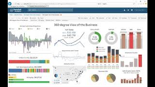
A CFO uses a dashboard to track lead and lag metrics side by side, clicking red flags like low inventory to drill into details by business unit. The tool projects cash flow 60 days out, showing inbound receivables against outbound payables and payroll, and lets you model scenarios like excluding a disputed payment to see if you'll hit your credit line.
Chapters
This video is part two of the Data Self Analytics Trial video series. To learn how to get to this page, be sure to watch the prior video. Links to them are in the YouTube description below. Part 2 video will explain how users interact with this actionable dashboard. If you can't find this dashboard on your Data Self Trial portal, click this Start here and select this Dashboard. This dashboard was designed by the CFO of one of our clients. The CFO received this dashboard by email every morning. The left side of this dashboard shows lead metrics, metrics that are looking into future transactions such as cash flow projection in orders to ship. The right side has lag metrics, metrics that look at past performance of the business. When something on the dashboard needs attention, the CFO clicks the dashboard on the email and that launches the dashboard on a web browser or on a mobile device app. From there, the CFO can drill down into more details to understand the underlying trends and then take action. For instance, this red bar means inventory on hand is too high. By clicking this bar, we'll drill into more details about inventory, including inventory by business unit cost on hand by the top 10 products today in the warehouses where the top items are. Let's go back to the main dashboard and take a look at the cash flow projection section. Here's the inbound money from receivables for the next 60 days. Here's the outbound money from payables and payroll. And here how much money is in the bank today? By adding all of these metrics, we get the cash flow projection. As long as the minimum cash flow projection doesn't cross the line of credit, the CFO doesn't have to worry about cash flow. Now. This projection allows what if analysis. For instance, let's exclude this payment because the client is disputing it. Well, if that payment doesn't come in, we'll have a cash flow problem to be worked out. Cash flow went beyond the line of credit. As shown here. Dashboards should inform key trends at a glance and allow users to easily drill into details to take action. Please watch the next video for accessing popular dashboards. Thanks for watching Data Self Analytics Trial Video Part two.