DataSelf Analytics Web Trial
Walk through DataSelf Analytics Web Trial at www.dataselfbi.com using demo accounts U0–U9. See pre-built sales and financial dashboards, blend CRM data with Google Analytics, and build custom reports by dragging customers, products, and dates into sheets. Create maps by customer state and save your work.
Questions this video answers
www.dataselfbi.com
10 (U0 through U9)
The username and the password are identical; passwords are the username in all lowercase.
Chapters
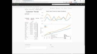
Thank you for your interest in testing data self analytics. Go to a web Browser and enter www.dataselfbi.com and for user credentials, the username and the password is exactly the same. We have created 10 usernames. U0, U1, U2, U3, U4, all the way to U9. And again the password is exactly the same as the username, all lowercase. So right Now I'm clicking U1 password password U1 all lowercase. Click Sign in. When I got in here I can do a few things. The first thing is just to navigate some of the pre configured reports for simplification. Right now just click the views and then you can see the views using the snapshots or the list. You can go either way. I'm going to click on the thumbnail. For now you can just navigate to this list and choose one of them and just click and see the content. So in this case I'm looking sales trends by month and six month moving averages. So, so sales is green bar, the six month moving average is an orange bar and here are the details. Click home to go back. Most of these views right now they're just for sales analysis, but there's also some others. So let's search for financials and we have a few financial dashboards. A sample. I'm going to click the first one here. By the way, if you see two names the same with an IP here, it means that this dashboard has been optimized for the user experience on iPhones using the Tableau mobile app. You can also see this using mobile devices such as smartphones and tablets on iOS as well as Android. Just search for the Tableau app on the app store. So let me Click on Financials KPIs by location. So this is just one sample dashboard. And the main story here is the person who created this dashboard created only two ways that users can drill down into this dashboard. So I'm seeing some major KPIs for each location. I also have the details here as numbers. If I click the Atlanta bar I see these two links which were created by the person who built this report. And if I click on any of these links it goes into a completely different report. Can be any report, even from other areas. You know right now when I click to that report you went to the Atlanta office yearly balances and monthly balances. But when you drill down like this you can go to any data. Could be revenues, could be purchasing, could be inventory, could be CRM information, could be payroll from Excel, spreadsheet data, self has capabilities to drill down into any related data. So just some ideas of how you can navigate. Let's make another change here. In select who's hot dashboard, I'm going to click on who's hot. This dashboard has actually three different tabs. The first tab just shows information from CRM. In this case, number of contacts by customer and type of contacts, including website hits which come from Google Analytics. So now in this particular view I have CRM information as well as Google Analytics data. In data self you can blend data. I'm just showing the result here. The bottom we have the same kind of information by geography and also opportunity amount for top product lines. If I come here and I choose a single state, it changes in the top customers that belong to a particular state. I can also use the mouse or my fingers. If I'm using a mobile device to select a few regions and automatically the whole dashboard changes on the next tab here I have customer trends. In this case I'm looking for a particular customer. So I see sales by month 2014 15. I see accumulated sales throughout the year and I see 2015 bigger than 2014. Awesome. Better business with this client. But I also see red. The profitability is low. If I click on red Here, the dashboard has been created that I automatically go into another dashboard for the same customer. Looking from a profitability standpoint, in this case by product line. This was all built in by the person who built the dashboard. So when people are using this, they go into the right user experience, providing them with the right information that they need to make better decisions. All right. So feel free to navigate and to clear the filter you can click this X button. So now you see all the views. There are workbooks which are setup views and views. Feel free to navigate over here. Next I'm going to show you how to build some reports from scratch. So go to data sources and I encourage you to click on one demo sales. It's easier than the other one. But check this box for one demo sales, go to actions and choose new workbook. So I'm starting now a new workbook from scratch. If you see something here that has already been done, some other data that maybe someone else was working on this click the revert button here and it should clear it out. So once you clear it out, you can start building the reports from scratch. For instance, what if you want to see sales this month by customer and product and invoice number. How can I see that? Well, here I have dimensions like customer invoice information, product sales people and so Forth and these are the numbers that I can analyze. So let me take customer, expand and bring customer name, drag and drop to my rows. So these are all the customers in my sample database. Well, I want to see sales, so I take sales and I drag and drop into the text button here or mark. And now what I see is sales in the whole company history by customer. Well, I want to see this month. I couldn't go different directions now, but let me bring invoice, date and drag and drop into my columns. So right now I can see sales by customer by year. Well, I can expand year by clicking the plus signal. And now I see information by quarter. I can expand quarter and go into sales by month in the whole company history. And I could drill down to weeks, to fiscal periods. Whatever has been built in the connector, I would be able to go in that direction. Now in this example, I only want to see sales in a particular month. So I'm going to drag and drop invoice date into my filter shelf and I'm going to click this arrow pointing down and choose year. So right now I'm selecting a few years. I only want to see 2016 data. So right now, all months for 2016. There it is. Well, I only see a few months. I'm going to drag and drop again invoice date into my filters area right below the other one. So twice the invoice date into the filters. In this case I'm going to select month on the right here. Now I have year and month filters. At any point I can just uncheck and select only let's say a particular month. And then, hey, I want to see how I did last year for this month. Now I select 2015 or 2014. So for the same month I see sales across the three years. Or maybe I only want to see two months this year. Very easy. Point and click and you get the result. Well, what if I want to see also sales by customer by product? You drag and drop, come to product, find product, drag after the customer. You see the orange arrow pointing down after customer name, I drag and drop over there and right there I see sales, buy customer by product. Let me remove one of the months here. Cool. Customer and product. What about invoice number? No problem. Invoice fields, invoice numbers. Here I can drag and drop after product or between customer and product. You see the little triangle orange between the two. I drag and drop over there and buy customer by invoice product sales in the particular month. So that's one report. Pretty straightforward. Drag and drop. Let's click this little icon for new sheet. Now we have a second report. And I'm going to double click sales. And I have a bar for total sales in the whole company history. I'm going to double click invoice date. And now I have sales by year. And then for the year here, I'm going to click the arrow pointing down and choose not this month, but this month here, which shows month and year. So now I have sales for the whole company history. And then in this example, we have combined in the data warehouse the sales from the ERP with Google Analytics website visitors. They're all already blended in this demo sales connector. Now, as a business person, I just drag my website visitors besides my sales and what I have now is sales here and website visitors. If I click website visitors here, I can change the representation from automatic to bars. And now I have sales at the top, website visit at the bottom. Pretty cool, huh? Last one. I'm going to create a new sheet and do some geography analysis. So now I'm going to go to customer address. It could be shipped to. It could be anything that has an address. I choose customer state. I press and hold the control button. I choose invoice size and sales. Now I let the control button go. I go to show me and I click this map representation and voila, I have a map. I'm going to click show me again to collapse that particular menu and I'm going to click the size to make the bubbles a little bigger. I click on the area here in the middle and I just use the mouse button to get a little bigger. And I can use this particular cursor here to drag my map to any position that I want. So bigger bubbles, bigger sales. And the bubbles are sliced by colors which represent the aggregation of sales for different invoice sizes. So just some ways to show you how you can build new reports from scratch. You could save them. You could actually build dashboards right now if you're using the desktop utility. This is just a quick overview. If you have more questions, if you're excited want to talk about it, feel free to contact us at the Data Self website. We have phone number, emails and so forth. I hope you enjoyed and feel free to call us anytime. Thank you very much.










