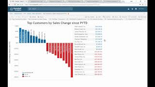
DataSelf Cloud Analytics is a Tableau-based platform that lets users build custom dashboards and run what-if analyses on financial data. The demo shows interactive features like drilling from product to city-level details, setting profitability alerts, and exporting reports to Excel or PDF.
Chapters
Data Self Cloud analytics provides an easy and fast way to get actionable information in the hands of your team, CEOs, CFOs, salespeople. Actually anyone with proper authorization can securely access in slice and dice their reports over the Internet. Here we're going to see an example. Upon logging to Data Self Cloud analytics, users will see a dashboard of their choice. This is an example of a dashboard for a cfo. From here, users can interact with data in many different ways. For instance, on this 60 day cash flow chart I can do a what if scenario where I can see the impact of removing a disputed Accounts Receivables receipt. So I exclude that inbound payment and then I can see what happens with the projected cash flow in the next 60 days. So a little what if scenario here. Users can easily access other favorite reports from here. So let me choose another one. Top Customer by Sales Change since last year to date if I'm a salesperson I don't want to forget to frequently check the status of these critical clients. So I'm adding this report to a subscription for every Monday morning. No more forgetting. Every Monday I will automatically get this report with the latest information in my inbox. On the other hand, an admin person can schedule bulk subscriptions, let's say monthly financial reports to board members and daily sales reports to outside reps. I can search for reports. So I'm going to go here and put year over year over year sales and select the year over year sales by product. Here I'm comparing year over year sales by product for the month of June and I can pick any other month or combination of months for a specific salesperson in this case is JB and if I click and select different salespeople as I add them in this filter, the report would automatically add input the additional sales or this filter can be automatically applied based on user credentials. So if I'm the VP of sales I have access to every one sales and I can slice and dice the data as I want. But if I'm a rep I can only see my own accounts, I cannot see anyone else's. Now let me remove these other users here other reps and let's say that I would like to see all the transaction details behind this particular sale. I come here, I click View data. I want to see the full data with all the columns. Now this show all the transactions behind that particular sale and I can download this file to an Excel sheet from where I can do I can share with other people or I can do further analysis if I want to so all the details, invoice information, figures, everything is in here. Now let me expand this report into more details. In the drill down that I'm going to show is configurable meaning you can control what level of granularity users can expand into. In this case this report was created in a way that I can expand from product and see invoice number and then if I click expand again I can see to what ship to each one of these invoices was sent to. If I click expand I can see ship to city. In this example I'm only showing sales data, but I could drill down into any other related information such as AR balances or CRM information. Now what if I want to download this whole report into Excel before I drill down into the details behind a number. In this case I want to download this whole report and share in a different way. I can click download, I can export into different formats like PDFs. In this example I'm going to export across tab which will put this whole report into an Excel file. It's that easy. The whole report is here now in Excel. Finally there are KPIs that I only care when they cross a certain threshold. Let me see an example. This example I only want to know if profitability goes below 45%. What I do is I click the profitability axis, I click alert and I set the criteria. So I only want to see if it goes below or equal to 45%. Right now is showing the red line is 45%. When do I receive this? Only the first time. That is true. Who should receive it myself and I can choose anyone else to receive this report and I create the alert. That's it. Now I do not need to check this dashboard anymore because it will notify me if that condition is met so I can keep my focus on what matters now. The last great news is that you can get up and running with Dataself cloud analytics in a matter of hours. Please contact us, go to our website and click Contact us to learn more. Thanks for watching.