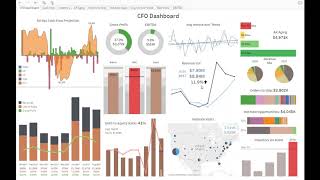
A walkthrough of DataSelf's CFO dashboard showing financial and operational metrics in one view. The demo includes a 60-day cash-flow projection, expense vs budget tracking, and sales data showing 11.9% year-to-date growth. Interactive drilldowns let you click into details, and scenario modeling shows how changes like a delayed payment affect your line of credit.
Questions this video answers
60 days
About 11.9%
An opportunity with 50% or more probability
$1.8 million
$2.2 million
Chapters
This is an example of a dashboard creating using the data self out of the box solution. Let me put in full screen because this dashboard was optimized to work like this. The whole screen has all the charts. This is CFO dashboard. The left part of it has primarily KPIs looking at financial information. The top left has a 60 day cash flow projection. So pretty much, you know, clicking here I see how much cash I have today. Then I look at the receivables, payables, wages, you know, see the outbound and inbound money coming the next 60 days. If I click projection I see the accumulated money I'm going to have. And this line here is like a line of credit that I have. So as long as the negative doesn't go above beyond the credit line, I'm fine. So just an example showing cash flow and let's say suppose that one of these clients paying something goes wrong with a certain order, they're going to say they're going to delay the payment. What happens if I cancel and I remove this payment here? Boom. You know, my cash liabilities go above my line of credit. So I'll have to do something about it, maybe push some payments or you know, whatever it takes to take care of that particular problem. So anyhow, Here we have some other financial KPIs. Here we see revenues, cost of sales, gross profit on a year to date basis. All of this except the cash flow, everything is here, year to date, gross profit, ebitda. So if I click on EBITDA here I go to a drill down of it showing by month how much it was, what is the accumulated throughout the year. Some information looking on a chart format. So just by clicking on it I went straight into those details here looking some expense accounts versus the budget in this example, three of these expense accounts are really closely watched by the CFO. And marketing is above the budget. And it's red. So everything that is kind of red here it means we are over or it's kind of, you know, something we something not good that we have to pay close attention to. The bottom here, some debt to equity ratio by month and what the percentage is. So left side mostly financial KPIs. It could be anything. And clicking on into these charts can go into more detail, whatever you want. This example of this dashboard is for a, a very sales driven organization. So the CFO also has on the right side of this dashboard a bunch of different metrics and KPIs circle around operations and sales. Right here in the middle there's a Big one, which is revenue year over year in this whole section here. Blue is last year sales. Black is this year's sales year to date sales. There's a growth of about 11.9% since last year to date. These two curves are showing sales on a monthly basis. The top one shows how the average invoice amount trend is going. The company wants to make the average sales to go up. In this case, the black dotted line is going up. So the trend is going up, which is a good thing comparing to last year which was pretty flat on the bottom. We have some information coming from Google Analytics. So right here we look at some financial information. There's actually no invoices that were shipped in here. Google Analytics data and the cfo, they're doing some campaigns to improve more website visitors, especially on the east coast. You know, right now most of the transactions comes from the west coast. So as you can see, the blue is getting bigger. The blue is the dark, the black is getting bigger than the blue, which is the goal. Increase more website visitors from the east coast. And this is the total for the whole country. There's more transactions or he's this year than last year, which is pretty good. Now if I highlight, let's say the east coast states right here, I can tell there's a major growth since last year, more than double the size from last year. And I can also drill into more detail. If I click web visit zoom and I click on it, I go to this other slide that shows only the states that I selected and see what happened from last year to this year. And overall it's a lot better, darker. Meaning Florida grew a lot a lot of these states. New York has a bigger growth in website visitors since last year. So good things as well here on the top right ar aging. So you know, red indicates not good. So if you click on any of these bars, you go into more into detail automatically in this case showing what over 60, which is what I clicked on the prior dashboard. It shows all customers invoices and how much is the balance that is over 60 days late. Also there's some revenue mix. You know how the revenues have been doing since last year, this year. So the bubble grew meaning we have more sales since since last year. And primarily this lightning sales is the one who grew from was 8% last year, now is 14%. These are the orders to be shipped. So open sales orders that are pending. I can see here individually the largest clients with order ships. If I click on any of them, I go into another tab with more Details. These are hot new opportunities. So now we're looking at CRM information. What opportunities are in the pipeline being hot and in this case hot means 50% or more probability. In this case there is 50% and 80%. If I click on any of these it shows there's 1.8 million for 50% probability. And if I go to 80% there is 22A 2.2 million in potential sales. If I click hot new opportunities, I go into more detail and I see all account names, account manager probability and how much the open opportunity is. Finally, again, it's a sales driven organization. They sell products and they keep a close eye on inventory. If the inventory goes above this threshold, it's bad. So this is showing you know by quarter how the inventory on hand is. And in this quarter it's too high. So if I click on this bar too high, it drills into another dashboard that shows by business unit how the inventory is. And here the top is top inventory on hand. So this information is from financials, this information is from the inventory module and by warehouse where these top items are being allocated. And if I put the mouse over I can see transactions changing at the bottom. So very interactive. One example of a dashboard creating using the out of the box solution, picking reports from financials. This one has AP ar. There's a bunch of information coming from different places. This is from invoices, this is from Google Analytics, Receivables, open receivables, open sales order, CRM information and also inventory on hand. So information coming from all different places. I hope you enjoyed the video.