DataSelf Desktop Trial - Building a Dashboard
Walk through building a DataSelf Desktop dashboard from three worksheets: customer and product sales, a trend analysis with dual-axis bars and lines, and a geography map colored by account manager. Then assemble them into a dashboard, apply a date filter across all sheets, and use one worksheet as an interactive filter.
Chapters
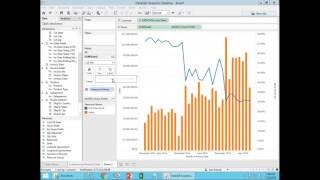
In the next few minutes, I'm going to show you how you can build this dashboard from scratch using the extract from your data and the data self desktop trial. So let me show you. Let me get out of this first. So I assume you already have installed dataself desktop on your computer and you also have an extract file from data self like this one, something tde. So once you have this, you just double click the extract file. It will open Data self desktop. Then you click sheet one and you should see something like this, the extract name and then dimensions and measures. Now I'm going to start building the report from scratch. The first one I'm going to build is showing customer and product sales this year. So I want to see customer information. I find customer information here. I drag it into my rows. So just drag and drop. So these are all customers from your database. Now I want to see sales, so I take sales from here and I drag and drop it into this area here. You have to see this square box around it. Not here, not here, Right in the middle of this area. So now I see total sales by company by customer in the whole company history. Well, I want to see this sales this year. So let's drag and drop invoice date into the columns area right here or right here either. We'll do the same work. So now you should be able to see by customer sales by year for as many years as you have in your database. All right. Well you could if you wanted to expand year by clicking on the plus signal. Now you see sales by quarter. If you click and expand quarter, you can see sales by month. You can do this at any time during your query building. Let me collapse here. I just want to see year at this point. Now I want to see sales by customer by product by year. So I find product in the list of dimensions and I drag and drop either. I can put it. Oopsie. Press enter. I drag and drop. Maybe here is one way to go. So now buy customer by product. I could drag product actually and drop it in front of the customer. You see the little blue triangle over there? It means I'm going to drop it right here. So now I have product and customer. But in my example, I want to see product after customer. So there it is. By customer by product by year. Well, I only want to see one year, not all years. So I want to filter this report for a single year. How can I do it? I find the invoice date and I drag and drop that field into the filters shelf. So drag and drop now you can select different filter criteria. For this example, I'm going to choose relative date. Click next I'm going to click on years to show this year and click ok. Now this report will always show this year's worth of data. If this was a production system, this would always show this year's data. Now usually when you build a filter, I recommend coming back to the filter you just added. Click this arrow pointing down and choose Show Filter. Now the filter will be on the right here and next time will be super easy for you to click on the filter and choose different periods that you're filtering the information by. Anyhow, so I'm going to keep this year for now. So that's my first report and I'm going to double click on the sheet name. Or I can also right click and choose rename. So either or double click on the name of the sheet or right click on sheet name. I'm going to call this Customer and Product sales. Okay, that's the first report from my dashboard. Second report. Let's click this button to create a new worksheet. And this one is going to be a trend analysis that I want to see sales and gross profit. So I'm going to take sales and I'm going to drag into my rows. Either here or here is the same result. I'm going to drop it here. So right now I'm seeing sales, the whole sales and the whole company history. And I want to break down sales by month so I can drag my invoice date to my header, my columns either here or here. So I'm going to drop it here this time. So right now I'm seeing sales by year. Well, I want to see sales by month so I can click on the arrow pointing down and choose month. This will be showing month and year. Don't choose only month, which will only be month regardless of the year. For this example you see month and year. So now I have on the bottom month and year. So I see sales throughout my whole company history. Now I also want to see gross profit together. Percentage gross profit. What you do, you drag and drop. So percentage gross profit. I'm going to put on my rows besides my sum of sales, so now I have sales at the top and gross profit at the bottom with their own axis here. Well, I want to see both of the measures together in a single chart, not separate charts. I want to see a dual axis approach. So I come here. Let's say on the percentage gross profit I use the arrow pointing down and I choose dual axis What I have now is percentage gross profit as a line in blue and sales as an orange line and then sales here and gross profit here. Well, this is still a little confusing because both are lines. I may forget which one is sales and which one is gross profit. So typically I recommend making sales actually something a different representation or maybe gross profit a different representation. How can you change that? Well, in this marks shelf we have all lines, sales properties and percentage properties. I'm going to click on the sales here and now I looking at the sales properties instead of using automatic, I'm going to choose bar. So what I'm doing now I'm converting sales into bars instead of being aligned and I'm going to make these bars a little thinner. They're kind of too thick. So I click size and make these bars a little thinner by dragging to the left. So now it looks a little better, maybe a little even thinner than that. Okay, that looks pretty good. And let's double click or right click rename and call this sales and percent gross profit. Okay, that's the second report. The last report is a geography analysis. I'm going to click new worksheet and now I can use ship to or customer address. In my example I'm going to choose customer state. I'm going to press and hold the control button on my keyboard and choose sales. Now I have both fields selected. I can let the hold button on my keyboard go. I go to show me and I click this geography approach. So now I'm seeing the map and then in my case I see sales by state and provinces in U.S. and Canada. Well, I want to make the bubbles a little bigger. So click size and pull to the right. Now bigger bubbles, bigger sales. But I want to slice my bubbles by colors of my account managers. So what I'm going to do now is take account manager. I'm going to drag and drop into my color shelf and I want to add all of my account managers with 35. So click all members by default. The automatic make this representation, which sometimes is not very informative. I'm going to click and choose a pie chart instead. So now I have pie chart showing sales by different account managers. But I want to be able to filter to only see some account managers, not all of them. How can I do that? How can I filter just by some account managers or anything else? You just drag and drop whatever you want into the filter shelf. So I'm going to take account manager drag and drop into my filter shelf and I don't want to see them all I just want to see let's say the first five and click ok. Now I'm only see the first five and I see their colors again. Every time you add a filters, I recommend clicking the arrow pointing down and choose show filter. So now I have it on the right here and then I can easily change that and become so much easier to edit the filter content. Good. So now I'm going to double click sheet three and I'm going to call account manager Sales by state. Those are the three reports part of my dashboard. The next step is I'm going to create a dashboard. So I go now to this button and click new dashboard and by default come here and choose automatic. For now, automatic is a good depot option. And now what you do is you drag and drop these reports into the dashboard area. So let's take the first one and just drag and drop. I'm going to take the trend analysis and drag it and drop not on the left, not on the top, not on the right, but at the bottom in this case. So my maps at the top, my trend analysis at the bottom and take my last report and drag it on the bottom right corner. There it is. Now I can make adjustments here. For instance, I can make this go a little more to the right, give more focus to my. Trend analysis and also let me go back to my map and also add the invoice date in my columns so I see the very top, the dates and how things are growing over years. So let me go back here and this is not yet as I was looking when we started. Let's say I only want to see this year, not only for this report which is showing right now this year, but for all reports. How can I apply this filter invoice date across all the quadrants. I can click on the invoice date anywhere. And then when it does have this box, I click this arrow pointing down and I choose apply to all worksheets using this data source. When I do that now every quadrant of my report on my dashboard will be controlled by this filter. So now it's all showing 2016 information. Maybe if I come here later and I choose previous year. Now what I'm seeing is 2015 data. Very easy. Let me give a little bit more room to my report here so I see this information in full. Okay, cool. Also I can for instance click on any of these quadrants on this little use as filter. So I just click it and when I do that I can use the mouse for instance and mark an area like these three states and when they let the mouse go, it will control and filter down the information from the other quadrants. So right now I'm only showing for the previous year sales for those three states and this has been controlling this and this. If I want to disable those three, I just click anywhere else in the dashboard. I will go right back to where it was. Currently this filter is only controlling this quadrant. If I want to control all quadrants, I can come here, click anywhere on this filter, do the same thing, click the arrow pointing down. Apply to worksheets. I could select only one, two or three or all of them. Select all of them. Now as I check or uncheck, I'm changing the whole dashboard together and that's it. That's how create from scratch. What I did before when I started, I actually clicked this button which put the presentation in presentation mode so I see things bigger. I'm going to click Escape to get out of it. Now once you're here, one thing you might want to do is to save what you did so you don't have to start from scratch again next time. How can you do it? You come to file, click Save as and typically it will go into your My Documents, My Tableau repository workbooks. Put a name to your file to be my first dashboard or whatever name that it is. You click save and that's it. Now you can close Data Self Desktop and later you can reopen it again. You know it might be on your desktop or you might have to go to under Data Self the Data Self and qlik Data Self Desktop. When you open it up you can either click it should be writing these options the My first dashboard or you can go to File should be listed at the very top, the last one that you saved. When you click on it, you go right back where you left with all the work you have done. If this is a production environment, you would actually be publishing this to the Data Self web server. But for trials this is how you can save to see later on the work you did. And if you want to modify further, you could. You could create more sheets, more dashboards. You can create water workbooks. Feel free to experiment. I hope you found this video informative. Please call Data Self if you have questions or comments about how to do this. Thank you.










