DataSelf for Acumatica - Customizing dashboards

29 Jun 2018 · 4 min
3:41

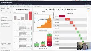
A business user customizes a CEO dashboard in DataSelf for Acumatica without coding. The demo shows creating a new sheet, adding sales trends with monthly grain and gross profit percentage, configuring a dual-axis chart, and dragging it into an existing dashboard section so other users see the change immediately.

Questions this video answers

Sheet 38.

June 29, 2018.

A dual-axis chart with bars for sales and a line for gross profit percentage (monthly grain by invoice date).


Chapters

More from DataSelf

youtu.be

Missed Shipments – Two-Minute Demo

11mo ago
youtu.be

Inventory Planning and Projection – Two-Minute Demo

11mo ago
youtu.be

DataSelf for e-Commerce – Two-Minute Video

11mo ago
youtu.be

Store Loyalty & Placement – Two-Minute Demo

11mo ago
youtu.be

DataSelf Overview – Two-Minute Video

11mo ago
youtu.be

Financials – Two-Minute Demo

11mo ago
youtu.be

Historical Data Loss – Two-Minute Video

11mo ago
youtu.be

DataSelf for Distribution – Two-Minute Video

11mo ago
youtu.be

Top Items to Top Customers – Two-Minute Demo

11mo ago
youtu.be

Google Analytics – Two-Minute Demo

11mo ago
youtu.be

Purchase Orders – Two-Minute Demo

11mo ago
See all content








