DataSelf for Acumatica - Sales dashboards
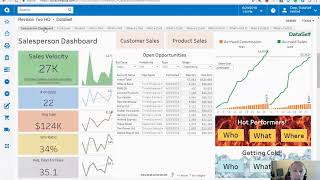
A demo walkthrough of DataSelf dashboards integrated with Acumatica, focused on a salesperson/account-manager view. It shows key KPIs (sales velocity, quotas, gross profit), daily to-dos (open opportunities), automated commission tracking (daily accruals vs. goals), and analytics for identifying "who's hot" and "who's getting cold" by customers, products, and geographies. The demo also covers drilling from summary dashboards into customer/invoice details, customer loyalty cohorts (e.g., customers buying > $15,000/month), and projection capabilities (revenue/expense forecasts). The content is instructional and product-demo oriented, highlighting out-of-the-box reports and actionable insights for sales management.
Chapters
What if I were a account manager like in Akumatica, you have this. Let me show the equivalent dashboard in Dataself. So this is kind of the equivalent salesperson dashboard in Dataself. The idea is as a salesperson when they log into Acumatica I should see something like this. The idea here is help the account manager to see where they are with their metrics that they're accountable for. So the left side of this dashboard shows the main KPIs they're responsible for. I'm showing sales velocity metrics, but this could be anything. Could be quotas, could be gross profit, whatever they're responsible for, show them right off the bat with these main numbers. Then the next thing is show them front and center things they should be working today. So in this example I have open opportunities that might come from Acumatica CRM or might come from other CRM systems like Salesforce and whatnot. And when it's supposed to close today, this week, whatever it is. But anyway, these are the to dos that I need to do today. Take a look and see what my day is going to be look like so I can plan accordingly. The top right corner is something that I'm so amazed that so many companies don't do a good job. Usually salespeople have a good chunk of their income based on commission. And the idea is many organizations just show the actual commission at the end of the month once all the numbers are crunched. And actually many salespeople throughout the month spend their own time trying to calculate how much money they're going to make this month. It's such a waste of time and resources. The idea is usually with data self we can usually completely automate the calculation of commission and show commissions as you go. In this example I have here for the past two months on a daily basis, the sales accumulating throughout the month for both months as well as the commission accumulating and also showing what the sales goals is. So the idea is keep salespeople knowing how well they're doing against their quota as well as how much money they're making out of commission. Keep them motivated. The bottom right corner has something that for some organization is so critical. The idea is salespeople should keep a pulse of hot performers as well as getting co performers. The idea here is who's hot or what products or services are hot? Maybe where is hot? By the same token, who's getting cold, what products and services are getting cold and where is getting cold? Let me show some example. I'm going to Click who's hot. So in this example I'm looking at the who's hot out of the box in data self. Two ways that we look at who's hot. One is top customers by sales this period. So we have the customers in a descending order. And what is this period? Well, out of the box right here I'm looking at this year to date, but I could easily choose quarter month rolling periods. So very easy to change the period. The other way that look at who is hot is also by top sales growth since prior period. In this example I'm looking at last year to date versus this year to date and who's growing the most. Maybe these customers are not big yet, but they're growing rapidly and that's because we define them as who's hot. And suppose you're looking at this list and you want to see more details. You know, let's say I pick a few of these customers and want to see exactly what products we purchased last year, last period, this period, how this, how it's growing. I just pick what I want and I click see details and then I drill into another subsection of this dashboard showing for each one of those customers the products they purchased last period, this period in the variance, dollar and percentage. So pretty straightforward in I have the same perspective for what's hot. So now I'm looking at products or services. What is hot? Looking from a geography standpoint can be country, can be state territories and whatnot. And what if you know, you don't care about sales? Maybe you want to see gross profit, who's hot from a gross profit standpoint or who's hot from a, I don't know, quantity, ship standpoint. You just come to the measure and you pick a different measure. If you want to see from a gross profit standpoint. There it is. My whole dashboard now changes to show who's hot from a gross profit standpoint. It's that easy. It's that simple things of advanced analytics that we provide. Now sometimes even more important than who's hot is who's getting cold. So let me click the who's getting cold button here and I go to this dashboard that shows who's getting cold out of the box. We have two ways to measure who's getting cold. Let me actually go back to my sales here. So one way is to typically look at top decline since last period. Again, in this case I'm looking sales last year to date versus this year to date and who's declining the most. The idea is why are they declining can you do something about it? In order to do something about it, you need to know who they are. So these are pretty easy way to keep track of those big declines. And as you put the mouse over a name of a customer on this chart you see in the centered area what products are driving the biggest decline for each one of these customers. So this is also one example of the advanced analytics capabilities that you have to have a solution like data self to really take advantage of. Very insightful. On the right side we have an exception reporting in this case it's no sales. So who was buying last year to date, but not at all this year to date. And the question is why can you do something about it? And by the same token, if you put the mouse over, you can see what products are driving the biggest decline. In this case the total declining sales from last year to this year. Alrighty, so this is the overview of our salesperson dashboard. Actually there's one more component here. Suppose when I see more details about my customers, I can click the customer sales button and I go to the other section that shows in whatever period like in this case I'm looking at this quarter, but I could change very easily the periods. So in this case, in this quarter I'm looking all for all customers, all the sales, all the details, all the products being sold this quarter and year over year trends by month and also accumulated throughout the year for the past three years for all of these customers. So quarterly information as well as year over year trends. Now what if I want to see a specific customer? I can come here, click this and choose, I say Sacramento Industrial Supply right here, I click on it. Now I'm filtering the whole dashboard to only show information for Sacramento Industrial Supply. So here I see the invoice details for this quarter, I can see what products were sold this quarter as well as I can see year over year trends for this customer for the past three years. And what if I need to call the customer? Do I need to find the phone number? Nope, I just click here call the customer. And again if my computer is connected to a phone system, it will place a call. If I'm looking this from a mobile device, it places the call right off the bat. What if I see one of these invoices and I say something is wrong about it, I want to see what the details are. I can click on the invoice number and it opens in acumatica that particular invoice number. So very easy to drill down from a high level dashboard into underlying data at any shape or form again, in Ecumatica, the drill down is usually easy to do from one point to the underlying table supporting that particular data point. In dataself, you can go in any direction, any drill down and drill through. As long as the data is related, we can take you from one place to another place very, very easily. And then we also provide, as I mentioned, more than 5,000 ways to slice and dice your data. Here in the customer view, I have two more buttons that can give me more ways to see customer trends. This is more advanced trend analysis, and this is like no customer loyalty analysis. So if I'm going to click customer loyalty, I can open a dashboard outside in this case of Acumatica, that will give me more options. This is also a little out of the box. We have different ways to show customer loyalty. In this particular dashboard, you can tell, let's say I want to see which one of my customers have been consistently buying from me more than $15,000 per month per year. So just choose $15,000. And now it aggregates. The blue bar shows customers that have been in this category for four or more years. This shows customers that have been buying more than 15,000 for three years, for two years, one year and whatnot. One of our clients, actually recently when they see this dashboard, they found out that they had some major issues in their sales commission structure because the new sales commission structure was helping clients get in the door. So they're having no issues getting new clients, you know, in the first year. But they were not doing a good job retaining the customers. And slowly but surely they would lose traction over time because nobody was looking at that trend. When they saw this dashboard, they realized they had a problem, they hired more people, they changed some of their commission structure, and they were able to reverse the trend because now they know the problem and they were able to fix it. And that's what we have out of the box. Lots of reports with a lot of different insights. So you can focus on things that really matter for your business. You don't know what you don't know. And out of the box we can give inspiration on metrics that have been working for other organizations that are similar to yours. So you can make a big impact in your business sooner than later. So that's another example out of the box. Let me scroll down to see some other examples. This is the same dashboard, customer loyalty, but inside of Akumatica, projections by product, by revenues, expenses, whatever you want to do, you can do projections very easily. Very powerful algorithm to calculate projections.










