DataSelf for Construction with Natural Language
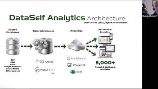
Johnny Girardi shows how DataSelf pulls construction data from scattered ERPs and spreadsheets into one warehouse, then serves it through dashboards with natural-language search. Pre-built KPIs cover sales, WIP, cash flow, and financials. Starts at $299 a month.
Chapters
Hello everyone, my name is Johnny Girardi. I'm Data Sales founder and CEO. First of all, thank you very much for joining us. I hope you're staying safe, well and sane, which has been my major challenge. Thank God. Let's jump right into our webinar. Today we'll be talking about key performance indicators, natural language and analytics for construction companies. The first good news is construction companies, they have a lot of valuable data being collected by their computer systems. Just give some examples of clients that use Data Self and our construction companies. You know these are proper ERP systems, Acumatica Dynamics, Sage and Netsuite. And people use a lot of these systems to manage their project accounting, their sales, their revenues, financials, whatnot. But companies also use, you know, Excel Google Sheets for some information reporting and they also usually have other systems like CRM, E Commerce, Google Analytics, Payroll. Overall, there's a lot of different systems that organizations use to manage their construction operation. So I'm just giving here a snapshot of common systems, banks and whatnot. Data Self we're not a construction company, but we use more than 20 different IT systems so we can run our business all information all over the place. And we call this, Oops, the data house divided. If you're a modern company, you likely have a lot of systems and they're helping your team to do their jobs. And if you or your or your decision making, decision makers are trying to see what's going on with your operations typically becomes challenging. You have to go to every system to see reports. You have to know how to log it, how to log the credentials, where the reports are stored, what kind of dashboards are available. Sometimes the answer to your questions is between two different data silos. Now you have to get the data outside of those silos, combining some kind of Excel, some kind of framework and build reports and dashboards. So a datahouse divided has a problem. A lot of decision makers complain that they are flying blind. Information is right there in their systems, but it's not easy to get out. So managers complain they're making too many decisions that are based on gut feeling alone or it takes too long to get to the right information and this is affecting management. So flying blind, a big problem of systems used by construction companies. And overall people say eventually they grow into what they call an Excel. Hell, absolutely nothing wrong with Excel. Excel is a great tool, but using tools like Excel or reporting services, Crystal, if you're using system like Acumatica, GIS and whatnot is when you have too many of these separate reports that someone built, who knows if they built correctly, who knows if the data is being maintained correctly. When is the data being refreshed? Is it reliable? There's so many problems when you use this simple report reporting tools to maintain a single vision of your of your system. And people call if you use Excel, Excel hell or GI hell or reporting services hell. It's just very hard and very labor intensive. Usually you know, people have people spending hours and hours and hours weekly, monthly is an error prone process because people have to do mechanical things. So these are the high level challenges that people come to data self decision makers complaining is flying blind and the people supporting decision makers, they say it's very hard to get data out of their data silos. How do we solve this problem? Primarily by using an inexpensive yet amazingly powerful enterprise BI and analytics platform. At the end of the day, we pull data from your data sources. If you're using ERP and you only care about ERP data, Absolutely. We take your construction information, your financials, your project accounting field service, whatever you have. We put the data in a separate database called a data warehouse. A data warehouse is a place where you can keep the single version of the truth easily and quickly. And you can tell the computers to how to maintain how often you want to refresh this data, how do you want to calculate your KPIs? You program your computer and once you do it, it becomes completely automated on schedule. You don't have to worry, you have the same information at the right time delivered to your users. So data warehousing is a big piece of the puzzle that can dramatically simp the house divided problem, the labor intensive and who knows if the data is accurate. We make it super simple to deploy and maintain data warehousing. We use a tool called data self ETL extraction, transformation, loading. I'll show a little bit a bit about it later on. But this is an amazingly powerful yet simple technology to get your data together from your ERP in any other data silo into a single data repository. Once your data is in this beautiful clean refresh status, then we use tools like Tableau, Power, BI and Excel to do the magic. This is a kind of framework where business users with little training, sometimes no training, they can quickly, easily, anytime, anywhere, access the reports and dashboards, slice and dice them, use natural language machine learning in all of these bell and whistles that technology is providing today to empower these people to be more self sufficient, coming up with answer to their questions about business operation trends. Not only that, but we also have built over 15 years doing this from so many companies out there. We have served hundreds of small and medium sized business out there. We have built a comprehensive library of reports and dashboards and key performance indicators that pretty much in minutes. Once we deploy Data Self to your system, we can inspire your decision makers to be more effective about looking those KPIs and we'll show some of them very shortly in the product presentation. So this is how we solve the Datahouse divided and automating labor intensive tasks and making easy in anytime anywhere for decision makers to become no longer flying blind but having clear visibility of everything that they care coming from a single version of the truth. Let's see how the solution overall works. I'm going to touch very different pieces of the whole Data Self framework. In the next 30, 40 minutes. I'm going to talk about the vision of the Datahouse United. I'm going to show natural language, how users can actually find answers to their questions. Just type in plain English questions. I'm going to show out of the box key performance indicators for construction companies. I will show how to do customizations in the system in the front end as well as in the back end in how report distribution works. Automatic report distribution works. So we're going to be touching a little bit of everything. If you're a business person, you're going to get some value. If you're a business analyst, you're going to get some value. If you're a consultant back in person, you're also going to get some value out of this whole presentation. I keep it high level so everyone can follow pretty much everything. But we'll go into the weeds of all the pieces of the solution. All right, so now I switched into the Data Self analytics portal. This Data Self analytics portal can be its own separated website that your team goes to to see your kp, you know, everything together. Or you can embed these reports and dashboards into your own applications. You know, if you use tools like ERPs like Acumatica, Netsuite, Sage X3 1 0, you can embed these reports and dashboards inside of your application. So users don't even know that the better bi the better reports more interactive are coming from. The Data Self framework can be completely embedded in most applications. Having said that, when you log into Data Self or you and your portal that have your Data Self dashboards, typically you can have something like this. So in this example actually let make this a little smaller so I guess a little bit more real estate. In this example I have full rights to Data Self in all these data, different data points. So I have my ERP information, you know, my sales, my contracts, my cash flow, my financials, you know, if I have inventory, my inventory, my purchasing, if I manufacture things in my construction, I have a manufacturing component. If I have payroll, you know, paychecks, ADP if it's embedded in your ERP, doesn't matter if you have a CRM system like Salesforce, if it's embedded in your ERp, if it's HubSpot, whatnot, you have E Commerce. All of your data silos, no matter how many you have, can be all embedded in the data warehouse and available in a portal like this. So as a user, if you have access to everything, you just go to the area that you want to see if you don't have access. Suppose I'm a salesperson. Well if I'm a salesperson I will not see paychecks, I will not see financial cash flow, you know, I will not going to be able to see manufacturing. So I'll only see sales and maybe contracts and opportunities. Right, that will be the only areas that you can see. So security, we have a very elaborate security framework to control what each user of group or group of people can access in their system. So but this is pretty much how a user will experience the Data House United. All your data silos that you care are in a single place. You don't need to know credentials to any of the systems. You just get what you care from a reporting standpoint in a single location. Maintained, refreshed, secured, centrally. Very empowering. Now so this is the kind of the Data House United framework. Now suppose that I want to see some of the data self out of the box reports and dashboards for construction. So I'm going to show that. Now I'm going to show some sales, some contracts, cash flow and financials. So these are very popular and I'll focus this on this. Only today we have more but I'll focus on those areas. So on the sales side, this dashboard here is fairly popular. The idea is looking at your revenues this year by month. And you can choose on the right here the year and the month that you want to analyze. And then right Now I'm looking 2020 for the first six months of the year. Actually let me make this a little smaller because I want to fit in my screen. There you go. Then I can see the total this year, the total last year, variance in dollar and percentage, how my sales this year, which is the dark blue, compares to last year buy period. I can see the territories that I'm selling to in the bubbles represent sales this year. Black is growing, red is declining. So Texas is growing by 14% while in Illinois I'm declining by 8%. Kind of easy to see those data points. And then I see my customers last year, this year in the variance in my projects. In this example, my projects go across multiple years. So prior year, this year in variance, everything from a, from a sales revenue standpoint in a single dashboard. And it can be easily customized if you want to add here different data points, project managers if you want to add cost centers and whatnot. Easily customizable. But these things are highly interactive. Let's say I want to see the whole year, not only the first six months. Sure, I can select the whole year. Press apply. Now this dashboard shows the total last year which is for the full year versus the sales this year which goes through only June. So I'm not being fair comparing whole year versus prior year. That's why I'm declining so much. And pretty much everything here is showing is decline comparing whole year versus partial year. And then if I'm looking at my customers, let me go back to the six month framework because I want to do a year to day comparison. So I'm back now to the six month comparison and I see that this customer is declining in sales a lot. Suppose that's something you want to, you want to analyze. If I select this data point, what happens is the whole dashboard changes to show the revenues by period, the totals where my construction sites are, in what projects that this customer is involved. Very interactive. Or maybe if I want to select the two customers are declining in sales by selecting these two, it aggregates both of them together, shows me the total, the trend analysis locations in the projects involved, Very interactive. And then the idea typically is to allow decision makers to see information at a high level aggregation level like I'm showing. But if they want to drill down and see details, they can click the show details option here. And when you click show details it will open at the bottom of your reporter dashboard every single transaction detail associated to those data points. Right now we're looking at revenues, so I'm looking as invoices. I can see invoice date, invoice number. In this case I have product monot. I could see all the details. So easy to go from the high level KPIs and numbers and drill down to transaction detail information if I want to. So very popular dashboard for pretty much every company that is focused on revenues. This dashboard has been proven to be Very, very insightful. Some of the other things that in our ways of analyzing on the sales side is popular rankings. Sometimes people want to see rankings of, you know, customers, how they're changing ranking over time by year by period. So this framework can easily show rankings of customers across again can be periods and can be years if you're working at the year level trend analysis if you're looking at what's happening with your numbers across the years. So in this example you know dark bars is to this year lighter blue last year even lighter blue even go back, you know, so you can see your sales by period, your gross profit line monthly, how things are changing. Kind of very interactive to see those data points. So these are some of the sales dashboards and in this solution we have almost 100 different KPIs built into these dashboards that you can. I'm going to show later how you can see more examples of the KPIs embedded in this out of the box. But let me show contracts. Contracts or project accounting which is very critical for financial companies, for construction companies. Let me go to the wip. Historic WIP reports is usually a big part of the construction operation. And right here you can see your projects ID description status and then you can see the contact, the contract amounts, the estimated costs, the gross profits, the actuals, you know what's being actually in transactions, cost and revenues under over bill forecast and what's what's remaining in the contract amount. Now some of the beautiful things this compared to what we've been hearing of why people are embracing data self. First of all performance. We hear that many of these WIP reports out of the ERP system it's very slow to run data self. Pretty much every single report, no matter how much data you have will run under 10. 10 seconds. Yes, 10 seconds no matter how much, how much data you have. That's the benchmark and the reason why is because we use a data warehouse and these powerful tableau power BI tools. Together they guarantee that reports run in seconds. The second data point is that people complain is when they're doing analysis or their weak reports it becomes a multi page process. You know they look at the big picture then they want to see the tasks associated to each project. You know why something is looking weird, it's too big or too small. Well they need to go to the task level and once they find some data points that they want to go further then they want to have to go to a different report to see the actual transactions behind that particular data point. And looks okay, so I want to show how in data self we help decision makers to be able to go from the WIP report and easily drill down into tasks and easily drill down into transactions by just pointing and click. So suppose I'm looking at these two different projects and I'm looking at some numbers that I'm not happy. I'm going to select those two data points. I just select them by doing so automatically. In this bus. Bottom section is going to pop up and show all the tasks that I have associated to those two projects. It shows me my project IDs, the account groups, the task IDs and all the more detailed level information right here in front of my eyes. Now if I see some of this and I say, well, I want to go down to the transactions now I just select the data point, you know, and I select this line and by doing so it will open this third level of drill down that shows me all the transactions associated to that single data point. And if I choose the whole project now, the whole section becomes all the details, transaction details associated with that project id, everything in a single page, top level, mid, below, drill down. Always drill down to the most detail quickly and easily. And if I want to see this on a bigger page, I can click go to Transactions and then I'm going to put all of these transactions in a big screen. And now I can do further analysis. If I want to drill down and slice and dice in Excel, I can quickly click Download. I can choose the cross tab. And now this report I can download into Excel to do some analysis in Excel if I want to. This kind of power, allowing people to go from the top level, go to tax, go to transactions, slice and dice. It is very straightforward and easy to allow decision makers to do it anytime, anywhere. All right, let me go back to my homepage. So this was the WIP report. You had the WIP report as of today and you have the WIP report looking at historical transactions. What were my actuals by project last year or the same period last year? Very easy to select. Some filters and the actuals will change in front of your eyes. Another out of the box dashboard we have for construction is this contract dashboard. It shows all the active contracts. It shows the revenue that you have as of today. You show the cost, it shows the gross profit. You know, black is positive, red is negative. And then it shows all the tasks that you have and how much money you're making per task across all of your contracts, how much it cost per task across all contracts, and what is the Gross profit per tax per task across, across all contracts. And then you can see some trend analysis. Again, highly interactive. If you'll go over here, you know which tasks are driving the biggest data sales in which contracts are driving them. So right now I'm just selecting these three tasks and when I see how these three tasks are distributed across different projects and how they affect my cost and gross profit and trends, or maybe if I go to my gross profit, which projects or tasks are driving decline in my group profitability. So I'm going to select all this red unprofitable tasks, then I can see which projects are driving them. The revenue tasks, the revenue by task, by cost, and all the details. So anyhow, again, dashboards, very interactive and easily drill down to see details go to transactions pretty much a click away. All right, so let me go back to my homepage. So I show some KPIs on the. On the contract side, receivables. One of our construction clients, a major pain point of their business was pro forma invoices. In open receivables. A pro forma invoice, as you probably know, is an invoice that has been delivered the services. It needs a signature sometimes for a third party, like an engineer to release that invoice so we can charge the client. So usually a pro forma invoice is a few hours or days away from becoming a receivables. Therefore, I want to look in my cash flow because this money is coming pretty much in a matter of few days or weeks. And one of our clients, they had the pro forma invoice in separate tables than AR receivables. And the CFO was spending hours and hours and hours every week to combine those two together so they could do cash flow analysis. Well, with data self, we combine those two data tables in the data warehouse and now we have this filter that you can see both of them together, only AR or only pro formas. And with that in place today, spend zero time doing prep. They just look at the dashboard that they want to see one of those two frameworks. They make decisions, they can do a very straightforward and more timely daily cash flow projection. So pro forma reciebus, a big pain point for some of the construction companies. Cash flow projection. I'm going to show quickly the cash flow projection. So here the idea is this is today bars up is inbound money. You know, invoices, performer invoices, recurring transactions that you're supposed to receive, loans that you're supposed to receive. Bars going down is bills to pay payroll, recurring transactions, loan payments. And then the black line becomes what your projected expected cash flow is. Very interactive. So you see the chart and on the right all the details for every day moving forward the AP and they are all the transactions. You see the amount and the actually the amount I think is this one. And this is the accumulated cash flow throughout the periods. And if you want to see right now a 30 day projection, maybe go 60 day, you just change this parameter and now this becomes a 60 day cash flow projection, not a 30 day. And if you see a data point that you don't know why that's weird, you can select a data point like in this case, it will filter the whole transactions transaction table on the right and you can see for that data point what the numbers are and quickly find out threats and opportunities in your cash flow projection. All right, and finally financials we have what I'm showing you is called advanced analytics. Is the entry level data self application. Very inexpensive, can be deployed in about 30 minutes. Yep, minutes, not months. You can deploy it very quickly. We have a powerful yet simple financial connection to ERP systems. So you can see revenues, you can see gross profit, you can see ratios of your financial KPIs such as wages versus revenues or net profit and whatnot. You can see a bunch of no charts and also simple P and L to keep track of your financial information. All right, so I just showed you in this quick overview some popular key performance indicators available out of the box. Everything I showed you today is out of the box in data self and it can be highly customized. The next section I'm going to show customizations and I'm going to show many of them that are very simple, anyone can understand. So the first I'm going to show is the natural language query and I'm going to use project management or accounting. So I'm going to click on this natural language section. What is natural language query? Natural language query is a fairly new technology. It's about five years old, which is new for technology standards and allows users to write in English a question and have a report written automatically by the artificial intelligence earn engine behind it itself to answer the question. It's very similar to searching on the Internet using Google or Bing. You write something, it gives you options, the hits. You choose the right one and then you see the answer. So let me show an example. This particular natural language right now is connected to my project management information, looking at my actuals as of a certain date and it shows me on the right what parameters are Available for natural language. Actually in data self. Any data that is in the data warehouse can be made available for natural language querying. At the same time, at the beginning of using natural language, we encourage users to make it simple natural language framework. So business people will have questions that have a context that when they ask a question, the answer will be answered correctly. For instance, suppose I want to see revenue by customer. What I have to do is write revenue by customer. The tool will try to make sense of my question. It will give me the hits, just like on the search Internet. You select the right one in the tool, build instantly accurately a chart or report to that question. This is not magic. This is technology, natural language, artificial intelligence and machine learning. Helping decision makers finding answers to their questions quickly, easily, anytime or anywhere. Show another example. Suppose I want to see gross profit and gross profit percentage percentage by project Project. There it is. It gives me only one option. I select that option and then it shows me this chart. So I have gross profit as dollar amount and gross profit as percentage and a bunch of data points. If I put the mouse over, I see the project. And sometimes when you look at something like this, you might realize why some projects are the profitability percentage is so much higher than others. And sometimes people might not be aware why and how. And this tool can help them get to that point. All of these things. Again, the natural language tends to show things on a chart. If you don't want to see a chart, you want to see a different representation, you can come over here and select the different representation. If you want to see a tax table, you click a tax table. And now you see by project, you see the gross profit and gross profit percentage. And if you want to see this whole data set in Excel, you select it. You tell the tool to show me the data. Now this is showing the same data on a tabular format. And if you want to see the transactions, Going to see the transactions. So these are all the transactions behind the scenes that added up to those particular data points. I can quickly download this to Excel open in Excel if I want to do more manipulation. So getting from analytics into Excel is just a few clicks away for those who prefer Excel as the main way to analyze their data. All right, so this is natural language query. The good news is it's amazing how many questions business users will be able to get answered by themselves without calling someone else. But just like searching the Internet, a lot of the questions will not find the answers in natural language. Natural language is for simpler questions like new essay question, you get an answer right off the bat. To build the dashboard like I showed you before, everything that I showed you before, those things require the report editor, the report and dashboard editor. And then you can customize pretty much extensively to answer more elaborate questions. And that's what I'm going to show you next, how easy it is to use this framework to build new reports and dashboards. And later I'm going to show the backside of it. So moving for the next 10, 15 minutes, I'm going to show a little bit more technical things. So if you're a business person, this might be a little bit too much. But the point is, even if you're not a techy person, we have many of our clients, the CEO, the cfo, the coo, project managers, salespeople actually do build reports and dashboards because it's fairly easy. Let me show how it works. I'm going to go now into the report editor in Data Self. The report editor leverages a lot of the back end technology that is easy to understand. Right now I'm looking at my project account. In this example, I have my budget numbers and my transactions. As a businessperson, I just need to understand the fields available to analysis my account groups, my branches, my products. If I have product, my projects, my tasks and all the measures associated to those metrics, then I just need to build a dashboard or report from scratch. That's what I'm going to show you now. How to build a dashboard from scratch using drag and drop. So suppose I want to build a dashboard that one of the widgets, one of the sections of the dashboard. I want to see revenues by customer. So I'm going to go back to the bottom section. In this case I'm going to use the contract revised is my revenues is the revision, the latest revision of my contract. So this is the total that is contract revised. And I want to see this by customer. So I double click my customer and there it is by customer. I have my contract revised amount. Let's make this pivot so I can read the customers and see the amounts by customer. So that was the first report. Point and click. I got it. Now I want to see a report that shows me the tasks associated for each. Just a task that I have in my database. So I'm going to click a new sheet, it's like a new Excel tab. And I want to bring my task. So I'm going to put my task cd. I want to put my task description and I want to see some metrics, I want to see the contract revised Amount. I want to see the cost revised and I want to see the gross profit percentage, for instance, revised. As you can tell, I drag and drop right there by task. I have the task description in all of those metrics and that's my second section of my widget. Finally, I want to build another simple report. So I'm going to create another new sheet. And in this case, I want to see account groups. So I'm going to take account groups and I want to see the cost revised. And let's say that's it. I just want to see this. I want to put some totals, let's make, you know, column grand totals right here. And for my prior report, I also want to put some totals. So I'm going to put my column grand totals and I also want to see subtotals. So for every task I see the total. All right, so I created those three reports and I want to make an interactive dashboard. So now I click this other tab here that allows me to build a dashboard. A dashboard is a way to combine together several views or widgets in any shape or form. So I want to take my first sheet, which was the chart that has my customer. I want to take the second sheet and just drag and drop. Could be on the left, could be on the right, could be at the bottom. I'm going to drag on the bottom. So I have my customer on the top, my task and those matches on the bottom. And I'm going to take the other report that I built and let's put also on the bottom on the right, drag and drop on this whole gray area. There it is. I have my customers on the top and then I have my tasks in my account group. Now this is very interactive. I'm going to call this my construction one db as in dashboard. So I just saved with that name. I'm going to click save. So I'm saving as a new dashboard and I was doing this as a report editor. And as you can tell, if you know how to drag and drop when in click, you can do quite a bit. So once I build this new dashboard, I can get out of the edit mode. So I'm going to remove get out of the edit mode. And now I am the viewer mode. The viewer mode is get this out of the way is a wait for everyone else that do not know that doesn't know how to build reports, but they want to interact. That's how a view mode works. And I'm going to search for dashboard. Dashboard. Did I put it right? Oh, no, it Was not dashboard, was construction. Construction. Did I name it right? Maybe I didn't, maybe I misspelled it. But anyway, I found that dashboard. I'm in the viewing mode and now suppose I'm looking at this dashboard on my mobile device. Or maybe I'm looking at this on a desktop and I want to interact with it. What's happened with this customer? When I click this customer, it changes the bottom sections to show me the tasks, the numbers and the account groups. Very interactive right off the bat. If I select a few and I could be using my finger on a tablet to select several IT groups at the bottom to show me how those things work together. Easy to build these dashboards, easy to save and to share with other people, easy to interact with them. And suppose that this dashboard should be automatically distributed to people. This is an area where many companies spend a lot of time taking the reports, exporting the data into Excel, manipulating, building reports for different divisions and project managers and people all over the place. Validating the data is good. And eventually email these reports to people. And it's very labor intensive and it's a headache and error prone here. If you want to distribute this report to people, you can click subscribe button. Just click subscribe. You put people's names. You know we're going to have myself, I'm going to add Taylor, I'm going to add Clark. You just add people. You tell if you want to send only this report or the whole workbook, why do when you send a workbook? Well, maybe you're sending your financial booklet to your board members at the end of the month. Then you have dozens of tabs showing everything. Sure, you send the whole workbook on a schedule. You can say it's going to be a PDF and you want to send this report. Let's say only monthly. Last day of the month and you click subscribe. That's it, hands free. From now on, at the end of the month, the last day of the month, this report will be refreshed and automatically emailed to everyone. And of course, if you have filters, only send information about the west coast to the west coast team. Only take this report and filter for the east coast and email to them. Only filter for the central area and email to them. You can absolutely apply filters before the refresh is automatically pushed out to people. So report distribution can usually be completely automated by using this subscription functionality. Alrighty, so that completes the product presentation per se. Let me go back to the PowerPoint because we have a few more things to show from a Product standpoint on the part. From a product standpoint on the PowerPoint slide. Now I want to show how to deploy data self advanced analytics, which is what I'm showing pretty much so far. You pretty much either contact your var or you go to dataself.com fill out the deployment form. It takes usually 5, 15 minutes to fill out the deployment form. Once you submit your order, what you're ordering from dataself pretty much it takes this process. You know you got to be having access to a. We call the data cellptl extraction tool. If it's cloud to cloud, you don't even have to do this. But if you have something on an on premises system, you're going to register the product, you're going to whitelist your ip, you're going to create your own user in the system, you're going to connect to your source database can be SQL, can be OData, can be Excel. Whatever it is, you tell how often to refresh, you press save and finish and pretty much the out of the box is deployed. On average it takes less than 30 minutes to deploy what I showed you today. Out of the box. That's again for the advanced analytics framework. We also have the enterprise analytics framework that usually requires sows discussion and it costs more. It takes longer. But advanced analytics is simple, easy and expensive to get your feet wet to customize the data extraction process. You know, if you want to add more tables, more fields, this is more technical so you need to understand tables, you need to understand fields, you need to understand links, how to do those things. Usually you have to be technical, but our data self ETL plus it's a brand new ETL we just released a few months ago. It's extremely powerful to connect your data sources. Select data warehouse tables and use SQL statements as a way to manipulate and extract your data and put in the data warehouse. Very empowering. You can tell how to refresh. Refresh everything every time. Just refresh what has changed since last time. If you have a lot of data, this update feature will make the auto refresh running seconds, sometimes minutes, no matter how much data you have after the initial refresh. And we have other ways to also refresh your database. A big value of this framework with DTL is if your source system is running slowly because of reporting and dashboarding, you're running against them. This will kill that pain dramatically. We have clients that were running reports and taking minutes, sometimes hours. We had a case of eight hours to run a single report. You have to run overnight and with Data Self after we did our magic it went down to under 10 seconds. It is completely possible using our technology to dramatically improve the time to run reports and completely leave your source system running quickly because you're no longer be running reports against your live ERP and CRM databases. So that's how the ETL process works. Pricing the advanced analytics solution starts at 299 per month based on your ERP. Some ERP systems cost more so if you have NetSuite or X3 it starts at 499 per month. We offer a 14 day free trial so you know can charge nothing and we can even deploy for free. If you just want the out of the box. We usually encourage to put some hours for onboarding you to understand the basics. But our goal is for you to get a taste of this amazing technology with very little investment and see if it works for you. What I can tell you if you try it, most likely you'll love it because there's nothing close out there for this price this easy in how much value get out of 30 minute deployment. If you try it, most likely you get hooked. All right, we're running almost out of time here. I'm going to open the Q and A. But before I do that, just to review what we saw here today we talked about the Data Self is a way to bring your datahouse divided into a datahouse United Framework. Typically clients start with a single data source. Your ERP system is usually how we had started but the vision in the long run is to have dataself as the single version. The truth with a 360 degree view of your business. Everything in Data Self. That's what we hope your long term journey will be. With Data Self out of the box, we have a lot of reports and dashboards ready to go. Easily accessible anywhere that you have Internet access, anytime, anywhere. The advanced analytics Solution comes with 100ish reports Dashboard KPIs pretty much after a 30 minute development deployment. If you go to the enterprise analytics that I didn't show here today, there are thousands of key performance indicators ready as soon as it being deployed. So if you are eager to get more insights of your system, the enterprise can be the way to go. Costs more, takes longer, but it's amazing the amount of out of the box reports you get. With Data Self again we leverage natural language, artificial intelligence and machine learning. What I showed you here today was pretty much on the front end of the tool, helping decision makers find answers to their questions by typing plain English. We're also incorporating Natural language, AI and machine learning on the back end to also help extraction processes, helping with IT issues that people sometimes face with their BI solutions. So we are going to be bringing a lot of this amazing technology to make your analysis be more efficient and more reliable. Deploys in minutes and the pricing starts at 299 per month. Having said that, I'm going to open the questions and answers. So if you have questions please use the Zoom Chat or Q and A session and let me see if we have any questions here. Yep, we have questions. Let me just expand this panel. So the question from Stuart is how long does it take to learn data self? Stuart, this question depends on what you want to learn out of data Self. Just to give you some perspectives, we have many clients that they saw demo like we showed today. We deploy out of the box and they ran with it. You know, pretty much. We use Fortune 2000 technology. If you're a self taught kind of a person, you can figure it out, watch videos, search on the Internet, visit blogs. There's a lot of documentation to teach you how you can become self sufficient with data self. But that's the exception. You know most clients they need some kind of training. The training to become fairly self sufficient with the report editor is about eight hours of training. We have a package we call Orange Belt for users. With the Orange Belt AR training you learn the main techniques required to build reports and dashboards. And beyond that training there's a lot of potential of what you want to do. Most of our clients don't do much on the back end. When I show the ETL and SQL conversation, most of our clients rely on their partner, on their var to be the one maintaining the backend or even with data self. The good news is this is not a black box. We're talking about SQL Server data warehousing technology. We just make it extremely simpler, easier, faster, more affordable for you to take it over. If you want to learn the back end SQL data warehousing, ETL and you already know SQL statements and if you know SQL or things of that nature. Typically we budget 12 to 36 hours of training to get a fairly well knowledgeable person in databases. What not to become like a SQL data warehousing person and do a lot of so 12 to 13 hours is typically the training we provide on the back end for you to be self sufficient. The good news again is if you want to be independent. This is Fortune 2000 technology. There is a lot of documentation online. I am one of the people here at our team that I have zero formal training. I'm a self taught kind of person. Everything that I learned here was by watching videos, trying things and I'm a data geek. I am fully self sufficient in the solution because I'm self taught kind of person. So if you're one of them you can, you can learn without going through formal training but if you want a formal training there is a lot of resources out there including our training to get you going. Stuart, thanks for your question. Let's see if we have more questions. Apparently that was the last question. All right no question much today quiet team a quiet crowd. This is my contact information, my phone number and my email address this session being recorded and tomorrow we're going to be sharing back with you. Feel free to share the video with your peers. If you have any questions please contact me. Thank you again for joining us. Stay safe we well insane thank you and enjoy your holidays. If I don't talk with you before the year end thank you.










