DataSelf for Construction with Natural Language
Johnny Giorardi demos DataSelf, construction analytics software that pulls WIP, contracts, receivables, and cash flow into instant dashboards. Two clients, Technicor and Hartzell, stopped flying blind on scattered data. Ask it questions in plain English and it builds the report.
Questions this video answers
Johnny Giorardi, DataSelf founder and CEO.
About 15 minutes (30 minutes for on-premises).
$299 per month.
Yes — a 14-day free trial.
Chapters
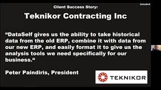
Good morning everyone. Thanks for joining us. My name is Johnny Giorardi. I'm Data Cell's founder and CEO. Today we'll talk about Data Cell for construction with natural language, artificial intelligence and advanced analytics. Let's get it rolling. So let me talk about the pains or the reporting challenges that people look for Data Self. The most important one is decision makers nowadays are becoming more and more data driven and quite often they complain that they are flying blind. It's hard to get information out of the system. It takes too long and they cannot do it by themselves. They have to usually ask for other people every time they have a new question about their business. So that's the main challenge that we are addressing. The second is the IT or the business analysts, the people who support decision makers. And these people typically complain that reporting, dashboarding, providing data for decision makers is complex and time consuming. They're usually always trying to catch up with the demands and it's hard. The most common reporting areas that we help companies in the construction is around projects or contracts, receivables, cash flow and also financials. And we'll show a little bit of them as I go through the product presentation. And the last also main pain point, and this is becoming more important lately, is twofold. It's legacy consolidation. And there's two parts of this data consolidation. Part one is many companies are moving away from an old ERP system that was handling their construction business to a newer, a more modern system, quite often cloud based. And then they want to bring the historical transactions from their contracts and projects and their financials from the old system to the new. And quite often that's very time consuming or they have to keep the systems apart for historical analysis. And then they have to be looking at both systems, the live one versus the old one, to have a complete picture of their transactions over time. The second part of the kind of legacy of data consolidation is some of the data that people need for better decision making. It's outside of the ERP system. It could be payroll, it could be, I don't know, Google Analytics, CRM and whatnot. And we'll talk about that in a minute. The way that we use Data Self to address those challenges is primarily by leveraging analytics solution that uses a Fortune 2000 kind of platform. We do have a data warehouse, typically can be in the cloud or it can also be on premises. We pull the data from the data sources, your erp, your CRM, Excel sheets, any kind of data we pull over into a data warehouse and then we plug tools Like Tableau, Power, BI and Excel to deliver reports and dashboards. The good news is overall, the Data Warehouse is a SQL Server platform where you can have full control of what you do with your data. Many ERP systems, they don't give that flexibility. And with Data Self, the data warehouse layer absolutely give you more control and speed when it comes to tackle your reporting needs. Anyhow, we provide this framework is deploying out of the box. We also provide several reports and dashboards. So when you go with dataself you don't start with a blank sheet, but a good starting point. And from that point on you can easily customize and create your own data extraction processes, reports and dashboards. At the end of the day, from a benefit standpoint, decision makers will have easy access to their KPIs instantly, accurately, anytime, in, anywhere, pretty much, you know, we provide typically a web based framework that you can use web browsers, mobile devices to access your reports and dashboards. For the people supporting the decision makers, you know, the it, the consultants, it's easy to deploy. Data Self is easy to maintain. In a lot of the tasks that today your team is probably spending hours and hours and hours doing on an ongoing basis will be completely automated. We tell people that we do not replace human intelligence. So the decision making process and anything that needs human intelligence, thank God we do not automate that. But the mechanical part of reporting, extraction of data, preparing the data, consolidating the data, getting into the, into the actual reporting in dashboards and distributing to other people. All of those things typically can be 100% automated. And we'll show them a little bit when we go through the product presentation. Just quickly. Two success stories that we have, we have several, but two in the construction. The first one is Technicor. Interesting story. They were working with a legacy ERP system and they moved to a new ERP system. In their case Acumedica in a major requirement for them when they moved to the new ERP system was to have clean and easy visibility of their project history. Their projects are usually multi year. In some clients they have business on a recurring basis. So they have to have visibility of the project history from the old legacy system into the new system. They have five companies that they need to bring it together and absolutely the data warehouse that we provided was able to consolidate the legacy data with the live data. Now when they are analyzing their project history, their financial history, P and L and balance sheet, it's like they never changed the accounting system. So very nice success story for Technicor. The other success story is from Hartzell, also in this case an Ecumenica client. The main pain points were they have a lot of customer reporting needs. The CEO was looking at data in different ways and before Data Self a lot of these reports, even recurrent reports that they need to see on an ongoing basis. It would take their CFO and controller to do a lot of the refresh and export manipulation. Excel, send the Excel to the CEO. They were doing pretty much once a day, once a week. Now with Data Self, the reports and dashboards are refreshed every day automatically. The CEO and other people, they just open these reports, they see the results and can make better decision without waiting for the CFO to crunch the numbers. So another interesting story showing the report automation that we provide. Alrighty, let's take a look at the actual product. So I'm going to show a little bit of different piece of the Data Self solution. The first thing I'm going to show is typically how people go into Data Self and how they go into different areas of the business to look at their KPIs. This is highly customized in what I'm showing you right now is like a home page of any user. In this case would be a user having access to everything that is in Data Self. So this person has access to sales information, financials with the contracts, cash flow, paychecks, information marketing like Salesforce, Shopify, if they sell something over the web and inventory if they have inventory to manage, maybe people from the sales department or project managers, they only would have a subsection like no sales and contracts. You know, these people should not be looking at anything else. And then this homepage for those users would be customized to only tackle or to only include the data sources that these people have access to. Anyhow, once you go to your homepage then pretty much to go to different KPIs becomes a matter of, you know, just a button a click away. So let's say for construction, the WIP report is a very popular, heavily used report that people look at. So let's take a look at the WIP report and by the way, most of the things, maybe all the things I'm going to be showing here today would be are part of the out of the box solution that we provide for construction. So of course it can be customized but out of the box you should be able to see things like this. So this is a WIP report. Looking at my project, I have my project ID description, the status, the contract amounts, estimated costs, some GP actuals, forecasts and Whatnot, I have a bunch of filters that I can apply to this WIP report and we have different ways to help people look at important things. In this example I have the highlighted low for GP revised. So if the GP revised is negative, like in this case, the whole line shows red. Because for this business they don't like to have the GP revised being negative. They want to see positive. Or maybe if I want to actually only look at, you know, what is over, what is under billing. If something is under billing, show me in red. And now the under billing, when it's negative it shows in red because we need to build more of these people so ways to highlight the data in different ways. And we could have multiple colors, you know, something in blue for awesome, red for bad and black that is okay. So those things can be customized to help the decision making process of any company. Now the other thing is typically when people are looking at their WIP report, they look at the big numbers as of today and they want to drill down and see the tasks and see the transactions. In most systems when you go from a high level to more detail, you go from a simple report and you're no longer looking at the initial report, you go to a multi page process where it's kind of hard to keep track of what you're doing. Let's say for instance here. And by the way, this one is looking at my W.I.P. s of today. So all the information I would be seeing as of today. We also have what we call the WIP with history. So now I'm changing to the WIP with historical actuals. What's the difference between the 2? On this second one, looking at historical actuals, I can actually take the historical transactions for all the history in based on a certain period. So right now I'm looking through the current period which is as of today. But if I want to see the actuals based on a prior period, prior year, I just pick and choose here. And this WIP report will be looking at the actual transactions as of that particular time period. So you can have this more sophisticated look at your WIP report. Now back of this WIP report, very often I might want to see some trends or kind of want to drill down into more details. So first of all I have my projects listed on an ascending order alphabetically. What if I want to see my contracts by contract revised, I can click here and say sort. I'm going to click on the sort button. And now I sorted all my projects by contract revised from top down. And now I Can see my top projects at the top of the list. Easy to change into filter and to sort these reports. Well, by the way, the top one is in red, meaning my I'm under billing. This case is only $1,000. Maybe not a big deal, but you could see which ones are under billed. And maybe I want to select, let's say two of these projects I'm going to select. Actually let me select the two projects that are in red. So I'm going to select this project that I have under billing and also my top project that is under billing. So using the control I selected those two lines and by doing so the tool opened this bottom section showing my tasks associated for each project. I'm still seeing the WIP report at the very high level. At the top I can see the two field that I selected. But now I see the tasks associated to those two projects with all the details, you know, the account group, the tasks D and whatnot. And maybe when I look at the tasks descriptions I want to go down to see the actual transactions associated to those tasks. I can select any of these things. I'm going to select the first project and now at the bottom I have the transaction history for that particular project. Very important to go from the very high level drill down easily to the task drill down to the transactions and slice and dice it. So right at the bottom I have all the transactions for this project. Maybe I need more real estate to see this bigger I can click go to transactions and I have my full screen to look at my transactions to make a better analysis. So very interactive, very easy. And in case you want to export this data to put into Excel and to share with other people or do some other customizations, I can quickly say download. I can download as different type of, you know, you can download as an image, as a data PDF, whatnot. I'm going to choose the cross tab which is an Excel file and download it. And now this report was exported into Excel and now I can do any manipulation that I want to do in Excel or share with other people. So we reporting very empowering, very easy to slice and dice it and customize. So this is part of the out of the box. The other thing that is fairly popular in the contracting construction is also dashboarding. And I'm going to show one of the out of the box dashboards, look at the high level. So I have my contracts with the revised amounts, all the projects and I see them on a, on a descending order by the actual revenue revised. I see the actual cost revised in what the gross profit revised is. So I see in a nutshell how I'm doing overall. And then I have here by task. So regardless of the project, which tasks are giving me the most revenues, which tasks are costing me the most in what is my gross profit by task. So kind of a summary. And then I also have the transaction actual. So over time how my revenue cost and GP is changing. And again, this is highly customized. If I want to choose my top projects by revenue, see what's going on, when I click on it, it changes the whole dashboard to only show me the data for that particular project. Or let's say, hey, I want to see which projects are taking and giving me the biggest revenue by these three tasks. So now I select those three tasks and I see which projects are driving those revenues. Or maybe I want to see by cost, hey, I want to see which, you know, are driving the biggest cost right there. I can see the projects and so forth and maybe know which ones are driving the biggest, you know, gross profit. So you just pick and choose. The dashboard quickly interacts this kind of interactivity. Decision makers love, they need it, they appreciate it and it will help them, they make better and more informed decisions and move the business forward. All right, so that was a quick example of an out of the box dashboard. Let me go back to my home and let's say maybe I want to analyze a little further my sales, my revenues. Sure, I can click let's say I want to see my revenues year over year. This dashboard is also available out of the box. So in this case I'm looking at for this particular year through period six. So as a year to date analysis, I'm looking total this year, total last year, and how much is changing since last year to date again through period six. And if I choose a few more periods and then press apply. Now the report goes through period eight, which in my sample database I don't have data for the current dark blue year. So let me go back to period six because it's a better comparison year to date. So I see that the totals I see by period, period, you know, dark blue this year, light blue last year. I can see by where the locations of my customers are. And the bubble size relates to the sales this year. Black bubble means the sales is growing, red is declining. So I can see some states I am having declining revenues. I can see my customers last year, this year in the variance and I can see my project last year, this year in variance on my revenue standpoint. But again, highly interactive look, I Have two customers that are declining sales since last year and maybe this could be a problem, you know. And I can just select those two customers and by doing so now, the dashboard will focus everything else only around those 2 customers. So I see the total for the 2 customers, the revenues by period, where they are located and what projects are driving that trend, meaning mostly decline. So very interactive to slice and dice your data if you want to see some trend lines. How are your overall business doing? So this is one way to see your sales with the bars and the gross profit with the line. I have three years, so the dark is this year, lighter last year and this is three years ago. I can see the data summarized by period, by year and the totals and the year to date variances in some other analytics. So great ways to easily see trends across your system. I'm going to show a little bit also about receivables. And remember when I was talking about Hartzell, one of our clients now one of their challenges with receivables was in acumatica, which is their erp. Their receivables is in ar, but they have the pro forma invoices in the PM module in a lot of their receivables are sitting in pro forma invoices that are probably a signature away to become a receivable. But until that signature is done, it's not a receivable and your cash flow is affected. So the CEO want to be sure he was keeping track of the pro forma invoices. And if something got stuck in a signature, sometimes he would call the project manager or the engineer. They're supposed to sign this performer invoice to move it forward. He would call the people directly to be sure things don't get stuck in paperwork. So this is one example of the out of the box receivables dashboard where you see the total you have in receivables by aging bucket. Where the money is coming from, where the money is coming from. A how the money is spread out by due date. And again the color schema we use here is used across the whole dashboard. So in this case today is here. These are on time receivables. These are slightly late, more late and very late. I can see by salesperson the totals and again which ones they have more late invoices by customer. In all the details right here is where like no companies like Hard Sell they would choose I only want to see ar, I don't want to see pro forma or I only want to see pro forma. They Choose a radio button and the dashboard would change accordingly. And again, highly interactive. If I only want to see invoices that are late, I can select delayed invoices in the dashboard filter to not show me on time. And now I can focus some initiatives around retrieving hopefully past due invoices. All right, I'm going to show one more example of dashboard that is available out of the box and then we move into some customizations on how to do it. I'm going to open the, actually I'm going to show two of them. One is the cash flow projection. For some businesses, cash flow projection is extremely important. We have this kind of, you know, intuitive way to look at your cash flow. Looking at a chart, bars going up is inbound money, receivables, any kind of, you know, maybe loans that you're getting money from banks and whatnot. So the inbound money, the bars going down is money going out, you know, your payments, your, your debts, your payroll and whatnot. Then the black line, which would be the aggregations of what's coming in and what's going out. So this is a kind of a chart showing that your cash flow starting today for the next 30 days. And by the way, if you want to see for the next 60 days, 90 days, you just change the time here on the right side and assuming you have data in your, you know, it will show you the projection moving forward. So changing how, how far out you want to see your projection is as easy as entering changing this number here. And on the right you have all the details. So hey, what's going on with this transaction? I want to see what's going on in this particular two days. Once I select what happens is on the right, all the details are only filtered for the data points that you have selected in your dashboard. Again helping decision makers to quickly see the big picture. If they see something really good or really bad, they can point and click and see the details and hopefully make an action to leverage the good or try to minimize the bad that's going on in their operations. Last dashboard I want to show out of the box is the financials dashboard. So we can have dashboards like this where you can see your revenues, your gross profit over time. You can see percentages, you can see ratios of your GL buckets, like, you know, operational expenses versus the revenues or your wages versus your revenues. Anything can be plotted and can, can be customized to the needs of your specific, you know, business. Here at the top we have a simplified P and L showing for the past Two years or more. How you're doing with the different types of your financial measures. At the bottom here we have a simplified P and L from your business. All right, so I showed a bunch of these preconfigured reports and dashboards and again, the idea of data self is to bring all of your data sources together. Maybe initially we're only bringing your ERP data, but eventually we hope that you can use to bring other systems, paychecks or adp. Whatever you're using for payroll, let's bring it in your Google Analytics. If you use POS or any platforms would be all. I mean, POS doesn't make sense with construction, but anything that will make sense for your business can be consolidated. And now management will have a place to go that has all data sources. And it's easy, it's simple. They can see on their mobile devices and make better and more informed decisions. All right, but what about customizations? Maybe what I showed here today. Some of these reports and dashboards will be valuable for you on day one, but you have needs that are not covered out of the box. How can you go about customizing the solution? I'm going to show two different pieces of the customization. The first one is the more elaborate way on how we can build these reports and dashboard that I've been showing you so far. So I'm going to show you some examples of that. Second, I'm going to show also how the solution uses natural language in artificial intelligence to help your team to build reports anytime, anywhere without knowing anything complex. I'm going to show the easier one later because I want to keep you around to see everything. Anyhow, let me go now to this other page. This is our report editor, report and dashboard editor. This is the place where usually you can build reports and dashboards that are very sophisticated, yet it's not too hard to build them. And they would be similar to the ones that I showed you so far. Currently, this one is powered by a tool called Tableau. So Tableau is the engine behind this framework and in the near future, we're also going to support Power BI as the report designer. Tech talk aside, what I want to show you is even though this can be very sophisticated, but the 80% of the new reports that a company needs, it's very easy to learn how to do it. And that's what I'm going to show you right now, how easy it is to build new reports in dashboards from scratch. So let me show how it works. So right now I am connected to My project management budget and transactions. We call it data source. Today I'm not going to show you how we can customize this data source being more fields, more tables, that's a more tech talk. And demo is not too hard, but I'm going to leave that for another day. But once you have all of the data you care in this example for your project management analysis, it becomes a matter of dragging and dropping. Suppose I want to see my projects ID in my projects. Here it is, project id. I'm going to put in my rows. All right, these are my project IDs. I want to see the project description. I drag and drop description, my report. So here I have IDs and description. All right, well I want to put some numbers here. So I'm going to go to the bottom of the list is where we have our measures and I want to see what is the contract revised, you know, what is the latest amount that I have sold to these people. So there it is. These are the contract revised. Maybe I want to see the contract remaining amount, you know, okay, which projects are still. I still have money to bill, so I have a bunch of them. And let me make this on a descending order. So these are the projects that I actually have still things remaining. And maybe I want to break this down and see who the customers are. Well, let me go back to the list here and find my customers, my customer view for my project. So now I have by customer, by project I have the totals. Okay, all right, so this is a simple report that I want to keep track of. Now I want to build another report and want to see things on a buy. Let me see if I have here. I want to see let's say sales by salesperson. So let me put salesperson here. Actually let me look at that. I don't have a salesperson. Actually I want to see sales by customer. So I just want to see my sales, which would be my contract revised as a bar. I want to add my customers. There it is. And I want to make this just I can read the customers and see the sales and making a descending order. So right now I have my customers in a descending order and the contract revised is this. And now let's say I want to put these two report that I just built into a new dashboard. So I'm going to say I want a new dashboard. I want to put my detailed report over here and I want to put my chart analysis at the top. Maybe I'm going to put this on the right. And I want to make this you know, fit the screen of any size. So it just automatically adjusts. There it is. Just in a few minutes I created a chart, I created some grid and now let's say if I want to see only my top, you know, these three customers, when I select it will filter the. Oopsie, I forgot to press the filter. So when I select my customers on the chart, it filters the right to show me only those details that I want to see. So very intuitive. Very quickly now I can save this report and now I would have one more report available in Data Self. So if you learn how to do this drag and drop point in click pretty much you can build and customize a lot of reports by using this web interface. It's very intuitive. All right, so there was the. Oh, by the way, so if I let me save this and if I close get out of the Report Editor, I was editing the report I created from scratch, something new. And now the report is here available and I want to see the dashboard that I just created. And now this dashboard here that before was, Was created, we're using the editor. Once I save it and I get out of the report editor as a user I can no longer break it. You know, it's pre configured but as a user I can use, you know, those functionality to slice and dice it. So I still can make changes here, but because I'm outside of the report editor mode, I wouldn't be able to break because let's say I'm not sophisticated enough to learn how to, to change things and go to the edit mode. The other good news is, hey, now that I have this report here available, what if this report should be automatically distributed to users every day, every week or every month. So how can you push these reports to people? Right? I mean those who know how to log to Data Self and access them? Well, those go through what we call the self service approach. You go to Data Self and you pick and choose what you want to see. But what about the users who want the reports to come to them by email? For instance, how can you push the emails to these people? Well, we have the subscribe button. I'm going to click the subscribe button and now you tell who should receive this report. So I'm going to see if I want to receive it and let me see if I have more people here. I'm going to add Taylor, I'm going to add Zach. You can add as many people as you want. You tell if you only want to send this view or all the views in a workbook A workbook is like an Excel file. You can have several reports. You can bundle them together and email to people you can tell how to send this report. I want to see as a PDF. You can call an email subject and you tell how often you want to send it. I'm going to send on weekdays 10am Eastern and I click subscribe and that's it. From now on, hands off the tool on every weekday 10am will refresh this report and you push to people that you have added to the list. So report distribution becomes automated and you can let even users define which reports they want to receive by themselves or you as the admin person, you can configure which user will be receiving reports on a scheduled basis. So you have control who can do the subscription of the reports and dashboards. All right, so lots of good news here. The last thing I want to show is I'm back to the main portal and I want to show you the part of the solution that allows users to create new reports from scratch using natural language and artificial intelligence. I'm going to click now the natural language query button and now I go into the natural language functionality. This is similar to searching the Internet like Google or Bing. The user just have to enter words describing what they're looking for. The tool try to understand what the person wrote. If the tool understands and find data points associated to that question in the Data Self analytics data warehouse, it will build an instant accurate report to that question. Right now I am connected to the sales side of Data Self and this is actually the sample database is not a project based is actually selling products to customers. But I want to show that even if you were to be looking at your project transactions, at your GL transactions, your payables, receivables, anything, I want to show you the mechanics. So again I am looking at sales and I'm going to say here, hey, I want to see sales by salesperson in a given year by in 2020. I do sales by salesperson in 2020. So I just wrote the question. The tool will analyze and it finds hits like on a Google search. Give you all the possibilities. You check which one matches your question, you click on it and magic happens. Actually it's not magic, it's technology. Natural language and artificial intelligence gave me by salesperson sales in a descending order in 2020. So an instant echo report was created. Maybe on a breakdown by month. Sure, by month. I write by month. The tool understands, give me options. You choose the right option. In this case in the year 2020 by month I am looking sales, where every salesperson has a line chart. So again, if you know how to ask questions like you know, searching the Internet, you can find many answers. Hey, maybe I prefer to see numbers by the penny like an Excel sheet. Sure. And we'll go over here and say show me a tax table instead. And now that report becomes a tax table. I see many users that they do this, they find the answer to a question like this and then they want to export to Excel. Sure. Let's say I want to take my January data points, maybe February as well. And then I select them and then I tell the tool, show me this data. So right now I'm just showing those two months, but I want to see all the details behind those numbers. Invoice number data, the customer, the product, if you're selling products, the quantities and everything input into an Excel file. And now I have extracted and put all the data into an Excel file very quickly and easily. I'm going to show one more example of natural language and then I move on. I want to see my top 10 customers by sales in April 2020. A more elaborate question. And then the tool again understood and gave me two options. I select the first option, which is what I want and there it is. It shows in my customers with sales in a descending order in April 2020. And then it gave me all customers. The blue ones are in the top 10 and the gray ones are outside of the top 10. So anyhow, natural language query is designed for business people, people who do not have time to learn the report editor so they can become more self sufficient and get a lot of this answers, a lot of the questions answered anytime and anywhere. Just like searching the Internet, people will find a lot of answers, but not all answers so many times. The more sophisticated questions will still require the report editor where you can build more elaborate reports and dashboards. So you're not getting away with natural language. All the questions, but a lot of them will be ready will be available in our framework. All right, I hope you have found the demo insightful. Let me go back to my presentation. What about deployment? How does it work to deploy data? Self analytics? Pretty much the Deployment is a 15 to 30 minute process depending on your source system. If it's a cloud based system, it's 15 minutes. If it's an on prem system it takes about 30 minutes. So it's in the minute range to deploy. Everything that I showed you so far, everything that I showed so far would be deployed in this framework. Let me show you how you can go learn more and give it a shot. Let me go back to my right here. Let me go to our website. So if you go to dataself.com and you want to learn about deployment, see pricing in details, you choose the ERP system that you work with like Acumatica and then you go over here we have some description about we have advanced analytics, we have enterprise analytics. If you scroll down you can see more videos, information descriptions, sample reports and dashboards. There is pricing as well. And if you click Deploy analytics now and if you are with Acumatica pretty much in 15 minutes you do the deployment, it might take some time to upload your data. It might take minutes, hours and even days if you have a lot of data. But the actual work to Deploy is about 15 minutes. And once deployment is finished, what I showed you today will be available as an out of the box solution. So fairly straightforward to deploy data self advanced analytics. Also if you want to learn more about the Construction Edition you can go to our section here and you choose Industries and you choose construction and this page here also will give you some additional data points about our Construction Edition information. So feel free to explore these resources. To do the deployment is simple, it's quick and if you have a cloud system like Akumatica, it will work all behind the scenes as a cloud to cloud system. If you have an on premises system then we have to install our data extraction tool on premises so we can pull data from your source system and push to our cloud pricing. Data sale pricing starts at 299 per month. That includes a very nice package. Let me just go back again to our website and this time I'm going to go to Sage, let's say, I don't know sage 100. All of these pages that you scroll down you'll see our pricing sheet and how it works and you can see what's included with 299. Usually there's a few users, some templates and then that's what you get with the out of the box. We're currently offering a 14 day free trial so if you're gonna run with it for 14 days you pay nothing. From a license standpoint we just try to make it easy for you to see the value and then if you're not happy, you unplug. If you're happy, you stick around. I can promise you that if you give it a try, most likely you'll keep it. There is nothing close to data self out there, especially for the price that we offer. So we hope that you use Data Self as a way to quickly, easily, inexpensively get your reporting and analytics to the next level. Having said that, I'm going to open the Q and A. If you have questions, please use the. Zoom Chat or Q and A and then I'm going to check their questions, the chat box here and the Q and A. There's a question here from Tom. How much training is required to learn Data Self? Tom, thanks for your question. How much training is required to learn Data Self? So data, let me go back to the system architecture to give you this answer. To be more precise, let me go back to the architecture. So this is our architecture. Pull data from the data source, bring to SQL Server Data Warehouse, put the data in Tableau and then provide reports and dashboards. About half our clients, they need little or no customization on the data extraction process. Pretty much their customizations is all done on the report and dashboard for those clients. If you fall into that half, we have many clients that learned to customize the reports and dashboards with zero training. Again, we're using Tableau and in the near future Power BI and Excel. If you know those tools or if you watch videos, we have a lot of training videos on our website. You can actually learn how to customize extensively with zero training. Now most of our clients that fall in that category, they go through eight hours of training to learn the basic, the core functionality of Tableau. So with eight hours you're going to learn the features required to do 80% of the customizations. Now, clients that are on the other half that they need customization the back end, many of them, they rely on their reseller and or on Data Self to be the experts to customize the backend. But many of our clients, they also learn how to use our ETL in data warehousing to customize the back end. This is a pretty open industry standard, SQL Server data warehousing. So if you do have resources in house that knows tables, fields, how to link them, if you have that kind of resource learning to customize the back end, it's going to be fairly easy for them. Still takes quite a bit of time because it's very technical, but we're not talking about years. It's usually no days of training or hands on experience to start being able to customize the data extraction process. Tom, thank you for your question. Let me see if there's more questions. Apparently not. And actually we budget 45 minutes, so we're running out of time. Let me just go back here to the last slide. I hope you found this webinar informative. I really appreciate you for making time today to learn more about Data Self. If you have more questions or comments, you can visit our website. You can email me or call me. We're here to educate first and foremost and if we can help you with the business, we are super excited to take you to the next level. Thank you for joining us. I hope you have a great day. Stay safe, well and sane, which has been very challenging lately. Thank you for joining us.










