DataSelf for Distribution with Natural Language
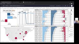
Presentation by Johnny Girardi (DataSelf CEO) introducing DataSelf’s analytics platform for distribution companies. It frames the common ‘data house divided’ problem (many silos, Excel workarounds), describes a data-warehouse-based solution that unifies ERP/CRM/Excel/etc., and demos out-of-the-box KPIs and dashboards (sales, CRM pipeline, inventory, AR/cash flow, financials) plus natural-language query and report customization. Ends with deployment, pricing, and Q&A.
Chapters
Okay. Hello everyone, my name is Johnny Girardi. I'm Data Sales founder and CEO. And first of all, thank you for joining us today. I hope you're staying safe, well and sane. What we're going to be covering here is key performance indicators in natural language analytics for distribution companies. So let's jump right into it. The good news is distribution companies have a lot of data being captured from their operations to run their business. Just to give an idea, most likely you use some of these popular mid market ERP systems. We cover all of them. You probably also have Excel or Google Sheets doing a lot of some numbers and reporting out of the systems and others. But you might have CRM systems, you might have E commerce, Google Analytics, payroll systems. I mean the amount of systems used by companies to run their business nowadays is amazing. At Data Self we use more than 20 different data silos to run our operation. And when you're trying to understand what's going on with your business, that's what you get a lot of systems with different user credentials. If you're trying to make decision based on your systems, you have to have credentials, you have to know where to go, how to run reports, and quite often you have to go to different people to get answers from your different data silos. We call this scenario the data house divided. As a decision maker, it can be challenging to having a single vision of your data when the data is all separate in these data silos. So that's a major problem running the business is the data house divided. We hear from management all the time that they're flying blind. They have the data, the data is right there, but it's hard to get it. And sometimes when they get it, it's too late. In some decisions were made out of gut feeling or not with the right information to make the best decisions. So flying blind is a common complaint or decision makers using these kind of systems. And quite often what happens is they starts to build some kind of reporting platform to get the information together using Excel or Crystal reporting services. Or if you're using tools like Acumatica, you're going to be using the GIS and whatnot and people tell that eventually they get into this Excel. Hell, we're using Excel as an example. Excel is an amazing tool. But when you use these simple reporting tools to bring data out of the systems, you try to glue the data together, it becomes time consuming, it becomes labor intensive, error prone and is just not effective. So these are the main challenges that people come to us helping decision makers with the flying Blind problem and the whole company to be spending too many hours and work around reporting. How do we tackle this two main issues from a very high level perspective? Well, what we bring to the table is data warehousing. We make it super simple, super quick and super affordable for companies to bring, let's say initially only their ERP information. You know, their sales, their inventory data, their purchasing, inventory planning. We put in a data warehouse that makes the data simpler, easier and faster. For reporting we use our tool called ETL+ Extraction Transformation Loading Technology super easy to extract data from the data sources put in the data warehouse, do things that people do in Excel, in Access, maybe even in SQL servers. Through complicated manipulations we can easily automate those procedures using enterprise level data warehousing. And yes, you can do it. If you know tables and fields, you can maintain the data warehouse simply and quickly and very effectively. Then we plug tools like Tableau, Power BI and Excel as a reporting tool. So when users goes to see their data, all the data is together. Not only erp, we can bring everything. Excel, CRM, payroll, Google Analytics, Social media, whatever you have can be unified in the data warehouse. All the data in a single place. And as a decision maker, you don't need to go to different systems to get your KPIs. Data Self will be your single version of the truth. With your credentials you'll have access to all the KPIs that you're entitled to. If you're the CEO, you go to CEO level KPIs. If you're handling payroll, you see only payroll. If you're on the accounting department you have financial related information. So security can control what each user will have access to. So let's take a look at how the product actually works once we have deployed. And I'm going to cover four different topics in this presentation. First is how we make the house divided into a house united. So I'll talk about that a little bit. I'll show some of the popular key performance indicators that we have been providing to distribution companies to be more effective. I'll be showing some things on the sales side, something on the inventory and inventory side, a little bit of receivables in financials and also CRM. So cover some of these popular KPIs. I'll also show how natural language, artificial intelligence and machine learning is helping audio distribution companies to be more effective when it comes to be more informed for the decision making process. Finally, I'll talk a little bit about how easy it is to customize the solution on the front end on the reporting side as well as on the back end when you have to deal with more data extraction processes. We'll cover a little bit of all of those things. Let's switch gears and let me go to the Data Self portal to talk about the Datahouse United. The idea is once we bring your data sources together, maybe initially only your erp, but eventually let's say you have your ERP data looking at sales, inventory management, financials, cash flow projection and eventually maybe you want to bring other data sources like your CRM can be Salesforce, can be Sage, CRM, Macumatica, CRM Dynamics. It doesn't matter what the CRM is, it can be right here. You have E Commerce. If you want to see your HubSpot, Google Analytics, your ADP paychecks, no matter what your data source is, they'll be all together in Data Self and then based on your user rights you have access to everything or only some sections of this data house United. But it's all here in a single place. All the reports you need for better decision will be in a single location and the single location can be embedded in other applications. So this dashboard that I'm showing you can be inside of your erp, your CRM, whatever your portals that you use for your users, it can be embedded. Now I'm going to show some of the popular KPIs or reports and dashboards for distribution. I'm going to start with sales. I'm going to show a little bit of CRM, some inventory in some of the financial sites. The first one I want to show is this popular year over year sales. Distribution companies are usually very sales driven and they're always looking at, you know, what's happening this month, last month, this quarter, this year, what's happening the same period last year, by customer, by product, by territory trend analysis. Lots of those questions around these topics can be answered in this single dashboard. How does it work? So right now I'm looking at my total sales this year. So dark blue is this year, light blue is last year and this is the variance. And I can control the year by just picking, choosing here. So right now I'm looking at my current year and in my sample database I'm looking at the first six months of the year. So as you can tell in my trend analysis, only for the first six months of the year in the totals I can see by customer total last year, this year, in the change since last year to date, I can see by product the same metrics and I can see the Ship to the size of the bubble is how much sales I have this year in the color is black if it's growing since last year to date. In this case in red if it's declining since last year to date. So right here I have a big perspective of my year over year, you know, trends. Now I can dramatically start to change the view by pointing. Click. For instance, look at this customer is one of my top customers this year, but it's declining quite a bit. Why is that? If I click this data point, the whole dashboard will change to only show me the total for this customer last year. Digit variance the trend analysis by period where I'm shipping to. So only I'm shipping to illinois and it's 13% decline. And these are the products that are driving the decline. So I can tell that hey, look at this, this product here is driving the most of the decline. And that quick perspective might be insightful for the account manager to try to reverse the trend. Or maybe, hey, I'm looking at these two customers that are declining a lot. Well, what if I select the both of them? Now I'm selecting those two data points and now the dashboard combines them together. This is the total for those two customers. Total trend analysis. So these are total shipments. And here again I see the total product sold. And again this product continues to be a major decline in sales for these two customers. Very interactive. If you try to do this in crystal or Excel or reporting service, whatever, you know, every click that I'm giving here usually becomes a new report. Call the consultant, explain what you want and wait. And again, what if I want to see the whole year? Sure, I can change the whole year here, press apply. Now I'm comparing my current year, which is through the period six. I have no sales for the rest of my sample database versus the whole year last year. So of course I'm declining what happens in 2019 versus the prior year. I can choose 2019. Now the whole dashboard changes to show metrics in 2019 for the whole year comparing to the whole 2018. And again I can see that I grew dramatically compared to the prior year. And I can see what's going on with my sales and whatnot. Very interactive and say, hey, I'm looking at my top product in let's see here, I have one product that is declining quite a bit. Now let me look at customer. I look at this customer here and hey, actually I want to see the sales details of this customer in those two years. So I select the customer and now I can click show Details. What's the idea here? So far I'm looking at top numbers at the high level, aggregated by month, by customer, by product. What if when I want to see the actual invoice number, the products that the quantities, the every detail. Well that's why we should have the details. When they click show details, I'll see at the bottom this pop up they will show me every single invoice. The invoice number, the invoice date, the products, the quantity sold, the sales amount, everything is in this detail. And if I want I can export quickly to Excel and do more manipulation. So seeing big trends and then drawing to the details is out of the box. What I'm showing is a little out of the box. But you can learn how to customize and make these dashboards really specific to your own reporting needs. So this is a very popular year over year dashboard for distribution companies. What I'm going to show you next is about these two dashboards. And these are the hot or cold performers. You know, hot customers, hot products, hot salespeople, what's growing, what's declining. When you care about the usually the tip of the growth curve, growing or declining, it's important metric. Let me show some example. I'm going to click hot performers. So in this example I look at my hot customers by sales and I have two periods that I can control by changing the dates. Here right now I'm looking the first six months of 2020 versus the last six months of 2019. And I'm seeing which customers are on fire, meaning the top customer by sales in the current period in which customers are heating up that are growing the most since last period to this period. And again, highly interactive. If I select some of these customers, it will show me what products they're buying in that particular period. Or if I show on the growth side, it's going to show me what products are driving the growth since last period. Everything highly interactive and you can change. So right now we're looking at my customers. What if I care about my products? Do I need to call someone else to change this report to be a product focused report? No, out of the box you can go over here and say show me product. Instead you just select product and now you're going to see the products on fire and the products heating up by sales. What if you don't care about sales, you sell oil products that the price of this changes every week. What you care is about the quantity sold or the gross profit. Do I need to call someone to change the metric in this example, out of the box, we already have incorporated sales, cost of sales, gross profit and quantity sold. So if I choose the quantity sold now this report is going to be showing my products on fire by quantity sold and which products I'm growing the most in the quantity sold since the prior period. And again, I can easily change the period by changing these filters. The same perspective works on the cold tab. On the cold tab, we're looking at customers, products that are declining the most in whatever metric that you decide, sales, quantity sold or which ones you were selling the last period, but not at all. So we call frozen, the ones that are no longer buying from you. And the cooling offs are the ones declining the most since the prior period. So these two dashboards, hot and cold, also very popular for sales driven organizations. And out of the box, we have good ways to get you started looking at those perspectives. Next one, I'm going to talk about the Pareto chart. Pareto chart is an incredible perspective when you want to compare two different metrics and see the trends between them. In this example, out of the box, I have my products and I have the gross profit in the middle panel in a descending order. So this is the most profitable gross profit, I'm sorry, gross, most profitable product and then profitability going down. The ones in blue, they represent 80% of my total gross profit. The ones in red are the bottom 20%. And the question here is, look at this product. It's a lot of sales and it's very unprofitable. Did you know that? Was that intentional? Sometimes it is. It's like, you know, milk in grocery stores. Grocery stores make almost no profit from milk because they know people come to buy milk and they buy beer, they buy diapers, whatever. So it's a way to pull in people to buy other products. But sometimes if the company is not looking, sometimes you're selling a lot of products and you're not making as much money. So this kind of Pareto report is to help those organizations keeping track of two different metrics, in this case gross profit and sales, and see if they can learn certain important trends to optimize their business. And again, you can quickly change, you know, I want to see by customer. You click customer now you look at the Pareto from a customer standpoint, not from a product standpoint. Another popular KPI for distribution companies is this one, Top products to top customers. So this dashboard shows, you know, in this case the top 25. And it can change to top 50, whatever it is. But the question is why some of your top customers are not buying as much of your top products. Is that a missing opportunity? You have to think about that, make a decision and hopefully you'll figure out that sometimes by knowing who these customers are, they're not buying a lot of your top products. You might be able to expand the sales of top products to top customers. So also a very popular dashboard from that perspective. The last one on the sales side is the daily flash report. We have many clients that when they come to data self, they say that, you know, usually it takes days, weeks or only after the end of the month. They can actually look at what happened the prior month to try to correct mistakes or go after missing opportunities. So it takes a long, long time for management to know the threats and opportunities in the business. Well, the daily flash report is exactly a way to bring information to management on an ongoing basis. This can show you the information as of yesterday or even today if you need to be refreshing more often you see the big numbers that you care again, you can customize this to bring any information to dashboards and then you can see segmentation of your numbers by ship, to by salesperson, by customer, by product, by service, whatever you want. You can easily customize to give management visibility into what is happening today or yesterday to be able to quickly make changes. And again, everything highly interactive. If I click the customer here, it will change the whole dashboard to show where I'm shipping to, who the salesperson is, what products they bought and all the details associated to that data point. Highly interactive point and click to help decision makers be more effective. All right, so these were sales driven KPIs. I'm going to show something on the CRM side. I'm going to show the stuck opportunity because it's a very common problem with organizations. Usually salespeople focus on people who are calling them back, who are giving them opportunities and closing sales. And sometimes the opportunity gets stuck. There may be a phone call, a way to move forward, there may be an email, a visit. And if you don't do this on a timely fashion, that opportunity might be dead gone for good. So this is a very popular dashboard. You can see from the CRM stuck opportunities by stage of the opportunity. You can see by account, by rep, by location, by the date of the last CRM interaction in all the details. So what happens with all of these opportunities being negotiated and they got stuck? What about that? You click, you get an insight of who is managing them, which the accounts are and you can tell for how many days ago you want to be considered a stock opportunity. Did 5 days, 10 days, 50 days. You just change this filter and that will control this analysis. We have a lot of KPIs to manage the pipeline. This one is very popular and today because we have limited time, I'll stop at that point on the CRM kind of KPIs. Let's move on to inventory management for distribution companies is usually another major part of their business. They have to have things in stock or in transit to be sure they can fulfill their orders. So we have ways to look at open sales orders. We can show quickly missed shipments. If something hasn't been shipped, who should you know about it? So we have ways to quickly notify the right people about missing shipments. You can look at what you have on hand to ship. So I'm clicking the on hand products dashboard. It's an entry level dashboard that gives you a perspective of products on hand by warehouse and product. When was the last date that you sold a product? So if some products are sitting for too long with no sales, should you do something about it? Should you just get rid of it? Heavily discounted? So this dashboard, this section is to show which items have been sitting on your stock for certain period without movement at all. This section is to show items that have been moving, yes, but they're moving too slowly. Should you do something about them to get them out of the stock? Get the money and invest in items that you're selling a lot? This section should answer that question. In this section is to tell you by item how many days of stock you have. So if you have hot products selling a lot and you don't have a lot of in stock, what should you do about it? Should you order more? So this is a way to also see days of stock buy item. All that I'm showing you here is available out of the box with data self and again highly customizable. So this is a little perspective into on hand. But at the end of the day what you need is, ah, I didn't have this. We have another dashboard that is not here in this particular demo dashboard. That is the inventory planning dashboard. The inventory plan dashboard is popular in distribution companies because it looks at your inbound items from, you know, from purchase order or if you have manufacturing also from your warehouse work orders. Then you see how many you have on stock today in all the expected outbound items, either from open sales orders or sales projection. And based on these three different metrics, inbound, current and outbound, it calculates when you're going to be running out of inventory so you can do better planning of your item purchasing. Unfortunately I don't have here right now to show you but is also part of our framework. On the financial side, I'm going to show three quick examples. First AR aging. For some organizations managing aging, it's time consuming. This dashboard has the total balance due by aging bucket. And then using this color schema here you can see where the money is coming from, how the money is distributed by due date. This is to date. These are current, these are yellow. 30 days, 60 days and more than 60 days late by salesperson, by customer in all the details in again, highly interactive. These two customers have most of my aging. So let me select these two customers and see what's wrong with them. So I select both the two customers and now the dashboard shows the total for these two customers. Let's say I only care about the old invoices. I'm going to select the old invoices and now the dashboard will focus on the old invoices for these two customers with all the details over here. So very interactive way to easily look at the main metrics and to better manage your receivables. Cash flow also a big topic for many distribution companies. Here you can see on the right all the inbound and outbound money. It can be open, AP, OpenAR, payroll, recurring transactions. And here you can see the numbers on a chart perspective. So this is today, the bars going up is the aggregation by day money coming in. The bars going down is money going out. This is a 30 day projection. If you want to see for let's say 45 days. I change here for 45 days. Now the projection goes way beyond and oh, look at this. I'm going to be running out of cash on this day. What the heck. As a cfo I was not expecting, you know, my line of credit is right here and on this day I'm going to be running out of cash. Why I click on this data point, it will filter all the details on the right to show me exactly what happened on this day. And let's say oh yeah, look at this vendor here, $4 million payables. And actually this invoice has not, this bill has not been approved to be paid. I'm going to click and do a what if scenario of removing this payment because a mistake. What will happen with my cash flow if I remove that payment and something went wrong? Let me try again. Ah, in the production environment when we remove that vendor, this big bar will get out of the way and we see the Projection is no longer going negative. And that's how our production cash flow projection works. The last dashboard that I want to show the last KPI is around financials. Many organizations very financial focused, they want to see their P and L, their balance sheet, their main metrics. And this is also a financial dashboard bringing data from GL and anything else to show you over time. The revenues, the gross profit, the ratios in like a P and L form. Detailed analysis. Alrighty. So this is kind of an overview of some of the KPIs popular for distribution companies. What I'm going to show you next is natural language query and then how to customize a solution. What is natural language query? All the dashboard that I showed you so far were designed using the report designer in dataself. And to know the report designer it takes usually hours of training. But most business people do not have time and interest in learning report designers. They want to see the data but they don't have the time to learn how to build it. How to build this more elaborate reports and dashboards. Natural language is this new technology. I'm going to click the natural language query tab here. It's about five year old technology where it's like going to the to the Internet, Google or Bing. You enter a question, the tool will try to interpret your question and if it finds answers it will give you options. You choose the right option, it will build an instant accurate report with the answer to that question. Right now I am connected to the sales data would be coming from the erp but any data in data self can be targeted to use with natural language. So I'm going to use an example that I'm the VP of sales and I want to see sales by salesperson this year. So what I do is sales by salesperson in 2020 I asked a question, the tool will interpret give me options like when I search the Internet I choose the right option. It will build an instant accurate report. This is not magic, this is technology, artificial intelligence, machine learning in natural language. Helping decision makers find answers to their questions anytime, anywhere without knowing complex report editing capabilities. This example by salesperson in 2020 I have sales in a descending order. Very easy if you want to break it down by month by month. You type in by month. The tool again makes sense what I'm asking. Give me the options. I choose by document, date, month. Yep. And now I want to see in 2020. By month I'm seeing sales and it gave me a line chart by salesperson. Try that in crystal or reporting services. And hey, I Actually maybe I don't like charts. I want to see a grid like in Excel. Sure. I can come over here and choose a different graphical representation like a text table. And now that information shows as a text table. And if I get into Excel I can select my data points, everything, or maybe only generate this example and I tell the tool, show me the data. So right now it's just took those data sets input in a separate page that I can export to Excel or show me all the data. All the data means I see the underlying data. In this case, invoice, number, invoice, date, quantities, sales amount, customers, products, anything is available to download into Excel. And now I can do my analysis outside of data self in case you want to use Excel as a reporting tool once you find the data points. So natural language, super empowering for decision makers to be more self sufficient in being able to find answers to their questions without calling the experts, the people who know the report editor. You cannot build complex dashboards in natural language. No, you cannot yet. At least we're far from that point. But it's amazing how many questions can be answered. It's a very good analogy with like no Google, you can find a lot of answers out there, but absolutely not all the answers. Every time that you need a more expert opinion, you gotta go and find the experts. But whatever it is available quickly, you know, natural language should enable these decision makers to be more empowered. All right, now what about the report editor, how easy it is to customize these reports and dashboard that I was showing to you guys? That's what I'm going to show now when I show the front end customization. I'm going to go now to this other tab where I have my report editor. On this demo I'm showing tableau as the engine behind the report editor. And tableau is part of data self. You don't need to even know it exists. When you get data self, you get the whole data warehousing, ETL and tableau all incorporated behind the scenes. You just have to learn how to use it. Here, this is the report and dashboard editor. And the first important news is this is the data panel. This is where the data is being fed from your source systems. In this example, SA sales come from the erp. Sales can be ar, sales can be some cases. So sales, whatever sales is brought into this panel and you see descriptive names, customer, product. If you scroll down you can see sales, cost of sales. And now I'm going to be building a dashboard from scratch to show the mechanics. This dashboard Will have three different widgets. I want to see sales by customer, by product. This in last year. I want to see numbers by the penny. I want to see sales and gross profit percentage trends over time. So how things are changing. And finally, I want to see sales by territory. It's going to take about five minutes to build this dashboard from scratch. Then I'm going to show how easy it is to interact with it and share with other people. So let's do it. So the first I want to see sales by customer, by product the last two years. So what I do is this is customer. I drag to my report. There are my customers. I want to see sales. I take sales put in my report. So this is sales by customer in the whole company history I want to see by year. So I bring document date to my columns and there it is for all my company history. I see sales by customer. I only care the last two years. So let's make the document the year and make it a filter. So I can only select the years that I want. So right now I selected only the last two years and that's sales by customer the last two years. Well, I want to break down by product. I guess we already got the hang of it. If you know how to drag and drop, you can do it. So I want to take the product put after my customer and now I see by customer products over the past two years. If you want to see sales by product by customer, I just reverse the order. I put customer after my product and now I have by product, by customer, sales by year. Very easy drag and drop. And if I want to see quantity sold, I can drag and drop quantity sold. And now I see buy customer by product, quantity sold and sales in those two years. Very drag and drop, point and click. You can do a lot by drag and drop it like I'm doing right now. So this is the first section, my dashboard. Now I want a second section and I'm going to create a new tab just like in excel. A new sheet in this case is a blank sheet. I kept my original one. And now the second sheet. What I want to see now is sales. I'm going to double click sales. I'm going to double click document date to see sales over time. So it's showing sales by year, but I want to see sales by month. Sure, it's showing sales by year. And what I want to see actually is by month. Instead I select sales by month. And this is the trend analysis. Sales by month. And I want to see gross profit percentage. I Take gross profit percentage put in my rows. So this gross profit percentage, this is sales in my example. I want to put this in what is called a, a dual axis representation for this particular chart. So much more visual. My sales bars, I'm going to make them a little thinner. My bars are sales in orange and my gross profit is in blue line. And I have this weird data in the past. What about it? Well, when I migrated from my other ERP system, I have this legacy data. I want to get rid of it. I'm going to remove, I quickly filter it out. Now I only see my current ERP data and I can see easily the trends. All right, that was my second section on my dashboard, the last section. I'm going to create a new tab. So new tab is I want to see by ship to, I want to choose the ship to state and I want to see my sales and I asked the tool to put this on a map. So I select the map and now I have the numbers on a map. Bigger bubble is bigger sales and I have sales by state and that's it. I create those three different widgets. Now I'm going to create what is called a dashboard. A dashboard is a way to put several widgets together on the same view like I was showing you in the automatic KPIs. And the way that I can build a dashboard is I take my first widget, I put it anywhere in my dashboard. So that's my grid analysis. I'm going to take the second one. I'm going to drag into a quadrant, I'm going to put in the bottom quadrant. So right now I'm going to see my trend analysis over here. And then my third sheet, which is my map, I'm going to put into another quadrant. I'm going to put on the top right, right here in this gray area. And that's it. Now I built the dashboard and I save the dashboard when I save this dashboard. And I could save as would be a new dashboard from scratch. When I save becomes part of my new dashboards. It's called this case Dashboard 1. So when I get out of the edit mode, so I just edited as the editor now anyone that has access to my data self system, they can go over here, they can open this new dashboard and they can interact with it. Let's say I'm looking this on a mobile device and I'm using my fingers to select hey, how I'm doing on the west coast. I select the west coast with my finger. How I'm doing the northeast How I'm doing the Southeast. You see that it's highly interactive and it only took a few clicks, about five minutes to build it from scratch. Try to do this with your existing reporting bi tool. How long it would take you to get to this perspective. And let's say, hey, as the VP of sales, I got this dashboard. I love it, but I want it to come to my inbox into my salespeople inbox every day, every week. How can I automatically push the reported dashboard to people so they don't have to come to the dashboard? Right. I can click the subscribe as an admin person or as a user, I can have the rights to subscribe. I click subscribe. I want to receive it. Yes, I want, I want to have my team. I'm going to add Taylor, I'm going to add Zach, I'm going to add Clark. So you just add all the people that you want. You tell only send this dashboard or the whole workbook. Suppose you have several reports you want to share with people. You can have 20, 30, 50 reports. You make a workbook with several tabs and then you select include the whole workbook and then you give a format I want to send as a PDF. I want to call a name of this email subject and I tell how often I want to send it out. Let's say I want to send weekly on Friday's afternoon and I click subscribe and that's it. Hands off. Moving forward, every Friday 4pm 430pm Pacific the whole workbook in this case I'm going to select a workbook would be refreshed in email to everyone Report distribution made easy self service with Data Self Alrighty. That was a product presentation. I hope you got some inspiration how it works. Let me go back to my PowerPoint to wrap it. How long does it take to deploy Data Self? Data Self we have this advanced analytics version which is what I show you is an entry level solution that is very powerful. Pretty much everything that I showed you today is part of the advanced analytics package. And it takes 30 minutes, not 30 months, 30 minutes to deploy. Primarily you place the order. You get an email with a product to download. If you have an on prem system, you register the product. You secure your IP for data privacy. You create a new user. You connect your data source. It can be on premises, can be in the cloud. You schedule a refresh and if you're happy, you just press finish and that's it pretty much. It takes half an hour to go through this wizard and check your security. To check where you're going to be installing this. It's very straightforward. The data may take a while to be uploaded. The first time we upload all the data that you have been ordered from Data, self sales, purchasing, whatever. So it can take minutes, even hours and even days if you have a lot of data. But after the initial refresh, the ongoing refresh pretty much refreshes only the deltas and then on an ongoing basis, the refresh will be much much very very quick. So deploying the out of the box is primarily a 30 minute procedure that you don't need to be a bi person as long as you know security of your source system. And if you have to install on a Windows machine, how to install a product on a Windows machine, you can get it done. Pricing the solution starts at 299 per month. We usually offer 14 day free trial in December. Now we're offering a 21 free trial and there's limited availability how exactly pricing works. So let me get out of this page and go back to my browser and show our website. If you want to know specifically how much data self advanced analytics are going to work for your business, go to dataself.com select your product, let's say Acumatica or Sage. I'm going to click Sage, but it works the same with the other ones. Select your product, let's say sage x3 and then on this page you're going to see that we have two main versions. The Advanced analytics is a lower cost and for x3 is 499, for sage 100300 acumatic and others it starts at 299 and we also have the enterprise version that we did not cover today, but it provides you even with more capabilities. Anyhow, if you're interested in advanced analytics, you just scroll down on this page you're going to see some information. You can click on these links. They're going to see sample dashboards available out of the box and if you scroll down further you're going to see pricing and how the pricing works. So feel free to explore how the pricing works on the website. All right, having said that, we're running at the end of our presentation. My next slide is about questions and answers and before I open for question and answers, just to give a quick overview of the value we bring to organizations, distribution companies. The first thing is initially we do not do Datahouse United because people have some specific pains around their ERP or their CRM. So we bring only one data source and we kill those pains. But the vision of data self is in the long run to bring the datahouse divided into a data house united. As I showed initially, where everything is available from a single location, a single sign on and you have all of your data for a better decision making process. Decision makers love simplicity in insightful from their KPIs and we deliver on that. Giving them Easy access to KPIs anytime and anywhere is critical and we absolutely do that using top notch security level. We use AWS in very robust technology to be sure the data is private and secured. The whole data warehouse in the front end is a way to automate most and sometimes all the complex and labor intensive reporting. We do not replace human intelligence, thank God, hopefully never. But the mechanical part of reporting, extracting data, running formulas, double checking things, refreshing reports, distributing reports. Those things are usually mechanical and there's no intelligence once you build it. It's just every time the same thing over and over and over. Usually we can automate 100% of those mechanical tasks so you don't have to. You can focus on that analysis, not on mechanical reporting tasks. We leverage natural language, artificial intelligence, machine learning. Today I show you how that helps on the front end, allowing decision makers to be more self sufficient. But we're also bringing this technology to the back end and even beyond. The idea is to leverage machines to keep track of the things, the good and the bad things to tell humans. Hey, have you noticed that show some things for the human, look at it and make a decision if they should be act on it. So we're also going to be incorporating this framework on the back end. Deploys in minutes and starting pricing is 299.99. Having said that, I'm going to open for questions and answers. So if you have any question please use the Zoom panel. There is a chat button and a Q and a button. If you click on those two we can see questions and answers. And I have a question here. Let me just open the panel and make it a little bigger. Question from Carl. Can you show me an example that you combine data from more than one data source in a single dashboard? Carl, thanks for your question. Fortunately I do have an example and I usually don't show because sometimes it's way over the head of some people to show in a first presentation. But since you asked a question, I'm so excited to show it. Let me go back to my dashboard over here and go to my main view and the salesperson dashboard is one example that talks exactly about what you said. Simple but still empowering. Let me open it up. So this salesperson dashboard, what it has here is it has your sales. So sales come from the ERP system and then you have the receivables status and usually comes from the ERP as well. But it can be a separate set of tables that in many systems is hard to put together. But it also has CRM information that usually comes from another system, Salesforce, Microsoft Dynamics CRM or Sage CRM HubSpot. And all of this data is in a single dashboard. Even though the data sources are different in my sample database here, this data is not interconnected. But if this data would be from a production system, from your erp, from your CRM, if I would click a customer here or an opportunity here, it will filter the whole dashboard to show, you know, if I click on opportunity we could see what actual sales I have done for this customer. Is there something receivables? So everything very interactive in a single dashboard. Carl, when it comes to talking about data integration or datahouse, divided is usually there's a lot of things to be discussed. If you want to talk this on a one on one basis, let me know and we can take that discussion offline. Let's see if we have more questions here. Apparently that was it. Well, let me just wrap with my last slide. That's it. I really appreciate for your time. Today we are recording the session and tomorrow we're going to be sharing with you if you have any questions or comments about Data Self, how we can help you or if you are in the BI journey and you're not going to use Data Self, you want to do something else and you want to get some inspiration, feel free to reach out. We're always here to help first and foremost and if we do business, even better. Thank you very much for joining us. Stay safe, well and sane. Looking forward to hearing from you. Bye bye.










