DataSelf for Distribution with Natural Language
John A. Girardi and Clark Walliser show how distribution companies can pull data from scattered systems into one warehouse, then query it in plain English and build dashboards in Tableau or Power BI. They demo natural-language search, pre-built dashboards for orders and inventory, and walk through pricing.
Chapters
On mute by the way. Alrighty. Hello everyone, My name is John A. Girardi. I'm Data Sales founder and CEO. I've been working with the analytics, data warehousing and more recently natural language, AI and other cool technology. I've been doing this for about 20 years and 15 years as head of Data Self. I also have with me Clark. Clark, please would you introduce yourself?
Hello, my name is Clark Walliser. I have also been with Data cell for about two years. My background is as an ERP reseller consultant for about 25 years. Working with clients, implementing their systems, trying to optimize their business processes. I've also worked in the industry as an end user for manufacturing and distribution companies as a business analyst. So I've both sides of the equation. I tend to be the advocate for the end customer experience and the VAR value added reseller experience on how to use data self etc. In practical ways, I am not primarily a data geek, I'm primarily a business process person. So it's a good complement between Johnny and I.
So that's.
My experience has primarily been through distribution, project costing and manufacturing. So that's. I try to pull all those pieces together.
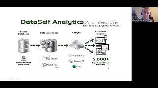
Thank you, Clark. Yep. And absolutely. I mean one of the reasons why we hired Clark is exactly because he's been for so long working with distribution manufacturing companies as an end user, doing reports, analytics and also he worked with the novella resellers for ERP systems and he brings a lot of expertise to help us better serve the channel in the market. All right, so we have a very good content. I want to jump right into it as a data geek, which I am one of them. One of the great news is organizations, you know, distribution companies have a lot of valuable data in their systems. It's amazing how much data people are collecting. And most likely if you are in this webinar is because you're using probably one of these systems as your ERP system. Akumatica, Microsoft Dynamics, Sage and netsuite. You use that as the system of record for your ERP needs. But most likely you also use Excel or Google Sheets for a bunch of reporting and data entry things. You might have CRM systems like Salesforce, HubSpot, CHRM, you might have E Commerce. I mean the amount of systems that companies use nowadays to run their business, it's amazing. Data Self, we are a fairly small company and we use more than 20 different systems to run our business. Payroll, marketing, project management, there's a lot of things and the data is there, my data is there. But Boy, it is a data house divided. Not going to politics of course, but most companies, they have their data house divided. And when management or even operations are trying to understand what's going on, the several touch points of a customer. Customers go to your website, they come from Google Analytics, you can see Google Analytics, maybe you have marketing campaigns. What are they doing with their marketing campaigns? If you have a CRM system, what are they in the opportunity pipeline? What about open sales orders? What about sales? What about receivables? I mean there's a lot of touch points in different systems. And when we try to understand that it is complicated, we got to call different people, different reports, different systems. It is a mess. So that's the problem that many companies face with what we call the data house divided. And we hear management fairly complaining very often about flying blind. They have the data is right there. But quite often they have to make decisions based only in their gut feeling, which sometimes is fine. But nowadays with the world changing so quickly so fast, more and more management is demanding fact based decision making. And they come to us and sometimes we only tell them some ideas how they can improve their processes. And that's our goal today is to show some of the kind of key performance indicators, natural language technology dashboards that can help management be more effective. Data self is a solution to do that. But if you have people and tools, you can get inspired by what we're going to be showing you today to do your own analytics and data warehousing. So anyhow, flying blind is a very common complaint from management and many say they get into Excel hell. Nothing wrong with Excel. Excel is an amazing tool. Excel hell is the concept of when people use simple reporting tools can be Excel can be crystal reporting services or tools like Tableau and Power Bi alone. When you use these simple tools it's very easy that every person will be building their own report out of their own system. Sometimes people don't know if the data is correct when it was refreshed. Two different reports showing the same metric where the numbers don't match. Excel hell means this ad hoc way that people start growing their business and don't do reporting consolidated with a single version of truth and it gets out of hand. So Excel hell a lot of error prone processes, error prone procedures with people doing hard to know when the reports are refreshed and hard to enforce the single version of the truth. That's the concept behind Excel Hell. Again, not Excel is just using any tool for reporting that is not consolidated. And finally labor intensive. We have so Many clients that when they come to us, they're spending a ton of hours, weekly, sometimes daily or monthly, trying to keep up with the reports, keep up with management, asking for information, it becomes slow and expensive. So those are the main challenges that people go to build better reporting solutions like data self flying blind, Excel hell and labor intensive. Let me show a typical architecture that you can get out of this framework. I'm going to be talking about the data self way of doing things, but the concept is the same no matter how you get out of this Excel health situation. Primarily you have on the far left your data sources and you probably have again a lot data set. We have more than 20. And the idea is to bring your data from your data sources into a place where you keep the single version of the truth. And data warehousing is well established technology and nowadays amazingly empowering and simple. If you pick the right tools to bring your data sources together in a place where you can do manipulation of your data to have your metrics calculated in a single place. How do you calculate your gross profit? How you calculate your customer friction? Everything is defined in a single place. And when you build your reports and dashboards, you just pull those those rules and you just build a report. You don't design the formula and the report, the formula is built in the data warehouse on the back end. In that way you can guarantee all reports will have the same numbers no matter who build those reports. So data warehousing can tackle data consolidation. Multi company single version of truth performance Many of our clients, they complain reports take too long. How is too long? Well, nowadays, especially with mobile devices, if you have an average user in a report takes more than 10 seconds. Most of these users will not wait and they'll make a decision based on whatever they think they know. So nowadays patience for waiting computers to spit out information is very short. And in our own internal processes we guarantee that any data self report will run under 10 seconds no matter how much data you have. No matter if you have multi company multi currency. We have the commitment to make reports run in seconds, no matter what the needs are. Anyhow, data warehouse is a critical component to get this journey to automate all this process and make it fast. Then on the front end people use a lot of different reporting tools. Crystal Excel reporting services if you use a data warehouse as a source of data for those tools you can, yes, you can manage single version of truth. You can do things much faster. It becomes so much better. At dataself we have embraced Tableau, Power, BI and Excel as our main reporting tools. If you don't know them, these three tools, they are considered currently the most empowering, easier, faster analytics layers that can get users who are not techies. You know, salespeople, CEO, CFOs, purchasing people, inventory management, whoever they are. With this kind of tools, they can do a lot more of their job with a lot less of learning different tools. So we have embraced these three tools. But absolutely you can use any tool that works well, especially if you're working out of the data warehouse. And with dataself we also have built over our 15 plus years of existence as being data geeks, we have built a lot of out of the box reports and dashboards looking at across the company many different data silos. So if you choose to go with Data Self, you don't have to start things from scratch. There's a wealth of KPIs ready to go on day one. But anyhow, here is about inspiration and let's move forward. I want to show now actually Data Self in action and if you do not use Data Self, you do not want to use Data Self. We hope that many of the concepts going to be showing now can be inspiring you to build your own better bi journey using besselbreed technology. I'll cover the following points and Clark will be chiming in. At one point of the presentation I will show how a data house divided looks in a framework that you're using a data warehouse in analytics tool like Data Self. So I'll show that concept. Then I'm going to show out of the box key performance indicators we have used for distribution companies, showing several touch points of a client in their interaction with the company. Once I show some of these dashboard that have been inspiring for many companies will show how natural language can also help management to become even more empowered. We'll also show a little bit of how easy is to customize things in Data Self specifically. So if you're using tools like the tools we're going to be using, you're going to get an idea of how empowering a technology stack like ours can be. And then we're going to also show the report distribution or automatic report distribution as we go through the presentation. Having said that, I'm going to switch gears and now I am in the Data Self portal of a distribution company and the idea is when a user logs to the portal I'm showing Data Self but you can have your own portal is to show this user what they care out of their data silos. So suppose I am the CEO or the cfo, a person who has access to a lot of different data silos. So in this case I can see sales information CRM. Again I'm showing Salesforce, but could be Acumatica, CRM, Sage, CRM, DynamicsRM, doesn't matter, it's a CRM system. If I have E Commerce, could be Shopify, could be Magento, doesn't matter. Marketing campaigns, HubSpot or Constant content, whatever you have Google Analytics, more ERP information, financials, payroll, doesn't matter. You know all the data silos, the data house divided becomes a data house united. Again, not talking about politics, but bringing the data together. So now you can get out of the fake news in your corporate environment. Do not look at the media out there because you might not trust it. But when it comes to your data, you have to be sure you have no fake news in your business and you have the data united. And that's this vision of having data out of a data warehouse with a single version of Truth where people can log in, they see all the data sets, they point and click and they can analyze. Of course, if I'm a salesperson, for instance, and I would not see payroll, I will not see financials, I will not see anything that I'm not entitled to. And then you have to have a system, a BI system that has security dials that you can fine tune in a way that the right person will only be able to see information they are entitled to, nothing else in Absolutely. Data self we use technology used by Fortune 2000 companies and we provide a lot of security dials to be sure the data doesn't get out of the right hands I would say. All right, so this is the concept of having everything, the data house united in a BI platform. What I'm going to show next is how a user can navigate through different of these components and see the several touch points of a client in their journey inside of a distribution company. And I'm going to take a flow, let's say starting with marketing campaigns. So in my case I'm going to be using HubSpot. So I'm going to show how people can analyze marketing campaigns and then what happens when they go to the opportunities in their CRM. I'm going to show some opportunities and then they go to sales orders. You know, they place an order, the opportunity becomes an order and then eventually, you know, you have to ship, becomes an invoice and eventually becomes a receivable. So I'm going to go through this kind of flow just to give an idea of if you're working with distribution companies and you build this kind of flow for your own business, you help management keep track of opportunities and threats that are happening every day so they can realize things today when something happens, important happens, not days, weeks and months out. Being timely is very critical today in business. So I'm going to start going to the my HubSpot which is looking at marketing campaigns very quickly, giving a perspective. Typically when you're doing marketing campaigns, you can see one marketing email in how many clicks, how many opens, how was the distribution for a single campaign? Well, from a business standpoint, you want to see across all campaigns, you want to see which businesses have been consuming or clicking on your marketing campaigns and who has been doing what and exactly what they clicked on. Like in this example, I have for several months all my marketing campaigns together and I can see what happened in geography, clicks and opens. I can see companies interaction, interacting with all the campaigns who have been clicking and opening. Let's say, hey, this company as my client, what's happening with them? If I click on a company, the whole dashboard changes to show this specific company which marketing campaigns they have been opening. You know, the gray is opening, the orange is there are clicks and they can see from that company who actually the people who have opened and who have clicked. And sometimes when you see this information might realize that some people that you're not aware of are consuming your content. Are they stakeholders that can help you get more sales out of your business by looking at this, that can help you answer that kind of question. Anyhow, we have this whole set of reports and dashboards to analyze marketing campaigns. Now once you get your opportunities into your CRM, whatever the CRM is, you can have and look at dashboards to analyze your pipeline. This is a quick example that I'm looking by salesperson, the totals of open opportunities, how they are distributed, by geography, by account, the details. And we have very many ways to analyze the pipeline. Some of the things we have found that in our clients, they're very excited in data self is to look at things that are stuck, which opportunities have not been moving for the past, in this case 25 days. And you know, we have a cycle that every 30 days you want to be sure opportunities are being moved. You can put here 25 and if it's getting close to 30, you got to be sure that your account managers are going back to the opportunity to see why they're not moving and update the CRM accordingly to be sure nobody is falling behind. So there's A lot of also dashboards we offer when it comes to analyze CRM analysis, if you want to see how your salespeople are interacting with the clients, you know, we call the activities or communications. How many calls are they placing per day, how many meetings, how many demos is it falling behind, when was the last time it was communicated? So we have also different dashboards to help you manage something you control. How many communication we do with your clients you control. How many opportunities you get is usually proportional somehow your communications. We have some clients that focus a lot in this part of the business because the more you control the pieces that you control, the more calls, the more meetings with higher quality. The more you get in your funnel, the better you get your sales velocity. So those are things we usually help companies to also analyze from a CRM standpoint. So once you get the opportunity into, you know, your pipeline eventually becomes a sales order. You want to analyze your sales order, you can click on open sales order. For instance, right here we have all open sales orders. It should be shipping today. If you click what I'm going to be shipping today, these are the customers that I'm shipping today. These are the products. And guess what I have here also some late shipments. Why is that? Maybe you care, maybe you don't. But it's easy to point and click here and focus your dashboard in those areas of the business. We also have out of the box or we recommend you to create alerts like in this example. This is an alert that tells what shipments were missed yesterday. They were supposed to go out, but they didn't. If this page is blank, no problem. You shipped everything that is supposed to have shipped. If this page has some kind of content, you want to be sure this email goes automatically to the people that should be looking this problem. And hopefully if you didn't ship yesterday, they shipped today or they call the customer to manage expectations. So having alerts that will automatically notify people about those things is also critical to have properly managed distribution business. When it comes to reports and dashboards, there's a whole section in Data Self that looks at also the inventory planning. In management we can see all on hand today. On hand forecast inventory planning. When you should be buying things, you can look at your purchase order. I'm not going to go down to the detail today, but we also provide several reports and dashboards to cover that area. You might be thinking, John, you're talking about a lot of things, but you're only showing about a few dozen reports and dashboards. Good question. Usually in a Company there's a lot more than what I'm showing you. This is a subset that's usually the landing page for a person and usually from the landing page they could branch out into other reports and dashboards. In our enterprise solution, you know, Data Self has the entry level solution called advanced analytics. In an enterprise solution, the advanced analytics we have about 100 or so reports and dashboards available out of the box. In the enterprise we have Thousands total of 8000 ish today covering all sorts of different reports and dashboards that many of our clients have been using over the years anyhow. So I talked a little bit about also the inventory side of it, but now I'm going to go into sales. Distribution companies are usually very driven by sales. They have to be sure they're selling properly, they're selling the right products, they take care of their customers, they're handling returns. There's a lot of things around the sales operations and for that part of the presentation I'm going to let Clark take over and talk about the sales side of our presentation today. Clark.
Thank you Johnny. We'll focus first of all year over year, that's not yo, that's year over year sales just kind of give you, it's a good way to get a perspective. We'll deal with hot performers, cold performers to see who you need to cultivate who who has not been contacted and we'll finish off with a Pareto chart to show some information and a daily flash report just to give you an idea. Okay, so year over year sales, it's now I worked as an ERP consultant. Did you know SQL reporting, Crystal reporting for companies. And for many years Johnny and I would talk, well why do I need Data Self? You get something like this and yes, I could have technically done this after many, many, many hours and then if another client needed it, I'd do it again for many, many, many hours. This is out of the box, ready to roll. You can get the information and make decisions and that was what actually attracted me to Data Self realizing the practicality of this. You can see right off this year, this fiscal year 34 prior fiscal year 31. So you are ahead of the game this year by 11%. You can also see where your trends are this year you start off going down whereas last year you started off going up. Something has changed seasonally. So you can take a look at those in the bottom you'll see a map red. Geographic zones are where you have lost ground. Between last year and this year I'm down by 10% there, black is where you have gained. So the size of the bubbles tells you where you have gained, the amount that you gained or lost. You can also see all of your customers and by product. So for example, if I wanted to take a look at my customers and see who have I, who have I lost ground with between last year and this year? So I can see this year nothing. Last year I was at 1 million. Okay, we've got, we've got a big drop there. Why, you know what's happening there? Well, I can go ahead and click on that customer and it goes ahead and changes the entire dashboard, focusing only on that customer and only on the products that that customer has purchased. I can also say, okay, which, which products are we going downhill on? And so I can go ahead and change my sorting there to show me these are the products, these top two products are the ones that I've lost ground on. So I can start building a, you know, a trend here. This customer I'm losing ground on and mostly on these two top two products. What's going on? You can see how you could, you could drill down a lot in a lot of detail and do some investigation here are these products losing ground all across, all the customers, Just these customers. It helps you ask the questions and then you can start investigating a little bit. I'll leave that alone right there. But there's one other item I would like to show. When you're on that customer, if you want to go ahead and drill down and see some of the details, you have a link in there to show the details and it will bring up a view at the bottom to show invoice by invoice exactly what's going on. So it might be down to one particular invoice or lack of invoice that that is causing the big problem. So you have right at your fingertips without asking anybody for another report or having to do another Excel query. It's right there. And then for example, on this one, if you want the details, if you want, you can export that out to Excel and slice it and dice it your own way according to what you need.
And Clark, just to complement what you just said, which to me it's, it's a, it's an interesting perspective. Some people, some people sometimes when they look at the reports at dashboards like this one, they think that it's just for high level analysis, which you know is true as a starting point, you want to see a high level analysis. But if you're using the proper BI tool like data cell for Instance, you can have these reports in a way that you can start from the high level perspective and when you find the outliers, because usually, no, usually things just work, right? You don't have to be managing one thing at a time. Usually things work. What about the outliers? The things overly good, great things or terrible things. The outliers is usually where management needs to focus their attention to take advantage of outliers, the good ones and try to minimize the bad ones. And usually you have to go down into the details, you know, see the transactions, see the invoices. And a good reporting tool, a BI tool, should allow you to start from the high level. Quickly finding the outliers and easily drilling down, slicing and dicing, connecting the dots. In the example that is showed where you clicked, you click show Details is a very simple example of encapsulating the details behind the high level. But when you need to see them, easy to drill down.
Very good point, Johnny.
Thank you.
Yeah, before I became an ERP consultant and got into bi, I worked in distribution and retail companies. And I wish I had this information at my fingertips at that time. This would take a lot of gut level analysis and manual research. Another view that's just handy is to show who are your top customers. Who's on fire this year? This is the top 25 customers in your period 2. You're developing defining your periods of data, time periods up in the top, right? So these are the ones that are the top 25 customers in that period range. You can go ahead and change those ranges if you want and see that. The other piece of this is maybe they aren't, they aren't your top customers overall right now. But the difference between period one and period two, these are the ones that are gaining ground between those two periods. They could have the potential for being a hot customer. So maybe you need to spend some time cultivating those relationships and seeing if you can get more out of it. On the other hand, your cold customers who is losing ground. This is the important one to me because I, you know, when I was in the business world, I didn't always pay attention to the people I never heard from. I was focused on the people I did hear from. This is the ability gives you the ability to look at the people I am not hearing from and maybe I can be proactive and call them. These are the top 25 customers in where they've lost ground. Sales are declining from period one to period two. On the other hand, the frozen customers are the ones where the sales are Zippo, no activity in that period 2 range. So why have they just all of a sudden gone quiet? Maybe that's a good point, a good indicator. We need to contact them and find out what's going on. Just right at your fingertips, a quick look that I can make decisions and act on them. Another view that is actually would have been very useful to me back in when I was in that world is the Pareto view comparing sales by gross margin. So you have the bottom 20% is the light blue. The top 80% is the dark blue. So you can see these customers are making your top 20 by gross margin. Then the next ones are the lower percentages by gross margin. So if you take a look at one, the medium high sales, but their gross margin is not that good. Maybe the resources you're spending on that customer to make very little money are better used on customers that where you make higher margins. I remember I worked in a lumber company doing working with contractors and one contractor was a top customer. Boy, they just ran lots of money through us. Started doing some analysis and realizing we were actually losing gross profit on them. I eventually fired that customer and our bottom line went up. Because I was able to take those resources and apply them to people we were actually making money on. I had to do all that by gut and hand management. This could have helped me see that trend much earlier in the process. Another one I worked in retail and a daily flash report. This is assuming you have an intuitive sense of what's going on on a daily by day by day basis. It's not showing necessarily comparing over time. This is showing you on any particular day what is the information about that day. And where I tend to look a lot is at the gross profit. If I've got a threshold, I need to be making at least 30% gross profit or 45% gross profit on a daily basis. I can go look at any particular day and see what the gross profit is for that day. I tend to look at percentage more than, you know, just dollars because that's the ratio I'm working on when I look at these. Then you can go ahead and see all of the other information related to it. If I were to select on one of those a particular customer, for example, it will reconfigure everything according to that customer. So again, this interactivity to show, okay, on this day, this Customer I did 53% better than overall. I can see what salespeople were involved, what products they bought on that day. So you have the ability to use this in a number of different ways to see who bought what. Or I could even go say on any product, I could say these are all the products that were sold on that day. So who bought that product? I could click on the product and it will show me the customers that purchased that product on that day and what your average percentage is. So it's high level. But with this ability to drill down and the interactivity, I can get a quick picture and feel for what's going on in that day. Johnny, I was going to go turn it back over to you.
All right, thank you, Clark. Just complementing also this dashboard. Many of our clients when they come to data self part of the reason is because management is flying blind. And they say that so many times they realize something really great or something horrible happened days ago, weeks ago, sometimes months ago, only sometimes after the month closed when it's too late to act on that information. And many of these clients that were complaining about flying blind typically now saying, hey, you know, today I can see what happened today or yesterday in dashboards, the data itself. And if something really good or really bad happened, I can act timely. You know, if I need to do something, I can do it today. Not waiting for a report at the end of the month. And sometimes it's too late. We have several success stories that management explicitly talking about how much value they got out of the daily flash. And in the daily flash report, at least in data self out of the box, when people open it, by default it will show the latest information, usually today or yesterday so you don't have to pick a date. It will show the latest data. It's called the daily flash because it's the latest information even though you can pick other days in case you want to go back in history. Anyhow, moving along, Clark, thanks for I love your insights. You bring so much experience. We usually I'm usually helping people to do better, but I'm not one of them. So I always love to hear your stories about how people are using systems to get better information out of them. Let me go back. You know, we're going to this presentation that we talked about initially, the marketing, the marketing emails. We showed opportunities, we show sales order, now we show sales. The last thing I want to show on the out of the box is receivables. Now that you sold, are you getting your money right? Are people paying you? That's for many businesses is not a big deal. You know, the payment always works well. But many distributions, sometimes they have some challenges collecting some of the money. And we also have dashboards out of the box that can help management quickly see the trends and pinpoint in case they need to act. Like in this example, we have the total balance in open receivables by the aging bucket and use these different color standards that you can see by region, by due date, by salesperson, by customer, details, everything. And hey, look at this one customer has a lot of lates. Actually, no, we have a few customers with a lot of late invoice. I can click on that customer and then it changes the whole dashboard to show that customer. But I have a few more. Let me pick those other three customers. These three customers, they represent probably the majority of the late invoices. And I have in a single report there's three salespeople involved. I could call them and say, hey guys, can you please work on these clients to get the money out of them? Anyhow, this quick tour we did in Dataself, we're recording the session. So in case you want to build your own dashboards with your own tools that have inspiration, we're going to be sharing this recording tomorrow, so keep that in mind. What we want to show next is customizations because typically this out of the box that you can get from a company like Dataself can give you so far, but usually you have unique needs not covered. What we're going to show next is two types of customizations as how customization can be done in Data Self. The first one I'm going to be showing is natural language query is how users using plain English you got to know English, but how users using plain English they can have answers to their questions. And what I'm going to show today is based on sales with any data brought to the BI solution. In this case, let's say Data self. If you're using natural language technology, any data from all the data silos, you know your data house United? Yes. Any data from your data house United States, you can use natural language to query it. I'm going to show some examples out of sales. Suppose I'm a VP of sales and I want to see sales by salesperson in 2020. I probably can find a report. Yes. But sometimes people just like to do like in Google, you search for a question, you get some hits, you pick the right one and you see the report. I'm going to do this right now. I'm going to say sales, Sales by sales salesperson. Jesus, I'm not typing well today in 2020. So I just type a question like in Google or Bing. The tool gives me hits like when you do a search on the Internet, you gotta read, understand the hit and find the right one. So in this case, I want to see the sum of sales by salesperson where the Invoice date is 2020. Yes, I click that one in instantly, accurately. The magic happens. A new report from scratch built showing by salesperson sales in a descending order. This is not magic. This is artificial intelligence, machine learning and natural language technology working behind the scenes to answer the question correctly. We don't control the question. And sometimes that's a problem. People don't know how to articulate their questions. They get an answer to that question and they were thinking about something else, something else. And they make the wrong decision. We do not fix that problem. That problem is on you to learn to tell people how to ask questions correctly. But people who know how to ask questions correctly to this machine learning natural language framework, they can go crazy. Hey, I want to see this actually broken down by month. I type by month, the tool will give me the hits of what I wrote. I choose the right one and now it converts that report. So by salesperson it gave me a line chart. So every, every line chart is for a salesperson in 2020. By month I have sales. It's that easy. Again, natural language asking the right question, you get the answer. Now many users, they like numbers, they like to see different representations, maybe like a grid. Anyone can quickly come over here and say show me this on a text table instead. And now that report is showing text like an Excel numbers by the penny. And if I want to export to Excel anything in UBI solution should be easily. Should provide easy ways to export data out into Excel and other form. Let me show how it works in data self. Suppose when I see generated data, I select generated data. It's all here. I tell the tool, show me the data. And when I show me the data, I can see an overview what I selected. But I can also see the underlying data, all the records behind those details. I was looking January 2020 sales by salesperson. And here I have everything, invoices, customers, every single detail is in this sheet. Now I can export it to Excel and do analysis in Excel in case I want to. So easy to get the information into data self and then easy to get the data into some other formats like PDF, Excel, PowerPoint and whatnot. So natural language super powerful to help decision makers find the answers. Natural language is fairly new, it's about five years old. Mainstream technology, it can do a lot, but still like searching the Internet, you're not going to Find answer to all the questions. You still need people that know how to use the dials of the PI solution to design more complex reports and dashboards like we showed before. And that's the last part of our product presentation. I'm going to show you in the next five minutes or so how to build a new dashboard from scratch, similar like we did before when we were showing the out of the box reports in data Self. So right now I'm in the report editor of Data self and if you're familiar, this is actually powered by tableau behind the scenes. Anyhow, it's an easy to use report designer and I have now three data sources connected. Three of my data silos are together. I have CRM information, I have sales and sales order. I'm going to build a new dashboard, a simple one showing me sales by customer in the current period. I want to see sales and gross profit percentage change over time and I want to see my open opportunities in a map, everything together in an interactive dashboard. So now I'm putting my data geek hat and I'm going to show you how easy or not if you don't follow, but you should, how easy it is to build a dashboard like that. So I'm going to start with the first section showing sales by customer in this period. I got to go to the sales data source, I find my customer and I put in my rows. So these are my customers. I want to see sales, so I find sales. I put in my report. So sales by customer in my whole company history. Well, I want to see sales in the current period. Well, let me find the invoice date which is called document date and put in my columns. And by default it puts all the years I only want to see, let's say this year. Sure, make this year a filter so I can take this report and only focus let's say in this year. And there it is. In a few clicks I built from scratch a report showing sales by customer in this year. And you know, if you want to do more, hey, what products they've been buying from us. I can take the product, put in my rows and it will be that easy. Buy customer, buy product sales this year. Or maybe you want to see sales by product by customer. You change the order by product by customer sales this year, very intuitive point and click, drag and drop. You can build a lot of reports doing like that. So this is one of the reports I just finished the next one I'm going to create a new sheet like in Excel, several tabs for different Views. So I'm going to create a new sheet, new tab at the bottom blank. And in this example, I want to see sales and gross profit trends over time. Well, with this tool it's very easy to do that. I can double click sales. The tool will put this on a chart. In this case it's just a single bar for my whole sales and the whole history. Well, I want to see over time. Well, I find my document date, I double click it and the tool will plot the sales by year. Well, I want to see by month. Instead I can tell the tool don't show me as a year, instead show me as a month with the month and year so I can see my whole history how my sales trends is. And there it is. Sales trend in the whole company history. All right, cool. I also want to see gross profit percentage trends over time. Well, I find gross profit percentage trend. I drag and drop into my report right below right before the sales. And there it is. Gross profit line in a percentage in sales right here. Sometimes changing the representation can be more informative. In this example I'm going to tell show me this on what is called a dual axis approach. And as you can tell now we have the orange bars for sales in the blue line for gross profit. And I have this weird thing at the beginning. Well, it's because I changed from one ERP to another. This doesn't look good in my chart. I want to get rid of that weird information that is old. I want to make a filter of my document date and I tell hey, I don't want to see the old data. I'm just going to filter it out. That's it. Quickly, nicely. I have a better representation of sales and profitability over time. All right, that was the second part of my new dashboard, the last one. I want to see open opportunities from my CRM system can be a commatica CRM chrm salesforce doesn't matter. Well, now I'm going to click opportunities from my data source and I want to see from the addresses I want to pick the state and actually let me just do something because I forgot to do this before we changed. So I see state and I want to see open so I choose open opportunities by state and I want to show this on a map. And then on a map it is. Let's make the bubbles a little bigger and let me make this a little bigger focus on the U.S. so right now, bigger bubbles, bigger open opportunities by state in the U.S. now I want to combine these three different reports into what's called widgets in a Dashboard. I'm going to create a new dashboard. A dashboard in our concept is a way to combine several widgets together. The first widget is my grid report that has by customer, by product sales in 2020. Then I have the second widget I'm going to put in the bottom of my dashboard which has a trend analysis. In my last widget is my map which I want to put at the top right. Drag and drop point and click. And now the dashboard is combining CRM opportunities, open opportunities, actual sales in this year in trend analysis across my whole history. Highly interactive. I could now save this report. I click save and it becomes a new report in my framework. And let me just show you, once I save it and I call this dashboard dashboard number one. If I get out of the edit mode of my reports, I can tell my sales team, hey, look for Dashboard 1 that I just created. They click Search Dashboard 1. There is Dashboard 1 we just created and this is the one we were looking at. And now as a viewer I can review or I can view the dashboard created by the business analyst. And suppose I'm looking at this on a mobile device like a tablet. And when I analyze only opportunities on the west coast and see what happens with the sales on the west coast, I can select opportunity in the west coast and automatically the sales. And it did not work in production system. This works in my demo today. It did not work. But in data cell when you connect the dots between the data sources, you can interact, open opportunities, marketing campaigns and see how that information affects the rest of your data silos. And I'll vouch for it.
It really does work.
Next demo, next webinar. We'll get it right. Sorry about this one. So and by the way, suppose this dashboard, I want the dashboard come to come to me. I don't want to go to the dashboard to see what's happening. I want this dashboard to come to me every day, every week, every month. How can I do that? Do I need to call the IT to tell them to add this to a schedule and explain what they want? What I want? Yes, I could. I could tell the IT to do that or we can use a self service subscription so you can click subscribe. Then you can tell who should receive this report. I want to get it. I want to get Clark to receive it. I want to get Zach to receive it. I just add all the people that should receive this report. I can tell how the report is going to be delivered. I want to see as a PDF what's the email address and how often. This report should be refreshed and emailed automatically. Hey, I want to receive this report only weekly. Monday 6am I press subscribe and that's it. From now on every Monday 6:00am Pacific this report will be refreshed and emailed to all the people you put over here. So you can let users to self subscribe or you can have people that maintain the subscription to be the ones that they can subscribe to others. But making it easier for users is critical. Alrighty. I hope you have found the tour of Data Self and these dashboards informative. I'm going to go back now to the PowerPoint to wrap up our next slides. If you were to go with Dataself what we showed you today, probably everything we showed you today can be deployed in minutes. Literally in minutes. Half an hour an hour can be deployed out of the box. You can order your Data Self by contacting your VAR or going to dataself.com once you order the deployment on your system. In case you have an on premises is primarily a 1530 minute process. You go through a wizard, you define a few things. Once you click Save and finish in a few minutes or hours, depending how much that you have, what we showed you today will be deployed out of the box. So deployment of Data Self with everything you show today is very fast and also it's very inexpensive to maintain Data Self to extract new tables, new fields. If you're a techie person, if you're a consultant, we use our latest and greatest Data Self ETL Plus. It's an amazing, powerful yet easy to use data extraction tool. It's actually ETL stands for Extraction, Extraction, Transformation and Loading. And this tool is changing the world for the better. So if you want to learn more about it, contact us and we can show how easy and empowering our extraction tool is. Finally, as I mentioned before, we have two main solutions with Data Self. We have the Advanced analytics entry level product that the pricing starts at 299 per month. We're currently offering a 14 day free trial. If you go with the enterprise solution is in the thousands per month. It comes with a lot more power, a lot more reports and dashboards. Reality is a lot of clients they start with advanced analytics and they never leave because it's so much more powerful than what they're using today. And larger clients or clients with more sophisticated needs, they might eventually go to Enterprise if they stay with Data Self because enterprise opens a whole new additional deal of possibilities. Having said that, we have five minutes to go. I'm going to open a Q and A session. But before just to revise what we saw today, we talked about how to bring your datahouse divided into a datahouse United. Usually data warehouse is a critical component to get the job done. You can build yourselves. There's other companies providing data warehousing. Dataself absolutely is an amazing company to work with, so keep that in mind. Super important to build well thought out key performance indicators for your management and allow them to access these KPIs anytime, anywhere, in any kind of device. By the way, with Data Self you can use Windows computers, Mac computers, you can use web browsers, mobile devices. We support a lot of these devices but make easy access anytime, anywhere with a lot of devices. Ability to automate complex and labor intensive reporting Sorry, this is from another PowerPoint, but the ability to automate complex and labor intensive reporting is critical and usually data warehousing is an important component to automate those processes to guarantee a single version truth and then using reporting tools like Tableau, Power Bi and Excel to push the information out. We found that very valuable. If you can leverage natural language, AI and machine learning. Do it is still young. Technology is not perfect by far, but it's already bringing a lot of values for the right people in the right organizations. If you go with Data Self, you can deploy things in minutes. Most of our competitors is in weeks. So if you go with the competitors, good luck and be patient, they'll get there. Hopefully with Data Self we do things much faster and very affordably. Having said that, let's see if we have questions. If you have questions, please use the Zoom panel. There's a Q and A section as well as a chat section to ask questions. Let me check it out. There's a question here from Mary. How long does it take to learn how to use Data Self? Mary, good question. It depends what you want to do with it. If you're an end user and you want to use the reports and dashboards, we have many clients that have learned how to use it themselves by looking something like this and poking around and getting the hang of it. We usually provide a one hour onboarding training to let users understand the filters, how to click and navigate. If you want to build reports and dashboards, I have many users that have learned how to do it by watching self service videos. On average we provide eight hours of training to give people a lot of the basics that cover a lot of the reporting needs. So usually eight hours will take someone a long way to build their own reports and dashboards, it'd be fairly self sufficient. Reality is, on average 80% of the customer reporting needs are easy or fast and clients can do pretty much all of them. The other 20% of reporting needs is when you have to call the data geeks. You know we're not making everything simple, we're making everything simpler, including the complex things. We make them simpler, but you might still need the data geeks if you have more complicated requirements. If you want to learn data warehousing, then you need to have a lot more technical background to learn the data self way to do the data warehousing. You do not need to have a computer science degree. If you've been working with reports like with Crystal Excel reporting services, you probably have the basic foundation to learn how to learn data warehousing. And then it goes to dozens of hours of training for you to become a data warehouse maintenance person. So training can be very little, sometimes no training at all. In more training case you want to be more sophisticated. We're running out of time. I see some other questions, but we'll answer them offline. As I mentioned, this video is being recorded. This webinar is being recorded. Tomorrow we'll be sending the link so you can share, rewatch it or share it. I really appreciate for you to join us today. If you have more questions, comments about BI in general or data self, how we can help your clients, feel free to contact us. Have a wonderful day. Thanks for having Happy Thursday.










