DataSelf for Distribution with Natural Language
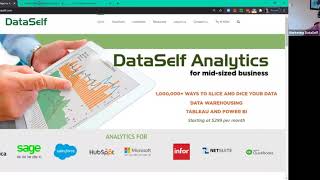
Johnny Girardi demos DataSelf, a platform that pulls data from ERP, CRM, and e-commerce systems into one warehouse so distributors can query it in plain language and build charts instantly. The walkthrough covers pre-built dashboards for sales, inventory, and receivables, plus a live report designer showing how to create custom sheets and maps.
Questions this video answers
November 17, 2020.
Johnny Girardi, founder and CEO of DataSelf.
About 100 reports and dashboards ("hundred ish").
About 8,000 reports and dashboards (presenter cited ~8,000).
Deployment of the out-of-the-box solution: roughly 30 minutes for the manual setup; data upload time may take longer (minutes to hours or days for large initial uploads).
Chapters
Okay. Hello everyone. Thanks for joining us. My name is Johnny Girardi. I'm Data Sales founder and CEO. And first of all, thank you. I hope you're staying safe, well and sane, which has been my biggest challenge lately, thank God. Anyhow, let's make good use of our time. Today we're going to be talking about data self for distribution companies. I'm going to be talking about how natural language, artificial intelligence, machine learning and analytics can help these organizations get better insights from their data. So first of all the good news is organizations have a lot of valuable data stored in computer systems that is easily accessible. Just to give some examples, these are some ERP systems that we connect out of the box. So if you have an ERP system that is one of these, we have solutions for you. But beyond the erp, you might have CRM, may be part of this solution. They also have CRM. You might use Salesforce, you might use Sales Excel for capturing spreadsheets, budgeting, forecast, whatnot. You might use HubSpot, Shopify, E Commerce. I mean there is typically a lot of different data silos or data sources that organizations use to capture your data to run their business. And I'm just putting some logos and names of systems that are very common to find out there in on average any organization have more than 10, two dozen data silos and these are some of them. So we call this the data house divided. It's a little joke with the politics in the U.S. but anyhow, the point is if you are a management and you're trying to have an understanding of your operations, the touching points of your clients with your system, it's hard and I hear many decision makers complaining that they're flying blind. The data is there is so close to them, but they can't put it together. Very common complaint from management. Quite often people use Excel to get the data out of the systems into Excel and manipulate the data and distribute the information. And sometimes you get an Excel hell, you know, is this Excel accurate? When was we refreshed last time? Did someone make a mistake in the Excel Why my numbers don't match with yours? When you use tools like Excel reporting services Crystal any reporting tool that just goes straight to each data silo, you might get into this Excel hell environment. The problem is not Excel is because the way that you extract the data from the data sources and sending to users. So we hear a lot about reporting or Excel help because the disparate data sources at the end of the day, if you don't use a proper bi Platform reporting becomes labor intensive. It takes a while to do anything. Reporting decision makers have to wait until the data is ready. A lot of effort into validating the data, A lot of effort into disputing if the data is correct. In a lot of effort putting into distributing the reports, the right report to the right person at the right time. Lots of challenges. How do we address these issues? Well, let me show the architecture. Typically with Data Self, we pull the data, data from data sources, any data source you might have. And I show some of them in the prior slides. But we bring the data together in a data warehouse. A data warehouse is a clean, simple way, simpler way to keep a single version of the truth. All the logic you try to build in the data warehouse, people who know data warehousing can maintain it secure, securely. The data there have a single place to define the rules. How you calculate your sales, your gross profit, your cost of sales, your services, your overtime. And then the solution will just refresh it on a scheduled basis. And when our people are hitting or hitting your reports using tools with Data Cell, we have Tableau Power Bi in Excel, the reports will be accurate, they run instantly and they would not slow down your source systems. So we use data warehouse and technology and also tools like Tableau, Power BI and Excel to make this solution to address the data warehouse divided. With this, you can have the data house united instead. Reports will run fast, it's easier. And things that people have to do mechanically today in Excel or other tools can be automated by this framework. So the intelligence of humans still are part of the reporting process. But the mechanical part of it, the data preparation, extraction, distribution, those things, usually we can automate most, if not all of it. Let's see in practical terms how Data Self works for distribution companies. I'm going to start showing a little bit of how users can go and see the Datahouse United, how natural language, artificial intelligence, machine learning can help users get data out of it. I'm going to show several reports and dashboards that have proven to be valuable for distribution companies as a starting point. So I'll show a little bit of that. I show some how easy it is to customize a solution and how easy it is to distribute reports to other people. So now I'm going to be switching to our portal and this is when a user logs into Data Self and Data Self dashboards can be embedded into your Systems like your ERP system or your CRM or SharePoint, whatever application used to bring your data together for operations. We can also, or you can also Embed these dashboards in them so people don't have to go outside of your framework to leverage this kind of technology. Now the good news is when the user logs to data self, securely logs their self based on their user credentials, they will have access to some of the data silos. In my example, I'm seeing things from the ERP system, you know, sales from the CRM system, this case Salesforce. It could be a Kumatica CRM, it could be Sage CRM, Infor CRM, Microsoft Dynamics CRM, any CRM. I can see E commerce like Shopify or Magento. I can see HubSpot, Google Analytics, more ERP data sources and let's say payroll doesn't matter. All the data silos become united inside of the data cell framework. As a user I just have to point and click and I can visit these different data silos or I can build dashboards that combine the data from all the data silos together. So I can see, let's say a visitor, you know, a customer that have visited my website. I can see in the same dashboard what opportunities are, let's say on salesforce.com and then I can see in my ERP what are the actual sales this year and last year to date. And I can see also how they are interacting with my Twitter account, LinkedIn, Facebook, whatever it is. Everything in a single dashboard absolutely can be done. But today I'm going to be showing the big picture and a little bit of things around the erp. Since most of you who sign up are from the ERP world, let me start showing first of all from here how users can use natural language to come up with questions, ad hoc questions, and see answers. So I'm going to click the natural language query within the shipped sales framework. Let's say I'm the VP of sales, I keep. I'm going to click the natural language. So I go to the natural language sales framework. In natural language it's like searching the Internet like in Google or Bing and the answer is a bunch of hits. You pick the right one and then the solution builds a report or a chart from scratch answering your question. Let me show how that works. Let's see, let's say sales by salesperson in 2020, I asked a question. The tool uses natural language machine learning to come up with potential hits or answers to my question. I select the right one and the tool will build instantly accurately an answer to my question, which a chart or a grid. So in this case by salesperson in 2020, I see sales in a Descending order. This is not magic, this is technology. And you can go further. Hey, great, I see my sales by Sales Person 2020. What if I want to break down by month? Sure, by month. You type what you want, the tool give you the hits, you select the right one and again you see the answer. So in this case, sales by month for every salesperson using a line chart. Maybe I don't like line charts. I like to see numbers or some kind of other representation. I can choose this and go let's say to the tax table and now that report, show me numbers by the penny for every salesperson for every month in 2020. Maybe I want to export this data to Excel. Sure I can select some data points. In this case I'm selecting month of January for sales by salesperson. The month of January. I tell the tool, show me the data, just those data points and I can see every single line detail behind those data points and I export to Excel. So now all that information has put in Excel file and then I can do whatever I want in Excel. You know, invoice, number, invoice, date, quantity, shipped, sales, you name it. So natural language is a way, a very empowering way to let business users find answers to their ad hoc questions without calling anyone else. But like searching the Internet, many questions people will not find the answer match in natural language. They will still have to call the experts, the people who go through training to build more elaborate reports and dashboards. So very empowering, but it's not a magic bullet. You still need to learn the others part of the framework. And that's what I'm going to show you next. I'm going to show you. I'm going to go back to my home page. I'm going to show some of the popular reports and dashboards for distribution companies that we have seen them benefiting from. Our entry level solution have about hundred ish reports and dashboards for distribution companies and I'm going to be showing them today pretty much the entry level solution data cell for distribution companies. We also have an enterprise solution that has Thousands, actually about 8,000 reports and dashboards covering a much broader range of reporting needs. Today we're going to be focusing on the entry level that has also a lot of powerful ones. I'm going to show some sales, some on hand, some receivables and some financials. So let me show a little bit of them. The first one I'm going to show is the year over year sales. Most distribution companies are very data driven and they need to have easier Faster, better ways to analyze their sales this year, this period and often comparing to last year, same periods. So in this example I have sales this year, last year in the variance looking from this filter. So right now this is my current fiscal year, I could select any fiscal year. And right now I'm only looking at the first six months of my year. Why? You know, let me put my whole year because in my sample data, you know, this year, the dark blue, I only have data through January, June. So it's a year to date comparison. If I do full year is not fair. Of course I'm declining a lot because you know, I only half through the year. Let me go back to only the first six months of my year. So I only have the first six months and I'm actually growing a little bit. I can see the trend analysis by month, I can see the ship to or the bill to, you know, where I'm selling. Bigger bubbles, bigger sales. This year, black is growing since last year to date, red is declining. So in this case Texas is growing by about 14% since last year to date while New York is going down by about 10%. I can see sales by customer last year, this year the variance and by product last year, this year the variance. So nice high level perspective. And again I can change the periods. Hey, maybe let's put also July to see our analysis here. And the whole dashboard changes to show year to date through July. Now when they look at this data, let's see that I look at this customer. Hey, why is this customer declining? I thought they were doing really well. Well, I'm going to select this customer and by doing so the whole dashboard changes to show only for this customer, period analysis or trend analysis what I've been shipping in, what products are driving the decline. Or maybe look at this. Among my top customers this year, several of them are declining. Why are they declining? I can select all of them and again the solution will show all of them and maybe which products are driving the decline. So right now I'm sorting by sales variance and this product clearly is driving the majority of the decline of this product. Is there something wrong with it? This is just a sample database. The point is business users will be able to slice and dice their data to interact, to quickly come up with answers or questions and hopefully find answers about threats and opportunities that otherwise would be very hard to come up with. And this is high level information aggregated at a period and year level. What if I want to see the details? Well, I just put the mouse over there and now I can click show details and now what happens is the tool will put me on the bottom every single invoice with the customer document, date everything on this bottom section and if I need to spin it, analyze it, export Excel is just a few clicks away. This dashboard is usually very empowering for distribution companies. Of course there's some customization. Maybe they sell services, not, you know, products or they want to change in ad salespeople, territories, easy to customize. And we'll show later a little bit of how to change the structure of an existing reporter dashboard. Let me go back to my homepage and show some other popular reports and dashboards. Hot and cold performers know usually you care who is growing the most or or who is declining the most and why can you maximize more growth? Can you reverse some decline? And the first question is who are into the tip of the growth curve of your business? Well, we have two dashboards covering we call the hot performers or the cold performers. Here I have hot customers by sales on fire are the top customers in a given period. And I can put any period here. And the heating up customers are the top ones by growth from the period 2 versus period 1. So these are the biggest customers, these are growing the most. Maybe you don't care about customers, you care about products. Well, I can come over here and say my main dimension instead of customers going to be my products. And once you change the product, the whole perspective now is showing hot products top, you know, the on fire and heating up. Maybe you don't care the sales, maybe you care about the gross profit, the quantity shipped. Sure, I can go to my measures and select, let's say quantity sold. And now you're looking at on fire by quantity sold by product and which ones are growing the most in quantity sold from last period to this period. The point is point and click. You can give your decision makers easy ways to analyze growth or we call the hot and if you see the cold, the ones who are declining the most or no longer buying, you can see in these two different tabs those perspectives very empowering. Another popular report for some distribution companies is the Pareto Chart. Many distribution companies, they want to be more profitable. And sometimes the challenge is who should they focus on to be more profitable. And that can be complicated. I had a prospect recently, now they became a client that they have been for two years trying to understand how to look at profitability, how to categorize profitability. And when they saw this dashboard they said oh my God, we need this, we need this today. And sure enough they become one of our customers. What is the Pareto report? Well, right here I'm looking at customers and I could see by product salespeople and whatever by changing this column, but by customer I have in the center panel my profitability in a descending order. So the most profitable customer by gross profit all the way going down. The blue ones, they represent 80% of my profitability in the one in red or the bottom 20%. And then on the left I have sales. And the question is why? Some customers like you know, my top customer by sales is the most profitable, the second one is still the most profitable. You know, I have to sell almost twice as much and why. And this is actually from a client's data, you know the trend. They realize that they have to align some of their products and discussion negotiation to hopefully make the other customers as profitable as the first one. But until you see the trend, you might just don't know how to maximize the threats and opportunities in this example. Why some customers with so much sales, they are so unprofitable? I don't know the answer. It's for you to answer those questions. But if you know those trends, you hope you can fine tune your process and maximize your business. The Whale dashboard. It's very popular for organizations that the overhead of every sale can affect the bottom line. And this was inspired by one of our partners, VARs where they sell to companies that are in the convenience business, convenience stores. So every time that a customer asks for an order, you have to send a truck to deliver those orders. If a customer only orders once a week, your overhead to fulfill those clients needs are low. If they call every day and you have to ship things five times per week, your cost goes up, their profitability goes down. This dashboard can show which clients are profitable when you take your total cost of business of operating, divide by the number of orders you ship and then look at the profitability by customer and subtract your overhead to operate based on customer delivery. So popular dashboard for those reporting needs. I'm going to show a couple more on the sales side I'm going to show the customer loyalty for many businesses tracking customer loyalty and why some customers are leaving your business after a certain time and why some customers are sticking around seeing those trends, those patterns can be valuable and we have dashboards out of the box to help you keep track of customer loyalty. The last sales dashboard I want to show is daily flash sales. What happened today? What's happening today or what happened yesterday? Which products I sold the most, which customers ordered the Most who was the most successful salesperson. If you want to see things happening closer to real time, things like this dashboard can be very helpful and valuable. And you can have these dashboards posted on big monitors in your cafeteria. I mean, maybe nowadays, not with COVID but in your plant floor, anywhere. So people can keep track of what's going with your business and help you move forward more efficiently. All right, so those are some of the out of the box for sales. I'm going to show a little bit of, you know, inventory distribution companies are usually highly focused on maximizing inventory management. And this dashboard is one available with the entry level solution. Gives a perspective of where your inventory is, which items are no longer selling and they are sitting on stock for too long. So you can look at, you know, the last sales date by item or maybe in a given period, which items are moving too slowly or not moving at all in how many days of stock you have on hand. So this is usually the starting point to have better visibility across your warehouses for better inventory management. I'm going to show a little bit of receivables. For some business, not a problem. For others, very critical. This is a way to look at all your total receivables and then by aging bucket and we look at these colors. They're used across all of the dashboards. So here I'm looking the totals by where the money is coming from. The totals by due date. So to date is this line here. These are on time receivables. These are slightly late. You know, the yellow is 1 to 30 days more late and even more, you know, old receivables by salesperson, by customer and the details. And again, highly interactive. Look at this. This customer has most of my old invoices. If I click on the customer, it will change the whole dashboard to give me details for that customer only. Or maybe you want to do a campaign to see all the old and then you want to see where the problems are. So right now it's only showing salespeople, customers and all the details around those old aging invoices. Very interactive. The last dashboard that I want to show in my out of the box is a financials. Many of you are in the financials industry. So this is an example of taking GL data and putting some charts, some donut charts and bubbles and whatnot. P and L as well. You can see your P and L. You can slice and dice it. They're interactive. Here look at, you know, revenues, total cost of sales. This is the whole P and L in my Dashboard and I want to drill down and see more details. I can click here and expand. So I went from looking at the revenues level and now I can see by, you know, the GL segment two or segment three, whatever it is. So you can very easily drill down and keep on drilling down to the next level. This would be the next segment you can go all the way down to drill down to the GL batches and in the documents fitting your GL transactions. Very interactive. What I just covered in the last about 15 minutes or so, the datahouse united having all the data silos in Data Self and giving you the user portal where each user will have access to different data silos. They point and click and they go to different locations. I show how natural language can help decision makers to find ad hoc answers to the questions. And I showed some of the out of the box dashboards that have proven to be valuable to distribution companies available with our entry level solution. Now I'm sure that most of you, maybe all of you, you want to customize the solution. How can I customize beyond natural language? As I mentioned, natural language can only go so far. So how can I go beyond natural language? That's what I'm going to show you next. And the first thing I'm going to be showing you and let me go back here on the dataself.com the website. I'm going to scroll down to these green buttons and I'm going to click the architecture. So you know where we're going now. So this is the whole architecture, you know, pulling data from the data sources to go to the data warehouse, go to the front end and see reports and dashboards in web browsers, computers and mobile devices. So far I've been, I've been showing you things on the analytics level and I'm showing the Tableau engine. I'm going to show you now how to create a new dashboard from scratch using this analytics layer. So I'm going to show, assuming that the data warehouse is working, there is no customization, how to create new dashboards reports from scratch. Later I'm going to show how we can change the data warehouse. Also very briefly in today's presentation, so how to create a new dashboard from scratch. This part of the presentation is a little bit more technical. So if you're not technical you don't need to freak out. I'm not going to be going to coding and be very complicated. Most things is pretty much drag and drop, so it's fairly easy. Still, users who want to become really empowered with this report designer, it takes hours of learning. On average eight hours is the effort required to become very self sufficient. I'm going to build a dashboard from scratch showing three different pieces of data. I want to see sales by salesperson by product in the last two years. I want to see sales and gross profit percentage trends over time. And I want to see sales by region, by state. And I want to put all of these different views, they're all sales, into a dashboard that is going to be interactive. So let's do that. So this is the report designer on the left. I'm connected to my sales data and I have my measures. I'm sorry, my dimensions and measures. Well, my first section of this dashboard is sales by customer by product in the last two years. So let's start building that part. This is customer, I'm going to put customers in my rows. So these are my customers. By the way, this is a sample database. This framework works the same way. No matter your source system, if you have Acumatica or Sage Dynamics, if you use Salesforce, no matter what, once we have the data in the data warehouse and plugged the ui, you're going to see something like this and you have to just drag and drop. So sales by I have my customers. I want to see sales. Sales right here. I'm going to drag and drop into my report. So sales by customer I want to see now by year. So I'm going to go to my document date and add my document date to my columns and I see by year in my company history all my sales. Well, I only want to see the last two years of my sales. Sure. I can tell the tool to make my year a filter. So I choose a filter and now I have the filter on the right and I'm going to select only the last two years. So there it is. Sales by customer in the last two years. Drag and drop, point and click. I also want to break down by product. I guess you already know what to do. You find the product and you drag and drop into your rows or columns. I'm going to put after my customer. So sales by customer by product in the last two years. Or maybe you want to see sales by product by customer. Sure. You take your customer and you put your product and now you have by product by customer, sales by year. Let me go back to sales by customer by product because it was my initial request. And again, if you want to put the warehouse, just put the warehouse over here. Or maybe you want to put as part of your columns very fluid drag and drop when you click and you make the changes. And maybe you also want to see your quantity sold. Sure. Quantity sold, drag and drop. And there it is. By customer, by product. I have my quantity sold and my sales. Very easy. But in my example, I don't need quantity sold. So let me go back to sales. All right, that was my first report. I'm going to double click the sheet and I call sales by customer and product. And now I have my title. All right, now when I build a second report by the sales and gross profit trends over time, just like in Excel, I can create a new tab or a new sheet. That's what I'm doing right now. I have a second sheet and in this case I want to see sales. I'm going to double click sales gives me a chart for all my sales. But I want to see trend over time. I'm going to double click document date and the tool thinks, ah, I think you want to see sales by year and gave me a line chart of sales by year. Yes, close enough. I want to see by month. How can I change by month? I can go to this pill that is year and choose instead month and year. So I choose month and year and now I see the whole sales trend in my whole company history and looks like it's going up, which is awesome. All right, that sales trend. What about gross profit percentage? It's right here. I can drag and drop into my rows as well. So what happens is I have at the top my gross profit percentage and at the bottom I have my sales. It's kind of cool, kind of easy, but visually it's not so easy to read things. Let's make a few changes to show this in a better, more insightful way. I'm going to click the show me button and tell the tool to show this in a dual axis approach. In a dual axis, I'm going to have my sales as bars in this example, orange bars in my gross profit as a line. This is so much easier to read than before. So I like this. And actually I have some data here that is kind of skewing the numbers is actually legacy data that I don't care. How can I filter that data out? Well, right now I can say to my month to be a filter and now the filter is on the right and I'm going to say I don't want to see that old data just, you know, as of this date and now that bad data is out of the picture and I see a clean, insightful dashboard once I see this a Few times I will know and remember sales are the bars in orange in gross profit is the blue line is going to be so much easier to see the trends in what's happening. So that was my second section of my dashboard, the third. And I'm going to create a new tab. So my third tab is sales by ship to by state. So again I go to my line here, I find my ship to state and I select my sales and I tell the tool, show me this on a map. I click the map and there it is. I have by state, I have a bubble where the bigger the bubble, the bigger is the sales and that's it. The dashboard. I mean the three widgets have been created and I want to put them together in an interactive dashboard now. So what I do now I click this button, which is a new dashboard. A dashboard is a way to combine several views together. So I'm going to put my grid analysis on the left, I'm going to put my trend analysis at the bottom and I'm going to take my map and put on the top right. You just drag, you know, whatever you drag and drop. You see this gray area? When I drag and drop, it will stay there. So I'm going to put it right here in this area in my map. It's right there where I posted. So in a few click in a few minutes, I built this dashboard from scratch. Now I can save it. So I save this dashboard, I can give a name, I can save in a certain location. Only salespeople can access this or only people in the west coast. You can use security to segment every report in who have access to it. Now once I build this dashboard, I could tell my team and by the way, let me put this dashboard, I'm going to call first dashboard. I just saved my first dashboard. I save it and then I can get out of the edit mode. So now I'm no longer adding the report and I could tell my team, look for my first dashboard and see what you think people could go back to their portal, they can click the search button and click first. They will see the first dashboard, they click on it and now the dashboard will come to their portal. And if they're looking at this dashboard, let's say on a mobile device, they couldn't start selecting, hey, what's happening on the west coast? What's happening in the middle of the country? Very interactive point and click give users powers to do this kind of analysis and be more informed. Now what if a custom one of the sales people say, hey, actually can you add my sub account but only the first two segments of my sub account in my detailed report? Very common, people. Hey, awesome, thank you. But can you do a change? Sure. As the report editor or whoever has rights to edit a report, they click the edit button, they go back to the dashboard, they need to put the sub account in this segment, which is this tab here. So now I'm back to this point and I have a sub account key. This could be a sub account, a GL account, any data point from your database. If I add the sub account over to my report, drag and drop, there it is. I got it. But they told me I only want to see the first two segments of my sub account. Why? I don't know, maybe some kind of code. Well, how can I get the first two segments of the sub account of anything in this reports? It's easy. I'm going to drag this out. Well, I'm going to leave it here as it is, but I'm going to take my sub account and I'm going to say duplicate it. So I'm going to have a second sub account and I'm going to edit it and I'm going to call this sub account first segment. And what I'm going to do is this is the code of my sub account. When I say give me the left two characters of the sub account, you need to understand a little bit if you know this language. But good enough, there is a health here. If you go and you find the left function, you'll see that the left function is right here. You click and you see a little bit of, you know how it works anyhow, you click ok. Now you have a segment first, a sub account per segment. You drag and drop over here. And as you can tell, it's just taking the first segment of the segments. The report has been fixed, has been improved. You can go back to your dashboard, you have it over here, you save it and you tell your user, go back to your dashboard. And now you're going to be able to see the first two segments of the sub account in your report. And there it is. Customizing reports and dashboards with this framework is amazingly empowering. And usually people can do things much more quickly than using Excel or reporting services or Crystal or if you use like Acumatic or Netsuite, those reporting tools that they have, it's kind of awesome, but it's not as easy as empowering as this one. So give users more power. All right, but I showed you just how to customize a reporting dashboard. Assuming that the data warehouse is properly mapped. What if I want to bring more optional fields? What if I need to bring more tables and customize the back end? How can I go back and customize the back end? This is technical. So this is not for the faint of the heart, but it's not overly complicated. It's actually usually easier than using other reporting tools because we have an amazing new product called Data Self ETL plus. Again, you have to be technical, but if you know SQL statements, currently the ETL plus only supports or is only designed for people who can handle SQL Server statements. If you can handle SQL Server statements, this is going to be amazingly easier to come over here. You have your source, you have your data warehouse tables, you put your SQL Server statements in the etl, will take care of the transformations, will take care of the extractions, will optimize the process, will make things so much easier. If you do not know SQL Server statements, next year when I create a layer on top of this that you can select tables, fields, table joins without knowing SQL because the front end will provide you the SQL Server statements behind the scenes and then people can choose one or the other or both layers to do maintenance of the data extraction. Anyhow, if you know SQL, you can come over here and added the SQL statement, just put more fields, maybe you want to add another table. You just keep on doing things. Once you're happy with your extraction process, you tell the tool to refresh now and you say you run in the tool will run refresh. We push to the data warehouse and usually we'll push the front end tool Tableau power bi so you don't have to do a lot of these mechanical things. The tool is automating lots of steps that typically IT people have to go through. And that's where I'm going to stop today. If you want to learn more about the backend, contact us and we'll be glad to show you more details on the back end. Finally. So once you customize, let's say that we have the new parameters, you customize your dashboard exactly the way that your users want. And then as a user, I go to the new dashboard, my first dashboard, and I say, oh my God, Johnny, thank you. This dashboard is exactly what I wanted. But I want to receive this dashboard automatically in my email every day or every week or every month. I'm so busy to go to the, you know, I'm so busy to go to the. To your portal. How can I receive things automatically? Well, typically, you know, you have to call the IT People and blah blah blah. That's what usually people do with data self. As a user or as an admin person, you can click the subscribe button. If you have the rights to do so, you click the subscribe button and I want to be receiving this email and I want to send it to other people. Let's say I want to add Taylor, I want to add Zach. I mean you just put all the people you have in data self. I only want to receive this dashboard or the whole workbook. Maybe you want to see what you want to send to your board members once a quarter or once a month, a financial booklet. Well then you send the whole workbook with all the details of your financial booklet to those people. In this example, I only want to receive this dashboard is going to be a PDF in my email is going to be first dashboard and I want to receive this actually only Weekly on Monday 7am Pacific and I click subscribe and that's it. Hands off. From now on, every Monday 7:00pm Pacific, this report is refreshed and emailed to all the people that I have put in that list. So automating the distribution of reports, knowing that the data warehouse is accurately, reliably, securely refreshing your data. A lot of these processes that people go through today, very labor intensive using the Excel hell or whatever tool that you use becomes automated by data self. So I hope you have enjoyed the product presentation. Now let's move to the last few slides of my PowerPoint deployment. Deployment of our entry level solution takes minutes. Pretty much you order data cell from your variable or from thedataself.com and I'm going to show you very briefly how it goes. Once you order, you receive an email with instructions to deploy the system. And pretty much the deployment of the ETL plus if you have to is pretty much a five step process that takes usually minutes. Usually tell people no budget, half an hour. We have time that it takes 10 minutes to finish. You do this setup, the system has to upload your data to the cloud. So that step can take several minutes, even hours and even days. If you have a lot of data the first time that you upload. But pretty much the manual process, the manual process pretty much in 30 minutes. You deploy the out of the box. In everything that I showed you today, everything I showed you today will be available right off the box. So order data self deploy in 30 minutes, wait for the system to refresh and when you get an email, the system has been deployed, you will log the data self, you'll get the credential and everything else and everything that I showed you today would be showing with pure data, not with my sample data today. So deployment is very straightforward. How much does it cost? The starting price is 299 per month and there is a 14 day free trial now. Very important. Go to dataself.com Let me go back to dataself.com here. Pick the product, the main system that you use, let's say Acumatica, click that logo and then the advanced analytics is the affordable one. And if you scroll down on this page you're going to see a price list. So maybe if you have an L to X resource level or E to P is more than 299. So the 299 is the starting point, the starting price. Or if you have let's say a Sage product. So click on the Sage logo and click on let's say sage x3. And then you're going to go to a page similar to this and you scroll down, you're going to see the pricing in X3 starts at 499. So check your pricing check with your VAR. Contact us once you're ready to deploy. You click Deploy analytics now to order Data Self directly on our website or again order from your var. We'll send you the information, we'll send you the links and we'll get deployed literally in a matter of hours. Everything should be up and running already. So there was pricing and with that I'm going to be opening a Q and A session. And before I read questions, main benefits of Data Self. First of all, Data House United, all your data from your ERP is going to be readily available across the board and you can easily join all the data. You can bring any data silo in dataself and everything becomes part of your single source of the truth for reporting purposes. 1 Credentials with reporting access across all of your data silos, people will be able to easily access the reports and KPIs anytime and anywhere. They just need an Internet connection and it's very secured. There's a lot of must have reports and dashboards ready on day one. So it's not a blank sheet. There's a lot of inspired reports. We bring natural language, artificial intelligence and machine learning on the front end of the tool and next year on the back end of the tool as well. So very exciting. Leveraging this new technology for reporting deploys in minutes and the pricing is very low. With that in mind, I'm going to check questions. So if you have questions, please use the zoom panel. There is a Q and A section where you can click the button and type your questions. So I have some questions here. Question from Bruce. Can we drill from one view type like a pie chart to underlying data displayed in a different view in a different viewer type? Bar chart, bar graph. So you want to click on one view to see the underlying data displayed in a different view type. I didn't quite exactly get your question, but let me show you an example of how to see the underlying data. So for instance, suppose that I want to see the underlying data for all of these data points, right? I want to see all the records behind the scenes. I select the data points, I put the mouse over and I go into this section like I showed before. It shows the data points you selected. You click full data and you have full access to every underlying information connected to those data points. This mapping is done in the data warehouse. So if the data you want is not here, you have to learn data warehousing to plug additional data points and do that. Now what I think you're saying is what if I selected some data points, but then I want to see something else related to it? What's your name again? Bruce. I think we should take this question offline. I need to understand what you're trying to do. Overall. This technology is used by Fortune 2000 companies. If it is possible to bring up the data together, usually we can do it. But I have to understand exactly what you want to do and then discuss how that will be done. But I didn't quite understand the question. Another question here from Peter. How long does it take to get trained in data? Self Peter, good question. It depends. Let me go back to my architecture here. Let me give you what we have seen. About half of our clients, they don't need customization, the back end, at least not after the initial is deployed. So about half our clients, they just need training on the front end of the tool, let's say in tableau, power, bi things of that nature. We have some clients that have learned and became independent with their customizations with zero training, at least formal training. I am a person who have never attended training on the front end tool. I saw some people showing the tool, I start to read it, poke around, watching videos, and today I'm an expert. So yes, you can become an expert without training. Absolutely you can. On average though, we recommend eight hours of training on the front end. And with eight hours of training, you should be able to tackle about 80% of the customization needs you have for the front end. So you can do a lot once you go through eight hours of training. If you want to learn how to customize the backend now you need to be a SQL Server or a SQL statement person have the kind of background if you don't have it's a lot of things to learn. But if you do have the kind of expertise knowing tables and fields and links typically it takes 16 to 24 hours to become fairly sufficient in a lot of customizations to become a wizard. It takes a lot of hands on experience but to get the basics is 16 to 24 hours to be fairly versed on the back end. All right Peter, thanks for your question. I'm going to only check one more question. Question from Carl Can I consolidate data from Multiple Sage and 100 company codes in the same report? Carl Absolutely yes we can. Can we do this with the entry level solution? Maybe it depends how many companies you have. It depends on some of the details. But if you go to our enterprise solution, by the way, let me go back here and click on Data self homepage click sage. Go to sage 100. So the entry level solution you can have for every company you can have its own Advanced analytics for 299 for the first and then we give discounts for the additional companies if you need to bring them together. Today we are enabling Advanced analytics to do the data integration. Yes we are, but is a new framework so we can talk about it. With Enterprise analytics which starts at 499 we have clients with more than 100 different databases brought together in the data warehouse. When you go to a report to see, you can see data across, all of them consolidated. Or you can slice and dice by company, individually or group of companies. So when you go to enterprise, the sky is the limit. So the answer is yes, absolutely. We can bring all of your Sage 100 databases together in a report. If Advanced analytics will work for you or enterprise, let me know later. We can connect on a one on one, discuss your needs and take care of it. Alrighty, I'm going to wrap and I'm going to move forward because I know that we're all busy and we have probably meetings to jump Next. If you have questions, comments, discussions, learning about this technology or comparing our solution with others, you have here my email and our phone number. I hope you have found this session informative. It's being recorded tomorrow you should have a link to the recording session. Feel free to share with others. I hope you have again enjoyed and learned something good today. Stay safe, well and sane. See you next time. Thank you.










