DataSelf for Sage X3 / EM - Aug 2019 Webinar
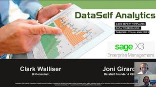
Johnny Girardi and Clark Wallisser demo DataSelf, a SQL-based analytics platform for Sage X3. It includes 5,000+ report templates, multi-company consolidation, and role-based dashboards that embed directly in X3. Natural-language queries let you analyze data without writing code.
Questions this video answers
Johnny Girardi (Founder & CEO, Data Sales) and Clark Wallisser (BI consultant).
About 14 years.
About two years.
Over 5,000 templates.
They state reports run under 10 seconds as a benchmark.
Chapters
Alrighty everyone, thanks for joining us. My name is Johnny Girardi, I'm Data Sales Founder and CEO and I have with me here Clark Walliser is one of our BI consultants. Today we're going to be talking about Data Self analytics for Sage X3 or Enterprise Management. We have been doing this, doing analytics in data warehousing for about 14 years in the Sage market. With X3 we've been working for about two years and we have some exciting new developments to share with you today. I'm going to let Clark take over and then later I'll get back to also do my part.
Good morning or good afternoon depending on where you might be. Last week we had a panelist from an attendee from New Zealand, so it's all over the time zones there. Wanted to talk about what is Data Self, where does it fit in? What are the challenges we are trying to address? I come from a background. I was an ERP consultant for over 20 years. I've also been an end user in ERP system, ERP end user. So I've been on both sides of the line and I have dealt with many challenges in getting the information I needed, when I needed it in a way that I could use it. And that's what has attracted me to Data Self. I have known Johnny for over 10 years and we have talked and I've slowly started seeing the vision and eventually I came to work to join the vision. So here are some of the issues we deal with. Reports and dashboards, you have your ERP system, CRM system, HR system, document control engineering, all these different systems and they all have their different data views and data portals all over the place. How can you see them all in one place? That's where a tool like Dataself comes in. It gives you the ability to consolidate all of your information into one location in an online portal that you can get to from any computer or mobile device. And it's powered by SQL in the back end so the data is fast and stable. That to me is worth a lot. Instead of going to different systems to try to see the information and then you can never see it combined together, you don't even have a chance. So this is the first challenge that I think Data Self addresses. Next slide there, Johnny. Consolidation a big issue. I'm sure you've all migrated from one system to another. Unless you've been on X3 for 20 years, that'd be interesting. And one of the common things with migrating from one system to the other is where is the history? All that Historical data rarely does that get migrated to the new system. So how can you get a full picture combining your historical data with your current data? Consolidation is one of the things Data Self can do very well. We pull all of the information from the different systems into one SQL database. We can build consolidated views. So at the touch of a button you can see all of the information together and all of the consolidation is being done behind the scenes in the SQL data warehouse. So if you're running a report, you don't have to wait while it does a manual consolidation while it's running much simpler. You can also consolidate data from different systems. You might have a CRM system with opportunities, an ERP system with sales orders, and you want to be able to combine that information together. That's another feature of this. You might have multiple companies in your X3 and do you have the ability to easily see all of the companies consolidated in one view? Those are the challenges and that's where we provide a solution. Next slide.
And Clark, just putting something in the consolidation that we also have some clients that they have x3 in some other ERP system like Dynamics or anything else and it's going to take a while for them to bring into a single ERP, like maybe all companies into X3.
Right. Phased approach. Yeah.
So for reporting purposes, we can bring the data from the other ERP systems into the data warehouse consolidated with the x3. And then people can see consolidated financials, they can see sales services, whatever reports, even though the ERP systems are different. So the data warehousing is not only for X3. Multi company, any kind of multi company system can be brought into the data warehouse.
Before we move on to ad hoc, I just want to add on to this. One of the things that attracted me to DataSelf as an ERP consultant was I've done data consolidations before, that's my job. But with each different system you've got different field names, table names, different things. And then how do you decide on, well, what's the consolidated field name going to be, et cetera? Data Self handles that automatically. We've got that all built in. So you don't have to take time, you don't have to spend time trying to figure out its invoice number in one system and invoice ID in another system and what's it going to be called in the combined system? That's what Data Self does to get you up and running and get results as fast as possible. One of the other things I like is ad hoc reporting. Lots of times I'm not sure exactly what I'm looking for. So I start noodling around, playing with the system and just pull things in different ways until I get what I like or what I think I need. Not every system has a handy reporting tool for that or querying tool. With Data Self on the back end and Test Tableau or Power Bi on the front end, you can easily just take your data from the data warehouse, create a quick view, swap views, change fields and pivot points, etc. Until you get the kind of information you need. And you get that data within seconds, not within minutes. It's not polling the original ERP source or other data source, putting a load on that. It's all coming from the data warehouse. So it does not impact anybody else. That is of immense value to me when I'm just searching and not sure exactly what I want. And I don't want to take go through 15,000 reports just to find if one report's something close to what I want. And this is a useful tool that is built into dataself. Next slide.
All right. Just, just. Also an interesting example in the ad hoc world. A few months ago I was visiting a client and I was participating in a meeting where they were bringing these data self printouts, you know, big pages, I mean huge pages with the charts and the reports. And the cool thing was seeing them was they came prepared for the meeting with all the information they needed to discuss. The meeting was going through and discussing the topics that they usually discussed. But commonly there are questions that pop up that before were never thought about. And they need to drill down and slice and dice some of the data that was printed on the paper. But the business analyst had a notebook connected to the big screen. So when they had a question, they had to drill down into one of those dashboards that was, you know, that was printed out. The business analyst went to the notebook, opened the same report data self and went to the edit mode and starts to slice and dice it and drill down. And it was fun to see them drilling into questions. They were not prepared for that for that particular meeting and just get the answer done. If you don't have a solution that is that easy, that provides ad hoc analysis, most likely they will have to either wait until the next meeting when someone would come back with the answer to those questions, or they would have to wing it. Hey, we don't have the answer. We have part of the, the information. Let's just make a decision based on incomplete information. And you know, nowadays winging it or waiting is no longer effective. So having a tool that is really empowering for ad hoc analysis is awesome. And you'll see very shortly how this works with Data Self.
One of the challenges of getting custom reporting and complex reporting is it takes a lot of work and it's not cheap. Can you imagine commissioning your consultant or your business analyst to build you 5,000 reports? That's a big task. One of the benefits of Data Self is it comes out of the box with over 5,000 templates built in. And these are reports that have been developed over time. A clearinghouse of data views and questions that hundreds of other customers have asked. And these are different views that give you ways of looking at your business that you might not have thought of before. It's a lot more effective to start out of the box with a foundation to work off of. Next step.
Another insight, if you allow me. Many of our clients with X3, when they joined Data Self, some of their complaints reporting was labor intensive. They were using some built in bi offer from X3, but every time that something needed to be changed, it was a lot of hours. All the BI competitors that we know in the X3 world, when you start your X3 project, you come with a small set of reports good for the very basics. But anything that you need beyond that is built from scratch. And you know, nowadays people have a lot of questions. So what happens is in the course of years, people spend a lot of time building reports in X3. And like Clark said, with Data Self the starting point is 5,000. We cover financials, payables, receivables, sales, purchase order, inventory, services. There's a lot of things available on day one. So if you go with Data Self, the amount of labor required is going to be dramatically reduced because of the out of the box plus, Data Self is much easier to use. So when you do need to build new reports that are not available yet, it will take a fraction of the time. So it's a big challenge that I've heard from any X3 clients. And we help, we can help a lot.
Okay, next. What we don't know, you don't. I mean it's that dilemma. You don't know what you don't know, you don't know. Have you asked all the right questions? And this is again where I come back to the 5,000 plus templates that come out of the box with Data Self Enterprise. That is a clearinghouse, as I said, of years of other people looking at their businesses in different ways than you might have. And Johnny's told me multiple times about stories of existing customers that they spend all this time on a customer report, I want to do this. Then later on they look at the existing reports and something pops up that answers a question they didn't even know to ask yet. And they're just shocked. That's a lot of value when you think about it. You can take a look at just perusing and get different views and ways of looking at your business that you might not have thought of before.
Yeah. And Clark, let me just give you one story because to me it was so inspirational of this. You know what we don't know sometimes is more important than what we know. One of our clients a couple of years ago when we started the Data Self project, their main challenge was financial consolidation. They have multi company, multi currency. They were spending almost 100 hours per month to prepare consolidated reports for their board meetings. So when we started Data Self, they asked us, can you just please automate this process as much as possible? We want to free those hours to do analysis and more work than just doing data prep. Make a long story short, it took us five months to untangle the beast coded automated trained people. So five months later, the CFO was hallelujah, it's working great. Every day the reports are consolidated. I don't have to wait for the end of the month. All those hours they're free to do something else. But then the CFO went to analyze to just kind of browse through the out of the box and he found a report showing some inventory issues that they had. And he called me Johnny, I just found this report. If I had seen this report five months ago, on day one, it was ready on day one, I would have told you forget, financial consolidation is a problem we have, which is costly, but we're managing today painfully. We have bigger fish to fry. So he told me what this problem that they didn't know was costing a lot more than then 100 hours per month of no Lamborghini around reporting. And that's part of the out of the box. We have all of these KPIs showing important trends that other business ask us to build. And as Clark said, sometimes what you don't know can be more important than what you know. And we have a lot of inspiration on day one.
How does this all work? It starts on the left hand side with the source databases. You might have an erp, a CRM, you can even do Google Analytics. I'm not a big fan of social media, but yes, you can do social media too. You can pull that data and instead of having to pull those data sources every time individually when you run a report, we pull all that data into a single data warehouse powered by Microsoft SQL. So it's industrial strength and our secret sauce is the data self, ETL extract, transform, load and application that pulls all the data from the data sources and harmonizes the data so that they all have the same names and structure so that the data can work together. Once that has all been transformed and I call it pre digested, it is stored in the data warehouse, then it moves up to, in this case for Tableau or Power bi into the cloud, into your cloud repository, Tableau server or Power BI service and it's sitting there ready for you on the end to do your reporting for actionable insights, whatever tool you're using, Power bi or tableau etc. And you don't have to pull from the original sources. You've got it all consolidated, optimized in the data warehouse and stored in the cloud ready for you at any time. Johnny, it's all yours.
All right, thank you. All right, Clark, thank you for the introduction. So I guess some people are probably eager to see the actual product. So let's jump right into the presentation. Let me bring my browser here and actually let me just start from scratch. So the first thing with Data Self that we always focus on is to give every person in the organization that want to have access to the reports and dashboards what we call a 360 degree view of what they care. So if I'm a C level person like the CEO, the cfo, typically I want to see key performance indicators across the whole organization. This is one example of a 360 degree view for actually for a CFO, one of our clients, the CFO actually build this dashboard from scratch and this person looks at cash flow, projection orders to ship opportunities from CRM, aging revenues, Google Analytics, data, financial metrics, many of them coming from drp, some coming from Excel sheets, doesn't matter, it's data that belongs to the company and the CFO wants to see every day when they start a day on his mobile device. The idea with this three 60 degree view dashboards is look at the big picture. If everything is normal, everything is working, you go about your day. But if something is really good or really bad, typically you want to see more details about it and perhaps take an action like in this example I'm seeing a red bar for my inventory. Inventory is too high, what the heck, I click on this bar, the solution drills into A subsection of my dashboard. I was looking at the main dashboard, now I'm looking at the inventory. And all of this is highly customized. In this example, this CFO wants to see the top 10 products by cost on hand. So every one of these products there is a bar and if the block, the little segment is red, it means I have too much on hand and then I have an aha moment. Hey, look at this. My west warehouse just has too many items on hand. And right now maybe I need to call or contact the warehouse manager to ask what's going on, right? In real life, when you need to contact someone else, sometimes you don't remember their phone number, their email address and you need to find that information. And if you get distracted, sometimes you just forget about it and you never take an action. So with dataself we have many tools to help bridge the gap between the aha moment and an action. Like in this case, if I click a label, in this case the west and I click call warehouse manager or email, it takes the action right from within the dashboard. Even if I'm using a mobile device is the same dashboard and I click call the warehouse manager or call the customer. Whatever it is from the mobile device, it plays the call. So shortening the time from an insight from taking action at the end of the day, dashboards, reports, analytics is about inspiring people to make better decisions and take an action and shortening the cut, you know, shorting cut the process between those two. Some of the things that data setup is really powerful. Like Clark was saying is again the ability to bring all the data together and allow business people to navigate from one point in their data to something else. Cash flow. I click on the cash flow. Suppose I'm going to see what's going on with my cash flow. I drill down into the cash flow projection where I can see a bigger picture, more details. Here I see all the transactions, you know, moving forward the apar. And look at this. There is a transaction that is in red alert. What it means. This invoice has been disputed. As a cfo, should I care if this customer doesn't pay? Will it cause my cash flow maybe to cross my line of credit and it's going to give me a headache. Maybe, I don't know, I can click on this transaction and say exclude. I'm making a what if scenario. If I exclude this payment, what happens? Oh, it's going to cross my line of credit. Well, that's going to cause me an issue. So maybe I need to get involved. Maybe I Need to call the customer, call the salespeople, whatever it takes. Be sure to that this particular issue is not going to cause me my headache. So building this dashboard that provide view across the whole organization, the whole data silos, allowing people to drill down as slice and dice it without knowing complex things is critical so they can make better decisions and be on top of important initiatives. So this is one example of a 360 degree view for sea level people. Let me show another example for a salesperson. So now it's also the idea of when a salesperson starts their day or throughout the day, they want to see how they're doing, they go to the dashboard, they can see the major metrics they're responsible for. It can be anything. It can be CRM like sales velocity metrics. It can be commission, it can be quotas front and center. You can put things they need to be doing today or maybe this week, closing orders, calling opportunities, top right is a very critical part that so many times we add a lot of value is calculating commission. A lot of organizations spend a lot of time doing commission calculation, typically at the end of the month using Excel sheets. And then they announce to the salespeople their numbers and what happens. Some salespeople don't agree and they started getting calls and emails to figure out what's going on. And there's a lot of waste of energy around data preparation and being sure everything is correct with data self. We can take the logic of calculating commissions and let the data warehouse do the heavy lifting so that all the data prep, the classification of the transactions, the payments and whatnot, go to the right bucket, go to the right percentage, go to the right rep. Doesn't matter if you have one rep or if you split commission. Let the server, the data warehouse do the heavy lifting so your salespeople will always get their commission calculated every day. They don't have to end at the end of the month and the numbers are correct. And if they want to see why certain numbers are not matching with what they think, they can take the report, drill down to details and find the answer without having to call and bug the people who usually do the reports in Excel. So commission calculation is a big area that for many businesses we can help a lot now in this kind of, you know, dashboard for salespeople. We also usually have what we call the hot in getting cold performers. You know, who's hot, what products or services are hot, where is hot and who's getting cold. And pretty much you point and click. So if I want to See who's hot, you click the who and then you go to this out of the box report. This report is pretty much ready on day one. That shows you the customers with the biggest sales in this period. What is this period? Right now this period is this year to date. But you could see quarter, quarter to date, month, month to date and moving windows. Very easy to change the period that you want to look at. And on the right side you have the customers who are growing the most since last period. In this case since last year to date. So these customers are perhaps not big enough to be a top customer, but they are growing the most. So we define them as who is hot. So this is one example of an out of the box report that typically for companies who deal with recurring customers is good to know the biggest by sales and the biggest by sales growth. And we have the same perspective by product. So that's what's hot by region. It can be country, it can be state, can be city. And we also have the opposite side in who's getting cold or what's getting cold. The idea here is who might be leaving your business. Sometimes when you look at the top decline. So these customers are declining the most in sales since last period. Again, I'm looking on a year to date basis. These customers have the biggest decline. Is there something wrong? Maybe not. Maybe it's fine. But sometimes customers are leaving and the salesperson doesn't know until it's too late. So knowing who have the biggest decline, you know, by product, by customer is a big initiative. If you put the mouse over the customers, you can see in the middle section which products or services are driving the biggest decline. So very interactive for people to see who's declining. Why the right side has what we call the no sales. So these customers were buying last period last year to date, but not at all this period. So if you care about those things, it's very good to have the kind of report available right in front of salespeople's hands so they can be on top of those initiatives and be sure if something is wrong to be proactive before it's too late. Let me show a little bit something on the P and L P and L budgeting. Many clients that come from the sage world come to us because the built in financial reporting budgeting is limited or is too time consuming. Let me show a little bit how it works in data self. So this is an example of a P and L. Right now I'm looking the P and L for 2018 and I'm seeing data through the period seven. So you know, 2018 through the period seven. What if I want to start to change this report and slice and dice it? Well, one thing is easy to just drill down from the year level to see the periods in the total. So very straightforward. If I want to compare year side by side, I can just pick year side by side and right there you see the numbers in front of you. Maybe you want to see how you're doing versus the budget or is it growing since last period? You just pick and choose and then the solution will show the post and the variances. Very straightforward, very, very easy. What if you want to drill down? Usually drill down is a multi page process. You know, when you drill down you go into a separate page and you're no longer, no longer looking at what you started. For instance, hey, payroll is going up. I didn't hire anyone, why is it going up? Well, let's see. You click payroll. Now what happens is you're still looking at the P and L payroll and now you see the balances for every payroll account for every year fiscal period in this segment. And then suppose, hey, I want to actually drill down further. Now I click expand and now I'm drilling down to the batch level. So I'm looking at every single batch, every transaction date, description and whatnot. And if you look at this particular number here and you get a call, you get distracted. This happens a lot with me when I come back to this report. If I cannot see where I started in all the clicks that I did to get to this point, I might not even remember why I'm looking at this page. We call this Data Self. With single page analytics you can actually see where you started, all the clicks you did to get to this point, all the filters. So if you get distracted when you come back to the single page analytics, you can see where you are, why and hopefully continue with your analysis, make a decision and take an action. So this is our fairly new. We have this functionality for about eight months. It's called Financials with single page Analytics. I want to show one more example here on this Data self right now. This I'm showing right now what is called Data Self Enterprise and as Clark mentioned, we have more than 5,000 reports and dashboards. If you come to this main page, these are the areas that we have connected for different ERP systems, including X3. But what if I want to build a report from scratch? So completely from scratch? Well, I can come to my data sources. I want to build, let's say a Sales report, let's say a new workbook. So what I'm going to do now is not for everyone. You know, many users, they don't want to bother how to build reports from scratch. But I want to show how easy it is. It's mostly drag and drop. Suppose I want to see a report showing sales details this month. So I want to see by customer and by product. So customers are here. I want to see customer. I drag and drop all my customers. I want to see sales drag and drop. So all sales from all my customers. I want to see my top customers. So I just sort in a descending order. Okay, cool. I want to see sales this month. So let me put invoice date. I have sales by year. Let me drill down all the way from year to the quarter to the month level. So now I'm gonna see my whole company history all the way to the latest month. So through August. Well, I don't wanna see everything. I only wanna see this month. I drag and drop dates. My filters, now I have a filter on the right and I can pick the beginning and end date or I can select relative date, which is something related to today's date. I want to see today's date. I want to see this month. You just pick and choose. And now you're filtering the report to only show this month. Or maybe I'm going to see the last three months. Just pick and choose and the report will show. Maybe when I see years quarters, just pick and choose. Well, let me go back to this month only. I also want to see sales by customer, by product. Well, you just have to find product and you drag and drop. If you know how to drag and drop, you can do it. It's that easy. You just drag and drop, point and click and you can build a lot of reports just with that functionality. Some reports will be more sophisticated. They require more expertise. Absolutely. But on our experience, about 70% of the custom reports are either tackled out of the box with the 5000 we have or by just doing what I'm doing right now, which is dragging and dropping. So that's my report, sales by custom product this month. What if I want to see sales by territory? Well, let's say I want to see ship to state. I want to see invoice size and sales. I want to see all of this on a map. Just point and click choose map. There it is on a map. I see bigger bubbles, bigger sales, and the bubbles are sliced by large, medium and small invoices. Finally, I want to put these two reports Together in a dashboard. I drag and drop into my dashboard and in a few clicks I was able to build from scratch a new report. And if I want to share with the rest of my people and I'm suppose I'm the VP of sales, I just click, you know, save. I'm going to call whatever, you know, sales by territory. I can save into different folders. Once I save, that's it. Everyone in my sales team would have access to this report and then I can start interacting with it. You know, suppose I want to see only how sales is doing on the Northwest. I select those, those territories and the report at the bottom is filtered. Very interactive, very easy, very empowering. So that's one way how people can easily go to like the meetings that I mentioned before. You can take an existing report or build something from scratch on a network basis just like that. We also have some new developments. We have the Data Self Lite. Data Self Lite is in beta version, but the idea is to make super inexpensive for you sage x3 clients to take advantage and start getting value from Data Self. When you go to Data Self Lite, you can go to also these dashboards that are very interactive. Let me just reload it. So this is a product sales dashboard. I'm seeing my products and I'm seeing the total sales this year versus last year. The blue bars are this year sales and the orange bar are last year sales. And this is showing decline or growth. So red is decline, black is growth. And then hey, what if I want to see my top products by sales growth? I can sort this by top growth. And now what I see is these are the products we did the biggest growth and who am I selling them to? I can just pick a bunch of products here. And when I select my top, let's say six products, it changes the curve showing how I'm selling my top six products in this past two years and who are my top 20 customers buying my top products. Very interactive. If you want to do extensive ad hoc analysis and Clark loves this particular query is this particular tab provides more than 1 million ways to slice and dice your sales. So right now I'm looking at say sales by salesperson for three periods. What if I want to see sales, let's say by territory instead I'm going to choose sales by State. There's 10 different ways that I can slice the first column. I'm going to choose state. So now I'm seeing sales by state. Hey, I want to see sales by state, by customer. I can now expand my Report. And for the second column, I'm going to choose customer. And now I can see by state by customer, how am I doing? What if I want to see how I'm selling? By state, by customer, by product. You expand it again and now you choose something else. In this case, I'm going to choose product and you can keep on doing this all the way to the bottom. You know there's 10 entry in each one of these. There are, let's say, hey, what if I want to see sales and gross profit percentage or anything else? You just pick and choose. Press apply. Now the report shows for all of the sale, state, customer, product, sales and gross profit for those two months. If you see all the possible combinations of all of these dropdowns, all of these filters, there are again more than 1 million ways to slice and dice your data. And you do not need, you know, any special training. This is even easier than dragging and drop. You're not dragging and dropping, you're pretty much no choosing drop down list. It's really empowering. And overall the light version again is inexpensive. It provides a lot of simple ways to look at your data. Very empowering, very interactive. This is like a territory analysis. How am I doing on the west coast? You can choose the west coast. And when they choose that, then it shows at the bottom that angle. From a branch standpoint, what customers are in those territories, what products, who are my salespeople? Oh, look at this. You know what's going on? You know this customer was declining. I can click on this customer. Now I further drill down and show only for this customer. And finally, if I want to see transaction details associated to anything, I can click transaction details and that would show in more detail at the bottom every invoice line, detail associated to that particular customer in whatever you selected. Very easy, very empowering. Now the other functionality is really exciting, is natural language querying. The idea is to allow users to ask questions and find an entrance, usually in plain English. For instance, I want to see sales by sales. Oopsie, Sales by salesperson. So gaps. I want to see the sum of my sales by salesperson. I click ok and now it shows me by salesperson, all sales. But these numbers are too big. That doesn't make sense. Oh yeah, I mean I just need to in 2019. So let's put in 2019 and then it gives me the options and I want to choose invoice date in 2019. There it is. That's more normal. That's my sales by Salesperson 2019. Well, I want to break it down by month. Well, let's type in by month and then it shows by invoice. Date, month. Yes, Click it and there it is. For every month, for every salesperson I see their line. Well, what if I want to see in a different format bar chart. So much better for me. I like this way and I want to sort it. So let's sort by salesperson in a descending order by sales. There it is. So top salespeople, top in a few words using plain English. I was able to build this report from scratch and I don't need to know anything about analytics. And if I like this report, I can click I'm going to call, I'm going to save as recall natural language 1. Just make it simple. Click save now. Everyone in my team I can tell, hey, people look for ML1. When they search, they can find the report saved in the portal. They click the sheet one and they go right back into the query I just created. Easy to create, easy to collaborate. And that's pretty much our product presentation. I hope you had fun. Let me go to the next slide to wrap it up. Our presentation. So as I mentioned, we have two types of node additions. We have the Enterprise which has a full fledged data warehouse, can be extensively customized. If you have complex reporting problems, if you spend a lot of time with reports, the Enterprise is for you. If you're not so sure, if you don't know how it's going to work for you. Dataslf Lite is a way to get started right now is in beta version but it's very inexpensive and it's very easy to get a lot of value to see if it's going to be worth it for you to invest in the long run with data self. With that being said, I'm going to open the question and answers and if you have any questions you can use the webinar panel. On the right side there is a little chatting box. Click your questions and I'm going to be addressing them right now. All right, let's see. So we already have some questions. So the first question is can you embed the dashboards you are showing within X3? Yes, absolutely. They're just web widgets that you can take the URL. There's a function that you click export any of these dashboards, you copy the URL, you go to X3, you create a widget inside of X3, you use that URL and that's how it's embedded. Any application that provides ways to embed web widgets can be used Salesforce, X3 and other applications. Another question is how is licensing and permissions coordinated with x3? Does a user need to have a license to both Data cell and X3 to access reports? If not, how is access to X3 data controlled? Skip. Very good question. So the good and the bad news. The bad news is no. Data Self has its own licensing model. So every user who have Data Self must have their own user license. But there are good news. We can actually attach the credentials to your active directory. So once people log to x3 we can actually connect the dots so they don't have to reenter credentials. It's called single sign on functionality and the security functionality is really robust and we actually have to kind of replicate the rules you have in x3 as far as what people can see in Data Self. But we can replicate the same rules, it's fairly straightforward. In another good news is people will be able to access X3 reports even outside of X3. So if you have certain users that are not X3 users but they need information to X3 like no board members sometimes, sometimes C level people, they don't have even a log into X3. They don't have to. You know, Data Self can be embedded in X3 for those users using X3 and for those users not using X3 and they want to see their data from X3 from the payroll, from whatever it is, they will have their own Data Self credentials to access the reports and dashboards. If you have more questions about it, we can get off the call and go into more those details. Good question, Appreciate that. What else here? Let's see another question here. Some of my X3 reports take over 50 minutes to run. We have to run some of them overnight. How do you address performance issues? Carl, thanks for your question. Data warehousing is primarily the main answer to that. And actually many of our X3 clients, they came because they were complaining that reports were slow to run in X3 and they would impact the performance of X3. So like you said, would have to run overnight or if they have to run right now, it would just drag. X3 will almost crawl, you know, be very hard to use. And that's primarily because you're running reports live against X3 database. With data Self data warehousing you bring the data outside of x3. We put in the data warehouse that has been optimized for reporting and we pretty much guarantee no matter how much data you have, multi company, if you can have millions hundred million records, doesn't matter how much data you have our reports run under 10 seconds. That's our benchmark. A report that takes longer than 10 seconds, most likely people will not run because it's just too long for too many people. So we usually address performance issues because we really use an enterprise data warehouse with tools like Tableau and Power BI in the front end. If you want to call, if you want to discuss more details about those things, let's take an offline and get the call. We have a bunch of questions. I'm going to answer one more because we're running out of time here. From Kelly. How do you compare against Sage Enterprise Intelligence? I don't like to make comparisons because it's usually you have to see on a 1:1 basis why it's not working for some companies and why would Data Self might work. All the clients so far we have from X3 they came from using SCI and their main complaints with SEI was slow and complex. Those are main complaints. We don't know why and how, but with Data Self those problems were solved. Again slow. It's not in Data Self reports running under 10 seconds. And our solution is overall a lot less work because out of the box we have a lot of reports done. In customizing reports it's easier. You know, we use Tableau and Power bi. They are the gold standard for ease of use in my not only my opinion, but now definitely they're way easier than other competitors in the mid market in my opinion. Again, even SEI in our data warehouse is a more mature, more well developed. It's been around for a long time and requires little programming. So overall maintaining Data Self takes a lot less effort. Folks, we're running out of time. We budget 45 minutes. So here is our contact information, Clark's and myself's email. This is being recorded so we're going to be sharing the recording later with you. Feel free to share it. If you have more questions or comments about Data Self, please feel free to email us or contact and we'd be glad to discuss if Data Self is a good fit for you. Thank you again for joining us and have a great day.










