DataSelf Lite for Sage 100 - Ad Hoc - v1.1

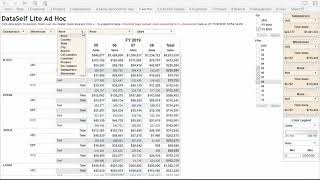
DataSelf Lite for Sage 100 lets you build custom reports by selecting dimensions like state or salesperson, adding filters and thresholds, and drilling down into details. The tool offers 10 dimensions per dropdown, over 10 measures, and more than a million possible report combinations.
Questions this video answers
10
More than 10
Over a million combinations
"Ad Hoc Details" (tab 5.1)

Chapters
Ad hoc report Right here I'm looking at the query currently showing by state is showing sales for some fiscal periods according to the filter selection and dimension. I can come to this drop down list and just pick any of the options and these options are easily customizable. I'm going to choose salesperson. For now. Let me add one more period to this query. Let's take a look to see how color legend works. Right now we set to look at sales and this is the automatic color range. This only applies to the actual amounts, not to the totals. That's configurable if you want to change the color legend to manual. I'm going to choose manual now. 0 to 200,000. These other filters right now the top one relates to this box. So the salesperson and I have all salespeople here and I could unselect some of them. And this total sales is actually the range of values available on this column. If I want to only see salespeople with at least $100,000, I put the number in here, press apply and then it filters out salespeople that did not meet that criteria. Let's see the variances from period over period. Choose sales and select Sales. Sales variance and Sales variance percentage. What if I want to see the coral legend based on variances? I can select variance percentage. Let's make automatic. So here it highlights which ones are growing the most or decline the most in variance percentage. Let's drill down and see more details. I'm going to click the mouse over here and click the plus signal. Now I have a new column and I can pick what I want to see. This new column. Let's say sales by salesperson by warehouse. Let's drill down further. Let's put the mouse over. Now I can slice by a new dimension. Let's say customer. Now when you have three different dimensions like in this case, depending how much data you have, this query can become really huge. So it usually is a good idea to start filtering this report. Let's only look at customers with at least 100,000 in sales. Another way of filtering is you can pick any of these data points. Let's select this salesperson and click keep only or exclude. I'm going to click keep only for now and let's say I want to drill down further. Let's say I want to see. Now to simplify this query, I'm going to collapse the year and I want to add quantity sold. And let's sort this in a descending order by sales amount. There it is. By just using the drop down lists Here you have 10 dimensions on each of these lists. There are more than 10 measures here, so that goes to 100,000 combinations just by using this drop down lists. And when you look at the additional filters here, the total possible combination you can do with this query is over a million ways to slice and dice your data. What's more, if you select data points in this report and you choose transaction details, you're going to see at the bottom all the invoice details associated to those data points selected. If you want to explore this list in more detail, you can come to the next tab. 5.1 ad hoc details. You see the same information now with more real state. Thanks for watching.