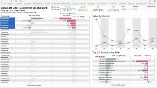
DataSelf Lite demo showing how to compare this year's sales to last year using side-by-side bars, variance coloring, and sorting. Drill into transaction details, view top products and trends, switch between measures like gross profit, and use the Geo tab to filter by region. Current data shows 13% growth through period 8.
Questions this video answers
August 18, 2019.
About 13% growth.
Period 8.
Chapters
This versus last year dashboards. We're looking right now at the customer from a sales standpoint. We see the list of customers they're currently sorted in a descending order by this year sales. We can see the blue bars for this year sales in the totals for this year. We can also see with the orange bars how each of these customers were doing in last year. And this section shows the variance from last year to this year being red decline in black growth since last year. This chart shows trend analysis the top 20 products by sales for all of my customers. The big numbers show the totals. So total this year, total last year, the variances last year and I'm growing about 13% since last year. Currently I'm looking through period 8. When I compare for the full year I can choose all the periods that I want to press apply and I'll do the comparison from that perspective. What if I want to sort my customers by ascending order based on this year sales? I put the mouse over the sort icon. Click once. Now it shows sales in an ascending order. What if I want to sort by the variance? Same thing if I click once. Now this is showing my customers with the biggest sales growth since last year. Now I see the biggest decline since last year. What if I want to see the top products affecting the biggest decline in my customers? I can choose the customers here and these are the products affecting the most that decline. And right now I'm seeing for these customers the total in the year, the total last year and the variance in how the trend analysis is is going. What if I want to see this dashboard by gross profit instead of sales Come to measure select gross profit. If I click on any of these data points I can also have this pop up to click Transaction details. It will show at the bottom all transaction details of the data points selected in. The Geo tab provides extensive ways to analyze information from a geography standpoint. With the out of the box solution the geography is connected to the customer location address. However, it's easy to remap to show by ship to or any other address. Let's analyze sales only in the continental area of the usa. So I'm going to select Canada, UK and Alaska. And now I'm going to exclude those three areas. So now I'm focusing only on the continental area of the usa. I can also interact on the map, let's say choosing the lasso and how am I doing on the east coast. There it is. And where am I shipping my top products? I just selected the top products and those are the states that I'M shipping them right now. Thanks for watching.