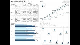
Build a Tableau-like dashboard from scratch with monthly sales data. Learn to create filtered reports, add parameters and calculated fields, build three chart types (bars, lines, variance circles), then combine them into one dashboard with floating layouts and workbook-level filters that control all tabs.
Chapters
This is the data self Orange Belt video for the charts. Part 2 Dashboard creation. The first segment we're going to create is a monthly sales through fiscal month five using a grid approach. Let's do it. That's the core report. Now let's filter for the last three fiscal years. There it is. Let's create a parameter to control a filter. They'll look at all the fiscal periods through period five. Let's create a field, a calculated field for this filter now. And apply the filter. That's it. Only the first five months of the fiscal year. Let's put the parameter to test it with other amounts. Seems to be working. So let's add now the sales. The use date sales or change sales from year to day sales using quick table calculations. That's it. Let's add sales again to the report. Let's put the measure after the month. Let's make this sales the percent difference from year over year. That's it. Let's add sales again to have the actual total sales per month. I'm going to add to the top here. I'm going to take the total year to date right to the bottom of the list. So I have sales percentage the year to date. Let's change the aliases to look friendlier to business users. Much cleaner. Let's call this report. Monthly Sales and let's make the title more informative. What's going on here? It. It's a lot more informative. What is what it does. All right, that's the grid report. Let's create a new report now showing sales by month by year using bars. So let's put in rows the year and the month. We don't need quarter. Let's bring sales as bars. Give me lines. I want to see bars and I only want to see the last three years for whatever months that I'm selecting. So let's go back to the initial report and tell that this filter should apply. Should apply in the whole workbook, both filters. The fiscal year and the fiscal month. By doing so, all other tabs now will be controlled by the same filters. In this case, I want to put the year after the month. So for every month I see what's happening year over year. Let's use some colors to make this more inform, more visual. Put the year date into color. You can live with whatever colors you like. Going to use a technique to change the edit colors. I'm going to change to blue and assign this palette so the darker is this year and it fades away as it goes to the past. And now because we have the color legend we actually don't need to see these numbers anymore because. Because the color already tells me what the year is. So I'm going to tell don't show me the header for a year. And I want to put actually the amounts on the bar so I can see the numbers at the, at the tip of the bar so I can take sales drag into my label. Bar label. There it is. And I'm going to make a little cleaner numbers with millions. So number show me millions. That's cleaner. And now I don't need to see anymore the axis. I'll say don't show the header for sales. That's it. So this is going to be monthly sales chart. The next report I want to see is the year to date. So my columns will be the years. And I want to see the month level. I want to see my sales and I want to put the year as color. So for every year I have a different line. But instead of being the monthly sales I want to see the year to date. So I want to see things growing on a yearly basis. That's how my sales is growing year over year on a year to day basis. Let's put this into the label and you're going to press and hold the control button so you keep sales where it is and you drop a copy into the label. Kind of busy. Change the format to be cleaner. And now with this we don't need to see the axis for, for this one. And I know already that I'm not going to need the labels for the bottom as well. So I'm going to clean the bottom pretty clean chart. I'm going to call this year to day chart. The last one is year over year variance. So I'm going to put the year go to the month level, put sales for my rows. I want to put yield at the bottom and show this bar. Sorry, this continues to go but it goes here instead. For every month I see what's happening but then I want to see this the percent difference year over year. When I do this, gotta be sure that this calculation is done correctly. I'm going to edit the table calculation and be sure to select the periods. And I don't want to see at the month level, I want to see the year level. So this is the year over year growth by month. And I'm going to use circles instead. And I'm going to drag this with the control pressing on the control button to keep over there making a copy into my labels. And now I don't need to have the axis for the percentage. Well, let's put color but let's put year as a color. So the dark is this year and the other one is last year. So now I no longer need this part can remove the label for the year. I'm gonna call this year over year percent report. All right, now I'm going to combine all of these four tabs into a single dashboard. I make this dashboard automatically fit my screen size. And I'm going to start with the first one. Drag and dropping anywhere. The second one is going to be at the bottom. I don't need this label because it's the same as this one. So I'm going to remove this title and then I'm going to put the year over year at the top right and the year monthly variance at the bottom right and making some adjustments. I want this to be floating so I can put it anywhere that I want. This is a good place and I don't need to tell is the year the invoice date. Most people will know what this these numbers are about. I'm going to remove the title. This one here. I want to also keep it floating so I can put it anywhere on screen. I'm going to put it on top right and oopsie. Right over here for now. In this whole bar here is a filter working behind the scenes. I don't need to show users I can get rid of it to get more real estate. Now I can make these things slightly different size. Put it somewhere else. In the colors. Also I'm going to put over here actually this one. I may want to make the bubbles a little bigger. Such a tiny bubbles. Let's make them bigger so we can see more clearly on the dashboard. Which ones are the dark for this year in which ones are for the prior year. So darker, a little bigger. It's better in this case anyhow. That's a dashboard. If you change now to different number of periods, it affects the whole dashboard. That's it. I hope you have enjoyed it.