DataSelf Orange Belt - Report Design Part 4 - Dashboard Layout and Containers
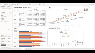
Learn to reorganize a Tableau dashboard for better space use and alignment. The instructor covers cleaning axes and labels, grouping widgets in containers, and using padding and borders to frame multiple sheets as one polished element.
Chapters
This video is a continuation of the data self Orange Bell training where we created this dashboard from scratch, which is beautiful, is very informative, but this dashboard can be improved. Let me show some examples of why this dashboard has some issues from a visualization standpoint. So right now we look in the first five months of the year and we already cannot see some of the data. You know, where is June? So we already have to scroll through here and if we change this dashboard to let's say to 10 months, then even more. Now to see the data we will have to scroll up and down to see all the data. It works is right there. If you can scroll up and down, you'll see it, but it's not ideal. I'm going to show you how we can take this dashboard and reorganize a layout to something like this is exactly the same information. However, we have the grid in a way that if we look for every month, we see, you know, the grid section, we see the bars for sales and we see the growth with the circles you're all aligned for every month. And then the year to date is a different presentation because it looks more informative this way if you change from, you know, five months to 10:12, then you know it uses the real estate. Actually if you were to put the number 12 here, if filled, this is green. So this, this way to organize the same information is way more efficient. Many people don't care about this, so you don't have to. But for those who care and for those who like pixel perfect dashboards, this video is going to show you many techniques to get a nice dashboard into a beautifully designed with a great layout to give this story using really well the real estate available. So let's check it out. So let's go back to the dashboard that quicker in the last video. There it is. And the idea here is to start to clean up the axes and putting more labels. So let's go one step at a time. Let's take first the sales widget and then make it cleaner. So that's the sales widget. So first of all let's put labels to these bars and let's make these labels more nicely formatted, putting millions instead of all the dollars in cents. So now the labels look much cleaner. Now that we have the labels, we no longer need the axis because this information is redundant. So let's get rid of this axis and get cleaner real estate. So we uncheck the show header section for the sales and since the colors are representing the year, we do not need to look at the year labels here we can just get rid of them as well. So uncheck, show header for the year. That's it. Much cleaner. So if you look at now at the bottom of this dashboard for this section, you'll see that it's cleaner than the one we had before. Better use of the space. All right, now let's do some cleanup with the year to date widget. Kind of similar idea. Let's put labels to our line and format the labels so they look cleaner. Also using the million units. And we can also remove the axis to clean it up. There it is. Much cleaner. Let's see how it looks in the dashboard. So better use of the real stick as well. Finally, let's do the same thing, same ideas with the year over year monthly variance, same idea. Let's put some labels percentage. We don't need to change the format. Looks fine for now. Let's remove the header and we don't need to look at the year header as well. So let's clean it up. All right, so this is the first, just pretty straightforward cleanup. As you can tell if you compare to the prior version. We're already using better space, better the real estate. We're seeing more data now. Now let's also clean up a little bit the grid section. Right now we have these names here that are very descriptive but they are long and we cannot read the whole thing. So they're not very friendly. Let's change the aliases to look something friendlier to business people. You can just click the measure names pill, choose Edit Edit aliases and then we put whatever we want, something more informative and shorter. Year over year, month variance, percentage and then year to date, same information, just cleaner. All right, let's see the dashboard. Better use of real estate for many of you, what we have done so far, it's enough, it's cleaner, it's using better use of real estate and you can stop at at these refinements. But if you do like better layout and again pixel perfect layout, what comes next will take you to the next level. And now we're going to be using tableau containers for dashboards which initially they can be a little bit confusing to get the hang of it, but once you get the hang of it, it's amazing, is amazingly powerful to help with the layout and again make pixel perfect dashboards. So in this example we're going to use a horizontal container to put three widgets together. The idea here is to put the grid, the sales chart, the sales bar chart and the variance inside of the same container, who horizontal container and glue them in a way that they will look like they are a single widget, even though they are three separate widgets. But we're going to glue them together visually that will look like they are a single widget. So right now we put the three of them inside of that horizontal container. And now we're going to organize a little bit, take the year and put at the top of the year to date, put the parameter on the right of the year color legend. So we're kind of getting better use of the real estate and getting rid of the right panel. One of the goals is to align the months here with the month here and with the month from this widget. So let's do that. So let's put the year after the month and then the measures as columns. And then when we make this kind of change, as you can see the year over year month, it's gone. What happened? So for that quick table calculation, we're going to edit it. Be sure it's using the invoice date. And now if you look, it's still looking the growth from the prior month. You need to be sure this is looking at the year level. So let's be sure we uncheck the month. And now the percentages are correct again. And because we changed now the form, the aliases is gone. So we'll have to fix the aliases again. So let's edit the aliases and put a name again. There it is. Okay, looking nice. Now let's go back to the dashboard. All right, we can tell that these two widgets are starting to align. Now that we're having them aligned, we no longer need this label because it's already here. So let's clean up further this particular widget. Go back to the sales tab and hide or uncheck the show header. All right, So it's looking better the alignment and we'll fix later to make them again align pixel perfect. But let's do the same adjustment to get this widget to align. Like to align like the grid report. So we're going to pivot it, put the year after the month and we don't need the month label as well. And that should do it. Can make the bubbles a little bigger to see the colors better. The year colors better. And finally, let's change this to fit standard, not the full size of the widget. And let me just clean up this invoice of year date title. All right, and now we're going to just pixel Perfect these three widgets in a way that they are glued together properly aligned with a frame around them. We're going to be using what is called a double layout, where we have pixel perfect control over these things. So let's go to the layout tab, scroll down and show the paddings. And for this widget, I know I got to push down 23 pixels. So they are perfectly aligned they to our perfect alignment with that 33 pixels. And when I remove the padding on the left and on the right. So this widget is going to use the whole width of this section. So zero for the left padding, zero padding for the right. I'm going to do the same thing for this widget. Change the padding, the top, I push it down, and then the left is going to. We're going to zero it so it's glued with the second widget. There it is. Let's do the same thing for this widget. Well, where we just zero the right side. As you can tell now, the three widgets look like they are glued together. And what we'll do now is since they're inside of a container, to make this container, we're going to grab this container and add a border around this container. So let's do it. Take one of the widgets, Click arrow down, select container where we are. And now we're going to go to the border area and put a color to the border. So we added a border. So we added the border order around that container. And if you look at it visually, it looks like this whole thing is a single widget. So for users, this is March. They see the years, the numbers, and the same numbers represented through the charts, all aligned by month. Beautiful. All right, what we're going to do now is make the year to date widget Also put a frame around it and adjust a little bit the height. Click on it. Set a border. You know, right now the numbers are pretty much touching the frame. If you're picky, you might not like it. If you don't care, forget it. But I'm picky. I want to put the numbers a little apart from the frame. So I'm going to put a internal padding of two pixels. There it is, little padding again. You might not care, but I do. And now we're going to take the outer padding and on the bottom we're going to zero it in a way that the bottom of this frame aligns with the bottom of the other frame. So pixel perfect alignment. There it is. If you look this dashboard now is pixel perfect aligned and if you decide to change the fiscal period to go to 10, you'll see that you'll be able to see the whole data set and we'll see nicely organized in this new layout. How about that? Again, many of these techniques for many people, they don't mind the layout, the real estate, but if you do, I encourage you to learn more about these containers, the layout, the padding, the changing, the structure of the reports in a way that these dashboards look beautiful, very informative and they'll make easier for users to get the story of the dashboard. Thanks for watching.










