DataSelf Orange Belt - Report Design Part 3 - Dashboard Hands On Exercise
Build a sales dashboard from scratch with four worksheets: monthly grid, monthly bars, year-to-date accumulation, and year-over-year variance. The instructor adds filters for the last three fiscal years, a user parameter for maximum fiscal month, and connects everything with shared filters and a parameter control.
Chapters
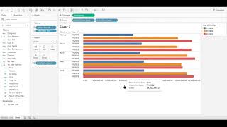
This is the data self Orange Bell training. We're gonna, we're gonna build this dashboard from scratch. A quick summary is a dashboard showing monthly sales through the fiscal month. Number is a parameter number five. So the first widget, it's a grid showing for every month for the past three years. It shows sales by month, the difference year over year, growth in sales from the prior year to this year. And then this line is the year to date sales accumulating throughout the year. We have the monthly sales over here showing charts. We have the year to date accumulating by year through the months and the percentage growth year over year. So all information on the grid is also via charts. So let's see how we can build this dashboard from scratch. Let's do it. First widget is going to be the grid. We're putting months on the rows, Years in the columns and sales amount as the measure. So that's the core report. But we only want to see the past three years. So let's add a filter to only show the past three years. Different ways to do that, we're going to use this special field. And select the last three years, which is 0 for this year, minus 1, minus 2 for last year and the prior year. There it is, filter for the past three years. And now we're going to create a parameter that we can control the fiscal month that we want to see. So we're going to create here a parameter and later we'll use in a calculated field. The parameter is the setting the maximum fiscal month being an integer. And for now we're going to use the value 5, meaning through the month 5 of this fiscal year. So just a parameter for users to enter different numbers. And then now we're going to create a calculated field that we'll use as a filter to select only kind of know the year to date. That's the name for the filter. The formula is the fiscal month number should be less than equal than the parameter, the user parameter, which is set maximum fiscal month. That's the formula for this filter. And finally we're going to add this new calculated field into the filter shelf. And then uncheck the false meaning. We only want the months through this command file which is the number we entered in that parameter so far. By the way, in the sample database, the fiscal year starts in February. So five months goes through June. All right, so that's sales. But we want to convert this to year to date sales. So let's use a quick table calculation and choose the year to date total to See sales accumulating throughout the year. There it is. When I add sales again to this report. And then we're going to make this second sales measure. Well, first let's just bring the measures to the right of the month. So for every month we see both measures. There it is. And now we're going to convert the second sales to be year over year growth from a month standpoint. So again, quick table calculation using the percent difference. And when you calculate these things, you're going to be sure it's doing the metric, which right now apparently it is doing the proper calculation. So this looks good. So let's add again sales to have the actual sales for the month. So there it is. We have sales for every month for every year. We have the sales growth between last year and this year and then the year to date accumulating throughout the months. So let's just reorganize the order of the measures being shown on this report. Let's put the growth after sales. Let's put year to date at the bottom of the list. There it is. So sales year over year growth and year to day sales. Let's rename it. Right click rename. Let's call monthly sales. Goes to the title of the report and actually let's edit the title of the report to make it more informative. So let's edit it. Let's put here monthly sales through fiscal month equal to the parameter that we created. So let's choose the parameter set max this command. Let's make a reminder here that February is the first month of the year. Make this smaller font so it doesn't look small, doesn't take a lot of real estate in our report. Just, you know, making the title more descriptive. Let's click ok. All right, I think this widget, it's all done. Let's go and create the second widget which is the bars with sales for every month. So we drag invoice date to our rows. We go to the month level. We don't need quarter, let's remove quarter. Let's put sales in columns. So we have the chart. It gave us a line chart. I think it's going to be look better if we change the bars. So let's put as bars instead. And we have all years, all months. Let's use the same filters we already created in the prior tab and apply them to all these worksheets. So the same field is going to apply across the whole workbook. So for the fiscal year and for the fiscal month, these filters will apply to our Whole workbook. There it is. When we go to sheet two again. Now we're only looking for the past three years for the first five months of the year. Now let's start putting some colors over here to tell the years apart. Let's actually put the year after the month so we can have for every month we can see how is it growing year over year using the color of the bars. Let's rename this report. Double click also works. And call simply sales. All right, next widget. This one is going to be the year to date widget. So start the invoice date in the columns. We change to month. Then we bring sales. And now we put year date in our colors to tell the years apart. But anyhow, right now we have monthly sales by year. Well, when I convert the sales into a quick table calculation with the year to date total, that way we can see from a chart standpoint how sales is growing throughout the year for every year. There it is. That was easy for the next one. The next one is the year over year variance percentage. So again, invoice date. I'll go all the way down to the month level and remove quarter again because we don't need quarter. Bring sales to the chart. And now we're going to make the sales. Also a quick table calculation showing percentage difference. In this case, if you try to understand this, you're going to see that it is not actually doing a year over year growth, is actually doing the growth from the prior month. That's the default of the quick table calculation. So we have to fix it to be sure. This quick table calculation is using the invoice date to calculate and look at the year level, not at the month level. So it looks at the last year, same month and see how much it changed. So let's see how we make that adjustment. So first of all we go and say that is compute, compute using the invoice date. So that's the parameter it uses to calculate the variance. Apparently no change, but there's a change behind the scenes happening. And now we go back and then we're going to edit the table calculation. Then here as you can tell is using the specific invoice date field and it's using at the most detailed level. And we need to see. No, no, no, we don't want to go to month level when I use the year as the level to calculate. So the difference from the prior year. So let's uncheck the box for month, Close this quick table calculation. And now if you look at the numbers you're going to see that for every month. You know, like in February, it actually grew a little over 90% from the prior year. If you go back to the other tabs and check, these numbers now are correct. Now let's change this representation from a line into something visually better. I mean, I think circles will give better story. In this example, let's again put the year as a color. So we can clearly use colors to this to separate them apart. Right click rename sheet 3. Intel is a year to date tab or widget. And the next one, same thing. Let's right click rename. There it is. All right, we got all the four widgets of our dashboard. Let's create now the dashboard. Let's set the size of the dashboard to automatic fit the screen of your monitor, no matter how big or small it is. Let's drag and drop now each widget into this area. The first one, just drag and drop anywhere. The second one I'm going to put in the bottom. The year to date on the top right. The last one on the bottom right. What we're going to do now is just clean up the right panel. You know, we have those filters for the fiscal year and fiscal month. Let's also after add the parameter, you know, the set maximum fiscal month so people can change that number as needed. There it is. So we remove the filters. Now we can select any of these widgets. Click the arrow down here, go to parameters and select the primary created. That's it. The dashboard has been created. Don't miss the next video where we take this dashboard and we make it look brand better and more efficient. Thanks for watching.










