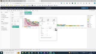
Build a Tableau bar chart showing sales by year and month, with text labels and grand totals. Add an Analytics reference line set to sum of sales to display yearly totals, then format the label with bold text and right alignment while hiding the line itself.
Chapters
Hello. Today we are doing a bar chart of sales by year subdivided by month with text labels showing monthly totals and a reference line to show the yearly totals. Beginning add the invoice date to the rows, come down and do the sales to the columns. Tableau wants to make that a trend line with its automatic formatting. You can override the automatic formatting to change it to a bar chart to show a different color for each month. Take the invoice date, add it to the color marker. This changes the color per unit and right now the invoice date is grouped by year, but right click on it to group by month. Now you see the sales per month as a different color. To show that as a text value, take the sales field, drag it to the text label. This shows the sales per month as text. Note that it does not show a grand total for the year. To format the number value there, click on Right click on sales format number and we will do the custom grouped by millions. This changes the format of the number, makes it easier to read, but there's still no grand total. To get the grand total, go to the analytics tab. Add a reference line as you drag it over to the main screen. Put the reference line over the cell. Choose total sum of sales on the label. Choose the value. You now see the total for the year on each line. To modify that when the mouse is over the reference line, you click once and go to the format option. You can remove the line itself. You can modify the format. In this case we'll make it a 10 point bold right aligned and then you can change the number format. I will make it by a currency rolled up by the millions. Once I've clicked on the main screen, that is what you get.