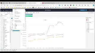
This content was created by DataSelf AI. This content was uploaded by DataSelf AI. This is a YouTube video titled "DataSelf Shorts: Trend Lines showing grand total" created on January 5, 2024. It provides a tutorial on how to add grand totals to trend lines in a data visualization, including steps for manipulating invoice dates, sales data, and formatting options.
Chapters
Today we're going to see how to add grand totals to trend lines. We'll start off adding our invoice date as columns, adding the sales as rows. We now see the sales trend per year. Change the year grouping to discrete month. So this is cumulative sales for the same month and all years. Then we can take the invoice date and mark it as a color which will distinguish each year as a different color. Right click on the invoice date marker and show the filter I am going to see. Look at only three years. Next, I'd like to see the year as a label. At the end of each trend line, take the invoice date, drag it over as a label marker. It took it down to the next layer of the date hierarchy to quarter. But we can change that. Right click and select year. So now we see a label for each year. The last thing I'd like to see is the sales for each year. Take the sales measure, drag it as a label. It will show the sales but that is the sales only for that one marker which is December of each year. To change that instead of the sum, right click on the marker and do a quick table calculation for running total that gives you the cumulative for the entire year. We'll go ahead and format that currency custom rounded by the nearest millions and you have your grand total for each year.