DataSelf Tableau 2 0

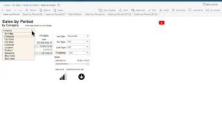
DataSelf AI demo showing how to analyze sales across three companies using a Tableau-style report. Filter by period and account manager, set thresholds like customers over $20,000, then drill into details and export to PDF or Excel.
Questions this video answers
June 9, 2019
June
$20,000 (customers with at least $20,000 in sales in June)
$1,000 (products sold for at least $1,000)
PDF and Excel (full data / Download all rows)

Chapters
With this kind of report you can extensively analyze and slice and dice your business trends. Right now I'm looking at sales by period by company. This is consolidating three different companies and I'm looking at sales in this fiscal year. If I want to see sales details in June, I can just click June right there at the bottom shows me all details. Account manager, customer invoice number, all the details of sales across the three companies in June. If you choose a different data point, the bottom section reflects that data point. Now let me simplify. This report show only sales this month. When I choose the drop down list, this shows me the out of the box options. This list can be customized, can be simplified or can be enhanced with whatever that you are interested in slicing dice in your data. In my example I'm going to choose account manager. So right now it's showing me sales by account manager in this month. You can filter information by using these filters Here I'm going to remove for now the null Account manager. And now I'm going to sort in a descending order to find my top account managers and just select the top of them in June. I'm going to only keep my top account managers in June. And that's the list. Now I want to slice these account managers further. So I'm going to go to the second tab where it gives me two slicers. And now I'm going to choose something else. For instance in my example customer and as you can tell the total sales in June. But in my analysis I only care large customers so I'm going to only look at customers that have at least $20,000 in sales in June. Let me only select them. I want to slice and dice this further. Now I go to this other tab where I can see another slicer. And in this example I'm going to choose product. Well for my product because it's a more granular report. I want to see actually products sold for at least $1,000. I'm going to change the filter to show at least $1,000 and that's the list. Now I will actually want to see all the details. I can choose this whole column, click this icon, drill into more details to show everything in a bigger page. There's sometimes I actually want to download information into something else. I just click the download button. Let's say I want to see in PDF format and that's the report in a PDF format. Or you might want to export to Excel. Click Export data Full data, Download all rows. There it is, the whole Excel file downloaded with these slicers, there are 10 ways you can slice and dice your data. For this particular perspective when you go to the next tab, by having these two slicers, there are 100 ways to slice and dice your data for two dimensions and you go to the third level, there are one dozen ways to slice and dice your data. I hope you'll find value in using this report to slice and dice some data and find critical trends for your business. Thanks for watching.











