DataSelf / Tableau - Power User Training S1 - Complete Session
Johnny Giorardi walks through Tableau 10.3 fundamentals: publishing workbooks, building charts with drag-and-drop, date filters, maps, and interactive dashboards. Learn to set threshold alerts, export data, and subscribe to dashboards.
Chapters
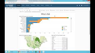
This is Johnny Giorardi with dataself. We'll talk today about data self power user training covering primarily what we call Reports and Dashboards 101. So the idea here is, let me switch the page is to show how power users, power users in this case are users that have access to, to the web user interface, Web and mobile user interface in how you can actually create new reports from scratch and dashboards and learning the very basic techniques to do that, to build for yourself as well as to share with other people. This is the agenda. We will be covering many different pieces of the puzzle. Again, the most fundamental techniques. I'll be using the latest version, which is version 10.3. However, most of the features that will be showing in the techniques apply to way back 9.3 and newer and sometimes even older. Later we will be sharing this training on a web recording. I'll also be sharing the workbook that I'm going to be using in this training. So if you want to practice later on using the video, you can, you have the video, you have this PowerPoint as well as the workbook to practice exactly the way that I'm doing things here. And by the way, a lot of the techniques I'm going to be covering here are also applicable for users who have the desktop. With the desktop you can do even more things, sometimes simpler, but the basic techniques between the power user interface and the desktop user interface or very, very similar and tableau is slowly but surely pushing a lot of these authoring features into the web. So eventually I believe they will discontinue the desktop. So that's the long term goals. Now before I start, I just want to show a glimpse of the possibilities. I'm going to show you a dashboard that actually was created by one of our clients. The CFO of one of our clients actually built this dashboard from scratch just to show the interactivity that is available once you learn these techniques, just very quickly. It's a CFO dashboard. However, it brings data from more than 10 different data sources. In this example, there is AR data, AP payroll cash on hand, projections, open sales orders, CRM information, AR aging revenues, Google Analytics financial numbers inventory on hand. I mean there's a lot here. The cfo, when he built this dashboard from scratch, it was after six months having data self and doing a lot of things with data self. So it takes a while to build the techniques to learn to do something like this. But it's not a lot with the basics you can actually create many of these components. I usually tell people today I'm going to get you crawling eventually we want you to get walking, running and flying. I would say the CFO was probably between the walking, slash, running, you know, expertise when he built this dashboard from scratch. In very interactive, you know, you can come here, let's say I click on this bar, it drills down into a different tab of the whole section, giving a different perspective. And as you put the mouse over things, it's all interactive. It's less enticing and whatnot. So just very quickly, this is a glimpse of where we want to to go and being able to do these things all by yourself. Alrighty, so let's go straight into the actual training and I'm going to start with the preparation part. The preparation is pretty much, you know, if later you want to replicate exactly what I'm doing here for yourself or you have someone else that you want to go through training. I'm going to be sharing this workbook with you. So you will need a data self desktop to upload this workbook into your data self server or the tableau server in the way that you do is, you know, if you have the desktop is you double click the workbook on a computer that has a desktop. It will open the desktop and then you just publish this data source into the web server. So, so I'm going to right click on it and say publish to the server and then I recommend saving under default project and you can call any name. I'm going to call one SA sales demo to clearly tell this is not a production data source, it's just a. I'm going to call even training here training. So be sure this is a training data source not to be used for any purpose but training. So I just published to the web server and that's something that only people who have the desktop can do. But the beauty is once you have done that, then what you should be doing as a power user is log to your data self web server or tableau web server. So you go to the URL that you have been provided, you put your user credentials. Most of the time the user credentials are your Windows credentials, your domain credentials, the same thing that you log into your Windows machine, you put your username, you put your password and you sign in and you got into the tableau and data self web server. Now what I'm showing you here, in my example, I have done something that is very popular among our clients is to select a landing page when you log in to data self server. Most of the time you want to start with the Same thing every time that you log. In this example I have this who's hot Dashboard. It could be anything. And how do you change this? Well, you just navigate to a query, a dashboard or a page that you want to be your landing page. Then you go to your name on the top right, you click here and say make this my start page. And with that, every time you log in, you go to whatever you selected. In any time you can change to something else. So very convenient the user of our clients do this once they learn this very simple technique. All right, now back to our training here. What I want to do is start to build a new report from scratch using the data source that I just posted to my Tableau server here. In your case, if you're doing your production database, you just select whatever data source that you want to do from your production data sources. So my example right now I'm going to click first on this data self analytics logo, the top left logo, just to go to the main page. Oopsie. Actually I clicked the home link here. So I go to the main page that shows me projects, workbooks, views and data sources. Depending on your security, you may not be able to see as many entries as you can tell here. That's not a problem. Whatever you can see, it's fine. It's probably only the pieces that you are entitled to look at or that only have been installed in your system. So in our case, we want to build a new report from the sample data source. So what you do is you come to the data sources, click on it in here you'll see all data sources available for you individually. In my example, I'm going to click on the name to sort them because I put the one that I just published, you know, this file when I opened it before I saved it as a one essay sales training. So it's at the top of the list. This is the one that I want to build something from scratch. Of course you can use any of them to start from scratch your own queries. So I'm going to click on these three dots and say new workbook. So I'm going to start from scratch a new workbook. It opens a new tab and I get into the edit or authoring mode. So this is, you know how to get into the editing mode. Now if you are not familiar with this, so the first thing that you have to really understand, and this is, you know, the foundation of the whole slice and dice and create new reports from scratch is having an understanding of this data tab here it's called the data source. Right now I'm connected to this data source. You could have several in your system. In this case we only have one. But in this case what we see is dimensions and measures associated to this data source. The dimensions are entities that you want to slice and dice your data by. I'm looking at sales, so could be customers, addresses, dates, products, salespeople, you name it. And the measures are typically the numbers that you want to aggregate the sales cost of sales, the quantities, the ratios and whatnot. Now in the out of the box solution we have typically in certain pieces of this data structure we put pop up windows to help you understand what this information is about. So if I put the mouse over percentage gross profit, it shows this little pop up where it is a formula that divides gross profit by sales. So sometimes it's helpful if you put the mouse over something to see there's an explanation of what that particular data element is. If you do have the desktop user interface, you can actually edit these pop ups and even create new ones to help users more easily and let's say being self sufficient at looking at things and understanding what, what these fields are about. Now sometimes you look at a certain entity here and you actually don't know. Even reading the details you still don't know exactly what that means. So let me show an example here. Suppose I come to this list and I expand the customer list and I look at these names and let's say suppose, oh look at this, I have customer, customer ID and customer name. Why do I have three? What are the difference between them? A good recommendation is experiment. You might figure it out. Let's say if I take customer ID and I just drag and drop into my rows. I'm just dragging, dropping into my rows. I see here a bunch of codes. Of course if I work for this company, hopefully I'll be able to see wow, yeah, this is the actual customer id. Okay, that was pretty straightforward. Customer ID and I see this. Now suppose you want to see another field or you go back to the prior step. How can you go back to the prior step? Well, there's this back and forth buttons that work just like on a web browser. You can go back and forward as many steps as possible. So be sure that when you do something and you don't know or you want to go back, be sure to use the back and forward buttons. What is customer name? Drag and drop and we see customer name. Very obvious. Let me click back. What is customer Drag and drop? And then if I know this business, I Could tell. Well, customer is the one that combines together the ID and the name. Sometimes I remember the id, sometimes I remember the name. Sometimes this field is more helpful to more quickly find exactly a customer that I'm looking for. So by dragging and dropping quite often is very helpful to just figure out what piece of information you're looking out of this list here. The other important thing for you to know is suppose you go to a list, I don't know products and you want to find a field that you have in your, let's say ERP system or CRM system and you don't find here. Well if that's the case, usually you have to talk with your data self admin people, maybe without my team or with your reseller. And pretty much every time that you need something new listed on these data sources, it's just a matter of adding that information into the data self data warehouse and plug into this connector. It's a one time setup. You can add 1, 10, 50, whatever the number of additional fields, it's a one time setup. Once they are added, you will be able to slice and dice the data as we'll see throughout this training. All right, so let me just drag some, let me drag division here and suppose I did a lot of drag and dropping and I'm putting, I don't know, company and just exploring things all over here. And suppose that at one point you say okay, I got it, now I need to start from scratch and I need to clear this whole sheet. Do I have to click back, back, back as many times as I click? Of course not. You have this button here with a little X. You click on it and you say clear sheet and you got a clean sheet to start from scratch. So this is a little overview of the data connector or the data source. So now let's go for the very first technique of actually creating our first query in the first query is going to show simply sales by customer by year. So I simply want to see a list of customers. I want to see sales throughout my whole history by year. As a guideline to build your reports and dashboards is pretty much you think about your question and you take each piece of it and you drag and drop it into the report, into columns and rows. That's pretty much what you need to do is drag and drop in the kind of order that you're thinking your question. So let's say I want to see customer information. So I go to customer here. I'm going to take customer name and I'm going to put in my rows. So drag into my rows. There it is. I have a list of all my customers, just customer names. And I want to see sales. Well, sales is part of my measures. But the way that you drag and drop different of these data structures into the report might have different effect on how the report will look. So if you just throw somewhere, sometimes nothing happens. Let me see if I throw it here. Actually worked when I drag and drop the sales. Let me go back here to show when I drag and drop the sales into this ABC boxes. And as you can tell, there's a square around this ABC box. If I drag and drop, I get the sales. And actually this is the whole sales all company history by customer. Alternatively, I'm going to go back and take sales again and drag into my text box here. I'll have the same result. So if I drag and drop into that ABC area here or the text area here, I get to the same report. So right now, a very simple report showing sales by customer in the whole company history. But I want to see by year. Well, by year I have to find invoice date. Invoice date is right here. And then I can drag and drop, let's say in my columns first, right there, I get by customer, I have sales by year. Very straightforward, very simple. What if I drag and drop my. Let me go back here. So remove the invoice date and I'm going to drag and drop into my rows. What happens if I do that? Just like you expect on the rows you have customer and invoice date and sales. But no, I want to put in my columns, it looks better. So I'm going to drag and drop here into my columns. There it is. I have by customer, by invoice date. Very easy, very. Just point and click drag and drop. Now I can explore and start to make variations. Pretty much every time that you see these spills, you know, in this right side of the whole query, if you see a plus signal, it means you can expand or drill down into the next level of this data point. So in the year level, if I click the plus signal, what happens is it drills into the next level, which is quarter. So right now I'm seeing sales by year, by quarter. If I expand quarter, I go into the month level and if I click expand again, I go to the day level. I could go to hours if I go all the way down to hours. Or we can build these buckets to drill down in any direction. We can even train you at some point in how you can build your own Drill down capabilities coming from one point of the data to any other point in any combination of parameters. This is configurable. Right now I'm just showing that this is possible and it's built in into the framework. Okay, so suppose this report right now have sales by customer by month. Suppose there's a report, you just want to save it and make it available to anyone else that is part of your user group. What you do is you come to file, click Save as I'm going to call one sales by customer by month and then here you save in a given project you can select different projects. For now I'm going to save into my default and I'm going to click show sheets as tabs. For now I'm going to leave this clicked and I'll explain later what this is about. And I click save and that's it. I just saved my first query. Now if I go back to the Tableau framework and I go to my projects and I go to the default project where I saved I just saved and I do a sort by name, I right here see a query that I just saved. Everyone who have access to this particular project now would have access to the new report. So they would just click on the new report. They see all the worksheets that so far I only have one inside of this workbook. And by the way, I didn't rename it so it's still called sheet one. So I'm going to click sheet one and there it is. I see the same report as I saved in my editing mode. That's it. Your first report published. Anyone that has access to your framework now has a new report. Now let's go further and for now I'm going to actually double click on the sheet name to rename it Sales by customer by month. So now the sheet will have a good name, a more descriptive name, and by default it will have the name here as the title of this sheet. Now typically when you are building reports and dashboards, it's a journey, it's a process and quite often you don't know exactly how it's going to look at the end and you have to experiment and usually it's a good technique to leave a trail of what you have done. So if you want to go back to one of those points or be inspired by something you did in the past, you have this kind of trail of steps that you're going through. So right now what I'm going to do to do this trail of my discovery process, I'm going To go to the sheet name, I'm going to click on it, Sorry, right click on it and I'm going to choose duplicate. When I duplicate, actually I get a new sheet with exactly the same content as the first one. So the first one is capped. It's one of the steps. And now I start to kind of mess around or experiment with my sheet number two. So now in this segment here for sheet number two, what we're going to do is filtering. Filtering is one of the most important features when you're building reports and dashboards. And understanding the basics is critical in understanding the possibilities is critical. So let's take a look at the basics of filtering. One of the most important filtering that people do is based on dates. So overall, what you do if you want to filter a query by date is you use drag and drop and you select different options. In my example, right now I have all years from 2016 to 2018, and my current year is 2017. But anyhow, I want to filter this report by year. So I'm going to take invoice date, I'm going to drag and drop into my filters shelf. When I drag and drop, it will show on the right this default approach of filtering, which is pretty much the whole range of dates available in your database. Quite often this format is not very useful. So you have different possibilities. You come to the invoice date in the filter shelf, you click this arrow pointing down and then you select a different time bucket to filter this report by. So in this case I'm going to choose year. And what happens is right now that filter changed into a list of years and you can say, I only want to see 2017, so I'm going to uncheck 2016 and 18, and right now I only have 2017 information. That's it, just filtered by a particular year. What if you want to further drill, you know, filter this by month or by quarter. Well, you can take invoice date and drag and drop again into the filter shelf. What's going to do is again select the same default approach. Now you go back to the pill here, click the arrow pointing down and say I want to see month. And now I see the list of months. And suppose I only want to see, I don't know, two months and that's it. So by using this drag and drop and selecting different the buckets here, you'll be able to build this stacked filters to narrow down your perspective into exactly the segments that you want. And by the way, in this particular example, suppose you don't need to see quarter, you just want to see year and months. You can take the quarter pill and just drag it out. Anywhere that you see the little red X on the pill as you move around means you're removing out of the query and it's gone for good. So no longer in the query. So right now I don't have the quarter. Again with the quarter. And when I remove the quarter, the quarter pill is gone and it's no longer here. All right, so let me put here sales by customer. I'm going to say this year just for. I'm going to say in 2017 and I could say February and March because this will be like a specific report showing those things. So very simple way of filtering that way. Let me duplicate this report again. Not again, but duplicate it. I'm going to remove the filters. Filter out, filter out. So I'm back to the whole history. I'm no longer filtering my query just as I had initially. But now I want to filter by what is called relative periods, which is very popular. So I'm going to drag and drop again invoice date into my filter shelf. Now, instead of using the pill here, I'm going to go to the filter on the right, click the arrow pointing down here and choose relative date. What happens is now this report is using relative periods. What is that? It's a date filter looking at today's date. So if I expand by clicking the arrow point down again, I have different time buckets. I'm going to choose years and by default it will show this year, whatever the year is. So if you look, all 2017 data is here. If you look at this quarter, which we're currently in the third quarter, I'm going to click quarters and it's going to show this quarter. And there it is, the third quarter of 2017. If you choose month, guess what? We're in September. It will show September. What if you want to see the previous month? What if you want to see the last three months, two months, whatever month, whatever months you want. Relative dates are very popular. Is one of the most used date filterings in this framework. So be sure to understand how this works. Just going to show quickly again and I remove it. I'm going to add it back in the invoice date into my filters. I go to the right arrow pointing down, choose relative click and then select what time bucket and select the options within the time bucket and off you go. This report now will always show sales this year, regardless of what year you are in. Or let's say let me go back to this quarter just to make it a smaller report. So this report will also show this quarter. So I'm going to say sales by customer this quarter. That's it. Now we're going to. What I'm going to talk about next is let me take the original report and duplicate it and I'm going to drag it to the far right. Actually I can drag it all right. And in this report what I want to do is a year to date analysis. Let's say I want to see sales through August for the last three years. How can I do that? I'm going to show you a couple of ways. One is I'm going to add invoice date and then I'm going to choose month and I'm going to remove the last four months. So what I have here is for all my and I'm going to collapse the year. I'm going to remove the. Well, by the way, if I show 2016, it goes through August and then it starts 2017 and then it goes through August and then it starts 2018. So I'm filtering data to only show data through August. Now if I collapse at the year level, what happens is this report is showing me by customer by year sales accumulated per year through August. So this one way to do a year to date analysis is using a combination of filters and collapsing things to a level where if you look side by side, right now we're filtering through August. Or maybe if I want to filter through June, let's say you just uncheck those boxes and now I'm filtering when I use dates through June, the last, you know, these three years. Another way to do the same thing is I'm going to duplicate and in this case I'm not going to filter using this approach, I'm going to remove it, but I'm going to use a functionality available in the data self data source which is called the invoice date fields. Invoice date fields are specialized time buckets that you can do to analyze specific ways to spin time filters. It could be to date periods, it could be rolling periods. There's a lot of possibilities. In this example, if I bring invoice year to date to my filters, just drag and drop. What we'll do is it will show you on the right two options. You can see year to date or after year to date. These fields are coded behind the scenes in a way that they will aggregate all transactions from beginning of your fiscal year, whatever it is. Could be January 1st, could be any day when you start your fiscal period through the last data self data refresh, let's say as of yesterday. So if I uncheck after year to date, what I'm doing in this example is removing all transactions, let's say after September 20th. You know, today is September 20th. So by removing this after to date, I'm automatically removing all transactions from September 20th through the end of this year and only leaving the transaction at the beginning of the year. So automatically, every day this report will refresh year to day basis. We have year to date, we have quarter to date, we can month to date. So you can use this filter to do those very precise comparisons in different periods to see if you're growing or not since the same period, let's say last period or the same period last year. All right, the last thing that I want to show you for filtering. So I showed you three ways of filtering dates, date buckets, by relative date and by to date periods. Now I'm going to show you how to filter by something else. So I'm going to double click and duplicate my original sheet. And now suppose I want to filter this by, by salesperson. I can come here, find, let's say salesperson ID and I drag and drop into my filters. What happens is I'll have on the far right the filter showing all salespeople available and say, hey, I don't want to see, I only want to see for one salesperson. And I select and now it will only show the sales of this salesperson to these customers in this year. So you just have to pick what data structure you have from the left drag into your filters. Let's say, hey, I also want to divide a filter by company. I drag company to my filter shelf and now I also have the right all the companies available. And you just keep on picking and choosing and you're filtering your data. So adding filters is very straightforward. Drag and drop, and you can put as many as you want to slice and dice your data in a very specific approach. All right, now let's go and talk about totals. So I'm going to duplicate my sheet, original sheet, and in this case I'm going to collapse it. And right now I'm only showing, actually I'm going to collapse. Let me see. Yeah, that's fine. I'm showing sales by customer, by year is the whole, the whole data. But how much is the total that I'm selling by year? So when I add a total here, very simple, you come to this totals icon, click on it, you can choose to put totals for your rows for your columns. So I'm going to add columns. What I mean is putting a total at the bottom of the sheet, all the way down. Now I have a grand total. And one thing that our clients do a lot is actually put the totals at the top. So I'm going to go here and say put column totals to the top so I don't have to scroll all the way down to see how much is my total. It's always at the top. It's very convenient if you want to add the rows. You just come here and say, show row grand totals. And now it goes to the far right. If you have a lot of rows. If you now put the grand total on the left, same thing, you come here, Put row totals to the left, and now the grand totals on the left and on the top. It's very practical. Let me remove these row totals for now. So I'm only leaving the grand total at the column level. But what if I want to see subtotals? What if I have a stacked query? Let's say I'm going to come here and say I'm going to add sales person and I'm going to put salesperson name before my customer. So I'm dragging my salesperson, dragging and dropping before my customer name. So now I have by salesperson, I have sales by customer. Let me do that again. You can just stack, you know, things any shape or form you want. I'm going to take salesperson. I can drag it after my customer name. So right now the salesperson is here. Or I can drag it and put before and I have now the salesperson before the customer. Accidentally I might drag it on top of customer. Right now I'm dragging on top of the customer. And what happens when you do that? You remove customer and you replace it with whatever that you did. So in this case, I just replaced customer with salesperson. Actually was a mistake. I'm going to click back and I want to leave the salesperson before my customer. Okay, so now I have by salesperson, I have by customer. But I don't see subtotals. I want to see the subtotal by salesperson. What do you do? You go back to your total icon and you choose all subtotals. And now every salesperson will have a subtotal at the top of the entry. And if you add more components, you know, hey, let's add product. I'm going to take product id, drag and drop after my customer. So what happens is right now I only have subtotal at the salesperson level. But if I also want to have subtotal at the customer level, I go back and say, add all subtotals. Now I have the grand total, the subtotal by rep, and the subtotal by customer. So that's how you add totals and subtotals. Let me rename, call this totals by customer. All right, let me duplicate this one. To talk about sorting, I want to sort things now, and for simplicity, I'm going to remove the totals and I'm going to make this simple by removing also some of these extra things. And finally, I just want to see a list of salespeople. And I want to sort this. I want to show my top salespeople at the top of this list. How do I sort? Easy. We have those two icons. I'm going to sort descending what I just did. I put my top salespeople at the top and bottom. At the bottom, if I click ascending, I reverse the order. So sorting can be as simple as just using these icons. But more often than not, it's not that simple. So let's see an example here. I'm going to add my invoice date. Now I have three columns, and I'm going to sort in a descending order. Let me just click in descending order. So now I'm sorting at descending order. But what exactly am I doing here? If I look, I'm actually not. None of these columns are actually sorting in descending order. It's a little of a mess. What did I do? Well, let me show what you did. I'm going to put the total for my rows. So this is the grand total for the rows. And what I did is I sorted the report, this report by the grand total on a descending order. So I didn't sort by any of the columns. I just sorted in a descending order for the total. And until I put this grand total, I didn't understand what was going on. So be careful. When you do totals and subtotals and you have several columns of rows, sometimes you're not getting exactly what you expect. So pay attention. But what if I want to see, I want to sort this report by one of the columns. Let's say I want to see my top customers or top reps. In this case, in 2017, I come 2017, I put my mouse over and I have this icon for sorting. Cool. I click. Now I sort. This report is showing Ascend in 2017. I click it again. No more sort of. I click it again. Now it's descending order in 2017. So once you. You have three status of the sorting. If you click once ascending, click again. No order. Click again. Is descending any of the columns. You can do that. So you select one of the columns and you do the sorting. This particular, particular perspective is useful because you're looking at last year, how you're doing and how well you. You're doing this year. As you can tell, my top customer last year is not doing so well this year. That could be a problem. So sorting things like this can be very insightful. All right, that sorts. Let's rename this sorts. Let's go to charts. People who love charts. Let's start taking care of you now. So I'm going to build initially a very simple chart. I want to see sales by salesperson on a chart. So what I'm going to do is take salesperson drag to my rows and I want to see charts as part of my columns. I'm sorry, I want to see sales as part of my columns. When I take sales drag and drop into my columns, and voila, I have in my rows my salespeople. And on a kind of column approach, I have the sales. What if I actually. Now let me delete this sheet and do the opposite. I want to see my salespeople in my columns and my sales in my rows. So I have my sales people in my columns and the sales is shown on a road approach. That's another way to do it. Or I can also do the following. I can do sales. Sorry, I can do salesperson, my rows. I can put the sales as a number. So right now I'm seeing sales just using numbers. And I click the show me button and I start to explore these options. They are highlighted. You know, whatever is not highlighted, you cannot visualize in that particular format. But if I want to see as a bar, so tableau will automatically convert that into a bar. Maybe I want to see as this tree view. So right now treemap, what it does is the size of the box is proportional to the sales as well as the color of the box. What if you want to see as a pie chart? So just pick and choose, and you might be able to see different representations and see if any of them would be insightful for what you're trying to come up with. I'm going to go back to the bar, which is one of the most popular data visualization techniques. And I actually want to sort this in descending order. How do I do that? I just click descending order here. Now I have my top at the top and I have my report. So building charts can be that simple. So the put here rep sales parse. Now let me duplicate this report and also show this on a grid approach. So I have two reports by rep. They'll have rep sales grid. So these two reports, one is showing information on a chart on using bars. This is showing grid. And right now I'm starting to go towards what eventually going to become our first dashboard. But before I build a dashboard I also want to see some geography analysis. So for geography sort of instead of duplicating some existing report, I'm going to click a new sheet. So this is the icon for new sheet, a new report from scratch. And what I'm going to do now is I'm going to select the customer state. I'm going to press and hold my control button in my keyboard. I'm going to press sales. So I have both fields selected. I go to the show me button here, click on it and I choose one of these map representations. What I get is a map showing sales by state. I can click the size button to make the bubbles bigger. So feel free to do that and okay. Hey, I just built this nice map and the bars and guess what my next step is? I want to put this together in a dashboard. Let's build my first dashboard. So to build a new dashboard you don't use this button, you use the second one which is a new dashboard. Click on it. So now I'm in the new dashboard mode. And as a beginner I recommend setting the size here. So click the arrow point down and instead of choosing fixed size at the beginning, choose automatic. So it will always take the whole space off your screen. Eventually you learn how to use fixed. That is usually better once you know what you're doing. But the beginning, the automatic, it's a better way to go, believe me. Start with this automatic to make it easier your life. And now what I want to do is by the way, let me just go back to my sheet 11 double click and call map. So I know this sheet is about the map. I go back to my dashboard and what I want to see in this report is take my wrap sales bar. So all the sheets that I created in this exercise are listed here. I want to take the wrap sales bar, just drag and drop anywhere. My first query, just drag and drop anywhere. I have the whole report right here. I'm going to take the wrap sales grid. I'm going to drag and drop and put it on the left, top, right or bottom. You have four quadrants I'm going to put at the bottom so I have visually the bars and the numbers at the bottom in case I want to see both of them. And I want to take the map and drag and drop. Now if I drag and drop, I can put in different quadrants. So just kind of exploring the mouse until you find a quadrant that will be convenient. In my case, I think it will be awesome here. And that's my first dashboard. So I'm going to click my first, first dashboard. Dashboard. There it is. I can come here. And for instance, usually when you're building dashboards, you want to make it a little interactive, right? Now, each of these dashboards, they are completely independent from each other. You can do things like, in this case, I'm going to go to the map, put my mouse over this icon and select this lasso approach. I'm going to select a few states and nothing happens. I mean, the dashboard is completely independent. But if I go to this area here where I have these icons on the side of this box and I click this filter that is used as filter. So I'm going to click this little icon. Now, this particular quadrant in my dashboard is a filter to everything else. So if I do again a lasso of my report, what happens is, is controlling the rest of my dashboard. It's very cool. Right? Now, what if also I want to apply some filters, other filters to the dashboard? How can I go about that? Well, let me go back to one of these source queries that I have. Let's say this one here. Let me take the actual, the grid one. And I'm going to take the invoice date and add to my filters and I want to have this one as year. So I have those years here. So I just added a filter to this particular grid. Now when I go to the dashboard and I go to this particular report, I just added a filter. I can click the arrow pointing down now and say filters and select the filter that I just created, which is year of invoice. Now I have the filter here right now, if I change the filter, I'm only affecting that particular part of my dashboard. So as I click, I'm only changing this one so far. Right? And by the way, just to prove you a little better, what I'm doing here, let me just add the invoice date as part of my column so you can tell what's going on and how the filter is working. So what I just did is I added the year in my columns, and so far this filter is only applying to this particular report here, so it's not affecting the rest of them. Most of the time you want filters to work across all segments of your dashboard. How can I do that? Well, you come to the filter, you click the arrow pointing down and you have the apply to worksheets, usually as a starting point. I recommend saying if you want to control the rest of your dashboard, click all using this data source. Because right now I have all of these reports coming from the sales data source. So If I unclick 20, 16 and 18, guess what? My whole dashboard now, the map and the grids is all controlled by this filter. It's very interactive. Finally, the last thing I want to change in this dashboard is what if I don't want to see these numbers in cents? I want to see actually in a different format. I want to format these numbers. How easy it is to format numbers. Well, I'm going to go back to the query which is the grid and I want to change this pill. I'm going to click the arrow pointing down, I'm going to say format this number and I'm going to say it's a currency and I want to use, let's say millions or maybe no, thousands with one decimal and that's it. So I just changed the format. Now when I go to the dashboard it looks much better. Right on. So let me save, I'm just saving again my dashboard, which is called the first dashboard. If I go back to the default project and I have here, let me just refresh it to be sure I'm refreshing it and I open the workbook I just created, I have all of these different queries that I created and I have my first dashboard right here. When I click on it, guess what? Now the dashboard I just created is completely available for everyone else with all the filters and with all the interactivity. It's very cool, very intuitive, very fast. Now what if you want to export something to Excel, you know, you're looking at this and actually you need to share some information with someone else that does not have access to data self. Suppose I have, you know, I have to export this number from Ingrid to someone else. I can click the number, I can choose this view data, it will go into this other page. I say full data, show me all the columns. And this is showing all details, all the transactions in this case invoice header, invoice detail. Everything that is in the data self system for that transaction is on this list. You can click download all rows and what you have now is a CSV file that you can open into an Excel or share with other people. So easy ways to get data into Excel. In this case I have 6,000 records specifically from that transaction. So easy to export. You can also come here and say download into different formats as an image, data, cross tab, PDF, tableau, workbook. So I recommend exploring ways to download and get data out of it. Now let's say that I'm looking at this dashboard and say, boy, I want to receive this dashboard every week, every month, every day. I don't want to go to the portal, I want to receive in my inbox. How can I do it? Well, there is the subscribe button. You click the subscribe button and if it's disabled in your data self, contact your data self administrator because this can be enabled. So you click subscribe, you select how often you want to receive this dashboard. Let's say every Friday 4pm you click subscribe and off you go. Every Friday 4pm you receive in your inbox this dashboard with the latest information. And if you click on it, you go right back into this portal. So you can slice and dice it if you want to, in this, if you want to. You know, you look in this report and you can edit it. If you want to change it, you can click the edit button and you're going to change it. So now I'm back into the edit mode and I have all the capabilities that I was showing you before. Now what if you don't want to receive on a schedule basis, but you want to receive as an alert, meaning when something changes? Only when something changes. When I receive a notification by email. This is a new feature only available on version 10.3. I'm going to show you how it works. So this is just a sample chart. Any chart that has axis you can set up alerts. So suppose I want to receive an alert every time that a gross profit percentage would go above 55%. Let's say how can I do it? I come to this chart, I click the axis that I want to have an alerts built and I click the alerts icon. And then I say, hey, every time this goes above 60%, let's say right now, you know, the whole line moved to the 0.6 level. Or maybe if you want to do 58% or 55%, whatever it is. So you select the threshold, is it above or is below. You define the condition, you define the name of the email, you define how often you want to receive it. Let's say only when it happens. And then I don't Care and who's going to be receiving? Maybe me and Jodo and that's it. You create the alert now every time that the percentage will go above or below the threshold, you receive an email like this in your inbox and then it will tell you, you know, the red is in this case is above what went above that threshold. And you can say hey, you can forward this email to someone else, hey Bob, what happened with this problem? And Bob, maybe Bob has data self and say gee, I need to receive this alert as well. What Bob needs to do is simply get in that email he received and say add me to this alert. That's it. You don't need to call it. You don't need to call anyone. It's very self service. What if you don't want to receive anymore? You click Remove me. What if you want to change, change the criteria, you click edit and right on the spot you can change to 55%, 80%. Whatever it is, this alerts capability is very empowering and very self sufficient. Folks, we are pretty much wrapping up the webinar before you go. We're not going to have time for Q and A unfortunately. But we just blasted to all of you an invitation to our webinar. Next week is about Data Visualization Techniques 101. I highly recommend that webinar is mostly talking about how to use colors, how to use shapes, how to use formatting in order to make your reports and dashboards more meaningful, more kind of easier to read. So be sure to sign up for that webinar if you have the opportunity at least. If you want to get a copy of the recording of the webinar, sign up. Because every time we do a webinar, usually in the next few hours or the next day, we'll send a recording so you'll have that information for later on. I hope you found this session informative. If you have any feedback, if you loved it, if you, if you didn't like it, what you didn't like or dislike, please feel free to let us know. We're really here to help you guys get the most out of this investment and your feedback is really important for us to improve and to serve you better. Thank you all and I hope you have a great day.










