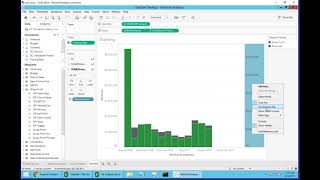
This is a short product demo showing how DataSelf's financial analytics (desktop client + DataSelf data warehouse + Tableau extracts) lets users map GL accounts into customizable analysis buckets and build KPIs without IT. The speaker demonstrates creating a user-defined KPI and a ratio (bad debt expense divided by liabilities), then builds a combined visualization (revenues, gross profit, net profit, and net-profit/gross-profit ratio) using drag-and-drop and dual-axis charts. The demo emphasizes out-of-the-box KPIs, customizable GL-to-bucket mappings (Analytics 1/2/3), and self-service metric creation for business users.
Chapters
Now let's talk a little bit about financial analytics and how that can fulfill the needs of different clients. And let me go to the desktop client here and show the framework we have to fulfill different financial analytics needs. So let me take this financial analytics and drag and drop my analytics one bucket and then let me put the posted amount. So what I have here is we add to the data self data warehouse a table that will allow you to put into buckets your different GL accounts. This is the out of the box but it can be customized. But initially I have all of the different accounts and this is showing how much is being allocated. If I expand the analytics one to analytics two, now I have more details from each one of these big buckets. If I drill down out of the box, we go into the actual segment one of your GL chart of accounts. But all of these things can be customized in different shape or form. Now why do we need this? Well, it's because quite often companies want to keep track of ratios like, you know, your wages versus your revenues or your gross profit which or maybe your marketing expenses versus other of these buckets or any bucket that you can imagine. So let me show an example of a custom application that some of our clients are doing. So I have this, I just created this, my KPI and I just created. Let me show how I created. I'm going to go to edit this. My KPI example is a little expression built by the user. There is no IT involved, no data involved. Personnel is just the user. They say, hey, actually I am the person responsible for bad debt expense. So he said my KPI is when the analytics 3 equals to this, then I have the actual amount. So he created this KPI. Let me show how it works. I'm just going to drag and drop this KPI into my query. So simply what it does is when the tool finds that particular account, let me just show it again. When he finds a particular account, it tells this KPI has an actual value. And for this particular example, this person who is responsible for the bad debt expenses, he also created a ratio. Let me show the ratio. The ratio is he divides the bad debt expense by all the liabilities accounts. So what happens is he takes all the money that goes into the liability. In the analytics one, everything's liability adds up this and makes a ratio. So now he has again the KPI which looks only at an expense account, bad debt expense and divides by the whole liability segment. So now he created these two metrics that he needs to monitor constantly. And then here I have in this other tab an example. So he has my KPI and my KPI ratio by year, by quarter and see how things are going. So financial analytics, once these buckets have been mapped to the way that you want to analyze your different GL segments, it will allow users to be very creative and create their own metrics to keep track of their own important needs or from a company wide standpoint. And here we have a bunch of different KPIs we have available out of the box. So if the out of the box is valuable for you, let's say you want to create a new view that would look at, let's say revenues, gross profit and net profit amounts and percentages. I want to put this all in a dashboard. How can I do it? Well, let's do that. So I'm going to create a new view here from scratch. And again I want to see revenues, gross profit, net profit, and net profit ratio versus gross profit. All of these four different KPIs are available out of the box. So if I want to see revenues, I come here and these are my revenues. I'm going to make them in my rows. So this all revenues. And actually let me break this down by date and let me make this a bar. And I want to make this on a month to date basis. So right now what I'm looking is revenues by month in my sample database. I also want to see gross profit. I come here and I find gross profit right here and I just drag and drop. So right now I have gross profit here and revenues here. Let's put them together. So I'm going to put a dual axis and I'm going to synchronize the axis to be on the same size. And there it is. I can even hide this. No, let's leave it. So right now I have gross profit in green, new revenues in black by month. Very quick and easy. Well, I also want to see net profit. Well, beautiful, it's ready to go. I come here and I find net profit right here. And net profit is this one. I'm going to drag and drop. So at the bottom now I have gross profit for the whole operation. And I also want to see the ratio of net profit versus gross profit. Maybe I don't care about revenues or if I can, I just choose revenues. But in this case I want to see net profit divided by gross profit. It's right here, it's ready to go. I just drag and drop. And in this case I want to make the net profit percentage a line. Oops. Sorry. I want to see the net profit divided by gross profit. A line. So there's a line here. I want to take this one and put labels on it and also to put the color to look nice and I want to combine this with my net profit. So I'll have. Here I have. And actually let's make my net profit as a different color so they just don't get confused. I'm going to use brown, perhaps maybe purple. There you go. So in a few minutes I was able to build from scratch this nice chart that here the top has revenues, gross profit amount per month and at the bottom I have the net profit which is the bar and the line is the net profit divided by gross profit showing also in a color format. So using the the financial analytics built into the data self, you can allow users to easily slice and dice their data by taking advantage of this very comprehensive list of KPIs. How do we customize this? Now I'm showing a sample of a table that tells how we put your different GL account numbers into these different buckets. This is just an example that we use out of the box. So you just map your GL account in this, you know from to and you tell how you want to group into the analytics one and into analytics two. And by default analytics three is your GL segment one. But if you want to create a segment in analytics three, four buckets, as many as you want can be created. Once we bring you to data Warehouse and we plug to the data self tableau extracts, then you have the beauty of having all of these things and you can start slicing. Dice your data in any shape or form. All right.