Financial Analytics with DataSelf and Tableau
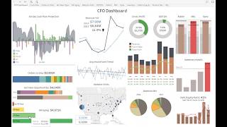
Webinar presentation by John E. Giorardi (DataSelf founder/CEO) demonstrating how DataSelf plus Tableau (and sometimes Excel) are used for financial analytics. Covers a CFO dashboard example, P&L and balance-sheet reporting, consolidation/multi‑currency/intercompany handling, budgeting and forecasting (what‑if scenarios), financial analytics KPIs, and total cost of ownership considerations. Concludes with Q&A and pointers to resources and contact info.
Chapters
Good morning, everyone. Thanks for joining us. My name is John E. Giorardi. I'm Data Sales founder and CEO. Today we'll talk about financial analytics with Data self in Tableau. Many people come to me, ask me, can Tableau do financial analytics P and LS and whatnot. And absolutely it can. Today I'll show some some of the things that we have been doing. Sometimes we use Excel, a lot of times we use Tableau, but we use both when the right tool is the right piece for the job. So our agenda is quite packed. I'll talk first of all about a CFO dashboard that was built by one of our clients. I think it's very insightful. So I want to spend some time talking about kind of the end result of financial analytics as clients embrace this. Then I'll talk obviously about the basics, balance sheet and profit analysis. I'll show in Excel as well as in the Tableau framework. So some people prefer one or the other or both. I'll show a little bit of both of them. I'll talk about company consolidation, intercompany transactions, multi currency, some topics that people sometimes are really having challenges with. Of course, budgeting, what if and forecast scenarios. I'll dive into financial analytics, which is a very powerful part of analytics that a few organizations are taking advantage, are getting a lot of benefits. So I'll talk about that as well. At the end, I'll talk about total cost of ownership so you understand the kind of investment you'll be doing if you embrace a technology like this. And then we'll have a Q and A at the end of the session. But before we jump into the presentation, let me jump and get a very quick survey from you. So if you don't mind, please check all the options and don't forget to click the submit button. Let me know what are your financial reporting challenges. So click all the options applied to you and don't forget to click the submit button. You're still getting a lot of answers. So wait ten more seconds. Five more seconds. Okay, thank you very much. Let me share very quickly. So the top is budgeting a lot of people with P and L issues. So those are the two top ones. Okay, thank you very much for your answers. Let me switch gears here. So let's take a look at the CFO dashboard. I'm going to now switch into the data self analytics tableau framework. I am going to log in as this CFO of one of our clients and when he logs into this portal every morning, he got into this dashboard and it's busy. Yes, this dashboard is busy, but let me tell you the story behind it to see how important this dashboard is. Working for the cfo. So this company is growing significantly. This CFO told me that he's not only a CFO per se, he is responsible for also the IT department and he's all over the company. He works with the operations people, sales, inventory. So when he decided, when they decided to invest in Data Self, one of his visions was I need to have a way to see on my screen a view of the whole business. You know, when you see my financials, sales, cash flow and see all of this information, an easy way that I can drill down into more details, make interactive, make decisions and move on with my day. He told me I'm not an IT person, even though I'm responsible for the IT department, but I'm not it. I'm, you know, I'm a cfo, but I'm, but I'm a smart person and I can actually use tools if you give me tools that are actually easy to use. Making long story short, in the course of six months, you know, they got the tool Data Self with Tableau and all the templates, he started to get some training using the tool. In six months after we started the project, he decided to build this dashboard from scratch all by himself. So not it. And he decided to do it. Many pieces of this dashboard were available out of the box, so he just had to plug and play to the dashboard. But some of them he built completely from scratch. Now again, this looks like a busy dashboard, but since he looks at this every day now, it usually takes a few seconds for him to take a glimpse at this dashboard and have important insights for should I do something about it. So let me go very quickly and give you a tour of this dashboard. On the left column he has what is called the lead metrics. Lead metrics are for things that are going to happen in the future and you can still influence the future. For instance, this whole thing, this whole left is about kind of 60 day projection into the next 60 days. In the top left is a 60 day cash flow projection. He has here open receivables, open payables, payroll, the amount of money supposed to go out in payroll and how much money he has today in the bank. And then adding all of these metrics together, he has a projected cash on hand for the next 60 days. And as long as the negative doesn't pass this line of credit that he has, he's fine. He doesn't need to do anything about cash flow management. But he might have a scenario where a client calls they're not going to be paying a major payment that is coming, let's say on this day he can come here and do what if scenarios. He click on this bar, he says I'm going to exclude this major payment. And right there you know cash flow is going to go over 1500 $1.5 million and then he has to do something about it. So very simple way to look into the future. Place some what if scenarios in this dashboard and act on as needed. The next section here is about orders to ship in the next 60 days by customer. And as you put the mouse over each one of these color bars, he sees how much is the open amount. So that will also influence eventually his cash flow. Hot new opportunities to be closed in the next 60 days. This information comes from the CRM system is just part of the out of the box from Data Self. And he just added as part of the dashboard, the bottom is AR aging. Things that are going to be paid current or not. In this whole dashboard he built in a way that if he needs to click and see more detail, he can. So let's say if he clicks on the AR aging, he goes into a second section of this dashboard that shows again the main metric at the top. And then he sees for all customers the aging buckets and how much each customer owns them as well as all the open invoices amounts due dates in total in here. If he selects all invoices on time, 30 days late, 60 days late and over 60 days he just clicks in the whole dashboard changes accordingly. Now he can do even more. Let's say now I only select the invoices that are really late and one of the clients has a lot of late invoices. He can click on this client and then this whole section will gonna change to to only show the invoices of this particular client. And from here we connected the software in a way that he could right here email to this customer. He could view the customer in their CRM system or he could pick an invoice and look at the invoice or again email the customer or viewing the CRM. So a very interactive dashboard that allows him to slice and dice the data to have actions that can make a difference in whatever that needs his attention. So as I was showing, the left is about lead metrics. The whole right section of the dashboard is about lag metrics. Lag metrics is about what already has happened today or in the past. Showing Your past performance. This section here shows this year and last year, using the colors as a way to represent. Blue is last year, black is this year. So he has revenues side by side this year and last year to see if the business growing or not. At the bottom, he has information coming from Google Analytics. So he can see website visits last year and this year and you know, hey, let's see how we're doing on the east coast. He selects east coast. And then let's say I can zoom into more detail to see this in a bigger chart. So now I can see 2016 and 17 by those states. And darker blue means bigger number of visits. So Florida, New York, some other states are growing significantly since last year. Again, as I mentioned, the cfo, he's all over the business and he's using this dashboard to really understand marketing, sales, and everyone else to do their jobs more efficiently. This section is more about financial metrics, gross profit, revenues, revenue mix and whatnot. The top section has actually he color coded to be brown. Okay. And red not okay. So these are three different kind of expense accounts that he has to look closely. The bar is the actual posted this year and the line is the budget. So marketing is over budget. So it's red. You need to work on something about it. The same idea of with inventory assets in here, let's say, you know, we're over the maximum. He clicks on this red bar. He can go into this other inventory assets subsection of the dashboard that he can see from the financial information, all of those details, but also from the inventory on hand system, which are the top products by cost on hand today that are affecting this big increase in my on hand today. And at the bottom, you know how much I have of these items in different warehouses. And as he puts the mouse over this, all of these dashboards are interactive. He see what's going on. Like my top product, most of the inventory is in the China warehouse, as I can see in the bottom. So a very interactive dashboard. He told me that now that he's using this every day is being very helpful and quite often he needs to make adjustments. He goes here, he clicks on things, tweak it, add new components. I actually have a video on our YouTube channel that shows how, how the CFO sometimes go into this dashboard and change sections and add new pieces to it, like adding a new P and L inside of this dashboard. So if you're interested, you can check out in our YouTube channel. All right, so that was a little overview of the CFO dashboard. Let's Go to the next part. Another quick poll if you don't mind, please just let me know what financial reporting tools do you use and select all the ones that apply to you and please click the Submit button. Ten more seconds. Don't forget to click the Submit button. Five more seconds. All right, let me share with you. So the top one is Excel. No surprise. Built in into the erp, Excel Add ons, Data, Self Double and others. Awesome. Thank you for the feedback. Now I'm going to jump into the the more traditional reporting balance sheet and profit and losses. I'll cover all of this content and I'm going to start showing a little bit on Excel. You know, many people use Excel, many people love Excel, many people hate Excel when many people come to us, sometimes they want to get out of Excel because it's time consuming, it's labor intensive. But sometimes Excel is the right tool and we have usually the knowledge of the expertise to understand your needs and tell you which way you should go. So I'm going to start showing first the Excel framework that we usually use when clients want to use Excel as a front end. But I'll focus most of my presentation about this on tableau because many people, you know, come to us because they have tableau and they don't know how to do financials in tableau. So I'll spend more time in that side of the puzzle. So in Excel, probably, you know, most of you are familiar with Excel and showing financial information. So this is just a simple comparative income statement where you see the accounts, you see in this case two years, the actual how much percent of these things represent the growth since last year from a number standpoint as well as the percentage. Some of the things we do that are really valuable for our clients with Excel in financials is the whole logic of crunching the financial information is done with our data warehouse framework. So for those companies who are spending hours and hours and hours to get their financials built and distributed and is licensed by division business unit what not Typically our data warehouse will completely or do most of the labor completely automated overnight, every day, at the end of the month, at the end of the quarter, whatever it is. So you can focus on having insights from this information instead of doing things manually. So the way that it looks, it's you can make any kind of shape or form the formatting in Excel Budgeting also very popular for Excel using. Some people only use Excel to see the budget. Some people like to use Excel as a data input. We support both framework. We have add ons to Excel that if you want to change the information and push it back into the repository like the data warehouse. So each user that will do the data input into the budget, they are doing this change, but the information is secured once they press submit. That change that they did only will apply to the fields that they can change. It would automatically be consolidated across all users users, all divisions. And then people will be able to start to slice and dice the budget based on the user inputs. So Excel in some companies very popular to be used in the beauty is with data self with our data warehouse we dramatically reduce the time that it takes to get financials budgets into Excel because the data warehouse will automate procedures that today usually people are doing manually. So that's pretty much a quick overview of the Excel, many possibilities. But if you have more questions we can talk on a one on one basis. Now let me show you balance sheet product losses in the Tableau framework. So let me switch to Tableau here and by the way, let me change my screen here very quickly and what I'm going to do now is go to my favorites. By the way, in Tableau, Tableau makes a way that you can easily find things that are very popular to you. So I added into my favorites here I'm going to go and look at P and L this year and when I go to P and L this year I have actually several tabs that are part of this workbook. And this is a very traditional P and L in tableau. The format is not the traditional format the way that the layout is, but the sort of the buckets, how they are aggregated is exactly the same way. So you see gross profit, revenues, cost of sales, and this is the gross profit. You see expenses with all the accounts, the total of the expenses here, and this is the gross operating income, then other expenses and then at the end net income. Very simple format that I have here, but it gives information and the building tableau as things can be easily changed. Users can easily slice and dice and drill down if you give them the power to do so. For instance, if I want to drill down from this level to one level in more detail, I just click the expand button and right there I go and I break down each of these accounts into their sub accounts. I can keep on drilling down, going to the actual glass chart of accounts. You can drill down from year. I can drill down and go, let's say to quarter. I can drill down and go to months. Very interactive. And you control what you can let your users do, but they're interactive you can have business units, divisions. Let's say I just want to see my headquarter P and L. So I remove the other divisions, business units right there the report changes to only show my headquarter P and L out of the box. We have hundreds of reports covering balance sheet and product losses and variations. Here we have only a few showing. Let's say I want to see by period. So in this case for all my databases shows P&LS by period. So you don't have to build those reports or just plug and play. If you want to see variances, you just let's say go to the variances out of the box. We have a lot in this case it's showing for the current month, which my sample data database is May shows last year, this year how much has been posted, what is the variance in a dollar amount and what is the percentage variance since last year. So financials, we cover a lot of these different options. Now let's talk a little bit about multi company. Many people when they come to us with the financial challenges because they have more than one company and they need to consolidate. It's time consuming, it's comple and is slow. So let me give you some examples that once we bring the multi company databases into the data warehouse and you can have any ERP system, you know, you can have a Sage ERP system, Akumatica Dynamics, whatnot, we can bring those data together and we can show consolidated reports like this one for instance. This is just an example where I have right now my P and L for my headquarters. So this is one company that has P and L. But then I have four other companies that actually are only for revenues. They're not cost centers. And if I want to see the P and L for them side by side with my headquarters, I just come here and I check. I want to see with northern, want to see what Southern and I just pick and choose. And this P and L kind of gets additional columns each one for the different company. If these other four organizations would be completely with all the cost centers then all of these other buckets will be populated and you have a P and L by each of those companies and also a consolidated one. So this is one way that we can show let's say in columns and we can build secure in a way that let's say if I'm the general manager manager for the western company when I open this dashboard I only see the western while the CFO of the headquarters opens because this person can see everything, all columns are available. So security can control what people will see. And this is automatic. You don't have to be switching gears. You just send to everyone the same report and security will take care of what they can see. Another way of looking at consolidated financials is actually looking on a vertical way. So here I have my operating income just for all consolidated. But then I can drill down from the consolidation into my actual individual business units. So the top here in this whole white band I have the P and L for headquarters and here is the business unit net income. If I scroll down I have P and LS at the bottom. You know this orange bar is the P and L for northern and then this is the P and L for sudden and so forth. So again if you have cost centers, this P and L will be vertically, not horizontally. As I showed before, many people that have multi company they also have intercompany transactions that sometimes is very hard to eliminate them from the actuals. And we have a lot of experience in looking at how you're doing those multi company transactions in how to help you in the BI platform to incorporate them in a way that they become completely transparent as you run financial. So if you have intercompany transactional challenges, let's talk on a one on one basis so we can help you understand how we can address those. Many people also have multi currency systems that they post in their ERP system their financials, different currencies. Right here what I'm showing is an example of P and L where we have post transactions were done in US dollar, Canadian dollar and Euros. This report is already showing all of them converted into the the functional currency which is US dollar. So right now this is a US dollar financial but it's splitting in different columns of how much was posted on each of these other currencies. Now if you want to see the actual amounts in the source currency you can come here and say show my source currencies. So right now what I'm doing is for each one of these columns I have US dollar converted but I have the amount in the source currency. So in this case is the same. So we have a match. For Canadian the source currency is a little bit higher than the US dollar and for Euro it's a little bit lower. But then right here you can see the conversion. If you want to see what was the conversion rate, you can click here and see at the high level how much the exchange rate was applied. So you just pick and choose and you have the insight. Finally you probably have a lot of GL Segments. And sometimes people need to slice and dice their financials by different GL segments out of the box. We have three segments, but you can add 4, 5, 10, 20, as many as you have. And then you can start seeing Your P&LS looking at your segments. Like in this case, I'm looking at segment two as different columns or as different blocks horizontally. So this is the P and L framework in Tableau. As you can tell, the formatting is not the traditional one like you can do in Excel. However, the information is correct, it's accurate, it's automatic, and you can drill down and slice and dice it very, very easily. It's very powerful. Just show a little bit of balance sheet. Balance sheet is the same concept. So I'm not going to go over this, all of these tabs and explain, but overall, you know, we have a balance sheet you can drill down into more details. You can drill down from the years to the quarters to the months. Kind of the same idea as I showed the P and L, but looking at balance sheet information. All right, now let's take a look at budgeting. So budgeting, pretty much every company has a unique way of doing budgeting. And before we show what we can do with budgeting, I always ask, how are you doing your budgeting, what challenges are you facing and what would you like to improve? And based on those answers, then we can show different approaches we have taken with our framework to address budgeting needs. What I'm going to show you now is something very simple, more from an analytics standpoint. This example here is if you have budgeting coming from your ERP system or from Excel sheets, and then we just bring into the data warehouse, we consolidated the data and then we allow people to slice and dice the data. So this is a simple expense actuals and budget. And the colors are showing that if you are over your budget, then it shows as in red. If you are below your budget shows as in green. So just a simple way to visualize that. Let me show a budget that is a little bit more sophisticated because sometimes people like to look at budgets from a number standpoint. Sometimes they like to see budgets also with the charts and see trends. This budget here is something that I see fairly common, fairly often when people put information on charts, in charts, sometimes because you might have one or two accounts that are so big they make everything else so small that the chart doesn't tell much. It's kind of a waste of real estate on your screen. But overall, with this framework and take advantage, advantage of tableau you can come here. You see how your actual budget and variance are for the whole business. You see this main account, you act on the big account. But then I want to get rid of it. I want to take it out of the screen so I can focus on everyone else to see what's going on. I can easily click on this particular one and say, hey, exclude. So now, once I excluded that one, and by the way, let me just show you what I just did. I'm going to undo that transaction. I just eliminated the top line. And by doing that, all the remaining lines become longer. And I can easily see the line is the budget. The color of the bar is above or below. So if it's above budget, it's blue. If it's below, it's orange. Because this is a revenue budget. So we want people to be always above the budget. And here the budget in this example was input by the account managers. So they entered into an Excel file. They click a submit button. The budget goes to a centralized data warehouse that crunches all the data. And then the VP of sales would approve those amounts, approve it, submits it, and eventually comes into something like this. Now, on a daily basis, sometimes they want to do what if scenarios or variations. What if we want to increase our sales by 10%? And then more people now would be below the budget. So you can apply different ratios to see how things change by using that kind of parameter. Let me show a little bit of what if scenarios. In this case, we have actuals and forecast. We have the total, we have a bunch of accounts, and then we have for this year all the months. And we see, you know, a lot of numbers here that, you know, numbers sometimes are hard to read, even though again, blue means above forecast and orange means below forecast. These bars on the right are aligned with each one of these accounts. And the bar is the actual, the line is the forecast, and the color scheme is the same. Above forecast is blue. Below forecast is orange. So this is very easy to take a quick look to see the trends among each of these accounts. In here you can see also the total right now through August. So we are overall above our budget. And let's say you want to just eliminate the months that we're not yet looking at. You can come here and say, hey, let's just remove those four months and just focus on the months that we are right now past. Or maybe I just want to see the future ones. So I don't say I just want to see the September, October because of the new months, just Going to focus on those ones. So very interactive. I have here the icon of R. Many organizations have very sophisticated ways to calculate forecast in the tableau framework works really nicely with R. So it covers a wide range of forecasting needs. It can be simple just looking at last year same period plus growth percentage or it can be more sophisticated, can have user entry, it can look at these sophisticated statistical analysis to come up with the forecast. So the beauty is this framework allows you to go from simple to very sophisticated. Alrighty, let's have a quick other pool here. So if you don't mind entering quickly, which of these systems do you work with? And please don't forget to click the submit button. Ten more seconds. Don't forget to click the submit button. Five more seconds. All right, thank you so much. Top is Sage, second Microsoft and the others. Thank you very much. All right, next, Financial analytics. Financial analytics is looking at your financial information and slice and dice it in different shapes or form. The P and L. I'm sorry the CFO dashboard that I showed you before is a very good example of taking advantage of Financial analytics is being able to pull information from your financials from other side of your business and just plug into simple or more sophisticated dashboards to come up with something like this. It must be easy, it must be fast because usually the people who do these things, they don't have much time to learn complicated tools. I'm going to show you how our financial analytics help significantly our clients be on top of their financial metrics overall. So first of all I'm going to talk a little bit of some concepts. I'm going to show here an Excel sheet where our clients usually fill out information. So they have here the GL chart of account from to and then they say these are the GL account numbers and usually the segment one they define these different buckets and then we, we can have several different buckets of we call the analytics buckets 1, 2, 3, 4, as many as you want out of the box. We cover 1, 2, 3 with a pre configured framework that already sets things aside by the typical big buckets of financial balance sheets. The same way the sub accounts we already have kind of pre mapped. So as long as the client populates these numbers based on their own GL account numbers, automatically we spin hundreds of reports and dashboards looking at different ratios. Let me show one example here. This one, many of our clients they look at wages, cost of, you know, payroll wages versus other buckets of their financials. In this example I'm showing wages versus Operating income, it could be gross profit, it could be wages versus operational expenses, any of those things. So in this example what we have is the bars or the posted amounts. The wages are in the green bars. In these other bars, which can be orange or blue, are the actual operating income. So I have this information, using this chart in the same information, show me the numbers in the ratio of operating income divided by wages. So this is just one example. This is an out of the box example that shows that you can keep track of different things. Maybe marketing expenses versus revenues. If you increase your marketing expenses, are your revenues going up? Maybe you want to keep track of that. So we provide a lot of these reports and dashboards out of the box so you can quickly see if they're working or you can tweak them to fulfill your specific needs. If you want to see operating income versus wages in more detail, this is a very high level view. Here we have an out of the box report that shows at the very top the operating income in the company history in this example. And then at the bottom I have all the details that will add up to this operation income. And at the very top my wages. So I can see how my wages are versus operating income and see all the details of my P and L at the bottom. So very, very powerful for people to do things like I was showing on the CFO dashboard. As you remember, I have one section of the dashboard that shows specifically financial numbers like the gross profit, revenues. All of these things pretty much out of the box. The CFO plugged and play because our financial analytics are really pre configured to his system. Now how can someone build something customized to their own needs like I was doing here? We already have many of these things out of the box, but how can a person start from scratch? What I'm going to show you now is start from scratch. So far you saw everything ready. But the beauty of data set up with tableau is easy to do new things to slice and dice your data. So now I'm on the publishing tool. I have here my data sources out of the box. We have ap, ar, CRM, Google Analytics, a bunch of GL things. Inventory, manufacturing, purchasing, sales, sales order services, US GDP information. Well, I want to use financial analytics and now I have my financial analytics out of the box system. And suppose I want to see revenues and gross profit by month. So I go to my revenues here, I double click revenues, I double click posting date and I choose by month. So right now I'm simply seeing my revenues by month. Very easy. Okay, now I want to see gross profit percentage. With this chart I go to gross profit. My gross profit percentage is right here. I can put on my chart. So at the bottom I have gross profit percentage and on the top revenues. But I'm going to right click and say, show me this on a dual axis. So now I have both side by side and for my gross profit percentage, I want to make this align. There it is. In a few clicks I have this chart showing my actual revenues and my gross profit percentage. What if I also want to see net profit and net profit percentage on this little dashboard? It's all out of the box. I come here, let me take my net profit and I'm going to put as my report. So at the bottom I'm seeing net profit and I see net profit percentage drag and drop. And I want to see the net profit percentage as a dual axis as well. And I want to make also a line and that's it. In a few clicks, in about two minutes, even explaining, I was able to build this dashboard from scratch. And as you can tell out of the box, we cover a lot of different buckets of the P and L report. We also have many buckets that cover balance sheet reporting in many buckets to cover both them together. So let's say if you want to see your wages versus your open receivables or your liabilities, it would be as easy as I just did with financial analytics. You can take your analysis of your glass metrics and KPIs to a whole new level that you can improve your bottom line and move forward more quickly. Already I hope you can see how powerful this framework is. Let's go back now to my PowerPoint and let's talk about now total cost of ownership. But before I tell you that, let me just say if you're here is because you're interested in analytics and bi and boy, it's a great time to embrace it. I'm passionate about BI analytics. I've been doing this for 17 years and for 12 years as the founder of Data Self. I love it and I'm finally seeing a lot of traction. A lot of people being knowledgeable about BI analytics, a lot of people that don't have a clue what it is. And I'm here to assist you. I'm here to educate you. My first goal is to learn from each other. And if your needs are not, if I'm not, if my solution, my business is not the best fit for your needs, I'll gladly tell competitors they can do a better job but if my solution is a great fit, I get super excited. We know our stuff really well. We do this every day. And I want to talk about some very important things about total cost of ownership. So since we are just past Halloween, I thought about keeping this blog post I just wrote which talks about the I cost will spook you up to 35 times higher than software costs. Up to 35 higher than software costs. Is that a problem or is that a good thing? It's a good question. One of the main culprits, I mean the two main culprits of high total cost of ownership of bi, the two main are a poorly selected BI software. If you chose your BI software because it was low cost, it might bite you back in the course of the next, you know, it might bite you back in labor. It might take a lot of effort to do. So I always tell people, do not select your BI product based on cost. Select your BI based on the right fit. And I'll talk more about that in a minute. But do not select based on cost. Second main culprit, lack of BI expertise. If you don't have BI expertise, you don't need to hire an expert. Maybe you just need to partner with someone that can augment your your BI needs as needed, or maybe you just need more training. But if you do not have BI expertise as part of your BI initiative, that will also have a big impact in your long term cost of bi. So be sure you have the right BI tool, not because of the cost, because it's the right fit. And then you have expertise to help you get the job done. Now let's peel this onion a little bit further back. In August, Tableau released a survey of seven large organizations in how much money they invested in software and in labor in the course of three years. These companies Tableau was a great fit. And actually they compared Tableau and Power BI side by side. Right now we get a lot of people ask me, how is Tableau in Power bi? So this report is very interesting because besides the point of Power BI and Tableau, for the seven organizations, Tableau was the right fit or the better fit. And in the course of three years, as you can tell, the majority of the cost is labor. If you're having a lot of success, you have user traction, you'll be doing a lot of work to get value to these people and it will cost you money to do it. You gotta map your erp, you gotta map your CRM, you gotta map your Google Analytics, you gotta map your payroll system Your inventory, your budget, forecasting. It takes effort. It just takes effort, but it pays off big time if you're doing it right now. For these particular seven organizations, for every dollar they invested in the analytics tool, when they used tableau, it took $9 of labor to get the job done. And with Power BI it took $35. So even though Power BI is more affordable, significantly more affordable for these companies, it took a lot more label and at the end of the day, actually the Tableau based solution was way less money. So I'm not telling that Tableau is going to be the right fit for everyone. Now what I'm telling is do not adopt an enterprise wide BI solution based based on cost. It can bite you back big time. Be sure that it's the right tool. Even if your BI comes with your system, comes with your Sage, with the acumatica, with your Microsoft, whatever it is, make an assessment, you have options and sometimes if you have the wrong framework, it can be a great tool. But if it's not the right fit for you, sorry, it's going to bite you back. So be sure to select the right BI tool. Now when I saw this survey back in August, I was thinking, wow, this is so great. And I've seen so many people complain that yes, it takes a lot of effort, it's great, but it takes a lot of effort. And the vision of Data Self was to address that problem. We want people to be getting value out of the BI a lot more quickly. So I thought let's do a survey among our clients to see what is the ratio that they experience between investment in software versus labor. Out of the hundreds of deployments, we had eight clients that enter our survey. Each of these bars represent one client. And we have some large clients that invest a lot of money in the course of three years. But we also have small clients that invest little money in the course of three years and everything in between. So this is a great sample of our client base. The blue line is how much the client invested into the analytics software. In our case, that was mostly in Tableau. Some other tools as well, but mostly in Tableau. The green is how much they paid for our software. In the orange is different labors backend, you know, data plumbing, sponsor involvement, publishing, training and IT infrastructure. Now what we have found in our client base is that for every dollar they invested into the BI software, our clients invest from $2 to 5 in labor. If you remember from the prior slide, if you start things from scratch, it takes nine to $35 in labor. Our clients is less than half. It's usually almost four times smaller than the minimum and seven times smaller than the maximum. So it's a lot easier, a lot faster. And why, why Data Self solution is so much more efficient. The first thing that I say is if our framework is the right fit. If you need a SQL Server data Warehouse, if you if tableau is the right fit for your analytics tools, then comes this. If you have any of these source systems, most likely they will be a big part of your BI system. And if you start from scratch, it's going to take a lot of labor to put them together. With Data Self, what we have is out of the box, already mapped all of these systems. We have a SQL Server data warehouse. We have an ETL tool, our own, that eliminates programming. So it's quick and easy to get things going out of the box. We have more than 5,000 reports, dashboards and KPIs. You don't have to start from scratch. If you want to see financials, we have hundreds. If you want to see sales analysis, we have more than 2,000 reports and dashboards looking at sales analysis, more than 2,000. We have inventory analysis, we have payables, receivables. There's a lot of things that you will not need to do things from scratch. That's one of the main reasons that we dramatically reduce the labor associated with PI. There's a lot of things that are ready. You do not have to reinvent the wheel. We've been doing this for 12 years as data Self and we have refined this framework. It's super fast. It doesn't matter how much data you have. Most of our reports will run under 10 seconds. Doesn't matter how much data you have. 5 million, 50 million, 500 million, you run in seconds. Regardless, I tell that as a rule, if a report takes more than 10 seconds to run, most people will now wait because they don't have patience. And we deliver that. Most of the reports will run under 10 seconds. My last poll let me launch it. So please answer what are you interested? And click the submit button. Don't forget to click the submit button. 10 more seconds. 5 more seconds. All right, thank you very much. Okay. I hope you find it informative. I'm going to open questions and answers. So if you want to ask any question, please use the GoToWebinar chat panel. And we have a few more minutes to answer questions. So let's see here. We have questions, so question from Rosemary. Do you support sage x3? Rosemary, thanks for your question. Let me actually switch gears here and show you. Oopsie. Show you our website. If you go to dataself.com and you scroll on the homepage can go to the middle section and you choose ERP and CRM, you'll come to this other page where you can see all the system we support. So yes, Sage X3 we support as well as all the other products. And we support, if you have an old product, you know, maybe you have, I don't know, S90, which is sage 100 nowadays from 2001. Yes, we support pretty much all ERPs from the past 17 years. We support all versions. So absolutely we do that. Rosemary, thanks for your question. More questions here. Question from John. Let me expand here. Let me switch my question. John is asking to show the list of sales reports we have available out of the box list of reports. John, thanks for your question. I'm going to go back to my homepage and again if you scroll down and you go to the 5000 reports and KPIs so click this link. This page here will show what we call our reporting packages. So here you have a description of reporting packages for CRM for core financials, distribution, manufacturing. You know, if you go to sales, you click, you can see a little explanation. But if you want to see a list of the reports for any of these modules, then you click this download full list, you get an Excel file, you click the Excel file and then here you have a summary of how many reports you have for each one of them. So if you want to see sales, you click on the sales and you go into this essay tab where you see on the left how the tableau data source for sales looks like out of the box. And then on this section you have the actual list of reports and dashboards. So reports are here. You can go to customer and see all the reports available or you can go to dashboards and see all the reports available. So this Excel file is a list that will show the names of all of these reports. If you want to see sample of them on the same page that I was showing you, you can click the Dashboard samples right now. It shows a few dozen reports to have an idea of how they look. Most importantly, and I think this is very, very important, I love to learn from what you're doing with Di and I love to share what I've Learned in these 17 years as a BI expert. Usually in a quick conversation I can give you pointers to where you should go next, other competitors, what you can do to improve your processes or if Data Self can be a good fit for you. So feel free to contact me to discuss your plans, discuss your challenges. I have been having many people lately coming to me or asking what about Power Bi and Tableau? Power Bi is free, right? I mean you can get the copy and you can get the feed wet and you can do a lot of things for free. Why should they look at something else? I've been getting this question for a while now with Power Bi and I decided to become also a power user. I've been using Power Bi quite a bit and I can make a very intelligent assessment of both options, Tableau and Power Bi and Data Self and tell you what my thoughts are. I actually just released a YouTube comparison of Power BI versus Tableau. So if you go to our YouTube channel, which by the way I recommend you to subscribe because we have a lot of great content coming out every week or so. So go to Data Self. And go to Playlists and there's Power Bi versus Tableau. The Clash of the Titans. Ta da. But if you come here, there's a bunch of different videos on the right. There's a lot of. I make very detailed comparison of things that I deem important when it comes to long term maintenance of your analytics platform. So I encourage you to take a look at it. And most importantly, feel free to contact me. I can help you more quickly decide if it's a good fit for your needs or not. All right folks, running out of time here. Let me just put my contact information in case you want to contact me. Feel free to this is my cell phone. This is my email. Feel free also to follow us on Twitter, on LinkedIn. We always have news coming out recently. Also let me show you this if you want to learn more about the Turokas of ownership. I just wrote an article if you go to the bottom of my homepage seems duplicated but at the very bottom you click this Costa Bi will spook you. And this post goes over this whole 2035 and shows the information about the Tableau Report. You can actually go to the Tableau Report from here. There's some metric from us you can go to our own SMB report. So I encourage you to take a look at this information. It's very educational. Hopefully will help you focus on your BI initiatives and make it more successful. I hope you have enjoyed the session. Thanks for joining us. Have a great day and again feel free. Oh by the way, once I close the webinar, if you could give a feedback of the last question from gotomeeting. I would really appreciate it. Thank you. Have a great day. And thanks for joining us.










