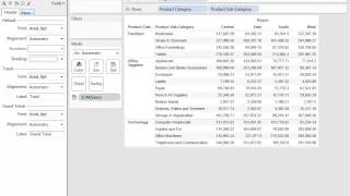
An instructional Tableau video focused on formatting options. The narrator demonstrates building a crosstab of regional sales by product category/subcategory and shows how to open Tableau’s Format menu, explains the formatting icon tabs (font, alignment, shading/row banding, borders, lines), and walks through applying and customizing row banding and starting number/currency formatting.
Chapters
Welcome to the Formatting video. In this video, we'll cover some of the many formatting options available to you in Tableau, such as row banding, shading, annotations, labeling, and tooltip formatting. Feel free to download the kanpanion workbook to follow along. Let's get started. I'd like to first begin by building out a cross tab. I want to look at my regional sales for each of my categories. So I'm going to drag out product category and subcategory. Then I'll drag out my sales and just throw that onto text. So to access my formatting menu, I can right click anywhere on my view here and select format, and that will bring up the format menu here on the left. Or I can go to the Format menu from the top toolbar and select my formatting options from here. Now that we have the formatting menu open, let me describe some of these different icons here. The A is for font formatting, where you can adjust font style and size and add bold or italics or underlined. The alignment icon is for alignment. The paint bucket is for shading for sheets and row banding. The borders icon is for adding borders and row dividers or column dividers. And the paintbrush is for modifying lines such as grid lines, zero lines, your drop lines, all of those things. Each of these tabs represents the scope of my changes. For example, I can have my changes affect the entire sheet, just my rows, or just my columns. Similarly, this field drop down will allow me to apply my changes to a specific field if I choose. So if I select Region, I can now format just the text for the region dimension. All right, now that we've talked about this formatting menu, let's actually start doing some formatting. So the first thing I want to do is apply some row banding to my crosstab. So notice that there is actually formatting present on my crosstab right now. In terms of row batting, you can see it's very light, so I'm going to modify that a little bit. I'll go to my paint bucket and I'll go down to row bending. So currently it's a very light shade of gray. I can make that a bit darker and I also want that to apply to my header, so I'll adjust that as well. I can also adjust the band size. Currently it's set to different. Each row is a different shade. I can set that to every two rows or every three rows and so on. I can also adjust the level of my row banding. Right now it's set to level two. There's only two options here, and that's because I only have two levels, Product category and product subcategory. Subcategory is my second level. If I set that to the first level, my banding will affect my product category, and that's what it would look like. So I'll stick with this option, and that looks pretty good to me. Now that I've got my row banding out of the way, let's talk about some number formatting. Notice that I have two decimal places for my current sales values. Let's say I want to get rid of those decimal places and also add a dollar sign to these numbers because we are talking about a currency value. So to do that number formatting, we want to go to the fields drop down here and select Sum of Sales. Because.