GETTING STARTED – Desktop Users - DSA Educational Video – Intro series
A walkthrough of Tableau Desktop showing how to connect to data, build visualizations by dragging fields onto the Marks card, and combine worksheets into an interactive dashboard. You'll see bar charts, treemaps, maps, and scatter plots, plus how to add filters, trend lines, and cross-sheet filtering.
Chapters
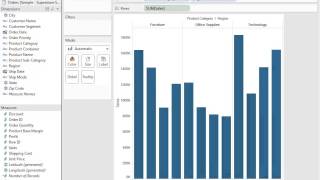
Welcome to Getting Started with Tableau desktop version 8. This getting started video is designed for those of you who have your data ready to analyze, but may have never stepped foot into the Tableau universe up until this point. Here we'll show you how to connect to data. We'll go over the user interface and we'll build some simple worksheets and combine them into a dashboard, all all of these things in hopes to get you on the right foot when analyzing your own data. Before we begin, I would like to show you the data set that we'll be connecting to for the duration of this video. We'll be connected to this sample Superstore Sales Excel file. This is just mocked up retail store sales data. We use this data set for two main reasons. One is that you have a very similar data set already at your disposal that shipped with your copy of Tableau. So if you'd like to follow along and build some of the views and dashboards we'll be experimenting with in this video, you can do that. Second, I like to point out how data should be formatted for best use in Tableau. And this is exactly it. Here we have a nice columnar data format where all of our column headers represent a different dimension or measure for use in Tableau and each row represents a unique row of data, in this case identified by a unique row id. So without further ado, let's go ahead and connect. This is the Tableau home screen that you will encounter the very first time you open up the product. Here you can connect to your data. You can connect in one click to some of your saved data sources, or you can one click Connect and open each of the workbooks that you have recently worked on. We also have some nice Getting started links in the lower left here. For those of you that would like more information or if you've never visualized anything before and would like a place to start from. We have some sample workbooks that that will populate the bottom of the window here for you to get started with. We're going to go ahead and connect to data. This is the Connect to Data screen. Here you see all of the different data sources that Tableau forges native connections to, whether they live in a flat file like Access or Excel or on a server either in the Tableau server or relational databases like Microsoft SQL Server or MySQL or Oracle. We also have OLAP connections, Oracle Essbase and Microsoft Analysis Services being a couple. And now we even connect to online data sources like Google Analytics, BigQuery, and Salesforce. We also again populate the list of saved data sources from before. For this video, we'll go ahead and navigate to that Excel file we talked about earlier, and then Tableau will ask us which table within our data source we'd like to connect to. Here there are three different tables within my Excel file, and if you're ever unsure of which one to connect to and you don't remember what data is in which, you can always click the View Data button to get a nice quick snapshot of the data you will be connecting to in that specific table so that you don't get lost. You can either connect directly to that single table. You can also connect to multiple tables by specifying your first adding a second table from the same data source and specifying your join clauses, of which some Tableau will recognize automatically. You can even write custom SQL. For now, we're going to connect to a single table and that will be the orders table. Now Tableau will ask us if we'd like to connect Live to our data source, or we want to import some or all of the data directly into Tableau's fast data engine. Connecting live is great when you have data that is coming in and streaming in by the second. We'll actually then forge a live connection to that data source and every move you make in Tableau will reflect the latest data. You may want to import some or all of the data into Tableau's fast data engine if your data source on the back end is not the snappiest in the world, or you might want to limit the data set you're actually working with for better and easier analysis. In this case, I'll go ahead and connect Live to my Excel sheet, and with just a couple of clicks, we are now connected live to that Excel sheet containing that superstore data. And we can see that Tableau tells us where we're connected here. There's our order sample Superstores Excel and you'll notice we have dimensions and measures that are brought in straight from those column headers. And in that Excel sheet, what are dimensions? What are measures? Dimensions are things that we want to slice our numerical data down by data slicers, if you will, categorical fields, in this case things like date fields, maybe a customer segment, maybe a product name or category. Measures, on the other hand, are our metrics. They are the numbers that we want to look at visually in Tableau. So if you want to start analyzing those numbers, it's a simple drag and drop process. Go ahead and start by taking your sales measure and simply dragging it right on to the field. And now we can see that Tableau queries the data and sends back a single result, giving us the aggregate sales in our data set, which is almost $15 million. With a measure out on the field, we can now take a dimension, let's say product category, drag that right onto the field as well. And now our aggregate sales number is broken up into each of those product categories. And when I hover over to get this tooltip view, I can see the actual numbers that belie those different bars we have on the screen. We can then break it down even further, maybe by product subcategory. And now we have a nice view again, with the aggregate numbers broken up accordingly. If you don't want to look at it by subcategory, maybe regional dimensionality is what you would like to see. Let's just put that in there. And now we have each of our categories broken up by region. We can easily swing those around with a quick drag and drop to put in this case, region at the top and then our categories below. And this is the beauty of Tableau, it's flexible. Every time you want to see something different or break something down further, it's a simple drag and drop. If you ever get to a point that you don't want to be or you went too far, you can always click the back button. And you have unlimited forward and back capability so that you can answer your questions as they come to your head and move forward and backward in your analysis freely. Again, flexibility is the name of the game here. If I want to have a row for each of my product categories, I'll just drag product category to rows. Maybe instead of rows, I want to see stacked bars broken up by color, by product category. In that case, I'll just drag product category from rows onto color. And now I have a nice clean visualization. But I'll go ahead and hit the back button again and we'll leave our analysis here for now. We'll go ahead and name this sheet bar chart. After you name your sheet in Tableau, a quick right click on the sheet and tab itself will give you the option to duplicate that worksheet. This is always a best practice that I like to impart, because now once you have a visualization that you like, but maybe you want to experiment a little bit, it's easy to do that. I've already saved my first bar chart here, and now I've got a new one to iterate upon. And iteration is the forte of our show. Me Feature 1 Click on Show Me reveals 23 different chart types that Tableau can make with a single click. In this case, maybe I want to change my bar chart to a highlight table. I'll go ahead and click that and Tableau will give me a nice visualization dependent upon the visualization type that I click on. Maybe instead of a highlight table, I want some packed bubbles. Let's click pack bubbles and there they are. Maybe a tree map is more what I'm thinking. I'll click Tree map. And now I see that Tableau has built a tree map with the dimensions and measures that I had specified. When you use Show Me Tableau will automatically populate the correct columns, rows or spot on our Marks card with the dimensions and measures necessary to build the chart. Right now we can look at this tree map and our Marks card tells us exactly how Tableau is plotting each dimension and measure. Look at the icons that fall to the left of each dimension and measure on the bottom of the Marks card here that I'm circling. In this case, we have our sum of sales measure that is breaking out our tree map by size. And this is our size icon which corresponds to our size button. We also have the sales on color. And in this case, Tableau automatically generates our color scale going from light green to dark green. And then our ABC123 icon denoting our labels tells us that Tableau is labeling each of our rectangles in our tree map by product category and and by region, which you can see in the tree map itself. And like any other chart type in Tableau, tree maps are easy to manipulate. Let's say I want to look at my profit by color in this tree map. I'll just drag my profit measure to the color shelf and Tableau colors my tree map accordingly. We can again look at our Marks card and see that now instead of sales, we have the sum of profit profit next to our color icon. We can also easily customize how our charts are colored by clicking on the color button. Here we have a few different options, one of which is to edit the colors. And now we can just choose from a large menu the exact color we would like to see in our treemap. I like blue in general, but in this case I think the actual green and red divergent colors were a little more effective. So again, I'll just use my back button. Labeling is also easy to manipulate in Tableau to adjust colors, we used the color button to adjust and add to labeling. We'll just use the label button. Maybe I'D like to go ahead and put my profit and sales numbers right on the labels on along with product category and region. I can just drag my sales and profit measures right to that label button and watch as Tableau populates each rectangle where it has room. With the labels that I want, I can also easily edit those labels by clicking the label button inside the menu. You can then add text and customize your labels. Maybe I will call out the fact that these numbers are different and I want to show my user which is which by adding some text there. And I'll also make my product category bold and a little bit bigger. Now there's a treemap that gives me some great information with one quick glance. We can also influence the tooltip in much the same way. A click here will let us then put in our own text and formatting options that we would like when users hover over each of our marks. In the case of this tree map, we cannot manipulate the size of each of the rectangles because they are actually sized in this case by the measure Sales. We can however, tell Tableau how we would like our visualization to fit in the window. Our Fit drop down menu here gives us normal fitting, width, height and the entire view for us to play with. In this case, if I click entire view, Tableau will populate the entire piece of screen real estate. With our visualization, we'll keep it on normal for now, but just to illustrate how easy it is to change the size of marks on different visualizations, I'll go ahead and click Show Me and choose a scatter plot here. Now when I click the size button, it's easy to dial up and down between the different sizes of all of my marks. Let's go ahead and go back to our tree map with just a couple clicks here and we'll save this sheet as our treemap sheet. Another great way to use Show Me is to make a map. At the top we have two different mapping options, a filled map and a symbol map. When I mouse over filled map, notice that ShowMe gives me the minimum requirements necessary in order to build a filled map. In this case, I need a geographic dimension and at least a measure. So I'll go over to my data window, I'll pick my state dimension, I'll hold my control key and pick profit as well. And now among others, you see the highlighted map or field map show up as an option in Show Me. I'll go ahead and with one click build a nice profit map. Now I have a view of Profit by state. And I see when I use my tooltip that Montana is in the red. Washington's doing okay. California is doing really great. But I can also break this down with a quick filter by a different dimension. In this case, I want to see how each state is doing profit wise by product category. The quickest way to evoke a quick filter is to right click on the dimension you'd like to filter by and choose Show Quick filter Tableau then populates on the right side of the view a nice filter you can then filter your data by. In this case, here's my profitability by state for furniture, office supplies and technology. Notice that when I used that quick filter option, Tableau actually put my product category dimension onto the filters shelf. This is how we build filters in Tableau. I'll hit back and actually do it manually to prove that point before we right clicked and we showed that quick filter. But this time instead I'm just going to drag my product category dimension onto the filter shelf. I'll choose all three of my product categories and then we just say let's show that quick filter from there and we have the exact same result. You can also customize how your users will see that filter option. And I always like to use a single value list in order to cycle through those options very easily. It's up to you though. And now we've got a nice profit map. But one more thing I'd like to add is I would like to add the state name to label along with maybe the profit numbers. That looks pretty nice. Let's call this sheet our easy map. The final sheet we'll build will be a scatter plot. Let's go ahead and drag profit to rows and we'll drag our sales to columns. So now we're actually comparing profit and sales and we can break that up further maybe regionally on our color button here. And we'll take product category to our shape button. Now we have a color for each region where you can highlight easy by just clicking on the color legend and a shape that corresponds with each product category. Tableau will give us some default shapes here in order to visualize our data, but we can easily change those by clicking on the shape button. Tableau comes pre packed with many different shape palettes. In this case, maybe I'll use filled shapes to make make them a little more bold. I can go ahead and just pick my filled shapes option, assign that entire palette and hit apply. Now we've got filled shapes to work with. We can make them a bit bigger if we'd like about like that looks good. And now we can use the final button that we haven't talked about yet, our detail button, to add detail to to this scatter plot. In this case, maybe I'd like to take my customer names and view my scatter plot at the level of detail of customers. Now I've got a nice scatter plot there and maybe I want to make this a bit clearer by adding profit to my label button. Now we really start to see how that profit interacts with our sales measure. The last thing I'll do is I'll right click on the view itself and come down to add trend lines to our view. Now we have a really easy way to highlight each different region and tell exactly how sales and profit are trending together. Now that we have made a few different charts, it's time to combine them into a dashboard. The dashboard button is right here next to the new sheet button. And when you click that, you get a blank dashboard to work with. I want you to notice that you can easily size the dashboard for the screen that you're working on. I'll go ahead and use automatic in this case. And then it's as simple as dragging out the sheets that you've made directly into the dashboard space. And Tableau will populate those with automatically. There's my scatter plot. And let's bring my bar chart down to the bottom here. And now we've got a nice overview of all the different analysis that we just made in Tableau. I'm going to take my product category filter that we built for our map. I'm going to tell Tableau to go ahead and apply that to all worksheets. And then I'm going to tell Tableau. I also want to use my easy map as a filter for the other sheets. So now I can pick a product category and see all those numbers accordingly in each of my other two sheets. I can also, because I used the map as a filter, click on any state and see the updated numbers for only that state. We'll name our dashboard the final report. And with that, you have now gotten through the getting started video. I hope this has given you a nice idea of the usability and the ease of use of Tableau. When you are starting to delve into your own data. I want to remind you that there are many, many other detailed videos on this on demand website. So if you saw something this video you want to explore further, you can rest assured that there is a video for you with the topic that you'd like to view. Thank you so much for joining us on this getting started with Tableau Desktop version 8, and I hope you have fun analyzing your own data. Thanks for watching.










