How Sage Summit 2015 changed self-service BI and analytics
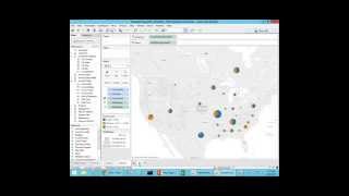
Johnny Girardi demos Data Self Analytics, which combines Tableau and Microsoft BI with 5,000 prebuilt reports to let non-technical users build dashboards without coding. The platform can join data from multiple sources like Google Analytics and CRM systems, and one customer used it to spot recurring profitability problems across customer groups.
Questions this video answers
Johnny Girardi — CEO and founder of Data Self.
More than 5,000.
August 26, 2015.
On-premises, cloud, or hybrid deployment options.
About two weeks of people-time to prepare month-end board reports.
Chapters
Good morning everyone. Hopefully all of us have been at Sage Summit in New Orleans, which was an incredible event for us. We had a lot of fun, it was very productive. And one of the major dilemmas that people came to us looking for BI analytics was should I choose price or should I choose power? And this is one of the most important topics that was discussed at Sage Summit and today we're going to talk about how we change that dilemma. My name is Johnny Girardi. I'm the CEO and founder of Data Self. Thanks for joining us. So let's talk about it. Well, should you go for power? Should you go for price? What if you go for low price BI solutions, what you get out of it? Well overall it's much better than regular reporting tools such as Crystal. So lower price BI is easier to use. But it still is what we call as expert centric solution, meaning someone in your organization or a consultant will have to go through a lot of training to be able to become more productive building reports. And what happens is decision makers, the people who need reports, the they will have to rely on this expert for new reports or for modified reports. So usually low priced BI solutions are fairly expert centric business people will not become self sufficient. They will have to rely on the expert. Also. Overall they're still pretty labor intensive reporting tools. This expert typically will be spending many hours on a weekly or monthly basis tackling reporting, building reporting and distribute reports to other people. So at the end of the day you're still a pretty labor intensive reporting platform. And if you have a lot of data, well it will be slow. Many reports will take just too long to run. That could be several minutes, could be hours and even days to run. So using low price BI performance can also be an issue. Well, what if you go to the other side? What if you choose power and typically you are paying a lot of money. What happened with that? Well, when you go to enterprise grade bi, what you get is actually user centric BI meaning now business people with little training, they can actually take care of a lot of the reporting needs all by themselves. So you push reporting to who understand the business, understand the business, understand the business opportunities and threats. They become more self sufficient anytime, anywhere. They can open a report or dashboard, even on mobile devices. They can slice and dice it, they can create new reports without calling for experts. So user centric is a major benefit of power BI power BI that is really powerful. Second is well now because business people can actually do the job by themselves, you reduce a lot of the labor associated with Reporting, crunching. You spend more time analyzing data, less time doing data crunching, a lot more efficient process. It is fast. Enterprise grade BI is typically designed for Fortune 2000. So it doesn't matter how big your data source is, your database is, reports will run in seconds. However, if you go to power, typically you have high price and then the return on investment seems like infinite. I mean it's going to take forever to take the money back. Well, at Sage Summit we changed the game. So we are solving this dilemma. You don't have to choose between price or power. And let me show you how we do that. We've been doing this business for 15 years and what we do for the Sage market and mid sized companies is we bring best of the breed technology from the Fortune 2000 world. Enterprise grade. We make it simple, we make it affordable. This chart here shows Gartner. I mean Gartner is one of the most reputable companies doing technology assessment for Fortune 2000 companies. And every year they release this magic quadrant for BI and analytics showing how well Fortune 2000 or enterprise grade BI platforms are doing. Make a long story short, Tableau has been considered the gold standard for analytics and self service BI for three years in a row. Right now the most successful company doing self service BI and Microsoft has been one of the leaders when it comes to BI infrastructure for several years now. Well, what about them? What about us? Well, data Self analytics is actually a package solution that includes right now nothing but the gold standard for self service bi. So out for the Fortune 2000 companies there is pretty much Tableau is the leader. And what you get from us, it's that we also bring Microsoft BI as the infrastructure. However, these two components, if you try to build a solution by yourself with your own team, is going to take a long time, a lot of resources. So we have added our own secret sauce to make the process simple, fast and expensive. We add our own ETL that eliminates programming and we have added more than 5,000. You got that right, 5,000 reports, dashboards and KPIs out of the box. So not only you're getting enterprise grade BI easy, fast, powerful, but there's a ton of reports as a starting point. So what we do is we give you enterprise grade bi. It's fast to deploy, usually in hours or days and the cost for you to take advantage of this is really inexpensive. So we're pretty much solving the dilemma. You're getting power, but you're paying mid size price for BI solution. Well, let me show you a little demo of how the product works. And the scenario I'm going to play here is from an actual case one of our clients. It's a distribution company here in California where the decision making team was very data driven. When they want to make decisions, they want to see facts combined with their gut feeling to come up with the decisions. And before Data Self they would spend ton of hours every month crunching reports and data for their operations. And the CEO would go for the board meetings at the end of every month to show how things are going. And particularly for the board meeting, they would spend about almost two weeks worth of people working with reports to get the reports done. Well, what I'm going to show in this demo is how the company after acquiring Data Self analytics how the CEO and his team went about building these reports. And I'm going to show two sides of the benefit of our solution. First is a self service PI meaning the CEO became a person able to build reports and change reports on the fly without requesting expert support. And he had to build several reports for the board meeting. One of them was just showing simply this month's sales details. You need to show customer sales, invoice, number, product and so forth. So I'll build a report on the fly. Then he also need to show how marketing sales were related to each other. They did a lot of website promotions and they want to see website visitors in sales and see if they're affecting each other. So I want to show how Google Analytics data was combined with their sage sales information and show how those two trends were working together. Then they were sending to the whole North America and they want to see how sales were by state and how the deal sizes were distributed across the state. So I'll build that one as well. The next report is a more sophisticated one. It's a financial report where they want to see revenues and also projection for this month. So I'll cover that. And finally is the data discovery component. Data discovery is a technology that allows decision makers to find trends that they don't know exactly what's going on. It's like I need to discover what's wrong or what's going super good and I don't know exactly where to look. So it's kind of a discovery process. And for that this company, this distribution company was growing their business successfully for many, many years from a sales standpoint. And it's a high margin business. However, gross profit was not high enough and the board asked last time what's going on with profitability. So I'll take some time in this demo to show how data discovery can help decision makers find information out of the blue. Just using this easy to use reporting platform. Are you ready to see the product? All right, so right here I'm using the publishing tool, which is the most powerful tool for reporting data analysis. What I'm going to show you here, I'm going to be using the desktop client. However you can use the web user interface, even mobile device apps to do most of the things I'm going to do here using the desktop. So in this case I'm connected to my revenues connector or my sales connector coming from the CRM from the Sage ERP system. And I have here my sales information, my customer products, invoice information and so forth. And at the bottom I have measures. What am I looking for? Sales, cost of sales, product and so forth. Well, let me build the first report showing this month's sales details. So I want to see customer invoice number, sales amount and so forth. What you do is you drag and drop. So I want to see sales. I drag and drop sales to my report. This is total sales. I want to see customers. I come to the customer list, I find customer name and I drag and drop. Just drag and drop. And you get there by customer, total sales. Well, I want to see for this month. Well, I want to see time. So I take invoice, date and drag and drop to my columns. Right now I see sales by year, by customer. Well, I want to go to the month level. I can expand year to quarters. I can spend quarter to month and I could go to the day level. I could go to weeks, fiscal periods, you name it. Well, I want to see this month sales. I don't want to see all the company history. Well, I need to filter this report. Again you drag and drop, drag and drop invoice dates to my filter area. You can select different time buckets or use relative date, which is very popular because I can choose the time bucket in this case month and select this month. And now every time that I open this report, it will show me this month, whatever the month is. And in the board meeting, sometimes the board would ask me what happened last month, the last three months, last year, whatever. It would be very easy for me to come over here, click this filter and choose previous month or maybe the last four months or just this month in this case. So very easy, very intuitive. Again, self service, bi business people can do it. They don't need an IT expert. Well, I want to see product, I want to see invoice number. Well you just drag and drop. If I want to see invoice number I come to invoice fields. I drag and drop invoice number and now I have invoice number. Maybe I want to see product again you just drag and drop. When I find product I can drop it right here between the two customer and invoice number. Or maybe after invoice number just drag and drop and you get the answer. Maybe invoice date just drag and drop. Let's put after invoice number. Let's put before invoice number. So this is something that any person with little training can learn how to do and they become self sufficient. Building reports, dashboards anytime, anywhere. Many of our clients they have learned how to build reports just by watching a presentation like this simple reports is pretty much drag and drop. Okay, that's pretty easy. So first report was done well now I want to see marketing versus sales trends. So I'm going to create a new sheet and now I want to see sales and website visitors side by side. Well for this distribution company the IT team work with data self to combine Google Analytics data along with the sales connector and now it's just another metric for my analysis. So if I want to combine both, I want to see let's say sales and I want to see sales by date. I want to see this on a monthly level. So right now I'm seeing sales company wide, the whole company history by month. Well I want to see website visitors, I just drag and drop website views to my report. That's website visitors. Let me see as bar so I can tell website visitors easily visually from sales and let me put them both side by side to see how they are affecting each other. And there you go. Website visitors orange bars sales is aligned and now for my next meeting we'll be ready for analysis and we can discuss before data self data. This report alone was taking several days of the IT team working with their marketing team getting data from the ERP system for sales, getting Google Analytics data, putting Excel, massaging the data, putting this together. Now I as a CEO build this and next time any day I just pop this report is ready. Very easy, very user friendly. That's self service bi. All righty. How about regional sales by deal size? Well now I want to see sales by territory. Could be anything that has a geography, ship to a billing address, you name it. So I'm going to choose in this case the billing to customer state. I want to choose invoice size and sales and I want to put everything on a Map and let's make this a little bigger and drag it and make the bubbles a little bigger. I mean, it took me a few clicks to build this very nice map feature where it shows bigger bubbles, bigger sales, and then the bubbles are sliced by the aggregation of invoices by size, large, medium, small. That was easy. Now when the CEO was going to these meetings, he was going with his iPad. So let's put these three dashboards on an iPad, on these three views on a dashboard. So when the CEO goes to the meeting, he can use the iPad to show and we just want to combine all of the views. So I want to bring the map, I want to bring the chart and I just again drag and drop whatever I want and then the detail report to my right quadrant at the bottom and there you go. I built a fairly sophisticated dashboard from scratch, not being an IT expert and it's very informative. Now, in the board meetings, sometimes some of the board members would say, well, I'm traveling to California and Texas, can you tell me how the clients are doing over there? Well, before data self, the CEO will have to make notes and Mr. Board Member, I'll get back to you in a few days with your report. Now, because of Data Self, they can actually the CEO and management can make decisions and change the reports on the fly like this. Well, I want to choose, in this case only California and Texas. And when I do that, automatically the dashboard changes to reflect only sales to those two states. I can now email on the fly this dashboard to the board member and job done. I don't have to go back ask my it, I don't have to send an email. I do, right there on the flight. We make decisions. We make decisions when needed and we move on. That's the beauty of power. You give decision makers a tool that they can actually do the job by themselves, anytime, anywhere. People have questions all over the place anytime. And you give them a tool that they can find the answer without calling someone else. And this goes a long way to do that. Well, the next report is a more sophisticated one is revenues and projection. So this report actually was built by it, at least the foundation of it. And let me explain what it is. So this is kind of a financial report showing here the top quarter information by cost center. So I have revenues by quarter, I have profitability by quarter. And then for this month I have a very interesting report here. I have current month bookings, which is invoice sales coming from financials. I also have open sales orders that are not invoiced yet, but are supposed to be invoiced by the end of the month. Then I have expected new revenues coming from my CRM system with deliver date by the end of the month. So when you combine invoiced with pending orders with expected orders from sales, you get a fairly accurate estimate of projection for this month. This report took a little while for the IT and us to put it together, all the connectors. But once that was done, it became completely automated. Before this company was spending also a few days crunching this dashboard. Now it becomes completely automated. The data crunching as well as this, the distribution of this report to the people involved in the process. All right, so that's self service. BI Let me show you now data discovery again, data discovery is I don't know what's going on and I need to find out because it's important and I need to answer the question why isn't profitability better? So as the CEO he thought well let me build a new report here to try to find some trends. And of course you start with something that you know. In this case the CEO knew sales and their business was mostly driven by customers. So he picked customer group in customer territory, which is major business drives of the whole operation. So right now by customer group, by territory, I have sales CEO look at this data. Yep, this makes this reasonable. Well, let me add profitability information to see what's going on. So I add profitability percent to my color. Very green is very profitable, kind of white, ish, not so profitable. And now we see some trends Right now regardless of the territory, SH is low profitability. So I don't care territory, I remove territory. And right now I can see SH profitability 9% while the other customer groups is above 50% which should be the target. How about that? Well, let's focus on sh only. So 9%. What's going on? Is it seasonal? Is it changing? Let's see. I'm adding now invoice date to my report and let me drill down to the month level and let's make this a little bigger. So once the CEO drilled down to the month level, he could see that at the end of last year profitability was negative 4% negative. Not only that, but prior year around the same time it was negative again and prior year was pretty low. So there's something wrong going on with my profitability for this SH customer group at the end of the year. Well, I'm the CEO, I'm supposed to delegate. Right. So I'm going to click last year information and ask give me all the data, all the details behind this month. Right now I'm getting about 36,000 records, all the sales invoice number, invoice date, customer salespeople, sales quantity, gross profit, everything. Now I can email this information to my account manager for the SH customer group and ask hey please look why we're getting negative profitability in this time of the year. Let's discuss because I need to have a more intelligent conversation with my board meeting in this coming next meeting. Anyway, using data discovery the CEO was able to find some trends, critical trends before nobody was aware and it just took him a few minutes to figure that out. The point is again you allowing decision makers to access their data slice and dice do self service bi in data discovery and they become a lot more productive with the decision making process. All righty. Hope you found that demo exciting. Let me move on. So at the end of the day, how do we solve the price or power dilemma? Well, it's twofold. These are the two main benefits. First of all is providing a technology that empowers decision makers so they can do it anytime, anywhere. How can you do it is by using the way that we do it is by using enterprise grade technology. And right now is nothing but the gold standard for Fortune 2000. So we're bringing nothing but the gold standard from Fortune 2000 to mid sized companies. Not only that, there's more than 5,000 reports, dashboards and KPIs available out of the box. So it's a great foundation for you to start analyzing your business. This is the most important benefit empowering decision makers. Second is just reducing the labor associated to report by on average more than 80%. So this tool will automate most of the reporting tasks, make them automatic. You don't have to worry, it will do data crunching and email reports. So overall it reduces the time to build and modify reports. It automates the repetitive data manipulation and automatically distributes the reports. Because you are attending our webinar as a thank you, if you decide to choose dataself as your BI and analytics platform and you place the order by the end of next month, we will give you an extra free viewer license. So please take advantage of that. We have very little time here. If you have questions, probably going to have time to one or two questions to address. So please feel free to use the GoToWebinar panel to address questions. And let me see if I see questions here. So we have questions and the first question is from Gary. Thank you Gary. So how do you compare Data Self with Sage Intelligence Solution Gary, this is an awesome question. I would love to go over an assessment of how we compare our solution versus the main players in Sage Intelligence is one of them. Actually Sage offered two Sage Intelligence reporting in Sage Intelligence Enterprise but unfortunately I have little time here to cover those answers. So I rather take this question on a one on one basis and anyone else that would be interested shoot me an email or give me a call and I'll be glad to talk about Sage Intelligence, Domo, Biznet and so forth. Actually I want to be sure I give you some information about how you can find out more about us by yourself. So if you go to our website dataself.com and you scroll down here, you'll find first of all a two minute demo. So if you want to show our solution to someone else and you have a very short time, this two minute demo is very powerful and very informative. Then you can come here to this button called the 5000 reports KPIs and dashboards and here you'll find a description of all reporting packages we offer and how many KPIs they include in each one of them. And if you click this download full list you'll get an Excel file that lists every single report available out of the box. And again we have more than 5,000 so this link is very popular. The other popular link is you want to see what ERP and CRM systems we cover out of the box. We can pull data from any data source, but these are the ones we already have pre mapped the 5,000 reporting KPIs. The other information that's very popular is the architecture of our solution. So this is how it works and we can deploy on premises or in the cloud. We offer both models or hybrid. So whatever you're using we have options to cover. And finally the webinars button. You'll see upcoming webinars and you also can find recorded webinars. And here tomorrow you'll find a recording of this webinar. And if you want to learn more we have a bunch of webinars focused on different products and also some generic ones covering more generic functionality. So please feel free to visit those pages. Folks, I hope you have found this session informative. If you have questions or comments or just want to discuss BI and what options you have, which one should be a good one? I'll tell you the pros and cons of everything, including ours. Everyone has its strengths and weaknesses. You can find here my cell phone, my email account and my Twitter account I hope you found this informative. I wish you a happy hump day. Thank you for joining us. Have a great day.










