In Depth Product Demo
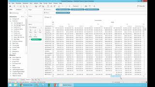
DataSelf CEO and CIO build board-ready dashboards from 30 million records using drag-and-drop tools. They create three reports, assemble them into a dashboard, and automate over 80% of their previous reporting work.
Questions this video answers
September 21, 2017
More than 30 million records
Tableau
More than 80%
Chapters
Okay, so now I'm going to show you is actually the product. And what I'm going to show you is actually an example from one of our clients, a distribution company here in California where at the beginning of the process the CEO and the CIO they call me. And make a long story short, the CEO told me, Johnny, my business is growing. We have a very data hungry management. We like to see data before we make decisions and it's getting too hard too often. We have to either wait until the IT comes up with some new reports and dashboards to answer our questions or we have to wing it because we can't wait. Either way, waiting or winging, we can no longer live that way. We need a tool that empowers my management to make more informed decisions anytime, anywhere with an easy to use reporting platform. The CIO told me, johnny, we don't have a resource problem. I have a great IT staff, very competent, very effective. But it takes us a lot of our time to keep up with the management requests. It's frustrating for all of us and frankly my IT team has better things to do than building reports. We have to. But I wish we can automate a lot of these procedures and empower them, the users, so they can do more of these requests without calling us all the time. So they asked me, can you help us? Absolutely. So they have been using Data Cell for almost two years now. And what I'm going to show you now is actually how the CEO himself built a dashboard from scratch. He built several, but I'm going to show one of them in this dashboard. Before Data Self was taking many hours every month for his IT to put together. The CO takes these dashboards to board meetings monthly. And the dashboard I'm going to be creating is actually a dashboard for the board for the monthly board meeting. So let me switch gears here. And now I'm switching to the Data Self desktop tool which is powered by Tableau. A lot of the things I'm going to be showing you on the desktop can also be done using web browsers or mobile devices, maybe using a tablet like an iPad and do what I'm going to be doing here anyhow. So the CEO is going to build this dashboard that shows three areas of his revenues. One is detailed sales this month. Then it's showing marketing sales and then finally sales by geography, everything a dashboard. So when he came here to build this dashboard, the first thing he needs to do is decide which connector or data source is going to be building these reports. And here I'm going To show the connection data source available, we have available out of the box, ap, ar, CRM information, Google Analytics data, GL inventory, manufacturing, purchasing, budgeting, revenue, sales, sales order, US GDP data. Anyway, he just pick and choose. In this case he chose revenues. And now pretty much building reports and dashboards becomes a drag and drop kind of functionality. Very easy to do. So his first report was. And by the way, my sample database right now that I'm using has more than 30 million records and the point is to show that even though I have a good sized sample database, my reports will run quickly and I have not optimized this demo for this database. This is just out of the box, out of this large sample database. Anyhow, so the co needs to see sales by customer this month by product and invoice number. So what he needs to do is he comes to the dimensions and measures and just drag and drop. Here are my customers, I find customer name, drag and drop into my report. These are all customers. I want to see sales, I find sales, I drag and drop into the report. So this is total sales by customer in the whole company history. I want to see this in a descending order so I see my top customers at the top. So there it is. Total sales by customer with the top customer at the top. Well, I want to see sales this month so I can take invoice date, just drag and drop into my report. And now I see my whole company history, total sales by customer by year. Well, I want to see sales this month so I can expand year to go to the quarter level. I can expand quarter to go to the month level. And I could be drilling down into weeks, into fiscal periods, into days, into hours, minutes, seconds, whatever time period that you want to analyze. We just have to be sure. We mapped them in the data warehouse, plug them to this framework and now users just have to expand easily, slice and dice it. It becomes very easy, very fast. Now I have a lot of data here. I only want to see sales for this month. So let me filter it. I'm going to take invoice date and just drag and drop into my filter shelf. I can select different time buckets. I'm going to choose in this case relative date, very popular. I'm going to choose months. Click ok and there it is. Now this report will always show the this month, whatever the month is. And if you want to change later, it's even easier. I come here and say hey, show me last month. There it is. Maybe when I see the last three months, two months, maybe when I see Quarters, years, weeks, you just point and click and you get to the answer. Very easy, very intuitive. All right, back to my month. Well, I want to see sales by customer, by product, invoice number, invoice date, you name it. If you know how to drag and drop, you can do it. So if you now add product, you come to the product list, you find the product description, drag and drop between customer and sales. There it is. Buy customer, buy product. I see my sales. Maybe you want to see invoice number. Just find the field invoice number is right here. Drag and drop and you got it. Many of my clients learned how to build reports from scratch by watching a presentation like this. If you know how to drag and drop, you can do it. Of course there's a lot of techniques that take more time to learn, more experience, but the basics are very intuitive and there's a lot of online resources for people to also learn at their own pace. All right, that was the first report the CEO built, the next one. He wants to see sales, actual sales and website visitors side by side. They do a lot of website campaigns and they want to monitor how the website campaigns are affecting their sales in the long run. Before data self, this report was taking several hours of two people, a marketing and an IT person taking Google Analytics data, getting data out of the erp, copy and pasting Excel, massage the data. It was a lot of work every time. With data self, we brought Google Analytics into the data warehouse. We blended website visitors with sales, linking by invoice, date and geography. Where is the click from, the country, the state, the location. And once we blend that information at data warehouse every day the data is automatically refreshed. What the co did was pretty much drag and drop. He actually double click sales and double click invoice date. So he sees sales over the years. He chose by month instead. So right now just looking at ERP sales by month in the whole company history, website visitors is just another metric. It's just data. It's part of my sales analysis. The seal doesn't care how it was bolted into it. It was done, it was validated by it. Now decision makers just have to drag and drop. So he took website visitors drag and drop in the report. So these website visitors he make a bar. So they are obviously different from the sales. He even put in a dual axis and there it is in a few clicks. He built his report from scratch. Now completely automated, something he was taking every month to people many hours to put together. And now completely automated. The last part of the Report of the dashboard was a geography analysis. He wants to see by state. So customer state could be shipped to anything that has a state. You can plot it. He want to see invoice sizes and sales. So he picked those three fields and he said show me this on a map. There it is on a map. Let's make it a little bigger. Let's make the bubbles a little bigger. So bigger bubbles, bigger sales and the bubbles are sliced by how large the deals are and that's it. In a few clicks he put it together. Now he built those three different reports and then he wants to put them together in a dashboard because he goes to these meetings using an iPad and then building dashboard is drag and drop. He drag and drop, the geography analysis, the trend analysis. He put drag and drop at the bottom and the detail report top left. Just drag and drop. There it is. In a few minutes from scratch, a dashboard that would take many hours, a lot of discussions for other people to build for him. Completely done when he goes to the board meetings. Now many of the board members, they also have mobile devices, notebooks and whatnot, so they can interact with the data all by themselves. There are some old fashioned board members that still want paper, so it's okay. He also takes stacks of paper and hand to these people. And sometimes some of these board members that don't have a mobile device, they say, hey, I'm visiting some states, how are we doing over there? In the past, you know, the CEO would have probably may have to make notes and I'll get back to you today with his iPad, he just opens this, let's say this dashboard. Select whatever states that he wants to take a look. It automatically changes to filter the whole dashboard for those states. Whatever the report is, he can quickly slice and dice it. He prints this information into a PDF file and emails to the board member and what's the next question? So make a long story short, those initial challenges they told me about now it is so happy because more than 80% of the time they were spending with reports before data self have been completely automated. So it has been freed to do more IT job and do more sophisticated work. So a lot of more free time to, you know, more important IT job. The CEO told me that they're so happy because more often than not now decision makers can access the reports and dashboards anytime, anywhere. They can open them, they can slice and dice them, they can create new reports from scratch without calling for it. So very empowering, very intuitive, very fast.










