Job Cost Analytics P2 - Modifying a Dashboard - DataSelf / Tableau
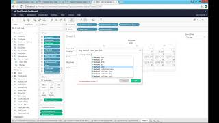
A non-IT user builds a new dashboard sheet in DataSelf by dragging in team site, actual sales, and job count, then creates a calculated field for average sales per job and adds it to an existing dashboard so all users can access it.
Chapters
This video is the second part of the job cost analytics using Data self analytics solution. And the goal of this video is to show how easy it is for a non IT person to create or modify these dashboards with no assistance from, you know, experts as well. I will show you how the data is structured in how that allows companies to heavily customize their job cost analysis based on the data self solution. So let's do it. What if I want to add to this whole dashboard, let's say a new report that will plug right into this white area here and I want to add to this corner team site information showing actual sales number of jobs rendered for each of these team sites in the average amount per job. So I need to create a new report showing those KPIs and then insert into the dashboard. Let's take a look how to do it. So if I'm a power user I will have this edit button. If I'm not a power user, if I'm a viewer user, I don't have an edit, I cannot change it. I can only work with the pre configured framework. But as a power user I'm going to click edit and now I go into the edit mode. That allows me to again create new dashboards, create new reports, change them, slice and dice them dramatically outside of the pre configured format. So my example I want to create a new report to plug to this white area here of this existing dashboard. So what I'll do is I'll click this button which allows me to create a new sheet. So I click it. Now I got a blank sheet. And here comes something very important is the data panel. The data panel is where you can see the the parameters or the data structures coming from your job cost data. In this example I have again a multi company system. There are four different company databases. There's actually two different ERP systems in professional service software being consolidated behind the scenes in the Data self data warehouse. It's a technical job. It takes some times, sometimes it takes some time to set it up. The beauty but the beauty is once it's plugged, once it's pulling your data, it becomes automatic. And any person with little training can actually do what I'm going to show you right now. As far as creating the new reports and dashboards. This top section shows dimensions and dimensions are entities that you want to analyze. Let's say maybe you want to see your customers. And here we have a few fields from customers. We can have a lot of fields, optional fields and whatnot. If you go, let's say to job detail. Then you see job cost, job type, job number, status, dates, agreements, equipment. If you work with equipment, I mean, there's a lot of fields coming from job cost. This list can be highly customized. More data structures added or removed depending on your needs. The bottom shows measures, numbers that you want to look at out of the box. We're looking at some date measures, looking at different ways of slicing or creating KPIs around date fields. We have profitability metrics, we have variances metrics and actuals. Build contract resources, utilization, A lot of different metrics available out of the box as a starting point. Again, this can be highly customized to fulfill specific needs of different customers. But the beauty is once we have this data connector pulling data from your job cost. And we can blend it with GL and AP and AR and PO and whatever else you need. But once we have this plugged to your system, building reports and dashboards becomes mostly a drag and drop kind of, you know, journey. So what I want to do in my example is I go to the service team and I want to find the team site. I'm going to drag and drop into my rows. So these are my team sites. What I want to see is actual sales, which is right here. So I drag and drop actual sale into my report. Right there. I get the numbers Right now this report is being filtered by the start date. So if I show the filter is right here, the same filter applying to my whole dashboard. So I want to keep. Because this report will be part of my dashboard. But let me put dates here. I want to see actually the date. Sure enough, it's just showing the date here. I can drill down, go to quarter, I can go to months. Very interactive, very straightforward. But I also want to see job count. So how many jobs were delivered for each, let's say month. I can just drag and drop into my report. So right now for each team site, I see the actual sales in the job count, But I also want to see the average sale, average actual sales per job. So I need a average metric right now out of the box. I don't have this average metric. Do I need to call it? No. If you know how to do this, you come and you say, I want to create a new calculated field. And there's a little wizard here. I'm going to call this average job, average actual sale per job. And what you do is you sum your actual sale. So let's sum the actual sale and divide by the job count. That's it. So the average actual sales per job is pretty much taking the actual sales and dividing by the number of jobs and I click. Ok, so now I just created this new metric and what I do now is I drag and drop into my report and right there I have the average actual sales per job. Now maybe I want to format this in a, in a better look, you know, putting some dollar signs and make it, you know, something that is easier to read. So I can come here and I want to say job count. I want to format this number. I want to make a currency. I want to use actually a thousand separator with only 1 decimals and voila. Actually I did that for the job count. That was my mistake. I didn't want to do for the job count, I actually want to do for the average. Sorry about that. So format my average sales for currency, just one decimal using thousand separator. So right now the average is showing that format. That's it. In a few minutes I just found the right fields. I drag and dropped. I created a new metric that's going to be available for everyone that has access to this data source moving forward. And for my particular example, actually I'm going to drop the information. I don't need to see it, it's just for this year. And I want to now insert this new report into my dashboard. So I go back to my dashboard. This is the area where I want to add the new report. This is the sheet five I just created. What I do, I drag and drop it right here and then I just make it room so it will hopefully look nice and nicely organized. And actually I don't need to see the title name. So I'm going to remove the title. And perhaps I want to do some totals. Let's do some totals as well. I forgot to put some totals here. So I want to add row column grand totals. So that's the grand total for my report. And when I go back to my dashboard, I can see everything here. Let me just get a little bit more room. And that's it. Now I can click file save. I just saved the report and now I file, close and that's it in a few minutes. By being a power user, I was able to edit, create a new report, plug it to my dashboard. And now anyone that has access to this dashboard would be able to access and take advantage of the new functionality. And it's all connected. If I come here and I start changing all the filters and whatnot, it would also affect the new component. I hope you found this video informative. Thanks for watching.










