KPIs and Natural Language for Distribution Companies
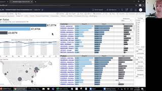
Presentation (recorded webinar) by DataSelf demonstrating their BI platform for distribution companies. Covers common reporting challenges (poor visibility, heavy reporting demand), how DataSelf ingests ERP/CRM and other data into a SQL Server data warehouse, and delivers ready dashboards via Tableau/Power BI/Excel. Demos include natural-language query for on-the-fly reports, sales dashboards (year-over-year, hot/heating-up, cold/frozen, Pareto, whale analysis), inventory planning projections (on-hand, inbound, open sales, projected on-hand, min/excess/short), and AR aging. Pricing/editions: Advanced Analytics (entry) vs Enterprise (customizable warehouse and many more templates). Deployment, trial, and compatibility details and an end Q&A are included.
Questions this video answers
$200.99 per month (Advanced Analytics).
14-day free trial available for webinar attendees (request via email).
Deployment of the entry-level/cloud version: about 15 minutes; on-premises/overall deployment mentioned as 15–30 minutes (varies with environment).
Enterprise edition: more than 5,000 reports and dashboard templates out of the box.
Advanced Analytics (entry): about a couple dozen reports and dashboards as a starting point.
Chapters
All right, so the search has been recorded. So let me show what our main, the main reporting challenges that we help distribution companies with. Data Self, the first one, you know, a lot of clients or processors, when they come to us, management complains that they're flying blind. There's a lot of things going on their business and they have little visibility into the data. There's a lot of fake news, a lot of opinions, but not a lot of insight. So that's a main challenge we hear from distribution companies. The other one is the people who support decision makers. It, the business analysts, the consultants. They usually complain that it's complex and time consuming to keep up with the requests from decision makers. New reports, new dashboards, new metrics. So it complains about the reporting tools that they use are complex and time consuming. A lot of distribution companies are heavily focused on sales analysis. To whom they're selling what products, Is it growing, is it declining? Which divisions or product segments are being more successful or less successful. So big visibility into sales trends is critical and also the reason that many people come to us asking if we can improve that part of the business. Inventory planning, looking at their inventory, checking trends, making projection of inventory, helping the purchasing of items is also critical. And we'll talk a little bit about it as we go through the session. And finally, for many companies in distribution, look at their financials, their P and L balance sheet and kind of financials also can be critical. And we also can help with that. So how Data Self works behind the scenes. Primarily, we are a enterprise BI platform made simple. It's still very robust, it still can scale significantly, it can have all the bells and whistles, but we make it significantly simpler and more affordable to get the ball rolling and give you better insights. Typically, we bring the data from the data sources. Your ERP system, if you have an inventory system that is separate, CRM, Google Analytics, any kind of data we bring into a SQL Server data warehouse can be on premises or in the cloud. So we bring the data together, we prep the data, we optimize the data for reporting, and then we use tools like Tableau, Power, BI and Excel to deliver on day one, easy, insightful reports and dashboards across different modules like for distribution, sales, inventory, product purchasing, financials, all of those things. We have a lot of reports and dashboards available out of the box. And that's how the solution works behind the scenes with Data Self. Pretty much what our clients say, that decision makers can easily access their KPIs, you know, their key performance indicators, anytime, anywhere, inaccurately especially with the whole Covid madness where a lot of people working remotely because dataset can be in the cloud, as long as people have access to the Internet anytime, anywhere, in pretty much any computer device, they can access the reports and dashboards and they can change, slice and dice and create new ones from scratch. It's very empowering for decision makers. For it, it's a simple setup. Deployment of the entry level version takes 15 to 30 minutes. Super easy to deploy, is easy to maintain and overall data celt can automate a lot of the repetitive time consuming IT tasks associated to report refresh, maintenance, distribution so it becomes more productive and and is more helpful for supporting the decision making process. Let's show some of the popular reports and dashboards from Dataself that has been designed for distribution companies and how they have been helping other distribution companies to be more effective. So right now I'm going to switch to the cloud data self analytics portal and primarily what I'm going to show is a little bit of natural language functionality. I'm going to show a few sales reports and dashboards that are very popular and I'm also going to show some inventory planning component in receivables. So today we'll cover those topics. What about natural language? What is this about? You know, the natural language query. Natural language query is similar to searching the Internet like with Google or Bing where a decision maker enters a question about their business, you know, and the data must be in dataself, let's say in your erp, in your CRM, anything, any data that we bring to data self becomes the repository for natural language query. And then decision makers, they just have to ask a question and the tool will answer the question if the tool has the components to answer the question. Let me show an example. Right now I'm connected to the sales data of my ERP system sample database. And as a salesperson or maybe VP of sales, I'm going to type sales by salesperson in 2019. So I just typed this question. Just like searching the Internet, the tool gives me hits. I have to see if one of them answered my question. In this example I want to see the sum of sales by salesperson where the Invoice date is 2019. Yep, that's what I want to see. I click it and then the magic happens. In a way the tool will build an instant accurate report or that you know, or chart entering that question right here I see my salespeople, I see sales in this case in a descending order for the invoice date in 2019, that's it. Maybe you want to break down by month. Sure, by month. Type the question, the tool, give me the hits, which one do you want? You find the right hit, you click it in the tool again, change the report to answer that specific question. So in this case in 2019, by month by salesperson gave me a line chart with sales. In many instances people want to see maybe a different representation, maybe a different chart, or maybe just a grid like an Excel grid. And you just pick and choose here, let's say text table and now the tool will give me that information. Now in a grid format, it's very easy for decision makers to find answer to their questions using natural language. And if they want to export to Excel, let's say I can just select data points. Let's say I want to see all my January, I select all the general data points in a tailgate tool to show me the data and I just focus on those data points. So right now in January I want to see full data mean all the records, all the transactions in my sales details. And now I can download to an Excel maybe I want to do this something else in Excel. And that was it. In a few clicks I was able to come up with a question, find the answer, export Excel and keep with my analysis. And that's the beauty of natural language. And just like searching the Internet, it will not answer all the questions. If the question is properly articulated and the tool finds the data and knows how to put it together in a few seconds you get the answer. Many times people's questions are more complicated and then they need to either use the report editor in data self or call someone that knows the report editor to modify if that report is not available yet. So natural language empowering, but it's not perfect. What I'm going to show you next is some of the out of the box sales dashboards that have proven to be popular and very helpful for distribution companies. The first one is just a simple yet empowering way to look at year over year trends. It can be sales, it can be gross profit, quantity, sold, any metric. And in this example what is showing is looking at the total. This year I'm looking at sales, the total last year in the variance and I can easily change what this year is. Right now in my sample database this year is 2019 and I'm looking all the periods the whole year and I can see the dark blue is this year. So this is a sales by period. The light blue is sales last period last year. And quite often when companies Are doing sales analysis, historical analysis. They want to see portions, let's say year to date, maybe only a single month, maybe a quarter. And it's very easy to come over here and just select the period you want to do the year over year analysis. Let's say I want to see year to date analysis through period nine. So from period one through nine I press apply. Now the whole dashboard changes to only show my sales this in last year through period nine. And I'm still growing quite a bit since last year. I can see sales by ship to the bubbles is sales this year. Black bubbles is growing, red is declining. So let's say Texas I'm growing 52% while in New Jersey I'm declining sales since, you know, last year. To date this I'm looking at my customers since last year, this year in the variance in product, last year, the invariance. And this is highly interactive, pretty much in data self. You can land with a dashboard like this and easily change things without being an expert. Let's say right now this is showing my customers with the top sales with declining, you know, with the top sales at the top of this list and going down, I see smaller sales this year. And what if I want to see my top customers last year, how they're doing this year, right? So what I want to do is actually sort these customers by last year sales. And I simply click or hover over last year and tell this icon to sort. When I click, it sorts in a descending order. So these are the customers in, in descending order in sales last year, these are sales this year. And I see the two of them, they have pretty big declining sales, huh? How about that? What if I wanted to focus only on these two customers with major declining sales? To learn more what's going on, I can quickly just select those two bars with the biggest decline in sales. And by selecting them, the whole dashboard changes to only show the total for these two customers, the trend analysis, the ship to analysis and what products are driving the decline. And here maybe I want to sort the variance of the products to see which products are driving the biggest decline. And these are the products driving the biggest decline for these two customers. Maybe I even want to go and see sales details. I can select for a particular period. For instance, say show me the sales details. What is sales details? Now I have at the bottom the details. I see document number, I see document date, customer information, salespeople, products, quantity. So every single detail associated with this customer now is available, available. And if I want to export to Excel or Do more slice and dicing is very straightforward. So again in data self, the ability to look at the high level information, find threats and opportunities, narrow down to those outliers and drill down and slice and dice and export is something that is usually very empowering. And most business people with little training, they'll become more self sufficient in doing those analysis by themselves. So this is one example of a dashboard available out of the box to help sales analysis. We also have other kind of. KPIs are very popular for distribution companies. Usually distribution companies. They are looking at what we call the hot customers or hot products, hot territories. Anything of those we call the hot performers. In out of the box. We have two ways to define hot. One is we call on fire. On fire mean the biggest by sales, gross profit, quantity sold, whatever the measure that you want to analyze. And also we call the heating up, which is which ones are growing the most in a given period. And the way you define the period is pretty much by changing this criteria. So right now my period one, the first six months of 2019, the period two is the second half of 2019. So my customers on fire in example are the top customer by sales in the second half of 2019, while the ones heating up are the top 10 by sales growth, comparing the second half of the year versus the first part of the year. In all of these things you're highly interactive. For instance, if you are a distributor of petroleum products, usually you don't care about sales, you care about quantity sold or gross profit. What you do, you just come to the measure here and you tell hey, I'm going to do by gross profit. And once you change the metric, the dashboard now shows the hot customers buy gross profit or maybe by quantity sold. So you just change the measure and you see that different perspective. Or maybe you don't care about customers, you really care about product. Instead I can come and say show me the main dimension to be product instead. So now instead of being the hot customers and it just didn't work well in production, it would actually show my hot customers. And again, let's say if you look at my top customer by sales and I want to see what I've been selling to this customer on those superiors, I just click here and the tool will open this drill down at the bottom. Show me the drill down by product for this specific customer. So again, have a high level perspective. Click on something and we'll give you more details. So this is the hot performer dashboard where we have the on fire and heating up in this example Customers, we also have the cold getting cold kind of perspective. These are pretty much about the cooling off. In this example, customers cooling off, meaning they are declining significantly. In this case, the top 10 customers by sales decline this half of the year versus the last half of the year. So which customer declined the most? And maybe the question is why are they declining? What products are driving the decline? And knowing who they are is the first step towards hopefully fixing those issues. The other way to look at the cold customers is the frozen approach. The frozen approach is which customers in this example were buying the last period, but they're not buying at all this period, so they're no longer doing business with you. Again, sometimes it's okay, sometimes it's not okay. And knowing who they are is the first step towards hopefully fixing that kind of trend. So the hot and cold are two pocket dashboards, very popular with distribution companies. Let me go now to the Pareto perspective, which is also for many business is very enlightening. The Pareto perspective is a way to look at your, let's say customers or products and where you select a first measure, let's say my sales. So this is my sales by, in this case, customer. The second measure is gross profit, which is this measure here, gross profit by customer. And this is how it accumulates the gross profit. Now the point is sometimes customers with large sales can actually have low profitability or even negative profitability. And sometimes if you're not looking this perspective, you put a lot of effort into the wrong customers or you should work smartly to make those customers that are not so profitable to be more profitable. We have some clients recently, they are again in the oil industry where sales not as critical as well as what is usually critical is the quantity shipped like the pounds and gallons that they shipped in the profitability. And let me change the measure from sales year to put quantity sold. Like this is an example. It's not from their database, but this report here is sorting. My customers buys gross profit in a descending order. And I see in here I can tell the quantity shipped by customer. And a lot of the customers with low shipment, they actually have a lot of profitability. While some customers that I also have a lot of shipments, they're actually negative profitability. And the question would be actually it's not negative profitability. The customers in blue, they represent 80% of my gross profit in total. And the ones in red are very little profitability. So the goal is why these customers are adding so little to your gross profit. Can you do something to try to move Them up to the, to the top, you know, 80% of your customers. So the Pareto analysis is this very simple yet critical analysis to see profitability versus gross profit and see how, how you can move, you know, people to different buckets. The next also very popular perspective is the whale analysis. The whale analysis, take the parent analysis to a slightly different angle. For a lot of businesses, a lot of the overhead they have around their operations can be measured by number of invoices. So let's say the more invoices you have, the lower your overhead by invoice. And sometimes if you don't look from this perspective, your overhead for each new sales, you might be again focusing too much in customers. That might be driving a lot of shipments. And actually your overhead, most of people are working around those customers, while customers with lower number of invoices in lower overhead is not getting enough attention. This dashboard here is showing on the top section, sales as the bars. And these dots are the number of documents issued for every customer. The middle section has the bars, which is the gross profit, the pure gross profit by customer. While these arrows pointing up or down means the net gross profit considering the overhead, the document overhead. So the idea is you take all of your operation costs, right, and divide by the number of invoices. That will give you what is called the document overhead. How much cost your company for every sale that you have, what is the average? You plug this number here. Now what happens is like in this example, you have a bunch of customers where you have good profitability with them. You know, the pause is positive, the gross profit is positive. But because you ship so many, you know, so many invoices, when you look at the overhead per invoice, the net profitability for those customers is actually negative. They are reducing your profitability, not increasing your profitability. From that perspective, in the very bottom chart is the actual whale chart. Why it's called whale, because it looks the shape of a whale. And in this example, all these black arrows up, they mean these customers are adding to your net gross profit. Looking from an overhead standpoint, and all the ones with red pointing to the bottom means they are decreasing this net profit in this company, particularly the total gross profit goes to $9 million. And when you start having these other people that are decreasing bottom line of this company, my simple database, their net gross profit is about a million dollar. So the question is, could you move some of these customers more to the left? Could you try to consolidate these orders, these invoices? Sometimes you can, sometimes you cannot. I was working With a client recently that when I showed this dashboard and they put the mouse over some of these customers, Some of these customers they were or they are big boxes where the company is shipping all over the country, a lot of volume. So maybe for those customers you're not going to do anything because that's the business model. At the same time, when I was talking with this customer about this perspective, I told them, you can actually come up with a different overhead, document overhead for your E Commerce sales versus your non E Commerce sales. Because usually commerce there is a different arrangement, it's a different cost. Right? That if you're very efficient, it takes little effort for your company to sell through the E Commerce. So you can apply a document overhead for E Commerce clients differently than the other non E Commerce clients. Anyhow, the Whale kind of report is amazing to give some insights that sometimes can help companies significantly improve their operations and become more profitable. The next kind of dashboard that we also have, many companies is around inventory planning. And inventory planning can have so many different directions or slice and dice in how people look at their inventory planning. A lot of companies use inventory planning or do their inventory planning in like Excel. It's very popular for people who do a lot of work around Excel to look at forecasts, to make projections, when they should buy and whatnot. With our framework, we usually can automate a lot of that mechanical part to be something that is automatically done by the data cell framework. And this is just an example to give you the idea behind the scenes. So in this sheet here I have the products that I'm selling and then I have for a given period. In this case, I'm looking at three months out future for the next three months. I see by week the on hand today by product. So this is the on hand today by each one of these products. What I have today, this would be my current week. And then what's coming inbound could be purchase order, could be work order, could be a combination of them. But this would be the items coming inbound from purchasing and manufacturing, let's say, and those quantities spread out by week. And then we have the quantities on open sales order currently in my ERP system. So I can see also open sales orders by week. And then I have sales projection. Sales projection is where we have different algorithm to look or to customize how you want to do your own sales projection. Is it based on past sales, maybe trailing weeks or months, maybe the same period last year, plus an adjustment and whatnot. So there are different ways we can do sales projection. And then we just add them together. So what is the on hand projected this week? Well, you take on hand today, you add inbound, you reduce outbound and you get the projection on hand and do the same calculation moving forward. And we can give you the perspective of your own on hand by item. Then we look what is the minimum on hand on your ERP system? If you have the kind of requirement and we plug the number and then we have the excess short meaning if the projection is above minimum, you have excess inventory. If the projection is below your minimum on hand, then you have a short quantity on hand. So pretty much this is a way to automatically calculate all of these metrics and give you a snapshot of your inventory planning projection so you can better do your, you know, your purchase of items. This component here right now is only available with data self enterprise. We have two versions. We have inexpensive data self advanced analytics and we also have the enterprise where the inventory planning can be customized and can be very effective. This component is similar to like Inventory Advisor. It's a product that is out there that does this in a great efficient very well as well. So we do not replace directly many of the Inventory Advisor projection algorithms. But for those companies who have simpler forecasting needs, our solution sometimes is a replacement for that kind of functionality. So anyhow, so this is how overall the inventory planning in projection works. The last thing I want to show is for many businesses looking at the ar, aging is not so critical. But for those who have a lot of aging, this dashboard is very insightful. You get the total AR aging by time bucket, by where the money is coming from, by due date, by customer documents and all the details. And again, highly interactive. If you want to see only your past due invoices, you just select those three colors or the three bars on the left. And now it focuses and it shows where the money is coming from, how is distributed by the due date, which customers are actually having the biggest decline, the biggest pass to. By the way, this one represents most of the very old invoices. If I click on it, the dashboard changes again to show me specifically what's going with this customer. So highly interactive. Alrighty. So there was a quick overview of the out of the box reports and dashboards. Today I'm not going to be showing the report editor, but overall people who want to learn how to create and maintain reports and dashboard like this, we have an ongoing class every month it's about eight hours of online classes where people who go to those training classes, they can become fairly self sufficient in creating their own reports and dashboards like the ones that I show you today, which are by the way available out of the box. So that was my demo. Let me move on here. Some of the good news is the Data Self Advanced analytics, the inexpensive product, the price starts at $200.99 per month. It's a month to month contract. So you go, you give it a shot. If you're not happy, you only spend 12 months, you cut the subscription and you don't invest a lot. Typically clients who try Data Self they realize oh my God, why we haven't start with Data Self earlier. So usually people try it, they'll love it and they will invest usually even more. Now because you are in this webinar, today we're offering a 14 day free trial. So if you'd like to get this solution for you, send me an email and I'm going to give my email at the end of this presentation. Send me an email and I can give you the instruction in how to unlock the 14 day free trial. So making available make it easy for you to take advantage of Data Self and run with it. Before I open the Q and A, let me very quickly show you on dataself.com where you can get more information about dataself and even kick off the deployment process. Let's say if you are Akumatica, Sage or client that use any of these systems, let me go for sales here. Just for the sake of example, I'm going to click Sage and select let's say sage 100. When you go to the Advanced analytics page of your product, you're going to have videos and explanation about a bunch of things here. And you also have the pricing of Advanced analytics starting at 299 per month you can see how users work. If you need more than 10 users, how much going to increase the cost per month. If you need additional templates, you can see the price right here. And then if you want to deploy right away, you can click Deploy Advanced Analytics. Now if you have cloud systems like Acumatica, the deployment takes about 15 minutes and you can do it all by yourself. If you have on premises systems like Sage, then we need to be in touch with your IT people. But the deployment takes usually about half an hour. So once we get connection pretty much the same day or next, you'll see your data in Dataself. So it's very straightforward. The other thing you might also use for your assessment, if you go to Data Self and the menu you have the industries section and if you select distribution, you're going to go to this page here where we have some descriptions and feel free to explore. At the bottom we have this section that talks about sample reports and dashboards and if you click on the sample reports and dashboards, you come to this page. It has a lot of screenshots. The first few screenshots is about the Advanced analytics by Dataself which is the inexpensive product and there's a bunch of reports and dashboard you can look at here. And if you scroll down further you go to the enterprise analytics software and then you have a bunch more dashboards available for your assessment. By the way, the enterprise version has more than 5,000 reports and dashboard templates available out of the box, while the Advanced analytics about a couple of dozen. Both very empowering, very insightful, but the enterprise just has a lot more credit out of the box. Alrighty. I hope you found that informative. I'm going to open now a Q and A session, so if you have question or comments, please use the Zoom Chat box or the QA box and I will address your questions. So let me see if there's any question over here. Let me open my. Okay, there it is. Sorry. All right, so there's a couple of questions here. Question from Martin, do you support Sage with a providex database? Martin, thanks for your question. I think you're talking about Sage 100 and yes, absolutely. Both the data self Advanced analytics and Enterprise can work with your Sage on providex or SQL Server. Doesn't matter. So work both ways. Thanks for your question. Question from Carl, what is the difference between Light in enterprise? Carl, thanks for your question. So actually we rebranded Light, now it's called Advanced Analytics. There are two main differences between the Advanced analytics versus Enterprise. The first difference is the enterprise version comes with a full fledged available data warehouse for customization. So clients that have more data in more complex data preparation needs usually need to get the data in the data warehouse to be massaged, to be changed, to be linking. You know, it's like multi company, multi currency things of that nature. So the enterprise allows data manipulation the data warehouse while Advanced analytics the data warehouse we call it's a transparent data warehouse. It's like a pass through that does part of the magic in bi, but you cannot connect to it directly. So that's one of the differences. The second is the out of the box Advanced analytics has about a couple dozen reports and dashboards as a starting point. You can absolutely create your own reports and dashboards and you can create lot of them, no problem. But the starting point is a couple dozen. While enterprise the starting point is thousands of reports and dashboards over 5,000. So there's a lot more things ready to go on day one. That's the main difference. And we have another question here. Question from Natalie I have a client using salesforce.com that is transitioning from Sage to Netsuite. Is it going to how much is going to cost to bring historical Sage data to salespeople candidates self help? Natalie, awesome question. We definitely can help but I'll do a We'll take this question offline because when we talk about blending data together and you're moving from one ERP to another, there's so much we can help and we need to know the details. Sometimes it's quick and easy and we can get things up and running in no time. Quite often when people talk about moving from one near p to another, blending with, let's say CRM like Salesforce, usually the needs can be a lot more elaborate. So we'll get a one on one conversation with you. Looks like that was it. Let me see if I have any other question here. Nope. Alrighty. Well, I really appreciate for your time for joining today. You can see here my name, my email and my phone number. Let me actually, by the way, get this out of the way because it's hiding the phone number. There you go. So now you can see the phone number as well. This session is being recorded and we're going to make it available. So by tomorrow you should be receiving an email with the recording. If you have any questions or comments, please feel free to contact us. Thank you for joining us. Have a great day. Stay safe. Well, insane. Insane probably is the biggest challenge lately. Thank you very much.










