Orange Belt Part 1-01
This is an instructional training video (DataSelf Orange Belt Part 1) introducing Tableau web report design. It explains DataSelf architecture and ETL flow (ERP/CRM → SQL Server data warehouse → transformed single Tableau file), shows how to sign into the DataSelf Tableau training site (student01/student01), tours the Tableau workbook UI (data source, data pane: dimensions vs measures, worksheet area, columns/rows, marks, filters) and demonstrates creating a basic view of sales by customer.
Chapters
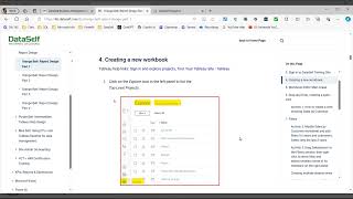
Hello, welcome to Dataself's Orange Introduction to Tableau Web Reporting. The documentation for this training information is found on Data Self's site. Going to the Knowledge Base menu on the Knowledge Base Going to Data Self Training Expand the Data Self training list and you will find the Orange Belt. You can either expand on that and look at the four parts of the Orange Belt. I will go ahead and click on the heading. The Orange Belt training is an introduction to Tableau web report design. It will it's broken into four parts of about two and a half hours each for a total of 10 hours of training. In this training video series, we will break up each part into ten 15 minute videos to make it easier for your learning experience. Starting off with part one this morning or today we will look at the Data Self architecture. How does this system work to get the data to your tableau? Examples of how Data Self has pre built some of the data for your use. We will sign into the dataself Tableau training site, discuss how to create a new workbook and do the tour of the areas of the workbook screen. We will finish off with creating a basic view of sales by customer. So step one how does Data Self work? You have your ERP system or CRM system, any database source system that has all of your information in it. The Data Self ETL application on a scheduled basis pulls a copy or extracts a copy of that information into a Microsoft SQL Server data warehouse in the cloud. This is so Data Self and Tableau works off of a copy of your source system, not loading the source system whenever you do a query. The second step is on a scheduled basis Data Self will pull the data, the raw data from your SQL data warehouse, transform it using SQL queries into a single file that is stored in the tableau server in the cloud. And that way when you run Tableau to create views, you're only pulling from one single data file, not a query of multiple data files. Below is another view of the pros and cons of this step 2 here are some examples of how with the work Data Self has done to create your pre built sales invoice data set. If your source system is Acumatica dataself pulled from all of these different Acumatica tables, combined them into one table in Tableau to give you your sales invoice data. As you can see from the different systems, there's a lot of querying there that you don't have to know how to do. You don't have to know how to do the joins the Filters the calculations. Data Self has done all of that for you. Next step is signing into the Data Self tableau site. When we log into the Dataself training site, we will use the user ID of student01 with a capital S on Student. The password will be the same. Student 01 with a capital S on the student. Right click on the bi1.dataself.com to open in a new tab. That will open up the Tableau site where we are doing our training site Login as Student 01. Click on Sign In. This will open up the Password screen. Click on the Password screen and it will also be student 01. This will take you to the Explore menu in Tableau. These are a series of project folders in Tableau where information and data is stored. For the Orange Belt class we will be using the the Orange project folder for our training. Alright, so let's go ahead and take a look at the documentation we have signed in. Now, how do we create a new workbook? That is the next step. We are in the Orange folder. That's where we'll be. So let's go ahead and click on the Orange folder once. That way anything we create will automatically be listed in that project folder. Now when we save our views or Tableau views, we will save them by putting our name as the file name and put a minus 01 or 02 after it. To identify which one of those is ours, click on the new icon. Create a new workbook. This opens up the workbook and forces you to connect to data. The usual question is how do I connect to multiple data sources at once? You don't. You start off your new view connecting to only one data source. Later on you will see the cylinder with the plus sign icon to allow you to add additional data sources if needed. So we'll go ahead and connect to the sales invoice data source. This brings us to the tableau screen checking our documentation. All right, we will now do the tour of the screen, the data sources, the data pane, the worksheet area, the columns and rows, filters and marks. Looking at our workbook in the upper left is the data source we are using. This is the prepared data source that Data Self has put together from all the individual tables in your source system and created common field names. These are not the field names as you would see them in the ERP system. They're common field names. So if you switch from one system to another system, Data Cell still uses all the same field names in your reporting Works just the same Data source The second section is the data pane. This section on the left hand side, the data is broken up into two different types of data that the top half is going to be dimension fields. Dimension fields are going to be alphanumeric which are used for filtering, grouping, subtotaling, et cetera, things like names, descriptions, et cetera. The bottom half is going to be measure fields. Measure fields are data fields that are numeric that you subtotal or aggregate in some way to do an average or that sort of thing. They're all database fields, it's just how Tableau organizes them. The third area is the worksheet area view where you see the results of your work as you drag fields into columns and rows and marks. They will display on this screen and you see the results of your report. Columns and rows are very similar to Excel pivot table columns and row sections. When you're creating a pivot table, what fields do you want to show as columns? What fields do you want to show as rows? The mark section in Tableau is equivalent to the values section on an Excel pivot table. Those are where you put your number fields that you're going to use. The difference being here you can display that value as text. You can display it as a color, which we'll look at in future sessions. The filters is where you can put in fields that you want to filter on. We'll find that there are multiple ways to create filters in a later session. Pages is a section we will not deal with in this session, so I'll save that for another time. Okay, looking at the documentation, we have done the basic tour of the different sections of the screen in the documentation. It goes into a little bit more detail with a link to the Tableau help site where it shows you information on the view screen. The screen views. Okay, step six, we're going to create a basic view showing sales by customer. Going back to our workbook, I first of all will add my customer field. Notice there is a customer id, a customer name and a customer field. This is a convention of data self. Whenever we're dealing with customer, vendor, item, those kinds of data sets, the customer ID and customer name will be separate fields. We the customer field is the combination of name and id. In the case of vendor, you'd have vendor id, vendor name and then vendor, which would be both the ID and the name. I will use the customer field. I hold down my mouse button, drag it up to the rows and there we have all of the customers. We have not used any filters of any sort. The next step is we want to add the sales. I scroll down to the left to the measure fields Numeric fields sales now there are multiple ways I could add this field to the to the screen. I could drag it up to the ABC area which will display numeric values as text, hence the abc. I can right click on the field and say add to sheet or I can double click on it and it will auto auto add it to the sheet. I prefer to simply double click on the field and let Tableau automatically add that to the sheet. Something to note, there is no column header on the Sales. Tableau's default log design is if you have only one measure field that you're measuring, it does not put in a column header. When you add 2 numeric fields to measure, it will put in the column headings for the two different fields. Congratulations. You have created your very first view.










