Power BI vs Tableau - Ad Hoc Analysis exercises
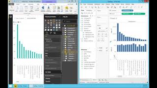
DataSelf AI builds the same sales report in Power BI and Tableau to show how each handles ad hoc analysis. Tableau lets you sort, add dual axes, and change colors without leaving your workflow. Power BI requires more menu clicks for the same tasks.
Chapters
All right, let's talk about ad hoc analysis and authoring. This will be fun. I'll show both products side by side and how to build queries from scratch. As you'll see, both products are really easy to use. If you've been using other reporting tools, you'll be impressed by both of them. They're both great. But what I want to show you hopefully in this presentation is this comparison why Tableau is considered the best in class. They have an edge when it comes to ease of use comparing to all other competitors. And if ease of use is very important for your team, hopefully this presentation will give you some insight into that side of the differences. So let's switch gear here. And right now I have both products side by side using exactly the same sample database. And I'll build initially a report showing. I want to build a report showing sales and gross profit percentage by salesperson and I want to build this report. As a business person, I want to see things visually. I don't want to build complex things. I want to see if it's something that is intuitive. No formulas, no special things, as easy as possible. And I want to get the answer. Now, in my experience, one of the interesting things that I've seen is that business people, sorry, business analysts, these people will learn the tool. If you give them a tool for them to do their job, they, they will read the manuals, they'll go for training, they will learn how to do things. But business people, we call the power users that are not it, they're not necessarily it savvy. They're managing people and selling, building things and whatnot. If you don't give them something that is really intuitive and really easy to use, quite often they'll not do many things because it's too hard for them. And I'll show that Tableau really keeps in mind business users and tries to make this tool as intuitive as possible so people can find the answer to the questions without calling for an expert, a business analyst and overall business people, usually they work inside of the report per se, and they try to find the answer to the next question by just poking around inside of their what they're looking at and not necessarily going around the tool and trying to find buttons and whatnot. So let's take a look at that. So let's build this report Sales and gross profit percentage by salesperson. Let's start with Power bi. I'm going to choose sales and I'm going to choose salesperson and let's make this bigger. So right now Power bi did a great job. It's showing sales by salesperson and it's automatically sorting in a descending order. So pretty good start. Let's do the same thing with tableau. So sales in salesperson. And there it is. Tableau also did a great job in this case is showing sales by salesperson, sorting on an alphabetical order. So different choices, but overall both answer the first part of my question. Sales by salesperson. Now, sorting is a very popular feature. So let's see how sort works on both products in tableau. Typically when you need to find an answer to a question, the idea is go to where you expect to find the answer and see if you can click right click and right there do something that will answer this new question. So if I'm in tableau and I see I want to sort this salespeople ascending or descending by sales, what I would do is I go to sales and right there I have an icon that actually is the sorting icon I click right now is ascending in descending order. If I click again, it goes in ascending order. If I click again, it goes in alphabetical and then I can do all over again. So very straightforward, very intuitive. I went to where I was expecting to see the information and I get the sort done. What about the power bi? It's not here, it's not here, it's not here. So it's not exactly what I would expect. So it's not as intuitive. However, it's not too bad. You just have to learn that is in this top right corner under more options. And if you click, you'll find here sort by sales and you click again. And now it's no longer sorting by sales. It's just on alphabetical order. So not too bad. Now what if you want to sort in an ascending order? Well, I go back here and actually it's not so obvious, but you know, you click to sort again by sales, then you have to click again and know that this line actually has two comments. This one is to toggle between sorted and non sorted and the left is between ascending and descending. Once you learn that, you remember next time. But the first time you might not figure it out and you might give up if you're not a patient person like many business people are. So not too bad, but also not as intuitive as in tableau. So let's go back here and put both of them on the same footing, the same comparison. Okay, so first comparison in the sorting we just reviewed. Now let's add gross profit percentage to this report. So I'm Going to click gross profit percentage and power bi added this additional bar which is the black, but because both are on the same axis, you know, 25 million in sales, the gross profit percentage bar is pretty much useless in this visualization. It's not telling me any story. Let's see what tableau does. We double click gross profit and right there, tableau is giving me a clean answer to my question. I can see clearly how much percentage each one of the salespeople have in their sales and answer the question. So right there, right at tableau was faster to give the insight. Now let's see if we can tweak power bi around to get a similar perspective. So there are different ways that I could change the visualization to give a better perspective of the gross profit. I'm going to take one approach, which is I would have to know that these two different visualizations here, they are called the line and stack column or line and cluster column. So I can choose any of them. In this case, I'm going to choose the line and stack column. So by using this approach and also I have to know that I have to move one of the measures to the line values. I'm going to drag the gross profit. So I have to learn these things. Very likely people would figure it out by themselves. It's not so intuitive. But anyhow, once you learn these things, then now the visualization is clear. I have green sales with the left axis and in black the gross profit with the right axis. And now this report is telling me sales and gross profit by salesperson. How can I do something similar in tableau? I want to change in tableau to do similar to power bi. Now so I go back to tableau and what I should do is, hey, I want to put in dual axis. I want to put my gross profit on the right side. So what should I try to do? I go to gross profit and I'm going to right click and right there I find the answer to this question. I just click dual axis and tableau right there puts sales on the left, gross profit on the right. Let me take this and give more room to my query. Now, easy on the flow. I found the answer. No have to go around. It's right there. Now when I look at them side by side, I actually like the sales to be bars. How can I change tableau to have bars for my sales? Right now my sales is in orange just in the flow. See if you can change by going where you expect to change. So let's say I go to one of These sales bubbles, I right click on it, and I would find the mark type, and I can change to bar. And right there, I was able, inside of the report, change it to a different format that would be visually better for my representation. So very intuitive. Now, when they look at these two reports side by side, if I look in Power bi, it looks clean, it looks beautiful. I'm happy. If I go to Tableau, I get intrigued. Why does it have this white area? I'm smelling that something is not right here or something is good. I'm intrigued by why there's this whole white area. If I scroll to the right, I would find that actually a salesperson has a very negative gross profit. Why I don't see the same perspective on Power bi? Because power bi did not align the zeros. And therefore, even if I go to the right here by accident, let's say, and I would see this, oh, there's a person with almost zero profitability. Actually, no, it's not zero. It's very negative. So the choice of not aligning the zeros can cause some misconception. While tableau, it kind of gives you a hint that there's something going on here, that you should check it out to see if there's a problem. So tableau was more intriguing, was more instigating me to begging me to ask the question of what's going on. So just an interesting perspective that Tableau does this quite often. Okay, now that I have answer the question of sales and gross profit by salesperson, and let's say I delivered this report to my managers, and what happens is they're going to ask for something else. They ask me. They want to see visually and clearly which salespeople are above the percentage gross profit percentage of 50% or above and which ones are below. Just, you know, show me in two colors above 50% or below, whatever representation you can do. Well, again, I want to do this change without using complex functionality and formulas. I just want to see visually and probably using colors, a good way to highlight which ones are above or below the 50% gross profit. So if I go to Tableau, let's say I go to the gross profit circles, I right click, and I would not find the answer on this menu. Okay, what else? Well, if I want to change color, there's the color here. If I put the mouse over, it tells me, hey, you can drag dimensions or measures here to affect colors. So if I want to see gross profit, you know, influencing the color, I can take gross profit percentage. I drag and drop into my Color. And right there, let me put this on the bottom here. Right there. What I'm having is for every circle. Now, the color is proportional to my gross profit, but I actually want to have only two colors above 50%. Let's say blue below orange. How can I change that? With the mouse, go to where the color is. Let's right click. And hey, I can edit the color right in the flow. That's the answer. So I click edit color in here. Of course you have to kind of experiment a little bit, but I only want to see two colors, so only blue and orange. And I'm going to click advanced. And for the center it's going to be 0.5. And once you fill this out and you click OK, that's it. In a few clicks I was able to change this report and now I'm highlighting which salespeople are not meeting the 50% gross profit criteria and which ones are very easy, very straight in the flow without having to go all around. I got the answer to this question. What if I want to do the same thing with Power Bi? Well, in this example it's not so easy because this particular chart I cannot change the colors based on gross profit percentage. I can change the colors, but it will be all the same color. All bars with a different color or the whole line a different color. So if I want to highlight salespeople that have profitability above and below 50%, I'm going to take one approach. It's not the only one, but as you'll see, it will take a lot of steps. So I'm going to go back to my report. I'm going to maximize all across this report here. And now I'm going to create a new report by gross profit by salesperson. I'm going to put it side by side or you know, top, bottom with the other report. This report is being sorted by gross profit, descending order. I need to sort it by sales and descending order. So both will be aligned by salesperson. The way that I can do that is by adding sales to my tooltips. And now that I have sales, oopsie. Now that I have sales on my tooltips, I can sort this report also by sales in a descending order. And now both reports, they have salespeople aligned, pretty much aligned. Now I also want to change the color of these bars to be above and below 50% with different colors. The way I can do that is going to format going to the data colors. I want to use a. I actually have to add first gross profit percentage to the color saturation. So now it is already using gross profit for color saturation. And now I go to the format, I go to data colors. I choose diverging. And then what I want to do is the minimum is going to be orange or brown. The maximum is going to be blue. It's okay. The center is going to be 0.5 the minimum. It's a little trick that you can do to get this working. And 0501, that's pretty much what you're getting is creating a similar representation like I did in Tableau. It took a lot more clicks. It took a lot more techniques to get the same job done. There are different ways to answer this question, but I just showed you one of them and now side by side they have the same answer. But as you can tell in Tableau it was in the flow. I didn't have to go outside of this area here and I was able to get the answer. Tableau has actually. Tableau actually works with psychologists and graphic designers. Every time that they want to add a new feature to the product, they work with those folks to try to understand how business people would find the answer or would find the actions to change the report to answer different questions in an intuitive manner. If it's something popular people need, frequently they they try to make as easy as possible for people to find those features. If it's something more sophisticated, that is for business analysts, then those functionality are a few more clicks away because business people will not bother looking for them. So business analysts will learn them. Business people don't care much. While in Power bi, there's usually the way that the functionality is spread out is is a lot more things with more menus and ribbons. You know, it's not as intuitive as in Tableau. So I hope you found this ad hoc comparison informative and fun. I found it fun.










