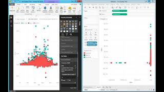
Tableau shows all data points in scatter plots while Power BI caps at 10,000 and samples. In a live demo with invoice data, Tableau's full visibility revealed unprofitable large deals caused by an ERP flaw; Power BI's sampling could have hidden the problem entirely.
Questions this video answers
10,000 data points.
47 items excluded (speaker says "selected 45, you know, in this case, my example, 47 items excluded").
82 points (speaker: "Another 82 points in this selection").
Chapters
Scatter plot data point limits first of all, scatter plot representations are not very popular. However, if you need them, this video is insightful. Tableau has no limit in the number of data points you can show in how many you can select to do your analysis. While Power BI can only show up to 10,000 data points, if you go above 10,000 data points, power BI will sample those points and only show 10,000 tops. And also you can only select one at a time if you're trying to make a specific analysis. I'm going to show a real case scenario where regards of how well you do the sampling of the actual data points. By doing sampling you might be hiding trends or not helping decision makers easily find trends that if you see all data and you can select them at will, it's great. If you don't have that functionality, you risk missing important trends behind your data. So I'm going to show a real case scenario right here. I have both products side by side showing a scatter plot where the X axis is gross profit percentage, the Y is sales, every dot is represented by one invoice and the color is from three different businesses. This organization, they have three different businesses and the owner was analyzing profit. Want to analyze profitability by invoice among the different businesses and see if there's any trend between or among those businesses. If you were to be using Power bi, I'm going to show the scenario that he could have taken because how Power BI works, he could come over here and see, wow, I have a lot of invoices that are pretty much $0 in amount and highly unprofitable. These are definitely outliers. One asks that he doesn't care so he would like to remove them out of the visualization. And in Power BI you can only remove one at a time. So you have to go one at a time and keep on removing. And because there are actually several dozens data points between this and the next ones here, most likely at one point he will give up in trying to remove one at a time and he would apply a filter to narrow down his analysis. And that's where the the risk could come up in his business, which is the green color circles. It's a pretty tight chip the way he manages it. And he pretty much doesn't have invoices that are non profitable unless it was very exception cases that he doesn't care. So with that assumption he could have come to the filter section and say hey, I only want to see invoices that are greater than or equal to zero. Zero in profitability. I don't care about this negative one up cases. So he would apply this filter, straightforward, pretty easy. And he would get all invoices profitability above zero percent. And then he could start, you know, trying to see if there's any trend among the different organizations what actually happened in Tableau with Data Self, he came, it's pretty much the same report from the outside. He would see the same trend here, but instead he could just select all the points that are negative, which actually he did. He selected the point on the left and then he say get them out of the way. He selected 45, you know, in this case, my example, 47 items excluded. And then he would go to a subset of his analysis. He still has a few that are, you know, zero. So let me exclude those as well. Another 82 points in this selection. So I'm going to exclude them now. When he excluded this zero invoices, zero dollar invoices, he noticed that for a bunch of invoices that were unprofitable, you know, here's the zero, they actually had pretty large sales, you know, right here, $100,000 and whatnot. They were like, no, what's going on here? So he selected again visually these invoices and said show only. So there's a bunch of invoices that are high in sales and high unprofitable. And what he found out was actually that the other two businesses, they had a flaw in the way the ERP was set up. And that flaw would allow salespeople to push invoices highly unprofitable in special deals. And that was not what was supposed to be done. So once he found out this trend, he was able to work with other organizations to close those flaws and tell salespeople that they could not do that. And they fixed the problem and right there they paid for the investment in Data Self and Tableau. The point is with Power bi, because the sampling of points and the way that people navigate is not so straightforward. It's risky for people to miss to see trends like this. The person doing analysis in Power bi, they really know how to use filters and whatnot. To avoid getting into this kind of risking not seeing some special trends. I highly recommend if you're doing scattered plot analysis, to really know how to use Power bi, be on top of it, or use other tools like Tableau that can give you the whole picture and help you navigate as needed.