Sage 100 Natural Language by DataSelf
Johnny Girardi demos DataSelf analytics for Sage 100, which extracts your data into a warehouse and builds reports through natural language queries or interactive dashboards. The starter plan costs $299/month for 10 users and takes 15 to 30 minutes to install.
Questions this video answers
Johnny Girardi, founder and CEO of DataSelf.
$299 per month.
14 days.
Five (5) slots.
15 to 30 minutes.
Chapters
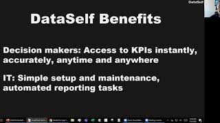
Okay. Good morning everyone. My name is Johnny Girardi. I'm data Sales founder and CEO. And first of all, I hope that you're staying safe, well and sane. I hope your biggest challenge is like mine. Staying sane has been challenging because boy, there's some other people with so much harder problems. So hopefully you are like me. Staying sane is the biggest challenge. Let's make good use of your time Friday. You know, I appreciate you being here. Today we'll talk about analytics in artificial intelligence for Sage 100 and how we make report easier, faster and better for you as a Decision Maker using Sage 100 or for you and or for you as the person supporting the users. You know, if you're IT person, a business analyst, a report designer, report writer for your company, or as a consultant. When I show a little bit of both, how we benefit users as the techies involved in reporting dashboards. Let's first talk about the challenges. You know why people look for data self to improve their Sage running the report. The first perspective from the end users, the decision makers and the common novelty we hear from people is about we are flying blind. You know, there's a lot of things going on in our business. We have questions about what's going on, new questions about what's going on every day and quite often the IT people, the people supporting our reporting have enough time to keep up with our questions. So many questions go unanswered. We have to make decisions without the answers and many questions we have to wait until it can come up with the reports and dashboards. So flying blind is a common complaint from decision makers without using data self. When we listen to the people supporting the decision makers with the reporting tools available in Sage like Crystal, Sage Reporting services business, whatever they are using for reporting, what we hear is it's complex and time consuming. A lot of effort into building reports, prepping the data, refreshing the reports, distributing the reports to people, being sure the data is correct. It's complex and time consuming. So those are at the end of the day, the main challenges we hear from IT people. What I'm going to show you next is the technology we use to address both sides of the problem. End users in it. I'll keep it high level even though this page has a lot of things. So on the far left we have your Data silos like Sage 100. You might have more data silos like payroll, I don't know, point of sales, Google Analytics, CRM, anything. So what data self does is we pull the data from your sage 100 for instance and we bring the data to a data warehouse. Why we need to bring to a data warehouse? Well, a data warehouse is the proper technology to tackle reporting pains. In the data warehouse. We, the it, the consultants, the business analysts, we can actually teach computers or program computers to do mechanical things. Refreshing data, coming up with business rules. KPIs automating the distribution reports. A lot of the manual processes that people do in Excel, Crystal, whatever can be completely automated using data warehousing. I will not show that today, but I'm going to tell you this is the part of the solution that typically removes a lot of manual labor in reporting. It's IT related but it's amazingly empowering. On the next layer is what we call the analytics data analytics layer of data Self. In here we use Tableau, Power, BI and Excel as options. I'm going to be showing Tableau today. But these tools are much easier yet more powerful to use when you put them in a solution like dataself. So it's easier to build reports, it's easier to build dashboards, it's easier to distribute reports, it refreshes automatically. You can use web browsers, mobile devices, computers, PCs, Macs, pretty much anything that you access your data. This framework will provide you with the tools to get users information at their fingertips in providing the IT people with easy to use and to maintain platform to get the job done. So that's how we do our magic. I'm going to keep it very high level but this is how we address those issues at the end of the day. From a benefit standpoint, decision makers will have easy access to their key performance indicators. Instantly, accurately, anytime and anywhere they can open on a mobile device or report a dashboard. They can slice and dice it. They can ask questions about their data and get answers by themselves as long as they have an Internet connection. Again, instantly, accurately, anytime, anywhere. At the end of the day, no more flying blind. You'll be able to make more informed decisions anytime, anywhere. If you are in the IT side of the business. What we do is we provide a what we provide this enterprise bi but we make it simple to set it up and to maintain. We can teach you to deploy maintain data self and be easier than what you're doing today using whatever you're using. You know Crystal, Excel reporting services will be easier to set up and easier to maintain. And you'll be able to automate a lot of those reporting tasks that today you're spending so many hours the computer will do it for you. You will use your brain for the Things computer can do, computers cannot do. So your job will be a lot more productive because you're automating repetitive mechanical tasks to the back end of Data Self. That's the main benefits at the end of the day for the IT side of the business. Let's see how it works. So what I'm going to show you today, I'm going to show some of the ways that users take advantage of Data Self. So I'll show you that first, how users non IT people actually can be more independent with Data Self. And then I'm going to show on the second part of the presentation how we empower the IT people to be more productive. Still, if you're IT or if you are business, I encourage you to stay throughout the whole presentation because both of them, most people will be able to get it understand how users will be more independent. If I'm an IT person and if I'm a business person, I'm going to understand what IT people go through to support me and both will make sense. I'll keep it at that level. So I'm going to get out of the PowerPoint and now I am in Data Self using a web browser. What I'm going to be showing you here in the web browser can be embedded inside of Sage 100. Yes, you can embed data self inside of Sage 100 if you have fairly recent Sage 100 versions. If you have an old one, maybe not, but it's possible to embed it. Right now I'm going to be showing Data Self outside in a web browser. This can be done on mobile device, can be done on even iOS or Android mobile apps. Now, the first part of my presentation for business users is the most empowering component we provide, which is called natural language query that uses artificial intelligence to understand what people are asking and building reports on the fly to answer those questions. It's like searching the Internet. You go to Google or Bing, you ask a question, you press enter, you see a bunch of hits that match with your question. You select one and you get an answer. It's the same concept, but the data source is your Sage or any database you brought to dataself. And when you write a question, it will show you the hits. When you select a hit, the answer will be a report created from scratch. Yes, it's like magic, but it's not. It's technology to help you. Let's see an example. I'm going to go over here. Right now I am connected to the sales information from Sage 100. Let's say I'm the VP of Sales. I'm going to type I want to see sales by salesperson by month in 2019. Suppose this reporter doesn't exist and I want to see this information. What I do is sales by salesperson by month in 2019. I answer the question like I would do in on the Internet and the tool give me the hits. Do you want to see the sum of sales? Yes. By salesperson? Yes. By invoice date, month? Yes. Where sales equal 2019? No, I don't want to see that. I want to see sum of sales by salesperson by month where the invoice date is 2019. So I choose the first hit and magic happens. The tool will create an instant accurate report with the answer to that hit that you selected. In this example, in 2019 invoice day 2019 by month by salesperson I see a line chart. It's that easy. You ask a question the tool builder report. Now maybe you are not fan of charts or you want to see a different chart. I can pick this list and choose a different chart. And maybe I want to see a text table. I love to see numbers by the penny. So I chose a tax table and now the tool converted the chart into a tax table by salesperson by month 2019 I see sales. Well, maybe I want to export to Excel. Sure, you can select a data point. Let's say I want to select all these data points in January so they are selected and I tell the tool show me the data. I click view data. It will take that data cells data set and put on a browser where I can export Excel. Maybe I want to see the underlying data. I want to see all the details behind January sales by salesperson. Sure. I want to see the full data. It's called full data where I want to see everything. Invoice number, invoice date, quantity, sold, you name it and I click download. Now I get all the data into Excel and I want to do anything that will do in Excel is all data in there with all the details. This example in my sample database I have 8,000 sales transactions associated to this sales in January 2019. It's that easy. Ask the question, get the answer. I'm going to show two more examples of natural language queries. So the first question was answered. I'm going to clear it even though I could save it. But this case I'm just going to clear it. And when I ask the second question, I want to see now top 10 products by sales in April 2019. So again I articulated a Question to the computer. The computer, the natural language query tries to understand what I'm asking. If it finds the data set or in the data model heats to what I ask, it gives me options. I want to see in this case top 10 products by sum of sales where the Invoice date is April 2019. I click on the right hit and magic happens by product shows sales in a descending order where the top 10 are in blue in a called and the other not top 10 are in gray meaning outside of the top 10. So it gave me everyone in highlighted the top 10. Maybe I want to see again. I want to see a text table. I select text table and when I change text table it only give me the top 10. That easy. Last example of natural language. I want to see gross profit by state by year as a map, right? So now I want to see geography analysis and what I want to see is the first hit. I'm going to click it and magic happens again. So by year I see a map where the gross profit has this color theme, so darker is more gross profit. If I put the mouse over, let's say Texas, $17 million last year, Louisiana almost 14 million. I can tell it's a little lighter. Louisiana this year 2018 is because from 11 million it went down to 9 million. So that's why it's lighter. Anyhow, natural language query is designed for busy business people who do not have time to learn report design and tools and crystal and whatnot. But they have questions and they need answers on the fly without calling someone else. That's what natural language is for now, like searching on the Internet. It has a lot of answers, but it does not have all the answers. So many times business people will still call the consultants, the business analysts, the IT people with elaborate questions that the natural language query cannot answer yet at least. And that's what I'm going to show you next. I'm going to show you a more elaborate answer to a question that cannot be built with natural language. But I'm still going to be showing the user interface for non IT people. So I'm not yet in the IT side of my demo. I'm going to go to this other tab and this is a pre configured dashboard available out of the box for Sage 100. And this particular dashboard cannot be built with natural language, but is an example of how empowering a dashboard can be once a user business users understand how it works. And that's what I'm going to be focusing right now. So if I'm a salesperson A VP of sales, whatever it is. And I'm looking at my sales year over year sales right now, this year total this year total last year and I'm declining 14%. I can see by period where the dark line is this year and the light blue is last year. So I'm comparing a full last year versus my current year is I am currently my sample database in 10-8-2019. So yeah, I'm declining a lot because I'm comparing a full year versus a partial year this year. What if I want to compare year to date through the period nine, which is a full period, right. I can come over here and uncheck the periods that I don't want to see. I only click whatever that I want. So I'm going to Click all from 1 to 9. I could only look at a quarter or whatever I wanted. But once I filter and I press apply now the whole dashboard changes to show only year to date sales from period one through nine. And now I'm growing about 11%. I can see the trend analysis by period. I can see my ship to information, bigger bubbles, bigger sales, black bubbles. I'm growing since last year. In the example, red is declining like Louisiana. I have a 16% decline on a yearly basis while Texas is 38% growth. I can see my customers sales last year, this year in the variance and it started descending in this year in the same information by product. Now if I'm VP of sales and I look at the dashboard and I say wow, look at this, my top customer by sales this year. Big decline, huh? What about that? Who else is declining from last year? Let's say I want to sort by the prior year. So now this is the top customer by sales last year, you know, in a descending order. Huh. Out of the three top customers, two of them are declining a lot. Why? What's going on? Well, I could come over here and select those two customers. So I'm just selecting with my mouse and selecting both of them. By selecting the two of them, the whole dashboard changed. And these totals are for those two customers. You know, it's five plus. It's like you know, six point something million dollars this year. Last year was nine. So I lost all of this money from them. This is the trend analysis for both two customers together. This is the ship 2. These are the products. What products? I'm losing a lot of sales. I can sort the bottom section lets me sort by variance declining. And look at that. These five products here are driving a huge loss in sales. Actually I'm losing more than $2 million for those two customers out of these five products. Oh my God, what's going on? And then maybe at this point I want to drill down and see details. Let's say I want to see invoice number, invoice date and I want to see who sold to these customers. Anything I can click sales details. And now the tool will show at the bottom every single line item and invoice detail associated to those two customers with those five products in those two years. This kind of interactivity business users can quickly learn by spending 5 minutes showing them how they can change things and have better visibility is empowering and they cannot break it. It's amazing. Empowering. So that's how Data Self supports decision makers. By providing either natural language like I showed before, natural language query or by giving users dashboards like this one where you, if you're more. If you go through training with dataself, you can customize these dashboards heavily. Maybe you don't care about customers or products whatnot, you can customize, you save them and then business users become more independent by doing ad hoc analysis. All right, so this is the first section of my demo where I covered end user experience with Data Self. My next portion is more driven towards the it, the business analyst, the people that usually use Crystal, Excel and other tools to support decision making process. Now what I'm going to show you is the piece I'm going to show you now are actually easy to use that even business people can do quite a bit. So if you're a business person, do not leave because you might enjoy the next step. I'm going to go now to the next step and this is our report and Dashboard Designer is a single tool that is easy to build new reports, dashboards and you can do it quickly and it does not require a computer a rocket science degree. I'm going to build from scratch right now a dashboard with three different data sets or data widgets as we call. The first one is showing a tabular, you know, a table showing sales by customer by product this year or in a given year. The second widget I want to see sales and gross profit trends over time. In the third widget I want to see sales by state and see how I'm doing nationwide. So let's see how it works. So the first report, oh by the way, so this is the sale we call the sales connector. This is currently connected to the Sage system pulling what's called the AR invoice header. The your invoice detail, the customer table Today we're going to not show how the mapping of Sage works, but it's fairly similar to crystal. It's actually easier than the crystal, the base are easier than crystal. So it has all those things already mapped in Sage. We have a tool extracting data out of Sage and pushing into the cloud to what I'm showing you right now. So all the backend is already sitting my data self. Now let me build a new report. I want to see sales by customer by product this year. So I want to see customer. I drag customer to my rows. So these are my customers. I want to see sales. I drag sales to my report. So this is the completely sales by customer in the whole company history. Well, I want to break it down by period. So when I take the fiscal period and put it in my columns, just drag and drop. And right now in my simple database I have two years. 2018, 2019. So sales by salesperson by year. By the way, if I click expand a year, the tool will expand and show sales by month. So drilling down from top to bottom, it's a click away. Let me go back to the year level. Okay. And I only want to see sales this year, which in my sample database is 2019. So I'm going to say take my fiscal year and show as a filter. So I select a filter which is here. And I only want to see 2019. And there it is. My report is focused on 2019 only. And now I want to also see sales by customer by product. So I find product description. For instance, I put in my report and that's it. Sales by customer by product in 2019. It's that easy. Maybe I want to see sales by product by customer. Sure. I put customer after my product and there it is by product by Customer. Sales in 2019. Very easy. Anyhow, let me go back. Customer by product. Okay, first report completed. Easy. Okay, second report. I'm going to create a new tab like in Excel. I'm going to create a new tab. In the second report I want to see sales and gross profit trends over time using a chart. So I'm going to double click sales. It gives me a chart showing total sales in the whole company history. I'm going to double click month. The tool puts by year sales. Actually, I don't want to see by year, I want to see by month. So I'm going to choose month instead. And now the tool plotted sales by month in the whole company history. And I also want to see gross profit percentage. So I'm going to add the gross Profit percentage. So right there. Wow, my graphic is 100%. My simple database sucks, apparently. So anyhow, let's suppose that gross profit percentage would be something not 100% all the time, but you know, right there is the number. And now I want to put this on a dual axis. A dual axis is a way to show sales in this example as bars and gross profit percentage as a line. Anyhow, in a few clicks I got it done. The last report. I'm going to create a new sheet, a new tab I want to see by location, in this case, state. I want to see sales. So I select state and sales and I tell the tool. Show me this on a map. And a map it is with bubbles. Bigger bubbles, bigger sales. And there it is. I just built three new sheets or reports and now I want to combine them in a dashboard so I can see everything together. So right now I have sheet one, which is my tableau report I'm going to drag and drop. That's the sheet one. The sheet two is my trend and nails I'm going to put in the bottom. So my trend and nails in the bottom in my map, which is the sheet three I'm going to put on the top right corner. And pretty much been taking, I don't know, five, ten minutes. I built three new reports. I put them together in a dashboard. I could click the save button and save a report. You know, new, I don't know, sales dashboard. We'll call Sales Dashboard. If I click save now, is a new dashboard saved? Then I could call the VP of Sales and tell, hey, the dashboard is ready, go check it out. Let's say the VP of sales was opening this dashboard on a tablet and the VP of Sales. Oh, let me see how we're doing on the east coast. It selects the east coast and what happens? The whole dashboard changes to show only the data related to whatever he selects or she selects on that section of the country using his fingers or her fingers on a tablet. Amazingly empowering and extremely easy to use. Try to do this in crystal or in Excel or in whatever tool that you have. It will be usually much more time consuming. It takes a while. It's not easy, it's not interactive data self will enable the IT people to build these things quickly. Even some users might even learn some of these things and become more independent. It's really empowering. The final thing is as a user and I forgot to show this as a user. Suppose I get this dashboard and I decide that I want to receive this dashboard in my. Inbox automatically every day or every week or every month. Do I need to call it to set up a new alert schedule? Why not? Nope. As a user or as the admin person, you have access to the subscribe button. You can click subscribe. You can decide who's going to receive this report. Maybe myself only, or maybe I want to add other users. I'm not sure if I have more users in my system here. My sample database. Apparently not. Well, I'm going to add Clark for instance and anyone else. And then I can tell send me all the tabs or only this tab so you can tell send the whole workbook like an Excel workbook or only this tab. Send me as a PDF and what is going to be the subject of my email and then how often I want to receive this report. Maybe only Mondays at 6am Pacific and please subscribe and that's it. Subscription is something that so many companies spend hours and hours and hours every week or every month where people get information into Excel. They copy, they paste, they calculate, they validate and they email to people. Mechanical job. Not for humans. Those jobs are for computers. So the subscription inside of the Data Self is a way to eliminate those repetitive non creative hours from people. Let the computer do these mechanical things that are always the same. And it's that easy for a user to self subscribe or for an IT or admin person to subscribe Reports for other users Alrighty. I hope you have enjoyed the product presentation. I'm going to switch back to the PowerPoint to cover some other thoughts. Some good news. The pricing of what I showed today, everything that I showed today starts at $299 per month. It's a month to month commitment. You can go month to month commitment. Unless you want to go yearly. There's some discount. And because you took the time to attend our webinar, we are offering you a 14 day free trial. So if you think Data Self might work for you and you place the order through the end of this month you will have a 14 day free trial of Data Self analytics. There is limit availability. Actually the number is five. If more than five people ask for this, you might not get the free trial. You might have to pay get started. So if you are interested I would encourage you to do what I'm going to show you next. How can you get the free trial going in? How long does it take to get it going? So let's talk about that. How you can deploy data self analytics in how long does it take go to dataself.com. i mean if you want to contact us to discuss, please absolutely feel free. Get your reseller. Let's get of a conversation. If you just want to just run with it because it's a no brainer, go to dataself.com click sage under the main banner. You're going to come to this page, click your Sage product, in this case sage 100 and then on this page we have Advanced analytics and Enterprise Analytics Today I did not talk about Enterprise analytics which is even more powerful then Advanced Analytics. If you have big databases, very complex, you might want to go to Enterprise Analytics. But most clients can start easily, inexpensively with Advanced Analytics. So let's click this button. This page, the Advanced analytics has a lot of videos, information, whatnot. So feel free to explore it, including pricing in case you go through the free trial and you have to pay, you know, 15 days after, then this is how the pricing works. So feel free to explore it. The 299 includes 10 users. If you need more users, this is the price for additional user. And currently we only incorporate AR aging and AR sales. But we are building core financial templates, distribution and manufacturing. So the solution is improving and we're going to be launching those additional templates and putting some additional costs for those things. Everything that I show you today is covered by the core system that I showed you for $209 per month anyhow. So if you think you are ready to go, you click Deploy analytics now. It takes five minutes to fill out this form. It's fairly straightforward. It will request a credit card information. But if you're part of this webinar and you contact us, we're going to give you a code that you'll enter in the registration process and that will make this actually contact us. And then I'll let you know how exactly that works. But once you fill it out for 14 days, we will not charge your credit card. And if you do not cancel your order by the 14th day on the 15th, the $299 per month will start to be charged to your credit card until you decide to cancel. And then we'll stop charging it. So it takes about five minutes to fill out the form. Then we will contact you, we'll contact your it, we might be even looping in your reseller. Most likely we like to involve the reseller, but we will need to deploy a data self component to extract your Sage data to the cloud. It takes from 15 to 30 minutes to install. It's super simple. If you have a server running Sage, probably it can be installed over there. It has little requirements, it's a no brainer. So it takes 15 to 30 minutes for us to work with your IT to install this data self extractor and then the data will be pushed to the cloud and your data will come alive in a few hours. And that's it. Once that is deployed every day the data will refresh and your users will be able to do reporting out of data self easier, faster and more empowering. And that's how you can get started. Let me go back Back to the PowerPoint. Alrighty. I'm going to open a questions and answer section. So if you have questions, please go to the Zoom panel and there is a chat in a QA box. If you type your questions, I'll be answering them right now. So let's see if we have any questions coming. And actually I need to find in my computer where is the chat chat. There it is. All right. Yep, we got some questions. So the first question is from Martin. Do you support Sage with a ProvideX database? So Martin. Yes, you're talking about Sage 100. Yes, we provide support for Sage on ProvideX SQL. Any Sage that you have, we can support you. What I did today, it works with that as well. Beth, how long does it take to deploy data self for a two company Sage 100 system? So Beth, what I showed you today, which is called the advanced analytics, designed to work with one Sage 100 company at a time. So if you have two Sage 100 databases, you have two data self advanced analytics sites. So Absolutely. And it takes the same time. So pretty much 15 to 30 minutes per company. With the data self enterprise analytics that I did not talk today, you can actually combine both companies together. So that's some of the advantage of enterprise analytics is the ability to bring data together in the same data warehouse in the same dashboards that I was showing you before that. Thanks for your question. Next question from Mason. What is the price for 15 users? Okay, Mason, let me actually go to the website to answer this question because I want to be sure that you know how to find the answer by yourself. So if you go back to dataself.com, you click sage, choose sage 100. Choose advanced analytics. Scroll down to the middle, you know from the, from this page here, scroll down to the middle, you'll get to the pricing point and 10 users is no additional cost. If you have 15 users total, you got to go to the next bracket which is $89 per month. But then if you go 16 users, 17, 18, 1920 users you are within this extra fee. If you go to 21 users, then you go to the next level and up to 40 is the same pricing. Mazo has a follow up question. You mentioned Data Self uses Tableau, correct? What Tableau user types do you support and do I need to acquire Tableau license separately? Mason, I guess you are a little bit of a data geek yourself. Or maybe a big data geek yourself like myself. So yes, we use Tableau as the user interface, but we embedded Tableau in Dataself so you do not need to know there is Tableau. You don't even have to care about Tableau at all because it's all part of the Data Self package. You don't need to acquire Tableau separately. It's all part of the package. If you already own Tableau by any chance, then we can work with you and connect your Tableau to our framework or vice versa to make it easier easier for you to use Tableau. But the answer is don't worry. We don't worry. You know Tableau is part of the package. And what user types? Almost forgot that question. What user types of tableau we use? We provide both the viewer, the explorer and the creator. This is only viewers and explorers. If you're a creator is a separate user license. Most people don't need Creator at the beginning sometimes ever. So most people don't need the creator. But if you do need the creator, which is a desktop, side of the tool is $59 per month. Looks like there was the last question. Let me just be sure I'm not missing anything. Yep, looks like the last. All right, let me go back to the PowerPoint already. If you have questions, comments, you want to talk with us, you get my email, our website and our phone number. Thank you for joining us again. Stay safe, stay well, stay sane. And I hope that those are your challenges because again, lots more people having a lot bigger challenge than trying to stay sane. Thank you for joining us. Have a great weekend. And if you decide to go for the free trial, do it quickly because the first five we will close the pretrial. Thank you. Enjoy your weekend.










