Sage X3 - BI and Analytics with DataSelf and Tableau
Johnny Girardi, founder of DataSelf, shows how Tableau and DataSelf work with Sage X3 for business intelligence. He demonstrates the analytics platform and explains why it's faster and easier to use than Sage X3's built-in BI tools.
Chapters
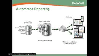
Good morning everyone. Thanks for joining us. My name is Johnny Girardi. I'm the founder and CEO of Data Self. Today we'll talk about Sage X3BI and analytics with Data Self in tableau. So why should we talk about dataself and Tableau? Well, Sage X3 usually comes with with a bundled or add on BI, which works really well for a lot of clients. So many clients find bundled BI perfect and it's good, it's awesome. It's actually a great solution, but for some companies they need something different. And what I want to talk about here is not to make a feature to feature comparison is more to show where we excel at, give some generic concepts about our solution and if our solution is a better fit, then we should talk further. So again, the Bundle BI solution from Sage is great, it's great offer, but sometimes ours is a better fit. Let me talk how we're going to be covering our content today. The first thing I like to always talk about is generic BI and analytics concepts. Then I jump into how and why we do the way that we do our approach. Then I'll spend some time showing the product, I'll talk about some pros and cons, and then we'll have a Q and A session. All right, let's get started. The way I like to talk about our solution is actually talking about the story of one of our clients, which actually is pretty typical. Most clients, when they come to us, the story revolves around usually the same overall issues, not the specifics, but the overalls are the same issues. So this client of ours, I mean, it was a prospect. A couple of years ago the CEO called me and he said, johnny, my organization is very data driven. We love to look at our data before we make decisions. We have many different systems, what we call data silos. We have an ERP system, we have a CRM system, we look at Google Analytics data for website visitors, we have a separate payroll system, we have social media, we have access databases and Excel spreadsheets. All of this data we need to use in our decision making process. In my team we have management, finance, sales, marketing. We're always looking at the data and we spend a ton of hours every month our it, our accounting and my team getting data crunching, discussing to get information and you know, sometimes, you know, we need to make a decision, we need a new report or new dashboard and we don't have it ready, you know, and then we have to either wait until we talk with the consultant, an IT person that can understand, you know, what we're asking. So they go about it, they build a report, they bring it back. Typically takes hours, sometimes days, even weeks. So either we have to wait until we get to the information or we have to wing it. Either way, waiting or winging, it's not what we want. We want to be more self sufficient. Can you help us? So that's what he's summarizing, his initial call, which again is very typical. Most clients, when they come to us, they have the same kind of story. Reporting is complicated, it's slow, it's not timely. We need more empowerment to decision makers. We need it faster, we need it anytime, anywhere. So I told him, well, so far so good. I think we can help you a lot. But before I tell you how we do it, let me tell you what the challenges that you're facing, what they are and how you can solve them. Regardless of the technology, regardless of the vendor, regardless of data self, maybe someone else is a better fit. So first of all, every time that the decision making team asks for a new report or a modified report, there's typically three phases to go through to get this new report. The first is called the data preparation. Data preparation means the person that is going to build this report. The person needs to know where to find the data, the database, the database structure, the tables, the fields, how to link them. This data preparation process is very technical, very complicated and usually only consultants or IT people can do it. So very complicated, time consuming. That's the data preparation. Once they find the data, the table, the fields, they link them, then they need to present the data the way that you want. So if it's a financial report, quarter to date, year to date, compared to last year, what not? Well, now we need to put in a, in a format, maybe spreadsheet, maybe some charts, build the actual report with the filters and calculations. Typically this phase is also fairly technical. You'll need the person that has a lot of skills using the reporting tool to build the report properly. And then finally, this person will have to send the report to the actual person who requested the report. Usually a business person who is not so technical. So it comes the data distribution stage. If it's only one person, simple, easy, no problem. Now if need, send the report to 20, 30, 50 people. And every person must receive their own information. If it's a salesperson, only their own sales, then the distribution may become a very time consuming, labor intensive and error prone process. Is that what you're going through today? I asked the CEO and he said yes. I didn't Know the terms. But yes, it's a lot of work, it's error prone. Yes, absolutely. So I told him, well, let me show you how you can solve a lot of these problems from a generic standpoint. How can you automate to hopefully have most, if not all of these processes done automatically? So the first thing is you have all of these data silos, you know, the erp, the CRM, Google Analytics. Every time you need a report from a different system, you know, is it a different person, is it a different process? Well, typically a data warehouse is one of the best ways to tackle the data preparation process. A data warehouse is a single data source. Sometimes you might have more than one, but overall it's a single database that you can bring all of your different data, it doesn't matter where it comes from. You bring all the data into this data warehouse and then you can start blending the data together, whatever that is, related payroll, with your services, with your ERP information, you can just blend the data warehouse, they're together, you can build business rules. And once you do it, the data preparation becomes something completely automated. Yes, it's technical to build and maintain the data warehouse, it's very technical. But once you do it and once you deploy it, it will automatically do all of these calculations, all of these aggregations and blending of data automatically. So quite often a way to automate the data preparation process is by having a data warehouse that will consolidate all of your data silos. Then you need to use an analytics platform that will take care of the data presentation and distribution phases. Now, there are three main requirements that we recommend when looking for a great analytics platform. The first requirement is be sure that we will deliver information in different formats. You know, nowadays some business people, they're always sitting on their desktop. Some people are mobile, they're going through the factory, whatever they visit clients, some people want to receive reports in a different way. So supporting desktop, web, the mobile devices, as well as receiving emails, report by emails, they are usually very critical for today's environment. So you can support all of your users with their different business and lifestyles. So different ways to deliver information is a big, big requirement. Second, and probably the most important, a lot of the decision makers, they're not necessarily it savvy. Computers are a tool they use, but if it's not something very easy to use, they won't be able to do much. So the reporting platform, the analytics platform should allow users, business users, to open the reports and anytime, anywhere should be able to allow them to slice and dice their reports. Drill down, download their data, and even build new reports from scratch. When there's a new question, they should be able to answer the question without calling for an IT person and waiting or without winging it. So giving something really easy to use is really critical. The easier to use the better. So that's the second requirement. The third is just speed today. Who likes to wait? No one. So if reports are taking too long to run, and too long can be maybe 15 seconds, minutes, hours, usually it's not good. So be sure that the analytics platform delivers information in several different formats. There is really easy to use and run reports really fast. Now, like you know, as I mentioned, the beginning the bundle option with Sage XV meets many of these criteria. So it is also a very good platform. Before I jump into the next part of the presentation, I want to bring up a little poll here. I want to hear your opinion. So if you don't mind answering what are your main reporting challenges? So please be sure to select all options that apply to your business and be sure to click the submit button. Don't forget to click the submit button. All right, in five seconds I'm going to close the poll. I'm closing the poll. Thank you very much. Let me share the results. So slow performance access anytime, anywhere is the most popular. Thank you for your feedback. All right, let's move on. Now let's talk about how we do it in why we do that we do our technology. I founded data self about 11 years ago. My core team has been working together for 16 years. And when we founded Data Self the main vision from the beginning has been let's find the best of the BRI technology available in the Fortune 2000 world. Let's make it easy, let's make it affordable to mid sized companies. A lot of the offers in the mid market, the mid market BI tools or inexpensive, they do many things really well. But typically they're not the best of the breed available out there. So what we do in a nutshell is we go to the Fortune 2000 world. We find tools that are really well supported, highly used, very refined, very fast. We make it work for you without breaking the bank. That's what we do best of breed, make it work together for you. If you look at our current solution I'm showing right now Gartner, Gartner is one of the most reputable companies doing technology assessment for Fortune 2000. And every February they tell how the Fortune 2000 BI vendors are doing on this magic quadrant for BI analytics platform. Make a long story short, tableau and Microsoft have been leaders, meaning the best according to Gartner, for several years in a row. They're not perfect, they're not a magic wand, but boy, it's a great BI platform. What about these guys? What about Data Self? Well, let me go back to the architecture that I was showing before in this whole flow. For data warehousing, Data Self uses SQL Server, which is one of the most rock solid and well supported data warehousing platforms out there. However, most the other vendors, they use SQL Server programming to build and maintain the data warehouse. And we find that that approach, while it works, is very labor intensive, is very complicated and is very expensive. You have to have very skilled people to maintain it. Instead, we have built our own ETL which stands for extraction, transformation and loading. And with our ETL we can deploy and maintain the data warehouse in a fairly code free environment, much easier, much faster. So that's one of the differences we have against other BI vendors out there. Then on the analytics platform we use Tableau. And Gartner has rewarded Tableau the gold standard for analytics platform for Fortune 2000 companies for the last four years in a row. So Tableau has proven to be the easiest to use analytics platform. Meeting those three requirements delivers information in many different formats. You know, desktop, web, mobile, by email. It's really easy to use. It's incredible how easy it is to use. And third, you run reports really, really fast. So really, really happy of being using Tableau as our analytics platform. So you know, we bring Fortune,000 technology, we make it simple, we make it better. We've been doing this for 16 years as a team. And over the years we have learned how our clients using our platform for better reporting. And every time we see a new report that a client created that would be generic for our client base, we add to our out of the box solution. If you look today, we have more than 5,000, 5,000 reports, dashes and KPIs out of the box that plug and play. They cover pretty much all different business areas such as sales, purchasing, inventory payables, receivables, financials and whatnot. So there's a lot of great reports as a starting point. Not only is it to use, but there's a lot of reports as a starting point. That's what we provide. Now some people ask us why Tableau? Why did we choose Tableau? We chose Tableau about five years ago and back then they were not a leader in the garner magic quadrant. They were growing, but they were not yet a leader. And we look at them. We found them to be again, deliver information, different formats, super easy to use. We were impressed and they run things really fast and pricing model kind of worked for the mid market. So we adopted them. We start to use an OEM with Tableau. Well, eventually we learned why they were so successful, why they were so easy to use. Most other BI vendors, they were founded by software engineers who thought, hey, I, I can do a faster BI tool, a flashier, kind of more cool and whatnot. And then they created some product. Tableau actually started at Stanford University. Professors, the founders, they were professors and they were studying how business people look at data and have insights from it. It's a process, it's a discovery process. So they used psychologists and graphic designers to study this process of how the mind of business people works. And then they came up with this study and at the end they realized, huh, we can make a software that will help decision makers to go through this journey. And then they hire the software engineers. So the whole beginning of the company started from the right perspective, from my standpoint is looking at the problem, finding how to solve it, and then, well, let's create a software to do it. So it's amazing. It's like fascinating the way that they started and how they being really attached to this idea of insights. We need to give insights in an easy manner. And let me show you in a few slides how they do it. Hmm. What should I do? We humans are very visual animals. If we weren't, maybe we weren't here as a species. But if you see the situation, you don't have to think. You just get the hell out of here. Right? So what Tableau tries to do is this. Not with snakes, of course, but with data. Let's talk about it. Rows and columns reporting. Absolutely. Tableau, data, self supports. Rows and column reporting. A lot of times people need to look at numbers by the penny and absolutely we do that. Now, if I ask you, how many nines are there on this table? If you're like most of us, you have to scan row by row to count and eventually you get the number. What the blood does is something like this, a subtle change to bold red. In a few seconds you can tell there's about 10. So you shrink the time that it takes to get to the inside so you have more time to decide and most importantly, to act on your decisions. How about this table? We have product type, product profit, sales, market. If I ask you which market has the biggest sale, which product is not so profitable? Again, if you're like Most of us, eventually you get to the answer. What the blue does quickly is something like this. Bigger bars, bigger sales, so you can tell central is kind of the bigger market by sales. And profitability is in red. So I can quickly tell which ones are not so profitable. Again, shrink the time to get to the inside so you have more time to decide and to act on. Now, it's not about being just beautiful, flashy, it's about being insightful. This is a business. You want to be sure that your decision makers are having accurate insights. What about it? Well, let's talk about 3D charts. Like a 3D pie chart. I find it very beautiful. I find 3D charts overall very beautiful. But are they insightful? Well, if I ask you which slice is bigger, red or blue, can you tell me for sure? When you put in 3D a chart, typically you may lose the perspective and you may not know exactly what you're looking at. So while beautiful, they are potentially deceiving. Pie charts should, overall chart should be in 2D. And when you can put labels if you have to. In this case, even if you don't have the label on this 2D pie chart, you could tell that the red slice is definitely bigger than the blue slice. What my point is, well, Tableau does not support 3D charts because they can be deceiving. This is a business. You need to be sure that people are getting the right insight. And 3D charts don't help with that. Now, what if you want some 3D charts for whatever reason you want? Well, just export Excel. It's super easy. In Excel, you can do whatever you want or any other tool. But Tableau, by nature, it wants to be sure it is insightful and accurate. So it does not support 3D charts is a good reason already. Before we jump into the product presentation, I'm going to open another poll. So please let me know what are your main reporting areas? Please click and click the submit button. Be sure to click the submit button. Five more seconds. Okay, I'm closing the poll, going to share the result. So financials, inventory and sales, and a little bit of the others. Thank you for sharing your thoughts. All right, let's move on product presentation. Finally. So this distribution company that I was talking about at the beginning, so eventually they acquired dataself. And what I'm going to show you now is what actually the CEO is doing and what he did himself when he acquired Data Self. So he goes to these board meetings every month to show how things are doing. And before Dataself, he was Going with a stack of paper to show the results of the company for last month and whatnot. And then one of the things he told me is, can you give me this information on my tablet so I can be on my tablet and be able to see the information? I mean, I hand out still the paper for people because some people still like paper, but I want to have my tablet and be able to answer questions on the fly. And I said, absolutely. So what I'm going to show today is how he built some of the reports himself. One of the reports he built is this month. Sales details, sales by customer, by product, invoice number, invoice date, things of that nature. Then they're doing marketing campaigns on the website and he wants to see website visitors from Google Analytics blended with the actual sales. Then he's shipping to all over the US and Canada, so needs to see shipments by state and how big the deals are. And finally some other reports. Let's go for the product. Right now I'm switching to the data Self analytics desktop client tool. Most of the things I'm going to be doing here can also be done using a web browser as well as mobile devices. We have native apps for Android as well as iOS both for phones as well as tablets. When a person wants to build a new report from scratch, they come to, let's say to the desktop here and then they choose which connector they want to work with here I have a few sample connectors, ar, GL and whatnot. But all of these connectors they pass to the data warehouse. We can have CRM information, we can have payroll information, we can have any data. They're all here. Then you just pick and choose what you want to work with. I'm going to choose the revenues connector. Then I'm going to be building my first three reports. Now to build reports, I need to learn how to pretty much drag and drop. My first report is sales, detailed sales this month, by customer, by product, invoice number and whatnot. So let's get it done. So I want to see my customers. I come here, I find the customer list, I drag customer to my report. So these are all my customers and I have about over 1,000 customers. I want to see sales. So I find sales in my measures and I just drag and drop very easy. So this is a total sales for all my customers. I want to see sales this month. So let's put some time into my report. I'm going to take the invoice date and just drag and drop into my columns. So right Now I see sales by year. Where I want to see month. I can expand from year by clicking the plus signal and I go to the quarter level. If I click the plus signal, I expand from quarter and I go to the month level. I can expand to weeks, days, hours if I'm capturing hours, fiscal periods, whatever the time bucket that you want to analyze, we have to set up that in the data warehouse. But once we have that set up on the user interface, a business person just needs to know how to expand the drag and drop and build. Any report for any time frame is really impressive and easy to use once the data warehouse has been prepared for different structure analysis. All right, well I have a lot of data here. I just want to see this month. Well then I want to filter this report. I'm going to take the invoice date and drag and drop into my filters shelf. When I drag and drop over there I have options. I can choose different time buckets or relative date which I'm going to choose right now. And then with relative date you can choose the time bucket. Let's say years or months. I want to see this month report. So this month and click. Ok, there it is. Now this report will always show this month, whatever the month is. And sometimes in the board meetings a board member would ask what happened last month, last year, last quarter, whatnot in the past, the co if they didn't have the report, they will have to find information. I'll get back to you now. On his iPad he clicks on the filter. Hey, last month, there it is. Maybe the last, I don't know, three months or two months. Whatever the number is, just pick and choose. You get the answer right there on the spot. Very easy. All right, let's go back to this month. Well, I want to see customer, product, invoice number, invoice date and whatnot. Well, it's all drag and drop. If I want to see product, I find the product, there it is. I drag and drop between customer and sales. So by customer, by product I have sales. What if I want to see invoice number, invoice date, anything. You just pick and choose. Invoice number is here. Drag and drop between customer, product. So there it is. Invoice date, same thing. I mean any field, you just drag and drop. Many of our clients users learn how to build reports by watching a presentation like this. If you know how to drag and drop, you can build a lot of reports by doing this. Drag and drop, create a filter, calculate, that's it. Very easy, very intuitive. It's really impressive. All right, so this was the first report. Second report was sales and website visitors. Well, now we have Google Analytics data and the ERP data. It must be blended well. The good news is my team worked with this company's IT and marketing team. We brought Google Analytics to the data warehouse and we blended in the data warehouse Data preparation. We did that. Once we did that, the data is refreshed every day automatically, completely hands free. And then the CEO himself built this report. I'm going to do right now. You want to see sales and website visitors together. So he took sales, he drag and dropped them to the rows. So total sales. He added invoice dates to the columns, so I'm seeing sales by year. And then he chose the month level instead. So him same sales through the whole company history. Now website visitors, the SEO doesn't need to know how to connect to the data and blah, blah, blah. No, it's all behind the scenes. The data warehouse to care. What the CEO needs to do is drag and drop. So take the website visitors, drag and drop my report. So these are website visitors. Let's make a bar so they are easy to tell and make it different than the rows. And then finally he put on a dual axis. Look at that. Awesome. Website visitors, orange bars, sales, blue lines. And now they can analyze this anytime, any day and they get the information ready. This report alone was consuming about two days of work before data self every month they have to, you know, it and marketing, copy and paste, export, Excel, massage the data and whatnot. Now this, you know, it's completely automated the data preparation. The CEO built the report himself. And now the report is available to anyone to access that have access to this report. The data is all automatic and refreshed. Really impressive. The last report I want to build is geography analysis. So you can put on a map any geography component, you know, addresses and whatnot. So in this case, he chose the customer address. It could be shipped to. It could be location, whatever it is. He chose customer state. And then he chose invoice sizes, how big the deals are and he wants to see sales. And then he told the tool, put this on a map and there it is. We see on a map, just center it, make it a little bigger and make the bubbles a little bigger. So in this case, bigger bubbles, bigger sales. And the bubbles are sliced by colors that represent the aggregation of small, medium, large invoices. A few clicks. The CEO built this. Now the CEO goes to the board meetings with an iPad, with a tablet, you know, an iPad in his case. And he wants to put these three reports together on a dashboard. So now he clicks on new dashboard and then he just need to drag and drop, Hey, I want to see the map. Drag and drop the map. I want to see the trend analysis. Drag and drop. Let's put at the bottom. And then the revenues report on the right corner. Just drag and drop. And you build the report in a few minutes from scratch. A report to before was taking a lot of time. The CEO built himself. And now when he go to the board meetings, sometimes a board member asks, hey, I'm going to Texas in California. How are we doing over there? In the past, well, the CEO had to make notes. I'll get back to you. Now with his iPad, he can just using his finger. Oh, California, sure. California and Texas. When he lets the finger go, the whole dashboard changes to reflect how we're doing in those two states. And then he can take this export to a PDF and email on spot to the person who has the question, what's the next question? So very impressive. You can have this dynamic analysis answer question on the fly. So again, shrink the time to get to the insight, more time to decide, more time to act on your decisions. All right, now what I just showed you is how easy it is to build reports and dashboards from scratch. And again, you do not need to be an IT person. We have several of our clients, business users, the CEOs, salespeople and whatnot that do this themselves. Of course, some business people, they don't want to do it because they are so busy they don't bother someone else close to them, will do it for them, will do the reports for them. But overall, whoever wants to learn they can. The tool is really impressively, is really easy and really fast. Now, most users will consume reports using a web portal. So they log to the portal using a web browser or a mobile device. And when they log to the portal, they will have only the reports that they have access to. So if I'm a salesperson, I would only see sales dashboards from the finance team. I only see finance if I'm the, I don't know, the big boss. I can see everything. So you can control what they can see. Now when they open the reports. Let's say I'm a salesperson and I open this report here showing my customers by top changes last year, top growth in the clients last year. This report is the same, let's say for all salespeople. But if I open this report and I'm the California rep I only see California information if I'm from Florida. Instead, I only see Florida if I'm the big boss, the VP of sales. I see the top customers across all territories. So the system can control what data is rendered based on your user credentials. Now you can have a lot of reports here. I have 1500 in this example. There's a lot of things. Anyhow, let me show some financials here. So let me search for financials and let me open this particular report here. This is just like a financial example, a financial dashboard example where I have some KPIs by location or office. And suppose I'm the CFO and I click on the Atlanta office and the person who built this report controls the user experience. Let's say maybe you only can see a report, you can't change anything or you can drill down in certain ways. So in this example, if I click on the Atlanta box, it gives me two drill down options, maybe only one. When I click, I drill down automatically. Maybe I have five, ten options. The person building the report defines the option of drill down and where you go to. So in this case, when I click this balance details, I go into a completely different report. In my example is still a financial report only for Atlanta, but it could be anything else. It could be a payroll report, it could be a Google Analytics report. The data is all in the data warehouse. Now when you jumping from one place to another, it's all there. You can create reports that you can jump from one way to another and you have completely freedom to do that. So in this case, I jump into this report and then I can slice and dice the report and change and whatnot. Now if I'm a regular user, I have all of these possibilities that are already preconfigured. I cannot break them, they're just there. So I cannot break them. Now if I'm a power user, I will have the edit button. As a power user, I can click the edit button and now I can change my reports. Let's say I want to take this report here and I want to add. I see GL segment 2 and 1. I want to add GL segment 3. I could be doing this on a web browser or mobile device. I come here, I find segment three and I just drag and drop. Maybe at the end of the list, there it is, segment three or maybe at the beginning of the list, any drag and drop. So segment three, two and one. The point is, this tool is very easy to use and will allow your decision makers to find their answers anytime, anywhere, without assistance from IT people Again empower decision makers to become self sufficient. Being easy to use is one of the most important requirements of analytics platform and boy tableau does a great job with that. I'm not going to save it. The last thing I can do also is hey, what if I want to receive this report in my inbox every day, every week, whatever the schedule is, I can say subscribe, I can choose the schedule. I have some sample let's say Friday and I click subscribe now every Friday 6pm I got an email in my inbox with this report refreshed with all the latest information and if I click on the email it will jump back into this portal and if I'm a power user I can start slice and dice and whatnot again. You need to give freedom of choices for your decision makers to get data to lice and dice it anytime, anywhere in the way that they want it. Alrighty, so that was the product presentation. I hope you found it informative and cool. Let me go back to the next part here and let's talk about some pros and cons of the technology we discuss in particularly our approach as well. Pros and Cons of Data Warehousing what are the cons? First of all, it requires skilled people to build and maintain it. So usually expensive people. And if you are going to be building yourself hiring programmers like most people do, be sure to retain these people because it's hard to find good programmers. And once you find them, if they leave and you have to hire someone else, the new team might start to write things all over again and it becomes a very expensive process. So a con is you require skilled people with data self because we remove a lot of the programming, we minimize significantly this problem, but still you need skilled people in data warehousing. Second is most data in the data warehouse is not real time. There's some pros and cons to that, but overall most data is not. You can do real time, yes you can, but usually most data is not real time. Finally, it requires additional investment. Depending how you do it. It might be a little, might be a lot, but overall it will take more money than just if you don't use a data warehouse or the pros, well you guarantee a single version of the truth. All data must pass through the data warehouse. The people maintaining the data warehouse will be sure that all your rules are all your metrics, all your KPIs are properly calculated. So when you're talking about some kind of growth and revenues, what not every report will show the same information. If you don't have a data warehouse, you may have different reports claiming to have the same metric but built out of different rules and you're comparing apples to pineapples. The data warehouse guarantees or facilitates that when you look at reports, all the information, all the metrics are coming from the data warehouse. So you have a single versus truth. So it's a very important benefit. Second is it can bring all of your data, all of your data silos and make it a single platform for all your reporting needs. Now you don't need to go for different systems for different reports. Everything comes from the data warehouse. Finally, with data warehouse, reports will run usually super fast and it'll be much easier to build than if you don't use a data warehouse. How about pros and cons of Tableau? Some cons, it's a standalone product. Tableau is not natively built into your Sage product or other products. So usually you go to an outside web browser, whatnot. It can be inserted, absolutely. The web views can be inserted into your, let's say Sage and other products. But it takes effort. So it's not natively built in, it's a standalone product. Some popular visualizations are not built in. If you want to see 3D charts, you have to export to Excel. But the good news is, well, you know, Tableau only delivers insights. There are charts that are more accurate and more insightful, but some of the visualizations are not built in, such as 3D pie charts. 3D charts and it costs money. Tableau is not too expensive, but it will require more investment. What are the pros? The most important? Ease of use. It's incredible when you compare Tableau reporting ease of use versus pretty much any other reporting tool tool out there. It is amazing how Tableau does a great job in ease of use. And I think primarily because the company started with that study in Stanford and they have been very abide with the vision of, you know, making something easy, making something intuitive for decision makers. So really easy to use. It run reports really fast. When you put the data warehouse and Tableau together, most reports will run in second regardless of the size of the database. Again, the focus is on beautiful insights. So you'll get insights, not only fluffy views. And standalone product I think actually is a pros. I also list it as a con. Why? Well, when you use a reporting platform like ours with Tableau, what you're going to realize is many of your users that are not in your Sage, that are not in Google Analytics, that are not in CRM, whatever. They also need Tableau. So having the product standalone that anyone can open, that anyone that you want to give the rights to, is a great benefit. You can insert the tableau views into, let's say a CRM application, into your ERP application, into anything else. But you can completely work as a standalone product by itself. So that's also a pro. Now should you build your solution or should you buy it? Pros and cons. What if you build your own? So some cons first is costly. I mean you can build your own analytics solution from scratch with data warehousing, Absolutely. You can typically have to find the right people. They're going to be working usually months or years to build it from scratch. It's going to be costly, it's going to be slow. And be sure that if you go to this approach, retain those people. Because if you need to maintain the solution in two, three years and you don't have the same people who build it from scratch, you might have to redo a lot of it all over again. So building your own can be a long term challenging because of having retaining the, you know, skill, talent. Pros. Well, everything is designed specifically for your needs. From the beginning you have control. Only the things that you need have been built. So some good pros on that record. What if you buy a solution off the shelf like ours and then you customize? Well, there's a higher license cost, so you're getting more value. So there's more cost on the licenses and usually it's tied to a platform. Like in our case we use SQL Server and Tableau, so you gotta be working with those. In our case, the good news is SQL Server and Tableau are one of the best out there. So not too shabby work with one of the best. But again, you are tied to platform. It's a con. Pros. Well, everything can be customized specifically for your needs. Even though there's a lot of things out of the box, like we have 5,000 reports, maybe you only need 50 or 200 and the rest we can scratch. Sure, scratch them, just use what you need. But the starting point is much better. There's much more things as a starting point than building from scratch. Speed. Most of our clients get the solution deployed in a lot of value in literally days of work. In a few days of work, sometimes people get 2,000 reports out of the box that show great insights. So getting quick return on investment is really impressive when you're using off the shelf solution. Overall, a solution like ours is easier and faster. To support in the long term because we have built in a way that you can maintain it yourself. And if you need our support, we'll do it for you. We've been using best practices for 16 years. So when you get a solution like ours and is using the best data warehousing techniques available, the best tableau techniques available, all integrated with your Sage product, CRM and so forth. So overall the total cost of ownership becomes lower than if you build yourself because of these benefits. Alrighty, so what's next? Well, you can send us your data and we can do a test drive. We can show you data self analytics with your own data. So contact me if you're interested in doing a test drive. Most clients do a test drive with our solution. They buy our solution because they're impressed how fast and how easy things get. So if you don't know, send us the data, we'll do the test drive. If you're close to place an order, if you order by September 30, we have the special of two power users for free. Before I open the Q and A, my last question, my last poll is what would you like to do next? So let me open this poll and I'm going to launch it. So please answer your question and be sure to click the submit button. All right, 10 more seconds. Thank you. I'm going to close the poll. Share it. It's pretty much the same across the board. Thank you for your feedback. Alrighty, questions and answers. Please use the GoToMeeting chat panel or yeah chat panel to ask questions. I want to check if we have any questions here. Yes, we have questions. Question from Beth how's the cost of data self compared to Sage Intelligence? Beth, thank you for your question. Well, I don't like to compare because I might not know specifics of pricing of them. I can give you some qualitative information about cost of Data self versus Sage Intelligence from past competing situations we've been to overall from a license standpoint it's easy to talk because we are more expensive. So yes, our license are more costly overall at least as a starting point. Our license are more costly overall because we think we deliver a lot more value. There's a lot more reports Tableau in our perspective is a more refined tool and the whole framework is easier and faster so we charge more. From a service standpoint is a trickier question because the only way to know is if you sell both systems to the same client and go to the process that has never happened before. What we have seen in several Instances in competing situations is that even though our licenses cost is higher, our services is lower because we can more quickly tackle many issues. So many circumstances the initial cost or investment is about the same because in our system a lot of things are easier and faster. But that's my opinion. Based on prior some competing situation we've been to, I would say it's hard to compare services unless you do the same thing. But overall that's my opinion. Prices were definitely more expensive services. My experience opinion is we can do things faster, much more quickly, more efficiently and sometimes that offsets the license cost. And if you want to know more specifics about our pricing, we can talk on a one on one and I can share our pricing with you. Beth, thanks for your question. Next question is from Natalie. Is SEI on Garner's Magic Quadrant? Okay Natalie, thanks for your question. Let me go back to the Garner Magic Quadrant. So this is the latest Gartner magic quadrant from February 2016. The answer is no, SEI is not on the Gartner Magic Quadrant. Is that good or bad? You know Gartner is one of the most reputable companies doing technology assessment. Yes. Why they're not assessing sci, I don't know. There are some other vendors also that they don't assess. So you know, I don't know, I just can tell. No, no, it's not why I would know why they're not. I can only tell. You know, if you look at this Magic Quadrant from Gartner and read all of these vendors and read Gartner's assessment, it's a really great assessment overall. And overall we agree with many of their points. One of the things I can talk to you about, not specific on the gardener Magic Quadrant question, but you know why I believe our solution for you clients and for you resellers, it's great and I think is better in a way than sei. Again, my opinion is even with bi, even with an easy to use tool as what we have, it takes, let's say 80% of the reports, takes 20% of the time to build. It's amazingly easy to build new reports and slice and dice. It's really easy. Now the other 20% of the reports are usually more sophisticated, a lot trickier to build. So it's not only drag and drop, you need to really know the dial, as in how to, to tweak and how to build things. And then quite often to have this knowledge, usually you need the experts that will help you with those more sophisticated reports. Well, we've been using this platform with tableau for five years and most of the time when we don't know how to do something and this from the beginning as we started embraced Tableau from the beginning, every time that we didn't know how to do something, our first level of support is Google 24 by 7. We just go to Google, we open and we ask the question, we say, let's say Tableau. I don't know, moving average. There you go, search and usually you'll find several posts telling how to build moving average. So most of the answers of how to do something is answered in Google. Someone already had a question, someone already posted and you can have the answer. So having a platform that has such a great resource online is incredible, incredibly valuable. Try to do something like this with other competing products and you'll find it. Quite often you have to call an expert. An expert. I'm an expert. Until you get the answer or spend hours until you figure it out. Having a tool like this is incredible because not only is super easy to use, but the community and the amount of people using it is so great that tech support is usually self service 24 by 7. You just google it. All right folks, we're running out of time. I see some other questions here, but I'll wrap it. Let me put my page here. I hope you found this webinar informative. It's being recorded so we'll be sending an email with the recording link if you want to discuss. If you want to talk about data, self and any other thing, more specific comparisons, feel free to call me. This is my cell phone, my email in our website. I hope you have a great Thursday. Thank you and looking forward to see you soon. Thank.










