Sage X3 BI with DataSelf and Tableau
Johnny Girardi shows how DataSelf connects Sage X3 to Tableau and SQL Server for business intelligence. The demo covers building dashboards that blend ERP data with Google Analytics, adding interactive maps and alerts, and setting up role-based security for mid-market companies.
Questions this video answers
Johnny Girardi, founder and CEO of DataSelf.
October 4, 2017.
More than 5,000.
Tableau and Microsoft BI.
SQL Server data warehousing.
Chapters
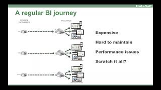
Talking about today is assisting BI Journeys to be more successful. I've been doing BI in the mid market for 17 years and I've learned a lot about clients, deployments, our own solutions, other competitors. So I want to be sure I educated educate you a little bit about what I've learned over these years and also to talk about the analytics for Sage X3 and also focus on the Data Self and tableau solution. Thank you for joining. My name is Johnny Girardi. I'm Data Self's founder and CEO. The agenda is I'll talk first about the successful BI journey, regardless of what BI tool you select. And I'll talk one of our clients their BI journey and I'll go over those concepts and then most of the presentation I'll be focusing on the Data self solution for X3, an overview in how it works. We have a Q and A session at the end and also a few polls throughout the presentation. So I want to start with the first poll. So if you don't mind entering it. And the poll is, where are my polls? There it is. So the first poll that I'd like you to answer is, is your organization using Sage X3 today? So please answer and select yes or no and press the submit button. So don't forget to pick your choice and click the submit button. 10 more seconds. 5 more seconds. All right, let me close it and let me share it. Most people already have x3. Okay, thanks for sharing it. So I'm going to start first talk about BI concepts and I'm going to talk about the BI journey of one of our clients. Almost three years ago, a prospect called me, the CEO and the CIO of this distribution company here in California. Make a long story short, the CEO told me that his organization is growing very quickly and his management team is very data driven. They like to look at data before they can make decisions. And he said that his team is growing frustrated because too often they're having the challenge of the answer to their questions about their data. It's not available, it's not ready. So they have to either wait for their IT team to put together a new reporter dashboard or they have to wing it with an answer with a decision without knowing the data. Either way, waiting or winging it is no longer working. So they need something that is more empowering, where these decision makers can actually access their data anytime, anywhere. And most importantly, to allow the decision makers to easily slice and dice the data, drill down, download and even create new reports and dashboards without having to call a BI expert that was the main point of the CEO is empowering decision makers to be more self sufficient. The CIO told me Johnny, we do not have a resource IT resource problem. We're fairly big organization. We have a very competent, skilled IT team. The problem is we spend too much time doing reporting and dashboards for our management. We spend too much time doing it. It's inefficient, it's, it's slow, it's frustrating for everyone and frankly for my IT people it's a pity that they have to do these reporting things instead of focusing on more real IT work because Gilmores and dashboards in his point was not something that they study like four or five years of computer science to be there. So he said we need a platform that can enable us IT to more quickly tackle the IT job of BI in as the CEO told me, to be able to empower them, the decision makers to be more self sufficient. So those are the main pain points of the CEO and the cio. So what I'm going to show you next is talk about these BI concepts that are usually important for you to keep in mind as you go through your own BI journey. The first is what are the ingredients of a successful BI journey? There are three. The first and the most obvious one is the BI platform. You should need a BI platform that will tackle the needs of your IT people or the decision makers. Report publishers must be a really good fit for your organization. A lot of options out there and definitely finding the right one is a critical piece of a successful BI journey. The second component is whatever BI platform that you choose, you need to have expertise to take advantage of it. A BI platform may require different kind of expertise. Expertise in your data sources, your sage x3, your CRM system, your Google Analytics and payroll. Whatever IT is, you need to have expertise in the BI platform per se and in how to put the pieces together to deliver value to the decision maker. So you need expertise in all of those different pieces of the puzzle. And the last and kind of the most important component is decision makers must be engaged in the main parts of the BI project. The main benefits of a BI project is enabling decision makers to be more self sufficient. So they need to be engaged. Understanding the pros and cons of every BI offer the costs in time to deliver so they can tell you whoever you are assessing your options, what the priorities are and what the right budget is. If you don't engage them, you may have under budget over budget. You might have the wrong expectations. Be sure the right decision Makers are properly engaged with the BI assessment. So those are the three main ingredients to have a successful BI journey. What is a regular BI journey? Most organizations, they have an ERP system like Sage X3, and quite often it comes with its own reporting NBI platform. And for many organizations it works really well. And then you might have another system, let's say a CRM system, maybe, I don't know, Salesforce, something outside of x3, and you may have a payroll system outside of x3, and you May have many other data sources. And typically every data source will have its own BI system. And for many organizations it works well, no problem. So this is the regular BI journey. Now, more sophisticated organizations might have challenges because these systems might not be really easy. And the same user must have access to different BI systems. So it's complicated, it's kind of expensive, different licenses, kind of hard to maintain. Sometimes you need to bring data from different data sources across the BI solutions. And even though they could be done, but it's complicated, it's slow, there are performance issues. And this company that they call me, the CEO and the CIO were considering scratching their whole platform because BI was not cutting it. So some people kind of go through major change in their systems because the BI solution cannot handle data consolidation and speed and ease of use. So for some organizations, this kind of BI journey, every package with its own BI solution becomes not a good fit. For those organizations, what they really need is a more structured BI journey that pretty much includes a data warehouse. So what is a data warehouse for? First of all, is all organizations have several data sources. Erp, let's say Sage X3, maybe another CRM system, Google Analytics, payroll, social media, Excel files and whatnot. So the data warehouse allows you to bring all of this data together in a single data repository and do data consolidation. All the data is together, all of your data is together. In the data warehouse, you can define what is considered a single version of the truth. You define your main metrics, your key performance indicators in a single location, how you calculate your profitability, what your sales actually, how you calculate your sales and whatnot. And then all reports pull those metrics from the single location so you can guarantee that two, two reports showing profitability, you're going to show the same number instead of being used by different people with different rules. If you want to run reports quickly, a data warehouse will guarantee or will help you to have reports running really fast. And finally, overall, you get easier reporting for decision makers when you use a data warehouse. So those main benefits of A data warehousing on the analytics platform. This is where users will access the data. The most important benefit is ease of use. BIS for decision makers is not necessarily for it, it's for people who are not necessarily IT people, people who are managing things, selling, building stuff. So being super easy to use, super intuitive is the most important functionality or feature in my perspective. Second is speed. Who likes to wait computers to run things. In my experience, if a report takes more than 10 seconds to run, most people, most business people will not wait and that report will be a waste of time. So you get, you got to guarantee your BI platform will run most reports in seconds to be sure you have users using the actual information that you're getting ready for them. Finally, people are all over the place. You need to provide a platform that will give them access to their data anytime, anywhere. At their desktop, in their notebooks, in their mobile devices, using different approaches, web browsers, emails and whatnot. So providing different ways to deliver information. When you go for a more structured BI journey, it's very important that you have people that know that have BI expertise. They need to understand your data sources, they need to understand data warehousing, they need to understand your analytics platform, how to put all of these pieces together and deliver value for your decision makers. So BI expertise when you go for these extracted BI journey is very critical. Now what kind of BI users typically you find out there? The most important BI user is what we call the power users. These are the data driven decision makers that need information to make better, more informed decisions in a timely fashion. Typically these people are the people who benefit the most because once they have access to their data, anytime, anywhere, they can affect the bottom line of your business significantly. It's usually a small fraction of your users, but they can actually do magic. They can make a big impact in your business if they have the right platform. So to me, these are the most important BI users in an organization. The power users. Then you have the business analysts. Business analysts are usually the people responsible for building reports and dashboards to other users. So very important user as well. Then we have what we call the viewer users most of the time. In many organizations, most users are considered viewer users like salespeople staff that needs to access reports and make limited changes like changing filters, dates and categories and territories. So they have usually have a lot of users with limited ad hoc capabilities and they pretty much consume reports created by these business analyst users. And finally, I mean and you also might have what is called report distribution users. These users, they usually don't need interaction with the reports, they just need to receive reports weekly, monthly, quarterly that you know, those reports are like PDF reports. You may have, you know, a lot of users maybe sending these reports to your customers, your vendors. They don't need interaction, they need to see the status of some part of the operation. Finally, you have the BI experts that work in your back end system to be sure that data is flowing for everyone else and they're getting the data accurate and whatnot. Now what is interesting, my experience is that most of the BI tools out there and in the Sage X3 environment is no different. Most of the BI tools do a fairly decent job tackling the needs of these four groups of users. It can be complex, it can be slow, but the job can be done. You have tools for the report publishers, you have tools to consume the data, to push information out. You have a bunch of experts working, but they really don't do a great job empowering the decision makers to be self sufficient. And to me it's a pity because at the end of the day the biggest value of BI is giving these users freedom so they can do it, they can do it by themselves, anytime, anywhere. So these topics that I just covered is a little bit of wisdom sharing I would say if you're new BI journey these things are relevant. I'm going to run a quick poll number two now. So if you could answer quickly what are your Sage X3 reporting challenges? So pick all the options that apply to you and don't forget to press the submit button. So select all the options that apply to your business and be sure to click the submit button. Ten more seconds. Five more seconds. All right, thanks Hugh. I'm going to share it quickly. So difficult to use and slow are the most popular challenges and actually many people when they come to DataSelf from the X3, you know, the main complaints are usually complexity is kind of slow, hard to maintain and many reports run too slowly. That's pretty common. All right, thanks for your answer. So let me talk about data self. You know when data self analytics is a great fit, pretty much. You know when you need something that is easier to use for it people for your business analysts and most importantly for your decision makers. If ease of use is something that you need, that you're struggling with complexity, well, quite often we are a great fit speed. If you need the reports to run in seconds, we usually deliver that. And finally, if the BI project is taking too long to to have a return on investment, we also provide very fast time to value Now I need to prove you why do we have that, why our solution is so easy to use, why it's so fast, and why we deliver value very quickly. I want to start with this slide here. I'm the Data Self founder and when I created Data Self, I found the Data Self one of the main values of Data Self. In the beginning we thought it must have the best of the breed technology for decision makers. So it must be really easy to use and they can be empowered anytime, anywhere. So what I decided to do is to go to the Fortune 2000 world. Looking at Gartner Gardner is one of the most reputable companies doing technology assessment for Fortune 2000 businesses. In every year they released a study telling how well the Fortune 2000 BI vendors are doing. And for the last five years in a row, Tableau and Microsoft have been considered the best overall BI platforms for Fortune 2000. And that's what we provide as Data Self. We take Tableau and Microsoft bi, we package it, we simplify it, we amplify it, and we make it easy for companies that use products like sage x3 to take advantage of one of the best technologies out there from the Fortune 2000 world. That's what we do. If you look at the architecture that I was showing before, we do use data warehousing. We use SQL Server for data warehousing. But instead of using programming language, we have built our own extraction transformation loading tool that allow us or whoever is maintaining Data Warehouse to do this in a fairly code free environment, very easy, very fast. Then we use Tableau as the analytics platform. And for the last five years in a row, Gardner rewarded Tableau as the gold standard for the analytics platform is the easiest to use, the most empowering platform for decision makers. So it's really great to have pretty much one of the best. It's not perfect, but it's really great. Now we've been doing this for 12 years as a business data self for 12 years. In these 12 years we have seen a lot of people asking the same questions, the same kind of reports, financial reports, sales reports, inventory reports, payable reports. So over these 12 years we have built an out of the box solution that has more than 5,000 reports, dashboards and KPIs. So if you need to see information by payables, receivables, financials, inventory purchasing, sales, sales order, CRM opportunities, contact Google Analytics. We have a lot of things ready to go, plug and play so you can help. So you can focus on looking at your trends, not building your metrics. We Have a lot of things to get you going very quickly. Let me make my third poll very quickly. So if you could answer it. So if you could choose, what are your main reporting areas? So be sure to select all the options and press the submit button. Don't forget to submit to click the submit button. 10 more seconds. 5 more seconds. All right, thank you very much. Let me share very quickly, sales and CRM, the top two areas. Thanks for sharing. Alrighty, let's take a look at the product. So what I'm going to show you is two parts in this presentation. The first part, I'm going to show you how the CEO of this organization that called me about three years ago, how they're doing now. And I'm going to show how he himself built one of the dashboards that before was taking actually a couple of days for his IT and marketing team to put together the pieces. And then he created, and I'm going to create those that report in about, I don't know, five, ten minutes. I'm going to show you how he did it by himself and how easy it is and how fast things are. And then on the second part of the presentation, I'll show you how people consume reports and dashboards and some examples of that are really empowering from a, you know, decision maker standpoint. So let me go for it. I'm going to switch gears now to show the data self desktop, which is a desktop tool. Most of the things I'm going to be showing you here can also be done using web browsers and mobile devices. So you could take, let's say an iPad and do most of the things I'm going to be showing here. Now, the CEO, this dashboard here, the CEO built, it was for his board meetings and he should have three main components in this dashboard. One was showing sales this month, detailed sales, sales by customer, by product, invoice, number things of that nature. Then he should show marketing, I'm sorry, website visitors and sales trends side by side to see how their website contains or affecting their sales over the long run. In the last part of the dashboard, issuing a geography analysis, you know how well they're doing sales by state in North America. So the CEO, after, you know, he got trained, he decided to build this dashboard by himself and I'm going to show the process. So he came to the tool here and the first thing you have to do is to select what data connector you're going to be pulling data from. And I'm just showing here the out of the box connectors we have ap, ar, CRM information, Google Analytics, GL information, inventory, manufacturing, purchasing, sales, revenues, GDP data, services. So in his case, this particular dashboard is a revenue dashboard. It could be a blend of different data sources, but you just pick and choose what you want to show. In this case, revenues. And then you see your dimensions, customers, products and what not in your measures. So now I'm going to start actually building the dashboard one query at a time. Before I do that, let me just take the number of records that I have in my sample database. This sample database has more than 31 million records that I'm querying right now on spot from scratch. There is no optimization here. This is out of the box and I'm querying 31 million records just to make a point that things are quick. Even though I'm hitting a fairly decent sized sample database, I'm going to build. The first report is showing sales detail sales this month by customer, by product. I want to see, let's say customers. I'm going to come to the list of customers here and find customer name, just drag and drop. So these are all my customers in my database. I want to see sales right here. I just drag and drop. So this is total sales by customer in my whole company history. Well, I only want to see sales this month for the board meeting. So I take invoice, date, drag and drop to my columns. So right now I'm looking sales by year in my sample database. I have seven years worth of data by customer by year. Well, I want to see this month. Well, I can easily expand from year to go to the quarter level. I can expand from quarter to go to the month level. I could go to the two weeks, two days to hours, fiscal periods, whatever time bucket that you want to dive into. If it's not calendar, we can easily build those time buckets in the data warehouse. Plug into this connector and once it's here. Now any person with little training, they can slice and dice, drill down like I just did by just like expanding and dragging and dropping. It becomes very easy to slice the data once the data has been properly structured. Anyhow, I have all my data here now, 31 million records worth of data. But I just want to see October. I don't want to see all my data. How can I filter it? You pretty much most things is drag and drop. I'm going to drag and drop invoice, date into my filter shelf. I can select different time buckets. I'm going to choose relative, which is very popular. I'm going to click next and say I want to see month this month and that's it. So this report now will always show sales this month, whatever the month is. And if later I want to change this report to show, let's say previous month, I just choose previous month. There it is. Maybe you want to see the last, I don't know, three months or two months or maybe I want to see quarters, years, weeks, days. Very easy. Once as you build a report or dashboard, it becomes very intuitive for changing, spinning it. Well, I'm back to this month because it's a monthly board meeting. Well, I'm looking sales by customer this month. What if honestly sales by product as well. And if invoice number is all drag and drop, I go to the product list, I find the product description, drag and drop between customer and sales. There it is by customer, by product I have sales. What if I want to see invoice number, Same thing, you find the field, there it is, invoice number, drag and drop, let's say between customer and product. So by customer, by invoice, by product and that's it. A lot of the report creation in dashboard creation is a matter of no dragging and dropping. If you know how to drag and drop, point and click, right click, you can do it. You can do a lot. On average, about 70% of the custom reporting needs of an average user, they can do it. If they take a little bit of time to learn the basics that they can do it. I actually have some clients that, you know, business people learned how to take care of a lot of their needs by watching a demo like this. It's very impressive. I have one story I might tell you later if I have time because it's really cool. Anyhow, so this is my first report, you know, sales detail sales this month. And I could drag and drop, you know, salespeople, warehouse, whatever it is you drag and drop and you keep on adding more pieces to this report. The second component of the dashboard is going to be sales and website visitors side by side. They want to see the trends, how they're affecting each other. Before data self, this report alone was done once per month. And the IT team in the marketing team would spend about a day and a half, you know, exporting data to Excel, copy and pasting, massage the data to get it right every month going over the same procedure over and over and over. We work with their team to bring Google Analytics data website visitors and blend it with their sales using invoice date equals to website visitor date and also the geography of where people are coming from, from the website visitors to where the actual sales were. And once we did that, then the CEO actually built the report himself. So what he did is he double clicked sales, he double click invoice date, so he's seeing sales by year. Then he chose to see things on a monthly basis. So whole company history, sales on a monthly basis, and then website visitors is just another metric. Behind the scenes, it and my team kind of went through some work to put it together, but now it's refreshed. Every day is just another metric as part of their sales. And the CEO simply dragged and dropped website visitors into the report. So these are the website visitors. He even made bars. So they are definitely different than the sales. And he said put them on a dual axis. And now he can see his website visitors as the orange bars in sales as the blue line. And they can tell that pretty much after about a month or so of their website campaigns, the peak of the website campaigns, their sales would also spike. This is not their data, but they actually were able to keep track of that kind of trend very easily because now the data is refreshed every day, not once per month, completely automated, hands free. The last part of the dashboard I'm going to be creating later is geography analysis. You can put anything that has an address, ship to customer address, vendor address, whatever it is. I'm going to pick customer state, I'm going to pick invoice size and sales. I'm going to ask the tool to plot this on a map and there it is. So for sales in US and Canada, I'm going to make the bubbles a little bigger. So bigger bubbles, bigger sales. And the sales are aggregated by large, medium and small invoices. So in a few clicks I got this nice map showing very insightful information. And now that I build these three reports from scratch, the co put on a dashboard. So now he's creating a dashboard instead. And building dashboards is also a drag and drop kind of functionality. He took the map drag and drop into the dashboard area. He took the trend analysis and dragged and dropped at the bottom of the dashboard. And then he took the detailed report and put on the top left quadrant. If you know how to drag and drop, you can do it. And actually the CEO did it himself. And now as he built this dashboard, he goes to the board meetings using his iPad. And in the board meetings, many of the board members, they also have computers, mobile devices, though they have interactivity with their reports and dashboards now with the data cell framework, but some of the Board members, they still are old fashioned way, they like piece of paper. They don't have these digital devices, so they're still the CO goes with a stack of papers and hand out to people. And sometimes a board member that doesn't have, you know, mobile devices or I mean digital devices, or he doesn't want to do it. He asked the co some questions and the CO told me that this example where a board member told him, hey, you know, I'm visiting these states next month. How are we doing over there? In the past the CEO would have to make notes and I'll get back to you in a few days with this report so you'll know what's going on in those states. Now in the board meeting, I mean, he took his iPad and using his finger, he just selected the states. The dashboard on the fly changes to whatever he selected. It's very interactive. And then he exported the dashboard on the fly to a PDF and emailed to the board member. In about a minute he got the answer to the question from the board member. He emailed to the board member and what is the next question? So the CEO was telling me that now with data self, his management team is so much more empowered because most of the times when they have new questions, they can, without calling for assistance, just take existing reports or even building new reports from scratch, get the answer, make more informed decisions and move on. So they're really happy for becoming a lot more empowered. Now what I just showed you is an example of how a decision maker, in this case the CEO, built from scratch a dashboard that is being very helpful for his monthly board meetings. But let me show you also how usually users will consume the data. And by the way, this whole dashboard is using this 31 million record sample database. And you can tell the reports in my changes as I was going through them only take a few seconds because the system is really optimized to run really fast regardless of how much data you have. Now let me go back and show how usually users will consume the data. They're usually using mobile devices or web browsers. They go to a portal, can be behind the firewall, the firewall can be on the open Internet, it can be using our hosted services, but they go to this portal, this secure portal, and they log in. I'm going to log in right now. When I log in, the first thing is I can select what's going to be my default view when I log in. Right off the bat, boom. I get that particular perspective. This dashboard that I'm showing right now actually is not from this company that I'm talking about, it's from another company. But it's a very interesting story. It's another company where the CFO built this dashboard for himself. So it's the CFO dashboard. Every morning when he clicks on it, when he logs to data self, it pops this perspective. So it's the first thing he checks after his email early in the morning. And he actually built this dashboard about six months after data cell was deployed. So you know, it took some time for him to learn the out of the box, go through some training, poke around, learn some tricks and tips on how to use the tool. But it's a very informative dashboard. It has really well designed. The very top left is one of the most important piece of the dashboard. It has a 60 day cash flow projection. It could be 90 days, could be any time, but in his case was 60 day. It combines data from AR, money coming in, money going out on payroll, money going out on payables, how much money they have today in bank at hand and what the projection is expected to be in the next 60 days. This line is like a line of credit that they have available. As long as the projection doesn't go up over the line of credit, no problem. And sometimes you can do what if analysis. Let's say, hey, this payment maybe is no longer coming. Let me see what happens if I exclude from my cash flow projection, Bang, now I'm over the line of credit and I have to be able to work things out so I don't have cash flow issues. So just an example to show the interactivity of this dashboard and it's something that the cfo, not a business analyst, not a IT person, actually built himself. And he told me that he decided to do this himself because he knows so much about the business and if you have to ask someone else to do it, it would take a very long time. And it took him about 16 hours of his time to take the data self out of the box solution and spin it and put together this. So in the course of a month he invested his own time, about 16 hours to come up with this dashboard. So a lot of interaction. You know, if you come here and you click let's say this inventory asset that's red, meaning it's not good. It's when we went over a certain limit, he clicks on the red bar, the dashboard automatically jumps into another dashboard that gives more perspective into that particular inventory. On hand view, it has information from the GL side and here has information from the quantity on hand today showing, you know, for the top 10 products. As you put the mouse over, the whole dashboard interacts. And let's say in this case it shows that my top item on hand, most of the items are actually in the China warehouse as shown in the bottom area of the dashboard. So very interactive, very point and click, the first thing that the CFO does in the morning. All right, now let me go back here and when you go to the portal and you log into the portal, the system will know who you are and will only give you access to the reports and dashboard that you have access to. So let's say if I'm a salesperson, I can only see sales reports. If I'm a person from the purchasing department, I can only see, let's say purchasing and inventory on hand kind of things. If I'm the finance, I can only see finance. So you can segment what reports each group of users can have access to. But then you also have role level security. So for instance, if I'm a salesperson and I open this report, if I'm let's say the California rep, this report would show my top customers by sales growth and decline since last year to date only for California. While the rep from Florida opens the same report and only views the top customers in Florida. While I say the VP of sales opens the same report and views the top customers by sales change across all territories. So a single report delivers information for all users based on their user credentials. Let me also show an alerts functionality which is really helpful, very powerful now when it comes to consuming information, in order for your users to really use the benefit of your metrics, your reports and dashboards, your key performance indicators, you need to provide a framework that will deliver this information in the best way possible. So you have to have ways for users to consume data, let's say by pulling it, meaning they go to a dashboard, I mean self service approach, they go to dashboard or framework and they find the reports and they consume it. You also have to do, let's say a pull approach, meaning you may be emailing reports automatically every, I don't know, day, weekly, monthly, quarterly, whatever the time period is. So you push. You may also have to provide ways that they can only receive reports if something changes, like using alerts. I'm going to show an example right now. Suppose I'm a user of the system and I have access to this report here showing revenues and gross profit by period. And I look at this report and say, well, I only care if this changes. If my Profitability goes above certain threshold or below certain threshold, I only care if that happens. If that doesn't happen, it's vanilla. I don't care. So as a user, as a business user, I just click on this when I say hey, gross profit, create an alert. If it goes above 55% or whatever the number is here, you just put the threshold, send the alerts, calling data alerts, gross profit and send me every time that this happens and I can receive it. And also Joe must also know about this change. As a user I do not need to be it. I do not need any special training. I just point, click, select alert, create alert and that's it. Completely self service users can maintain can create their own alerts. Now every time that this alert will happen, let's say the the gross profit would go above 55% the users that I configured would receive an email like this showing you the situation, showing you where the threshold and whatever that has just passed this threshold and will be completely. You only receive when that criteria is met. Otherwise you don't need to see that alert at all. And the fun thing is suppose at one point hey, I don't need to receive this alert anymore because I don't care, you just click this button and you're out of it. You don't need to call it, you just get out of it by yourself. Or maybe you take and you forward this email right now I have Johnny and Joe as part of the email. Maybe I forward this email to Mary, right? Hey Mary, check this out. And Mary, look at this alert. Oh my God, I also need to be part of this alert. Mary goes and click add me to this alert. And now automatically Mary, Joe and Johnny are part of the alert. Completely self service, taking it out of the equation unless you need it to control the rules and the security around it. But once the rules and security have been built at the server level, users become self sufficient. Finally maybe hey, I no longer 55% I want to see at 60% the alert. I can just click edit this alert. It goes right back into the selection. I choose 0.6, I click Save alert and that's it. This is the beauty of this framework is designed to be self sufficient, is designed to let business users to do what they're supposed to do without having to call it all the time. So more empowering and freeing it their time to do more it job. All right, with that I hope you have enjoyed the product presentation. Let me go back to the PowerPoint and just kind of reviewing here. When data self analytics is a great fit. If you feel that your BI is complex, well, we have one of the easiest to use platform tackling it needs as well as business people primarily the reason why we can do that is because we use SQL Server data warehousing behind the scenes. We use our own ETL to make it easier and faster. To maintain the data warehouse we use Tableau, which is one of the most empowering BI platforms out there. And we have this whole package wrapped, ready to go with more than 5,000 reports and dashboards for Sage X3 and several other ERP and NCRM systems. If you need the reports running in seconds, regardless of how much data you have, we might be also a great fit again, you know, as a benchmark in data self, we work to have all reports running in less than 10 seconds. Some reports will take longer, certain conditions, yes, but it's rare. Most of them we can deliver. And finally, because we know Sage X3, we know a lot of these other data sources, the mid market ERP systems, CRM systems, we know how to bring them together in the data warehouse. We know how to plug to Tableau, we know how to deliver value. There's a lot of reports and dashboards out of the box so we can get you going very, very quickly for a known cost. So it's not like, oh, it's going to take years. No, usually it takes days, weeks. And you know how much it's going to cost and how much value going to get out of it. So if these things seems to be valuable for you, be sure to let me know and we'll have an offline conversation to go more detail and assess if we're really a good fit for you. I'm going to make my last live poll. So what would you like to do next? So I'm going to launch it. If you click it, please click the option you like to do. And don't forget to click the submit button. So please don't forget to click the submit button. 10 more seconds. Five more seconds. All right, thanks for your feedback. Okay, I'm going to open questions and answers. If you have questions, please use the GoToMeeting chat box. So place your questions over there and I'm going to check it out and see if there's any questions already. Yes, so we have some questions here. Let me just open them up. So question from Amy. I have sales data from my old ERP product. Can I consolidate it with my Sage with My Live Sage X3 data? Amy, thanks for your question. So you have sales data in the old ERP and you want to combine with your live Sage X3. Actually, this is a fairly common request that we hear that when you go to Sage X3, a lot of the data move over, you know, your customer list, your product list, your GL chart of accounts, maybe a new one, but maybe you got your latest, last year's transactions to got some information into it. But then most of the transactions, let's say your sales, like you said, your inventory on hand, historic inventory on hand, your historical financials, they all left behind in the old system. So typically you'll have to be if you're trying to do a historical analysis, you have to do analysis from Sage X3 live data and another report from the old system and then combine them together to make decisions. I think that's what you're talking about. And it's a fairly common scenario. And yes, we tackle this need. Actually we do quite a lot when clients, they move from one ERP system to another, it's typically very complex to bring historical transactions into the new system. So most of these conversions, they only convert what is called the master tables. Again, the customer tables, the GL CHARV accounts and whatnot. And in the data warehouse, actually, let me go here back to my presentation and go back to the data warehouse. So the data warehouse we can actually take the data from the old ERP system we bring into the data warehouse. We format the data in the same format of the Sage X3 live data and we plug it to the bottom of the table. So if you go to the invoice header, invoice detail in sage x3 in the data warehous you would have the live Sage XV data. But at the bottom, these tables would have the invoice header data and invoice detail data from the old system. Just plug in, just plug in the massage it and plug to the bottom. And once we do that, you'll be able to do your data, your analysis. Like when I was doing here, I could be looking at this revenues connector and when I go back to history is just like you never change your ERP system. It's just your customers, your products, your salespeople, your invoices. It's just the same information and it's blended together. It becomes seamless. So yes, Amy, if you are having the challenge and you're struggling, I'll send an email after this webinar so we can talk about it and discuss. But definitely, data warehousing is usually a great way to combine the data to tackle those problems. Amy, thanks for your question. Let me see if we have more questions here. Yes, question from Joe. What Sage X3 versions do you support? Joe, thanks for your question. Sage X3. So we support Sage X3 from version 6 all the way to the latest. So if you have any of those, we support it. If you have an older one, talk with us. Maybe it also works. We just haven't worked with prior to version 6. But overall our packages we support systems back 20 years ago. If you have a 20 year old ERP system, usually we can support it. Probably X3 as well, but definitely version 6 and newer. Joe, thanks for your question. Another question here from mark. My Sage X3 database is about 1 terabyte big and my reports are very slow. How does data self handle that kind of database size? So Mark, good question. Your database is about 1 terabyte big. So yeah, big databases typically slow reports. People think it's an evil. It's a necessary evil. No, it doesn't matter the size of your database. Actually one terabyte of database doesn't say much about how big your database is because there's a lot of components into that particular topic. Typically A better way to discuss performance is how large your tables are from a number of record standpoint. So that's one criteria is Mark, do you know how large your largest tables are for a one terabyte database? I would say your largest tables are probably, I don't know, 50, 100 million records tops kind of thing. If you know, let me know or shoot me an email. So that's one component. The second component is how big your dimension tables are. You know, how many customers you have, how many products you have. Once we know those two pieces of information, we can make a fairly good assessment of performance impact in what kind of, you know, tweaks. Typically we do in data self to make your reports run in seconds. Even though you have a lot of data, one terabyte of data for our standards, it's not a lot, it's, you know, it's a good sized database. Oh Mark, Mark just said that his largest table has 85 million records. Yep, right on spot on my experience. So you know, no, 85 million records is not, is not a lot. Your reports should still run in seconds once the system has been fine tuned. My sample database is about half the size of your database of your 85 million records. This is 30 million records. And you see things were running in seconds. So big database does not necessarily impact performance of reports dramatically. If you use the right BI platform and if you Know how to fine tune it. I'll send an email later so we can talk more specifically about your challenges. But definitely with Data self we usually don't have slowness issues. And when we happen, for instance, one example, when there is low issues with Data self, suppose you want to run a report showing whatever it is and you have let's say 10 million records to show. It's like a report showing detailed sales the whole year. You have 10 million records of sales. If you try to bring this to a browser, there is no BI tool that's going to make it fast. Because 10 million records in a browser is just the time it takes for the web browser to deliver those 10 million records. Going to take a lot of minutes. It's not because the BI is slow, it's just because the delivery method, it's slow. If you print to a PDF those 10 million records, then probably in a browser you can download it in 10 seconds. Then yes, it will be running fast. But overall, again with the right BI platform, you should run your reports in seconds regardless of how much data you have. Folks, we're running almost out of time. I'm going to wrap the questions. I'm going to show some important piece of information in case you want to learn more about Data self by yourself. You want to do a little bit of self learning, you can go to the dataself.com website on the homepage. I recommend you watching the little video here. If you want to learn about the 5000 reports and KPIs, click this 5000 KPIs button. You go to this other website. I'm sorry to this other page where you have a list of reports for CRM, Core Financials and ERP Distribution Manufacturing. Show all the 5000 a list. If you click Download full list you'll get an Excel file that will list individually all reports we have out of the box. So I recommend take a look at this list. Let's say if you go to, I don't know, sales analysis, you go to this tab that hey, I want to see all the dashboards. And you keep on expanding. You have the name of all the reports and dashboards in what kind of, you know, connector we have available out of the box using the Tableau framework. If you want to see some sample reports, you can click this dashboard samples. It opens this other page that will show you the look and feel of these dashboards. So you know, you can just poke around and see how they look. It's just a small sample out of the 5,000. Also I recommend on our website to go to if you want to see the architecture, how things are stacked. I recommend that the final recommendation is go to Resources and choose demo videos. Here we have probably, I don't know, seven, eight different videos that show different things and different functionality of the tool. So I recommend poking around. If you're a business analyst and you want to learn a little bit of techniques for data visualization, I highly recommend this 45 minute video. It talks about visualization techniques regardless of what tool you use. Very informative. Anyhow, I think the most important thing is, you know my main goal as a professional is education. I love to share what I've learned, what I've heard out there so I can help you become more successful with your BI journey. So if you want to talk about Data self, you want to talk about competitors, you want to just discuss some ideas about your BI project, I love to do that. I love education, I love to share my knowledge, I love to learn from your experience so we can just help each other. And if Data self will be a good fit for your business boy, then I'll be super excited. We know our stuff really well. We just do this day in, day out and if we're a good fit will have fun. You're not going to be spending a lot of money with this, but your users, especially business user, will be loving you because Data Self, when it's a good fit, we really make it awesome for all of us. I hope you have enjoyed the session. We are recording it so later today you'll receive an email with the link to the recording session. Feel free to share it and feel free to contact me anytime you have here my cell phone.










