Sage X3: Make Better Business Decisions by DataSelf
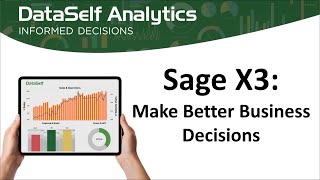
DataSelf analytics for Sage X3 turns task-level reports into management dashboards with KPI tracking and predictive insights. The platform connects in minutes, offers natural-language queries and drill-down analysis, and runs on cloud or on-premise. Try it free for 30 days.
Questions this video answers
Roughly 30 minutes.
October 20, 2022.
Over 8,000 (covers multiple ERP/CRM solutions, not only Sage X3).
Starting just under $400 per month (three editions: Advanced, Pro, Enterprise).
Cloud-hosted, on-premises (behind firewall), or hybrid (mix of cloud and on-prem components).
Chapters
Don hi everyone. Once again, my name is Don Farber. I'm joined by Data Self CEO and owner Johnny Girardi for today's presentation on Sage X3, making better business decisions. This session will take roughly 30 minutes. We're going to divide that into three sections. First, 10 to 12 minutes we'll be discussing some high level business concepts around Sage X3 and making key business decisions in that application. We'll be following that with a product demo of the Data Self analytics solution. And if we've done our job right, we'll be leaving a couple minutes at the end for any questions you might have. If as we're going through today's presentation, you do have any questions, feel free to type them into the chat dialogue box and we'll be sure to answer them. If not at the end of this session, then via a follow up email that you'll be receiving from us. So let's kick things off. Data Self. We've been around since 2005 and as I said, I'm joined in today's presentation by Data self founder and CEO Johnny Our mission for the last 15 plus years has been to enable clients to make more informed business decisions. And the way we do that is by combining three concepts or technologies, one of which next Generation Data Optimization engine. We combine that with industry leading BI such as Microsoft Power BI and Tableau and then we round that out with a template or report and dashboards library. We'll be discussing those points in more detail as we go through today's presentation and into our demo. But first let me turn the mic over to my colleague Johnny Girardi to talk about some of the typical challenges that you and your colleagues who use X3 might face.
Thank you Don. Again, this is Johnny Giorari with Dataself. We've been working with X3 for about five years now and all of the X3 clients we earned over the years, they came with a few complaints or pain points. When they were doing reporting out of sage x3, many of them they were using already bi add ons to x3 and they were still having challenges. And the challenges were primarily complicated, complex, you know, reporting data analysis was still pretty time consuming and many decision makers, they couldn't make timely, informed decisions because it would just take too long and being complicated. So that was the number one pain point. The second was just the speed to get reports running. When you open a report and you say give me the latest data, press the refresh button and wait until the data is refreshed. It was too Long and too long. Nowadays in our benchmark it's 10 seconds. You know, over 10 seconds is too long. And many expert clients come to us telling you no, it takes minutes, sometimes even hours to run a report. Those are the primary main challenges. But we also have been having many expert clients that they come to us because they have just too many reports and dashboards to build to fulfill different business units reporting needs. And it takes a lot of effort. And as we're going to be showing today, not only we solve technology problems on the reporting side, but we also provide templates that make it easier, better, faster to get information out of X3. Back to you Don.
Thanks very much Johnny. So what I'd like to talk about is the fact that there are indeed two kinds of reports that you run across or that you need in your daily ERP activities. And the first of those we tend to refer to as the little picture or the microscope analogy because these are staff oriented reports and they focus on task completion, keeping your staff informed about what needs to be done right now, what has been done, perhaps today, yesterday, last week or next month, what is coming down the pike in terms of tasks that need to be completed by tomorrow, next week, next month. And good examples of these staff oriented reports are things like today's shipments, stock status report AR aging and invoices processed today. Now the good news here is that your Sage X3 application is exactly filled with these staff oriented reports. It does a superb job of a providing that staff level visibility. However, the second type of reports that are used by organizations today are really management focused and we call them management oriented reports. We use the analogy of the telescope because these are what provide management and executives with the big picture. And the focus here is on decision making, giving management access to key performance indicators that not only show what's gone on within your business, but why it's gone on on. And that why enables your managers and executives to make more informed and more timely high level business decisions. Now good examples of these management oriented reports are things like high risk receivables, debt inventory projection, sales rep growth analysis, negative cash flow projection and year over year variance. It is exactly these management oriented reports, which is what is provided through analytics solutions. Now that begs the question, why can't you Simply take your X3 standard staff oriented reports and make them work for your management? The answer comes down to technology and it begins with a scalable data warehouse. Because management reports has to look at so much more data, consolidated, combined and massaged, a scalable data warehouse is essential and that's provided within the those management oriented reports, but not within staff oriented reports. And very quickly to go through some of the other differences from a technology layer speed of data retrieval, infinite drill down, Google like or natural language searching so your managers and executives can run their own reports in an ad hoc environment. What if reporting to look at? What if we make changes to the products we carry, the regions in which we sell, et cetera Predictive reporting. If you deal with inventory, you need to know not only that you have enough stock on hand to fulfill orders today, but also tomorrow, next week and beyond Key Performance Indicator Based Alerts Management decisions are so sensitive to timeliness, the right decision has to be made at the right time and being able to get alerts to management about key performance indicators is absolutely critical. And then finally, because management needs to look beyond just sage x3 into perhaps your CRM application, other ERP add on solutions, or potentially even combine data from x3 with data from one or more Excel spreadsheets. So these are the technological differences between staff oriented and management oriented reports. Now we here at Data Self we specifically focus our primary attention is on management oriented reporting. And if you start by looking at the left hand column under limited visibility, we have found that these are the typical challenges that are faced by your managers and executives. Revenue shortfalls, unpredictable cash flow, etc. And through the Data Self analytics technology, we're able to provide that 360 degree visibility that enables management to be more aware of what's going on and make those more timely and more informed business decisions having a profound effect on the bottom line of your business. So within the realm of analytics, what is it about Data Self that makes it different from other analytics solutions? In fact, there are three key components and the first of those we consider under the heading of Power because dataself is the only solution out there that gives you a next generation data optimization tool with our patented ET plus technology married with a SQL Server data warehouse that enables you to do the most complex and sophisticated analysis and get that information quickly and easily out of your X3 system. Secondly, top rated BI engines which facilitate ease of use. I mentioned earlier both Tableau and Microsoft Power bi. Those are traditionally the top two rated BI engines in the market today. And Data Self is the only analytics solution that gives you the choice of using either of those to make sure that whatever technology your users are most comfortable with, they'll be able to continue using from a BI perspective with Data Self and finally an analytics library. An analytics solution is good, but if you just implement that solution. You and your staff are faced with having to start to write all of the reports and analyses and dashboards that you require. Whether it's 10, 20, 50 or more. Data Self analytics comes out of the box with over 8,000 pre configured reports and dashboards. Now don't be daunted by that 8,000 number because that covers not just Sage X3, but all other ERP, CRM and related solutions. But the fact that you have that library to use means that you can quickly get your analytics solution up and running and providing value to your organization. So enough about the description of the technology. Let's have a firsthand look at it. And for that I'm going to turn the proceedings back over to Data Self CEO and founder Johnny Girardi.
Thank you, Don. Appreciate it. Let me switch gears here to control. All right, just checking. Can you see my.
We sure can. Thanks, Johnny.
Thank you, Don. All right, back with me, Johnny Girardi. I'm going to do a quick product presentation in Like Don was saying, you know, the idea is to show how manager how decision makers can easily find answer to their ad hoc questions in data cell. I'm going to show some ad hoc examples. Today's webinar's focus is business users. Next month we're going to be focusing more on business analysts. So today if a business user, you're in for a treat. So the first functionality I'm going to show for answering ad hoc questions is the natural language query. Natural language query is like Google. You know you type a question in plain English and you have to use English. So middle school required. But if you know English and you articulate the question, the tool will give you an answer will give you a report built from scratch answering the question accurately and instantly. For instance, I want to see sales by salesperson in 2022. So I wrote just a question in English. If you noticed the tool uses natural language query artificial intelligence machine learning tool. Identify what the human wrote against the data available so it can resolve the query. As a user, I don't care. I write in English. I press enter in the tool. In this example instantly accurately put my salespeople here the total sales in a descending order in that particular time period. Very straightforward. This report didn't exist. It was just created from scratch because of my question. And maybe when I go further I want to see by month so I want to break down that perspective on a monthly basis. Press enter in the tool again changed. Now in this example it gave me a line chart where every salesperson has a different color. I see sales by month in 2022. Now many people might not like the graphical representation that the tool chose to show. Well, you can easily come over here and say show me differently. Show me in a bar chart. Maybe taxable. Accountants love taxable. They want to see the numbers by the penny. Absolutely. You can use natural language to get the data input in a text format like in Excel in case you want to. And from here if you export Excel, it takes a couple of clicks. You can get this information to Excel. So amazing technology, just like Google. But to look at your data in data Self and easily build reports to answer your questions. Now like Google, it will not answer all the questions. It's very effective, but not all the questions. So let me show other examples in Data Self that can also that are also used for answering ad hoc questions. Now I'm going to go into what's called the slicer. The slicer is also a very powerful way to ask different questions in a different format. It's like a Excel pivot table on steroids. Right now I'm looking sales in a given period by customer. And if I want to change, see something big picture and drill down, let's say I want to see sales by salesperson. In months two and three, I just select month two and three, press apply. So right now I just change the time period and I could change the year as well if I wanted to. Right now here is two and three. But I don't want to see customer, I want to see salesperson. This list here, a business analyst can customize, it can add, can remove, can customize extensively the drop down list. As a business user, you know, once I have all the parameters here, I just have to know how to pick and choose. So if I'm a salesperson, I just click salesperson and there it is. Now the report shows sales by salesperson those two months, big picture, the telescope. Great, I got the numbers. But now I want to drill down. I want to go a level down and see buy salesperson, sales by item. Well, I can just click the plus signal to go from column one to column two. And right now I already have items. So that was easy. Sales by salesperson by item. I want to drill down further. I want to go down to kind of the microscope view and I click expand. Let's go to the next column example. When I choose customer or anything else, just pick and choose and you keep on building this report and going, drilling down measures. I'm looking at sales. What if I want to See different measure, maybe budget, maybe growth, gross profit. You just pick and choose from this list, which is also customizable by, you know, business analysts can also customize this list. Once it's done, business people just have to pick and choose and press apply, and pretty much that's it. In a few minutes you show business users how to use this slicer and usually they got it and they start to run it. This is one of this, one of the top. This is the. This is among the top five most popular reporting features out of the box in our solution because of the flexibility it gives to business users. All right, so that's this lifestyle. I'm going to show something slightly different from an ad hoc capability as well. I'm going to go now to a financial report in data cell and like Don mentioned, you know, we cover for X3AP, ARGL, inventory, sales, sales order a lot of different modules. This is an example of a P and L. Right now I'm seeing in a certain year and period, it's just reloaded certain year, certain period. I see my P and L, my sales, cost of sales and whatnot. And typically when people are analyzing the big picture, sometimes they see a number that is weird, it's too high or too low or they don't show Y as that number. And then they want to go microscope. They want to drill down, drill across, slice and dice until they see the why. In P and L, it's very common to see, hey, I see the balances, show me the details. Let's say that the wages here, this number is not expected. If you click on the number automatically, you bring at the bottom, you still see at the top where you started, but it's at the bottom all the GL transactions where the total matches with this one. Because we are in period one for this particular account. If you choose the next month, it shows at the bottom the same thing. And this is very interactive. If I show the whole line, I want to see everything across this whole P and L. The total is 28,000. I click over here and I will show all the transactions at the bottom that totals 28,000. If I want to see the whole cost of goods sold, I click it. Now I get everything of this particular item that totals this amount. And if you see it matches over here. So super easy to go from the telescope to the microscope and you can drill down and drill across in case it's needed. Very powerful and very powerful for business users. So this is a third example of ad hoc analysis looking at report and Start to drill down. Just pointing and clicking the next one is also more kind of a dashboard perspective. You know, before I was showing just tabular, simple, one report at a time. This one is kind of busy initially. But keep in mind I'm going to explain is not it's kind of simple. This is the number one most popular out of the box report or dashboard in our solution is because it's looking at year over year variances. You know, you can look at this year, this period, this quarter, year to date, a few months, see how you're doing those periods this year and then compare to the same period last year. It's a very popular perspective. And the way you select this year is by just choosing the year from the dropdown in the periods that you want to use. You know, only one period, a few periods a quarter. I'm going to select year to date through period nine. Press apply. So right now, what this dashboard is showing right here, the big numbers, the big telescope, total sales this year, total sales last year to date and the variances in percentage and $. So big numbers, the big telescope. And then I start to go and drill down visually. The next widget shows the same number, the same data, but now broken down by period. Dark blue this year, light blue last year. So I can see that I'm growing slightly since last year from a trend analysis standpoint. If I go to the next widget I see the same data but now by geography, by ship to or customer address in the size of the bubble is proportional to the sales this year. Black means growth, red means decline. So let's say taxes. I put the miles on taxes. I see the numbers is growing by 2% since last year to date. If I look at New Jersey I see the total numbers and I see there's a small decline of 1% since last year to date. Very easy in here. These two widgets they show by customer and item total sales last year, this year in variance. So high level big picture telescope. I see the big numbers now. When people are analyzing a dashboard like this, they usually care about the outliers, you know, the things that are too good or too bad. Let's say look at this customer. It's a major customer that has a major decline in sales since last year. Now I want to go and drill down into more details. I want to, you know, just, just let me discuss but nothing else. When they click this customer on this widget, it will filter everything else. And now it shows me the total for this customer, the trend analysis for this customer. What I'm shipping to in what products this customer has been buying last year and this year. And if I say oh look at these three items is a major decline, let's select only those three items. Now I drilling down further is more kind of, you know, microscope only for this customer, only these three items. I see the trend analysis and whatnot. Now with data set up at one point you might want to actually see the microscope. Really show me the details, all the transaction details. In this case I click show details and now at the bottom again it shows me all the underlying data feeding into those numbers. Invoice, number, invoice, date, the item, the customer quantity, sold on sales and everything else. So very empowering for decision makers to start with the big picture. And it starts to drill down, slice and dice until they get answer to their questions. Everything that I showed you so far is available kind of out of the box, plugged to X3. Now what I'm going to show is how to change things more kind of a business analyst role. Everything that I showed you so far, any user with security rights to data self can do this licensed in natural language. Everything is for regular users. The next example is more for business analysts, people that have more training how they can actually change a report structure or create a new report from scratch. So I'm going to show you now. For instance, I don't want to see customers because I sell to retail. I care about customer cities but not individual customers. How can I change this widget to show city set of customer? I need to have the edit button that is only for people that have rights to change reports and create reports. I'm going to click the edit button when I go to edit things. For many people this is too much, too overwhelming. So don't worry, it's going to be quick. I just want to show that if you want to do it, it's not complicated. I want to change this widget of the Moho dashboard. I'm going to go right into it to see all the settings that control this widget. And here I have all the fields that are available out of the box from AX3 for field analysis. And I have my customer address in customer state. I'm going to bring this customer state and replace with the customer name that was there before. Oops, I put state. I want the city, sorry, customer city. So right there I put city. I want to store this ending and that was it. Drag and drop. Replace customer with customer city for this ending. Go back to the dashboard. And now the dashboard that was before showing customer. Now we're showing customer city. Very easy. In many business users will be able to make these changes because it's that easy. The last example I want to show is how to create something from scratch, a new report from scratch. And again, we have many business users that have seen a demo like this and say I can do it. If it's that easy, I can do it. I'm going to give an example. I want to build a report showing sales by customer this month and I want to come as a slice and dice it. So a customer put in my rows. So there it is, all my customers from my whole company. I want to see sales take sales drag and drop into my report. So now I see sales by customer. Let me put my top customers at the top. So these are my top customers company wide in the whole company history. Well, I want to see by period and I want to put invoice date. Let's start with putting the columns just to see what happens. And by default it gives me sales by customer by year and the whole company history. Well, I want to see only this month. So let me filter this. I'm going to say show as I filter my year. And I don't want to see everything, I just want to see this year. So I filter only for this year. There it is. But I want to see months. I can expand, click the plus signal to go to the quarter level. I can click the quarter plus to go to the next level. So now I have month and now I have all month. Cool. I don't want all months, I want to filter. So let's make a filter for my months. And I just want to say, let's say November, September. So there it is. Sales by customer in September 2023. And if you want to start to check boxes, I want to see what happened last year, you know, side by side. So there it is. I took check last year, now I have two years side by side in the same month and see if it's growing or declining or maybe, you know, I want to see sales by customer, by product line. You just drag and drop in, point and click. There it is. By customer, buy by product line, sales in that period. A lot of the reports and dashboard that people need is a drag and drop away. And that's the power to give business users the ability to easily find answer to the questions anytime and anywhere. Don, back to you.
Thanks very much Johnny. And I'm just going to now share my screen and finish up our talk. You know what I really love about The Data Self value proposition is the fact that although you typically go in on that management level and get those big pictures, there's that that infinite drill down that lets you go, as you say, from the telescope level to the microscope level if you need to. Okay, now contrary to I think popular belief that BI is too expensive and out of the reach of the average client out there, I just want to very quickly touch upon pricing for Data Self. It comes in three different editions, Advanced Pro and Enterprise. And you can see the pricing on the slide in front of you starting as low as just under $400 per month. And when you consider the kind of value that you can get out of Data Self and the kind of management decision making that can result from it, that's a very easy value proposition to support. I do want to mention that full details of the pricing, the individual components. We actually break down each of those levels of pricing into its components because we believe that if you're not going to need or use a specific aspect of Data Self, you certainly don't need to pay for it. So full details on the pricing are available on our website, as is also the ability for you to try out Data Self for free for 30 days. It's the full function software. We'll be there to assist you as you try it and evaluate. We certainly encourage you to do so. So before we wrap things up, I just do want to open up the lines for any Q and A, any questions that anyone might have about Data Self and Johnny. Actually I'm going to start off with asking a question of my own because with all of this functionality flexibility that's available, certainly one of I think our clients primary concerns is how quickly can they get dataself into a a production ready environment actually giving meaningful management level analytics based upon their X3 data.
Yep, it's a very important and proper question in X3. Pretty much all X3 deployments we have done so far, the X3 system was heavily customized to the client specific needs. So typically when we deploy Data Self there is primarily a a out of the box deployment that usually happens in less than a day, usually within an hour or so. We connect, we install, we pull the data and we bring the out of the box. And sometimes as soon as we do this initial deployment, there is some data in the Data Self solution that might be ready for consumption soon after. Most of the times with x3 because of the level of customization that people go through in their X3 system, there is usually days, sometimes weeks in some very complicated ones it Might take months where we adapt the out of the box business rules to the specifics of the client's X ray system. On average, we always tell that in a matter of weeks, two to four weeks is usually when you can get at least one or two of the data self modules like the sales or the inventory analysis or even financials customized and ready for production. So out of the box deployment pretty much in a day usually can have some data in data self ready for some consumption next day. In practical terms, for many clients that have heavily customized, actually might take a few weeks and even more to customize the data self solution and training. You know, for us it's very important to teach you how to take over data self and customize it yourselves licensed and become completely self sufficient, making more informed decisions.
And one additional question that came in, Johnny was asked about deployment. Is it in the cloud on Prem, how does that work?
Good question. We have the data self analytics infrastructure, we call it kind of a leg approach. If you don't want to host anything and you want to have the minimum investment in infrastructure and server, primarily you have to do nothing. We can just install a very small footprint application, the ETL plus, in a place where we can pull your X3 data into the cloud. And usually our cloud is very robust, very secured. So everything cloud, you don't have to do anything on premises except giving you access to your X3 database. Some clients on the other hand, they want everything behind the firewall and we can absolutely take all the whole lag box, Lego block set and put behind the firewall. Most clients use our cloud system, some clients using the hybrid, some pieces on premises, some pieces on the cloud, some clients use everything behind the firewall. The good news is, whatever the framework you need from an architecture standpoint, we can take data set up and adapt using the Lego block approach.
Perfect. Thank you, Johnny. I don't see any additional questions and I do see that we're up against our time limit. So on behalf of Johnny Girardi and myself, Don Farber, I want to thank you very much for attending this session on how to make better business decisions from your X3 ERP system. I do want to remind you that we do hold monthly webinars on data self analytics. And next month's webinar will be a deeper dive into the data self technology itself for your business analysts. So go to dataself.com to see when the upcoming webinar dates are and sign up for them and we'll look forward to speaking with you again for today. Again, thank you so much for your time and interest, and we look forward to working with you. Thanks very much.
Thank you all. Bye Bye.










