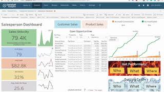
A brief product walkthrough of a Salesperson Dashboard that surfaces sales velocity, daily to-dos, recent sales and commissions, and drill-down customer/invoice details. The demo highlights interactive features (click-to-email/call, ERP invoice links), configurable period windows (monthly/quarterly/30/60/90-day), and visualizations to identify "hot" (growing) and "getting cold" (declining/no-sales) customers and products.
Chapters
Salesperson Dashboard this dashboard shows critical information to salespeople. The left side has metrics about their sales performance. This is showing sales velocity but this can be easily customized. Front and center are the salesperson's to do's for today. This can be CRM opportunities or other tasks such as quotes. Top right has sales and commission accumulated for the last two months on a daily basis. This dashboard provides lots of drill down options. Clicking on customers will show their sales invoice details, products sold and year over year sales trends. Selecting a customer will filter all the quadrants of this dashboard. If I need to contact this customer I select their name and click email or call customer. And yes doing this on a mobile device will call the customer right off the bat. Now what if I want to see this invoice in the ERP system? Well you just click the invoice number and voila. This feature is available for many systems like Acumatica and Salesforce. Back to the main page we have these Hot and getting cold performers. The question is who's hot? What products in areas of the country are hot? By the same token, which clients products in areas are getting cold. Let's see who's hot. Here are my hot customers. The left shows top sales this period. The right shows top sales growth from prior period. Their sales might not be big yet, but they are growing rapidly currently. This period is this year to date. So this is showing top sales growth from last year to date. I can use the drop down list to choose the period to be monthly quarter year, 30, 60, 90 day moving windows. I can also select a few customers and select see details to see more information. Let's see where is hot? The size of these bubbles represent growth from the prior period. Hot performers are usually getting plenty of attention from your team. But what's going on with the getting cold performers? These are the customers getting cold. They were driving big business last period. The left shows top sales decline from prior period and the right shows no sales. These clients were buying a lot less period but not at all this period. Hovering over them will show in the middle area what products are driving the largest decline. This dashboard is available out of the box and is easy to customize and here's our contact information. Thanks for watching.