Tableau and DataSelf Analytics v10.3 - New Release(Full Webinar)
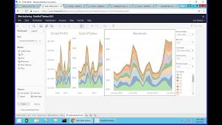
Johnny Girardi, founder and CEO of DataSelf, walks through version 10.3 of Tableau and DataSelf Analytics. The release adds improvements to query caching, web and mobile interfaces, data formatting, and alert features.
Chapters
Or Happy hump day. This is Johnny Girardi, Data Cell Founder and CEO. I will talk about today the new release of Tableau and Data Self analytics. That's version 10.3. We have many clients joining us, as well as some resellers and some prospects. Many of you clients are using some older versions. I'll be focusing primarily on the latest, you know, Updates available from 10.3. Let's go through the agenda. So the first part of my presentation, I'll talk specifically about the improvements popular improvements on the Tableau engine As you might know, Tableau is the front end of Data Self Analytics. We have an OEM relationship with Tableau, and the feature I'm going to cover here is what is the most popular among our clients, and I'll also talk about some features that are not so popular, and I'll be showing references to how you can get more information from it. At the end, I'll talk about the latest templates we have released. So let's get started. The first main feature is about automatic query caching. That's a kind of tacky name. In a nutshell, it's speed. If you're using our framework Data Self and Tableau, sometimes you might realize that when you open a query early in the morning, the query might run slowly. But when you open the second time, or when someone else opens after the first user, it runs very fast. And that's pretty much because of the cache. It's a feature of computers, and what Tableau has done now is create a feature that allows Tableau Server to automatically warm up the cache, meaning queries that are popular that have been used frequently. If you go as an admin, if you go to Tableau Server on Settings General Workbook Performance after schedule refreshing, click this checkbox. What will happen is that every time the Tableau refreshes, the Tableau extracts. It will check what queries have been used. The most recently used in the last week, it would automatically run them as part of the refresh. So when a user will open one of these queries for the first time, it will run much more quickly. Overall, with Data Self, we tell people that queries should run in less than 10 seconds. If they take more than 10 seconds, many users will not wait. So this feature will be very helpful to allow users to run queries again within seconds. Regardless of how much data you have. I think most of our clients will really benefit from using this new functionality. Make things really fast for all queries at the very beginning of the day. Next, one of the most Cool things that Tableau is doing is bringing more and more functionality to the web and mobile user interface. If you have access to the mobile interface and you are a power user or publisher user or interrecord as some people call now, you can do a lot more without the desktop client. And I'm going to be showing these features that are new and available. So let me switch gears here and I'm going to go to the web portal of my presentation and I'm going to open one of these workbooks to show the new features. I'm going to open the first view. So far I'm just opening a view or a report in the web server. Now if I have the edit button again, if I'm a power user, publisher, user interactor, I can click the edit button and go into the edit mode where I can change the query dramatically. I can change things, I can create new reports, dashboards and stories. I'm going to show you now in the edit Mode these new 10.3 features. The first one is format numbers more easily. So what is that about? If you want to change how a measure is being showed, you can come on a query, come and where the measure is being shown on the query, click the drop down list here, the little arrow pointing down and choose format. And right here comes this very user friendly way of choosing different ways to show the data. Point and click, you change and you get a different result. Let's say I want to see currency, but I don't want to see decimals. There it is. Maybe when I see in thousands. Very easy to change your format. It and I believe will be very popular among many people. Let me open another query that shows the same idea. So here I'm seeing a plot of numbers on a chart. So I go to the measure per se, I click the arrow pointing down, choose format number and then I can say hey, I'm going to show with decimals. And then it changes automatically the formatting. So this feature I believe will be popular is focused on a specific, specific report or dashboard. You cannot change the data source. Formatting is just how it looks on a given report or dashboard. Next is drill up on continuous axis. That's a new feature as well. Before, if you come to a continuous access like this one and you click on it, you could only drill down. Now Tableau also enabled the drill up, meaning if I'm on a monthly level and I click drill up, I go to the quarter level. So quarter. If I click and choose drill up, you go to the year level. So this feature before you could only drill down. Now you can also drill up. Kind of silly. I thought they would be coming up with this. This drill up much sooner, but better now than ever. Next feature is about maps. So here's a map and with older versions, you couldn't edit much of the options available on a map. Now you can come to map and this map options is the new feature. So you click on it and you can decide which of these controls you want to show and make available for users. So sometimes this is very handy, very useful, and this is a new feature. So again go to maps and click Map options. Create bins Bins for certain type of analysis is very helpful. For instance, suppose you want to break down all your revenues in beans every $10. You have a lot of small transactions and large transactions and you see how many of transactions is into different buckets of your measure. Before, to create beans you'd have to use desktop. Now on the web you can choose a measure, choose create and choose beans. So here comes the little wizard revenues revenues bin. And then let's say I want to see break in bins of $10. In this case I could ask the tool to suggest how many beans to break up. But in this case I'm going to choose beans of $10 each. So when I create this bin, now I have a revenues bin here that is being created automatically. And if I drag to my rows, so what is. Let me sort descending. So what this is doing is from all invoices, from revenues from 0 to $10, I have about 320,000 records. From 10 to $20 is about 247,000 records. Let me just put the number of records as labels, so probably a little easier to read this. So how many records I have for transactions between 7 and $80, 24,000. So pretty much creating revenue beans from measures was only available on desktop. Now is also available on the web browser. Sometimes as a web user, you ask your business analyst to create some new data source, publish, you know, a workbook that you're asking some reports and dashboards. The person, the business analyst builds this new data source publish to the server the workbook. And you go there and you find the information and you get what you asked. But then you know, as a power user, you want to create some additional views and maybe you want to share with other people and let them create their own reports out of this news data source. And let's assume the business analyst forgot to publish this data source to the server. So before this version you have to Call the business analyst and say, hey, can you please publish this new data source to the server so everyone can have access to. Now we're empowering more the end users. They can come here and let's say that this data source here is not published to the server. They can come to the data source that is not published and click Save. When you click save, this data source now is going to be published to the server and everyone that have the same rights as you, other users will also have access to it. As you can see here, this data source has been published. It has a little tableau square. This one is an embedded not published yet. But when they click yes here, I'm going to convert this inside of the workbook data source into a published data source to server I'm going to click yes and that's it. Now this data source is available to all users with the same rights as you. They can create their own reports and dashboards with the new published data source. So new future. Also exciting for some situations. Next feature, Distribute Evenly in Dashboards. This is very popular as well. How many times you are building a dashboard and you get something like this, you have different sections of the dashboard that they're not evenly distributed and you want to get them right. So you start to put them visually. And if you are very picky, and I'm very picky, sometimes you spend quite a while just trying to get all of these things pretty well evenly distributed. So Tableau created a new feature that allows you to evenly distribute different objects within a container. If you don't know what a container in Tableau is, I recommend you to come to this links here that have a lot of explanation about how containers work. Anyhow, in containers, what you pretty much do is you select one of the objects within a container, you click the arrow pointing down and then choose select the whole container. So in this case, this whole container has these three different objects. Could have as many objects as you want. And when you go here now click the arrow and choose Distribute Evenly. What it does is it automatically puts the same size for each object so they are evenly distributed. This is useful for objects like no charts, grids and whatnot, but also for, let's say, filters. Sometimes also with filters, you know it's a pain to resize them and you get the wrong size and you can spend quite a little bit of time trying to get all of these things properly distributed. The same thing here you choose the container and then you click Distribute Evenly and the tool will automatically split the size of all of the objects properly. So if you do a lot of dashboards, learning how to work with containers and take advantage of the new distribute evenly feature will save you a lot of time. The last main feature for web authoring that I think is really good for many of you. If you're using Stories now, Stories is also available on the web browser. You can create new stories before you couldn't. So now you just come here. There's this new button for Stories. This is new sheet, new dashboard, new story. So click this button to create a new story. I call first step of my story. I'm going to add one of these queries. So double click one of the queries and then let me make this just a little smaller. And let's add a second step. So one more step, we're going to put this particular query here. This would be cost of sales. And I'm just going to create another one and put the map I just created Story. I'm going to call this story my new story. Stories are like in PowerPoint. As you're browsing them, you can come here and just use this to go from page to page. You can change the layout to show numbers instead. You might have several steps to tell your story. And in 10.3 there is also the dots approach. Dots was not available in 10.2, so pretty much makes the whole view more streamlined with less real estate being used by the navigation capabilities. So creating Stories is a new functionality that was not available on the web and now is also available on the web. So these are the main new features for web authoring. Again, we will be sharing later a recording of this webinar as well as this PowerPoint. And these links can give you more information about some of the functionality covered on each of these slides. Tooltip selection Tooltips can be very helpful, very informative in what Tableau has added with this new release. It is amazing for certain type of analysis. Let me show you how you can use Tooltip to see how related data is performing. I'm going to go to a tooltip example. So in this example what I have is I have a scattered chart where for every dot in this particular scatter chart, I have revenues on this axis, quantities sold on this axis. Each of these circles, they have a different color showing how profitable that particular transaction was. And every single circle is represented by a product in a given state to a given customer. So every circle is one product in a given state for a specific customer. How much was the total sales, how much was the total quantity, and how profitable that particular set of data is. This is what this particular chart is showing. And on the right we have the same information by product, by ship to state, customer profitability, quantity, sold revenues, and here's the total for everything that is being showed. This is just like a regular dashboard showing this information. And the story behind this dashboard is actually the company using this particular dashboard. They were on a mission to increase profitability. So they want to move things out of the below 40% more into this range of the 50 to 70%. So below 40 is bad yell is still okay, this is the target and this is kind of awesome. But it's kind of rare to get very profitable. And this is a real case scenario. And the company was actually starting in order to improve profitability. They started to first working on sourcing of products, trying to make them more profitable, just product pricing, what not. And then they were working with account managers for every territory, every state to make the sales with less discounts and whatnot. And then specifically they also want to see the customers because some customers they were larger, they had to get more discounts. So they went in this phase approach of we need to improve profitability by product as price list and sourcing by state and the shipping whatnot and eventually by client. Now let me show how this new feature in tableau can make the analysis of this dashboard so much insightful. So as a manager come here and I look at say hey, wow, I still have a pretty large sale that is red below 40%. So this is no new. When you put the mouse over that particular data point, it shows that this, in this little pop up, this is the product, the ship to stay the customer, profitability, quantity and revenues. All of the information is known new feature. If I click on this particular data point in this particular dashboard and this is what the company was doing before, you can still drill down. So now I can see exactly in these details what this information is about this particular data point. So far everything is the same as in prior versions of the solution. What I'm going to show you now is how I can in this particular view use the tooltip selections in store to see how we are performing with related data. In this example from this company is very informative because they say, hey, look at this, this is the product that this particular data point is showing. Am I having an issue with this product? Is this product still not so profitable across the board? Without 10.3 I would have to create filters, additional dashboards and reports to see that perspective. Is this product the Problem now with 10.3, I just click on, instead of this pop up, I click on the product. And what the tool does now is filter the whole dashboard, in this case to show how well this product is doing. So most of the sales are green. They're doing pretty well. You see, profitability is pretty high, except for that particular transaction, still low. So it's not the product. The product is not a problem. Okay, so what else could it be? I go back to my tooltip and let's see if by state. So I click state. Now what happens is I'm filtering this view to see if in state I'm having low profitability. Actually, profitability by state is not that great. And I could see here in more detail what's going on and see if it actually is an issue with the state. Let's go further. Let's now go for the customer. And if I click the customer now I'm filtering the view to show all sales for this particular customer. And in this particular example, that's where the real issue is. This is a really large client. And the profitability for this client with all the, you know, the sales is about, you know, below 40%. I can see the revenues, the quantity sold, and I can see individually all products by state and how much I sold. So this new functionality of being able to go and choose these things inside of the tooltip can be very helpful, very valuable when you want to see how related data is performing. And this feature is available for anything that you have. A tooltip can be grids, can be charts, can be maps, anything. And if you want to know more about it, you can go to the link at the bottom here. Next, latest data presets. This feature is helpful especially when you're working with data that it's not necessarily related to today. Sometimes you have data sources that bring data that is old, days old, weeks old, months old, or maybe data that is in the future. Like when is going to be. When is the last expected shipping date from your orders? You don't know if it's this month, last month. It's just like the latest and before version 10.3, seeing the latest date was you have to do a little bit of massage and understand how to use the right features to get to the latest date. Now it's so much easier. This feature is only available in filters using the desktop. So what I'm going to show here now is I have here a sample database where I have all descending orders. So I have at the top of this list the latest date. So 2017, July and the latest date is July 28th and then just showing that it goes back to older data. So if I only want to see the latest data available, what I do is I take the, you know, this is invoice date, I take invoice date, drag and drop into my filters, select any of these time buckets. Let's say I want to select month, day and year. Click next and now I can choose this new checkbox. This is the novelty filter to latest date value when workbook is open. So click this one and I think I have to refresh my data source here. Let's see if that fix it. There you go. So when I click OK now what it's going to do is it's going to show me only the last date, whatever happened the last day, it's not today, not yesterday, it's the last date. Now let me do it again to show a variation, drag and drop I'm going to select now month and year. And what's going to happen is in my sample database the last month and year is July. So when I click OK it's only going to show July, nothing else. So this is a new feature, very helpful when you're trying to find the latest date in a data set regardless of what the data is. Alerts, this is I think after performance, better performance. I think this is the most important functionality. I personally have been waiting for so long and finally it's here and it's an amazing tool. And every time the tableau does something they always focus on self service and this alert functionality is really focused on people being able to create their own alerts, consume their own alerts, manage them, also allow administrative people to manage in bulk. So being self service and being easy, it's very important and they done a great job. I know a lot of other alert tools out there in this market. In most of them they are very IT driven. You know business people have to tell it what they want. If they want to change the criteria, they want to change the amount that the trigger is going to be sent, everything they have to ask someone else to be changed. And frankly that's not useful, that's not very practical because business change too often too quickly nowadays. So the main idea of alerts is when a business person or a group of people decides that a metric is critical but they only want to know when this KPI, this metric went above or below a certain threshold, they want to be notified. Alerts is very critical so they don't need to go to the report, they don't need to go to the dashboard, they will receive an email, an alert telling what happened. Is this functionality. It's very easy to set up new alerts. It's just three steps. Select an axis, click alert, choose sending condition and you have to be sure that you set up the alert on what is called charts with a continuous axis. These are some tutorials how to learn about them. But let's see it in action. Go to alerts and this is a very simple example of a dashboard. You know suppose I'm a user that I exit this dashboard and I decided to hey, I actually want to receive an alert when the profitability goes above or below a certain threshold. So what I have to do is I select the axis. So I'm going to select the profitability axis, I click the alert icon and then I can choose when to be notified. Let's say maybe when the profitability goes above 54% and I can say as above, below, equal, just select the condition and make a subject, you know, gpalert and how often you want to receive this alert, just select different options. Let's say only once the first time it happens. And then who's going to be receiving? Just myself. Or maybe you want to also add other users that are available in the system and then you create the alert and that's it. Now every time that that condition is met in this case I'll receive an email like this. So this is an example of the email I would receive automatically in my inbox. It comes with a screenshot of what the dashboard is. It shows where I configured the alert and all the little piece of information. Now again, being self service is very critical. So if I receive this alert here on my email, I can on the email click and edit the alert. Maybe I want to change the criteria. Or suppose that I forward this email to someone else in that person. Wow, I also need this alert. That person would just click add me to this alert and once that person does it, boom, that's it. Next time this alert happens, I will receive and that person will receive as well. Completely self service, no it involved. Or maybe you know, hey, I no longer need this alert. I don't care, I can get out of it. So just myself I click I'm out or I want to change the alert or change my alerts. So I click manage my alerts. Then the tool goes back into the my profile, all the alerts that I have available. Let's say I want to come here and edit this alert right there I can say hey, I actually Want to increase the threshold to 0.60, click Save alert and that's the alert is saved. If you want to see your own alerts, if you're the admin, you want to manage all alerts from everyone. There are different ways of doing this. If I manage my own alerts, I can also come to my name. Just click content and go to alerts. This is a new feature available and here you see all the alerts available that you created yourself or that are assigned to you and it tells who the recipients are. I mean it's a very self driven, very intuitive functionality, very exciting. I mean this will be very, very helpful. And many people using some competing alert functionality, I believe they're going to be decommissioning them because I believe this new functionality because it's so self driven. Sorry. So self service will make users a lot more empowered by creating, changing and updating their own alerts. Now also there's so many things you can do with it. I'm showing another example here where I have a dashboard with three different business units, each one of them showing their own revenues. Profitability. Now suppose that I am the ABCW person. I can see everyone, let's say. But I only care about ABCW and I want to receive an alert that is only for this section of the dashboard, not for everyone else. How can I do it? Well right now if I do the same thing as I did before, I select profitability and click Alert. What it will do is it will set the alert based on all the data. I don't want to do that. I only want to see for abcw. Do I have to call it? No, this is self service. I click ABCW and I say click on keep only. Now this initial view, I'm focusing on only this particular data set and I tell that this is going to be like a new view for myself, ABCW profitability. So I create this new view for myself. And now that I did that, I can create the alert. Oops, select gross profit, create the alert. And now I'm creating the alert. There is only ABCWGP alert and that's only for myself. I'm gonna select only when it happens Create Alert and that's it. So again, self service alerts finally available, very easy to use. Anyone can do it. You can be a publisher user, you can be a power user, you can be a viewer user, you can be an interactor. If you are a user of the web server, you have access to alerts. Very exciting functionality. Again, once you get this PowerPoint you want to have more information, Here are some links that are very useful to learn more about it. Now talking about alerts. Sometimes there's confusion out there. You know what, what is the best method to getting data to business people? And now there's even alerts. So many options. Should you change everything to alerts? Actually no. Every need has to use the right functionality. So yes, people are too busy and they don't want to go to places to find the reports and dashboard, they want to receive the information. So with the Data Cell framework and with Tableau, there are different ways to automatically receive information. One of it we just talked about is alerts. When something passes threshold, you receive an email. So only when that happens, you received a message with that particular report. The other way is subscription. I want to receive the same report every day or every week or every month. So you can also subscribe and automatically receive those reports and dashboards as you schedule them. Self service as well, but you always receive regardless of what if the data has changed or not you receive them. We also offer the automatic distribution module, which is a way where the admin person can configure an unlimited number of users to receive an unlimited number of reports on schedule. Those are not dynamic reports, they are like PDF reports. But if you have dozens, hundreds dozen users and they don't need interaction, the automatic distribution is a great way to provide these people refresh report on different schedules. So these are some of the most popular ways to send information automatically to people. The other one is hey, self service. When you want to see something, you go to the web portal, you go to the desktop client or you go to mobile device, you open whatever you want, you search for and you pick and choose. So self service is the other way to consume data. And finally is embedding these web widgets or services inside of other web applications. And I've seen many clients, you know, inserting their tableau and data self dashboards into the CRM like Salesforce Dynamics CRM or Sage CRM saleslogix or maybe into their own web applications. So as people go to their job of, you know, whatever they do in their workflow, the dashboards are part of their workflow. There's no need to go to a different location. So these are options available. And Alerts definitely is a new addition that I think is very helpful. This page lists other 10.3 improvements in our assessment. They are not very popular in our client base, so if you want to learn more about them, once you get the PowerPoint, you can go through Each of these links you can see the whole list. Also at the bottom of this list here, let's talk about some news with the data. Self new templates. Core Financials, which is financial analytics, payables and receivables. We currently have more than 1700 total reports and dashboards available for each one of them. Financial analytics is the latest we have added. And financial analytics goes way beyond profit and loss and balance sheet. Yes, it covers profit and loss and balance sheet, but allows people to do ratios of financial metrics, wage expenses, admin expenses versus gross profit or revenues or net profit. Lot of different ways to slice and dice your data this year, last year, quarter to date and whatnot. So very important functionality. We also have our distribution package revised and improved now with more than 5,000 reports. That's for the KPIs covering inventory, purchasing, sales and sales order analysis. And on the CRM side, There's more than 1800 KPIs covering account activity, cases, lead opportunities. Many people still ask us, you know, what CRM package you guys cover? Sage CRM saleslogix or Info CRM, Dynamic CRM and Salesforce. Those are the four that we're currently cover. Now many people ask us, you know, gee, it's too many. I mean, there's more than 8,000 total reports and dashboards. What about them? Let me give you three scenarios why these templates have proven to be so valuable to so many of our clients. One of my clients, when the process came to me a couple of years ago and he told me, no, Johnny, back then we have about 5,000. You know, you have this 5,000 reports, but I don't care. I need 20 reports and I'm sure you don't have them. I kind of cracked up and said, you know, that's a good point. Yes, for many clients they're all custom reports, but throw me one. Let's see if we have. Well, his business is a distribution business. And he told me that, you know, he needs to look at a moving window of four months looking at average sales by product. So in four months, the average sales by product in a moving window. And I said, well, we have moving window averages by sales by product. Let me see if we have. So I looked out of the box and I found for three months, for six and for 12. So he told me, I told you I needed for four. And I said, you're right. I told you I probably wouldn't find it, but let me see if we can change it in less than a minute. I took one of them the three month I right click on the metric properties change from 3 to 4, click OK, click Save and I told him, well now we have 5,001 reports and dashboards and one of yours is included. And that was it. The sale was pretty much showing that we have a lot of the point is these reports we're creating out of the box, they didn't come out of thin air. They came from people like you, like our clients asking for different reports and dashboards. And every time we see something that is valuable for other clients, we add to the library. So you don't have to start from scratch, you don't have to do it. Hopefully it's ready or close to what you need. The second situation, why we have so many is because of inspiration. Quite often if you ask decision makers what they want to see, what dashboards they want, usually they know. Yes, they're going to tell you a few, five, 10, 20. But there are so many critical business trends in their business that they're not paying attention to yet. They haven't even thought about that. When they get to the out of the box for Data Self and they look at some of these, they might realize boy yes, we need to pay attention to growth and decline and and no sales kind of things. So inspiration is the second biggest value. You don't have to go to the discovery of all your metrics. Hopefully many of them are ready in Data Self or close to be ready so you can get to improve your decision making process much more quickly than if you just go by yourself. The last example is actually from one of the clients that is in this call. I'm not going to tell who the person is. I don't have authorization but he told me I changed the business from one company to another. I was using Data Self before and we needed a self in the new system. Can you please install it right away? Back then I said well we need to make an assessment how much it's going to cost you to install. He said no, forget it, just install the out of the box. No customization, no data quality, just install as is and let me me drive the process. In my prior experience, you, Johnny and your team and my team were working for months to connect to do data quality testing. I don't know what you guys were doing. You're doing something. But I'm the decision maker. I know the business, I know the threats I need, the opportunities. It's my data. If the data is bad, I have to know what data I have so I can tell you and my item what you need to fix, I want to drive the process. It's my data. And that's actually a great insight. Since this particular case, every time that I sell data self, or I'm talking about selling data self, I tell the client, you can do three ways of deployment just out of the box, quick and easy. Usually takes hours or days to get the out of the box installed. And then you, the decision makers will drive the process by looking at your data and telling us what we need to be fixed. That's approach number one. Approach number two is, hey, given the report that you need out of the phase one, we'll make an assessment and we'll get them done. And option three is a blend of the two. Most of the time I have option one, people decide to just get the out of the box and drive the process from there. Or approach three, which is do that but also work on getting some credit reports as soon as possible. Before, pretty much all of my seals were option two assessment estimates. And you know, you should take weeks to get the system on their hands. Now, rarely people ask for option two and that's why we have so much out of the box reports in dashboards. Now if you want to learn more about these reports and dashboards, you can go to our website, datashop.com, go to Solutions. Click 5000 KPIs. This page here shows a summary of what's available for each of these templates and reporting packages. You can click Download full list. This will get you an Excel file that has in detail all the names of all reports and dashboards. And I'll show you quickly. So if you come here and say, let me see my sales, you go to the sales template here. It shows an example of how the tableau data source will look. So with all the individual piece of information coming from all over your sales tables and here is the detailed list of reports and dashboards. So if you click Dashboard, Dashboards and Expand, you see in detail all information of all this data. Go to financials, balance sheet, income statement, GL transactions. Here we just have a little bit of showing. Oopsie. That we have a lot of KPIs admin expenses versus different kind of metrics, net profit, operating income expenses, wages, budget, cost of sales, depreciation, gross profit and whatnot. And if you click this button, you have a sample of dashboards how they look. So feel free to do that as well. Folks, we're running almost out of time.










