The board had questions, and the CEO had to have answers from Sage 100
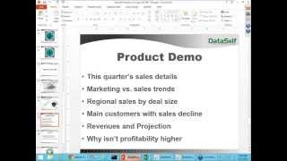
This is a 2015 webinar-style YouTube presentation by Johnny Giorardi (CEO/founder of Data Self) demonstrating Data Self Analytics — a packaged self-service BI solution built to work with Sage 100 and other systems. The speaker positions Data Self as combining Tableau (visualization), Microsoft SQL Server BI infrastructure, ETL, and a large library of pre-built assets (5,000+ reports/dashboards/APIs) to empower non-technical decision makers to create and modify reports on the fly. The core of the content is a distributor CEO case study showing how to: connect to Sage 100 sales data, drag-and-drop dimensions/measures, create a calculated measure (average price sold), apply relative-date filters ("this quarter"/"last quarter"), combine Google Analytics visitors with sales in a dual-axis chart, build maps for regional deal-size analysis, use out-of-the-box reports (top sales change; customers with no recent purchases), and drill into invoices to investigate a low-profit customer group (example: SH group with ~9% gross profit vs. company average >50%). The presenter claims rapid deployment (hours/days), ~15 years of company experience with Sage 100, an expected >80% reduction in reporting labor, and that the session was budgeted for about 25 minutes; a recording will be posted on their website.
Questions this video answers
May 22, 2015
More than 5,000
About 15 years
Approximately 25 minutes
Over 50% (company average gross profitability)
Chapters
What is self service BI and who needs it? Well, who needs business intelligence? Who needs reporting? Who needs data analysis? At the end of the day are the decision makers, the people who understand the business threats and opportunities. These are the people who really need information, anytime, anywhere. They may be in an office, they may be in a meeting, in a coffee shop, visiting a client, a vendor. These are the people who really need bi. Self Service BI is the next generation of bi. It's something that goes beyond easy of use for people who build reports. It actually goes to help the people who need information, to empower them anytime, anywhere to have their information. That's what we're going to be talking about here today. It's a little case scenario where the board had questions and the CEO had to have answers from stage 100. Welcome. My name is Johnny Giorardi. I'm the CEO and founder of Data Self. So let's talk about self service BI and how a decision maker like this CEO could actually have the answers by himself, anytime, anywhere. Before we jump right into the presentation per se, let me talk a little bit about self service BI and how we do things. First of all, this slide is showing Gartner Magic Quadrant. Gartner is one of the most reputable companies doing technology assessment for Fortune 2000 companies. And every year they assess which companies are doing better, the best, or how they are doing from Fortune 2000 vendors. Making a long story short, right now Tableau is considered the leader company doing self Service BI for Fortune 2000 companies. And Microsoft is considered a leader when it comes to BI infrastructure. What about these vendors? What about Data Self? Well, what we sell is actually a packaged solution that includes today nothing but the very best from a self service BI, which we'll be talking very shortly. But Tableau as being one of the most successful self service BI solutions out there today. So we leverage their technology. We also take advantage of SQL Service BI infrastructure which is also considered a leader by by Gartner. Plus we add our own secret sauce that includes the ETL which simplifies the deployment and maintenance of these other two high, you know, upper market vendors and we add more than 5,000, you got me right, 5,000 reports dashboard APIs out of the box. So not only we provide what is considered the gold standard self service BI technology out there not only is a very easy to use framework, but it comes with a ton of reports, looking at regular reports as well as very critical reports for your operations. So you know, it's fast to deploy, usually takes hours or days to deploy We've been working with Sage 100 in related products and doing self Service BI for about 15 years as a company and overall the cost of the solution is comparable to other mid market BI solutions. So that's why what we provide is considered one of the best self service BI solutions out there. Alrighty. So in practical terms, how does this work? How can it enable decision makers to do their own reporting data analysis? So right now, in the next about 15 minutes I'm going to go through a case study, a real case study where this company, which is a distributor from the west coast, they have been growing their business very quickly for years in a row and they have quarterly meetings where the CEO goes to this quarterly meeting and has to show the to the board many of their metrics in the reports, how things are going. This company has a very data driven decision makers. So the CEO and all the managers, they like information to make decisions and the board also is very data driven. So these meetings, these quarterly meetings, there's a lot of questions about the operations and quite often when the CEO was going to the meeting before Data Self he would have many questions unanswered because the reports he would bring to the meeting would not go into certain details. So recently they acquired Data Self Analytics. Right now I'm going to play the role of this CEO going through a preparation for this meeting and see how that's going to work. So first of all, there are these five different reports, you know, this quarter, sales details they want to see, you know, the board wants to see sales by customer invoice number, product information, salespeople information for this quarter. So this was a report that every quarter we have to show to the board. Also the company looks at marketing and sales trends, you know, how website visitors are affecting sales. So they also want to see that information and see how this investment on marketing is going to. There's sales all over U.S. and Canada. So they also want to discuss how sales per region is and how the deal sizes are relating to different regions. Also it's a distributor so it's very critical to be sure if the main customers are well served, especially the ones that have declining sales, why is that? And who are having declining sales and so forth. And finally no revenues and projection. You know, all of these five types of information. Until now, my IT team and my other team would spend several days every quarter crunching data, give me these reports and I would go with these reports to the board meeting to discuss. And again quite often the board would ask me questions about this that I Do not have a report. And then I will have to postpone the discussion until we come up with a new report to answer the board. Hopefully now that we have acquired Data Self analytics, we'll be able to have more answers on the fly and see how that works. Finally the board asked me last time, well, it's been great. We've been growing the business so much. But why isn't profitability higher? Our profitability on average the gross profitability is over 50%. Why our profitability is way below 50% and actually I have no clue. And I want to see if I can start digging into my data to discover where in our business profitability is driving the whole number down. So that's going to be a completely new area of reporting for us. These are the real case scenario that I have to go through. And as a CEO of this distributor right now I'm going to start give it a shot. So we acquired Data Self recently. I went through training and the main idea is this technology is supposed to be self service bi it means people that are not techies, that are not a report publisher also can do things very easily, anytime, anywhere. I could be at the office, I could be in a coffee shop, in a business meeting and I should be able to slice and dice the data, build new reports without calling a consultant an expert. And let's see how it works. So I open this Data Self analytics desktop tool and most of the reports that I have to respond are from the sales side. So right now I'm looking at the sales connector that out of the box connects to Sage 100 and already pulls sales information. As I mentioned, we have a lot of things available out of the box. We have connectors to sales, sales order, purchasing, inventory payables, receivables, financials. We have a lot of things available out of the box. In this case, I'm going to be focusing on sales most of the time. So here I have my sales dimensions, you know, customer products, invoices and so forth. And here I have my measures. Now the very first report I want to see is this quarter sales details. So I want to see sales. You know, it's drag and drop. I put my sales in my report. I want to see sales by customer. So let me drag customer to the report. I just drag and drop and then the report starts to take shape. So right now I have for every customer, my total sales in the whole company history. Well, I want to see this quarter information. Well, let me put invoice date in my columns. Just drag and drop bank right there. I have by year my whole company history. In this case 4 years total sales by customer. Well, by quarter I could just drill from year to quarter. So now I have quarter information. I could drill from quarter to month. I could go to the day level, to the week level, maybe fiscal period, any kind of time bucket you can just drill down like I just did. Well, in my example I want to see quarter, so let me go back to the quarter level and I actually want to see this quarter. So let's filter this to see only a section of the whole report. So just drag and drop the invoice date to my filters and then I could choose just different type of time buckets. I like to use the relative date because would be this quarter or this month, last year, last quarter, whatever it is, you just choose the time bucket that you want, in this case this quarter and you choose this quarter and bang, there you go. We have second quarter, 2015. The good news is next time this report will always show this quarter. It doesn't matter what quarter it is. Oopsie, what did I do here? Why I'm getting this? Hold on a second, Let me just stop and reshare my screen because I did something with my gotowebinar. Oh, I think I know what I did. Sorry about that. There you go. Sorry about that. Okay, so right now looking at this quarter information, always this quarter doesn't matter what the quarter is. In my board meeting, sometimes the board asks me, what about last quarter? Well, next time I can just come here to my report, click and choose maybe last quarter or maybe I want to see the last three quarters or maybe I can change to the year level. I mean whatever the time bucket is. Now with this kind of wizard, it becomes very, very easy for me as a decision maker to just slice a report, change it on the fly by myself. It's self service, bi. I can do it and I'm so excited. All right, so that's customer information, but I want to see more. I want to see let's say product information. So let's just add product to the report. Just drag and drop. So now I'm looking by customer, by product, total sales and let's see, quantity sold. You just drag and drop. It's very intuitive. As you can tell. You don't need to be a consultant or an expert to build a report like this. So right now I have quantity sold and sales. Now often, you know, they ask me for averages. What is the average price or things of that nature? Well, when I go here to my list of, you know, measures out of the box. I don't have average price. What should I do? Do I have to call it and ask them to build a new measure? Do I have to export to Excel and build the calculation outside in Excel? Yes, I could do both. But guess what? This is self service. I should be able to figure it out. So I went through training and I learned that if I double click here, I can build a calculation. So I'm going to do sales. I'm sorry, sum of sales. And I'm going to divide by sum of quantities sold. So I'm just building the formula quantity sold. And I just added a new formula to my report. Oops, I'm sorry, I misspelled here. Quantity sold. Quantity sold. There you go. Didn't do it right. Quantity soldier. Quantity sold is this one. Close the parenthesis, press enter. There we go. So I got quantity sold. Now let me make the following. This quantity sold actually is a measure that I'll be using quite often. So I want to make it available as part of the framework that anytime that I want to build a report, I want to have average price sold available. So I'm just rename it with a descriptive name for next time. And there it is. Right now I have average price sold. And actually I want to make it a dollar amount because it's a currency. With the dollar amount and the cents, I'm going to change from a regular number to using the currency approach. And voila. Now I have average price sold, quantity sold and sales amount. How easy was that? It was very easy. It was very intuitive. I was able to do it and now it becomes part of the framework. Next time that anyone wants to use average price sold, it's available. Awesome. Well, you know, the board wants to see invoice number, invoice date, salespeople, warehouse, and they sometimes they come up with some crazy requests. The good news, I just have to drag and drop. So if I'm putting an invoice number, I drag invoice number to my report. And now I have invoice number. Maybe I want to put invoice date. You just drag and drop in any location, you know, columns, rows, and you get the report. There you go. Okay, that was easy. Let's go for the next report which is marketing versus sales trends. So I'm going to build a new report, I'm going to put sales and I want to see things in a monthly time frame. So instead of looking at the year, I can choose a different time bucket, like months and Now I see things going how it's growing throughout the months. I already have Google Analytics information combined. I did that. I just drag and dropped my report. So this website visitors, I make it bars for website visitors, while my line is for sales. So there it is. And let me put them actually side by side in a dual access approach. So orange bars is website visitors, sales is a blue line, and bingo. That was easy. Awesome. Okay, that was an easy report. The next one is regional sales by customer, by deal size. Well, let's give it a shot at that new report. Well, a customer region I could be looking at bill to address, ship to address, whatever has an address I could choose. I want to see deal size and sales. And I want to put in a map. Before the board meeting would have no maps, only a spreadsheet. Now I can see information on a map and typically we only look at the United States continental. So let me zoom into that area. So right there I see United States continental area. Let me make the bubbles a little bigger. So bigger bubbles, bigger sales. And the bubbles are sliced by colors which represent the invoice sizes. And boy, this report will be so much more informative to my board discussions than my old Excel spreadsheet. Awesome. I mean, these three reports I just built, I want to put in a dashboard in my iPad, and I go to my meetings with my iPad and now I just drag and drop everything into it. You know, the map I want to put the trend analysis at the bottom and then the detail report on the right side. Everything is drag and drop again. You don't need to be an expert to do this. You don't need to spend, you know, days, weeks learning how to use it. Many of our clients, like, you know, CEOs, CFOs, controllers, salespeople, they learn how to do these things by watching a demo like this. And sometimes in my board meetings, some of the board members would ask me, hey, I'm traveling to these two, three states. Can you show me how they're doing? In the past, it was a pain. I could not enter on the fly because to just get a slice of the data, my reports were all static. Now I can come here and let's say, oh, the guy is traveling to Texas and taking this state here and this other state, I just select these states. When I do that, the whole dashboard changes to reflect my marketing trends, my sales details, just for those three states. This is so exciting. My next board meeting, I'm pretty confident a lot of the new questions I'll be able to address because now I have a tool that is self service that I can do things. All right, that was good. So we just tackled these three. The next two reports. There's some good news. Data Self comes with more than 5,000 out of the box reports and I know that many of them show growth, decline and no more transactions. So let me see if I can find the main customers with no sales going to Data Self's out of the box list. And this is a website, a web portal that will be installed for the client. And if I choose here, top customers. This is only a few sample out of the 5,000 but one of them shows top sales change. This report here we have several reports like that shows top sales change from last year to date, last quarter, today and so forth. These customers grew the most, these declined the most. So this answers the question which clients have the biggest sales decline? Also this report here, customers who are no longer buying. So beautiful. I don't need to build those reports. They are available out of the box. From a financial standpoint, we have a dashboard like this that shows revenues by different cost center by quarter this quarter and then revenues this month. Current bookings, information coming from the open sales order information coming from the CRM system, all combined giving a projection. So out of the box we don't need to do so many of these reports. I just open them up. The last is why profitability isn't higher. I have no clue. But I'm going to start to build a new report and see if I can figure it out why profitability isn't so higher. Let me start with sales because I understand sales. Let me put my customer group in my territories because there are two major drivers of my business. So there it is. By customer group, by territory. My total sales so far there's no news. Now I add percentage, gross profit and light color is not so profitable. Very green is very profitable. And I can tell that regardless of the territory my SH customer group is very light color. So I don't care about territory, just customer group. And look at this profitability, 9% while the other folks is over 50%. So let's focus on SH and see what's going on with SH. So 9% profitability which is pretty low. Let me pivot it. Is it changing over time? What are the trends here? I don't know. Let me put invoice, date and drill down to the month level and see what's going on. Let me go to the month level now I start to see some trends here. So red is not profitable and I can tell last year it was negative profitability. The prior year about the same time also was negative in the prior year. Also it's pretty low. So something is going on at the end of the year where my profitability is pretty low. So right now I'm going to click here and I'm going to drill into all detailed information, all the records that are adding up to that profitability and I could email this information to my account manager for the SH customer group and ask what the heck is going on here. And here we have all information. Invoice number, dates, customer warehouses, products, sales, gross profit, everything. And now I know that something's going on with that profitability at the end of the year for the SH customer group. In my next board meeting I will have some answers and hopefully a lot of them. Anyway, as you can tell, it's self service bi. As a CEO I was able to build a lot of reports from scratch right here in the last 15 minutes. And I'm so excited that in my next board meeting I'll have answers in a timely fashion and hopefully we'll make decisions more quickly and grow our business even faster. At the end of the day, there are main benefits for data self analytics. First of all, empowering decision makers. Because it's a self service bi, you'll be able to give decision makers a tool that they will be able to do analysis by themselves. There are more than 5,000 reports available out of the box. So as a starting point you don't have to build reports for about half of our clients. The out of the box is sufficient for the reporting needs. So it's really empowering. Besides that, if you spend a lot of hours every month, every year building and crunching data, this tool will reduce the labor associated to reporting by more than 80%. So those are the two main benefits. Folks, we are actually running out of time. We have budgeted this session for 25 minutes. So if you have questions, actually send me an email or give me a call. Right here you have my phone information, my cell phone information, actually my email, my Twitter account. I hope you found this session informative. Actually on our website we will be posting a webinar recording. If you come probably later today or tomorrow to our website under resources and webinars you'll find here registration to new webinars. But this recorded webinars. So you'll find a recording of this webinar posted here. If you want to see more information, I recommend again to visit our website or even better, you know, just give me a call, even if it's asking information. I'm here to educate you and see if our solution could be a good fit for your needs. And if not, I'll be glad to tell you there are other people who may do a better fit for you. I hope you have found this informative. I hope you have a happy Thursday. Thank you for joining us. Have a great day. Thank you.










